Module 2 Navigation Homepage Homepage Navigation pane that
- Slides: 19

Module 2 Navigation

Homepage

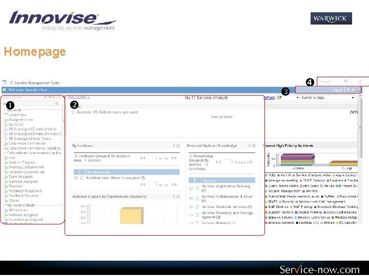
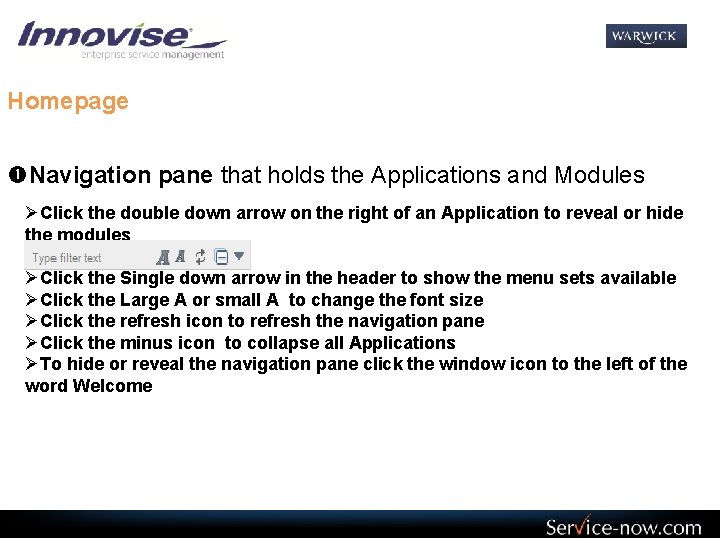
Homepage Navigation pane that holds the Applications and Modules ØClick the double down arrow on the right of an Application to reveal or hide the modules ØClick the Single down arrow in the header to show the menu sets available ØClick the Large A or small A to change the font size ØClick the refresh icon to refresh the navigation pane ØClick the minus icon to collapse all Applications ØTo hide or reveal the navigation pane click the window icon to the left of the word Welcome

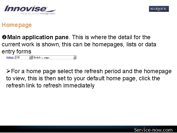
Homepage Main application pane. This is where the detail for the current work is shown, this can be homepages, lists or data entry forms ØFor a home page select the refresh period and the homepage to view, this is then set to your default home page, click the refresh link to refresh immediately

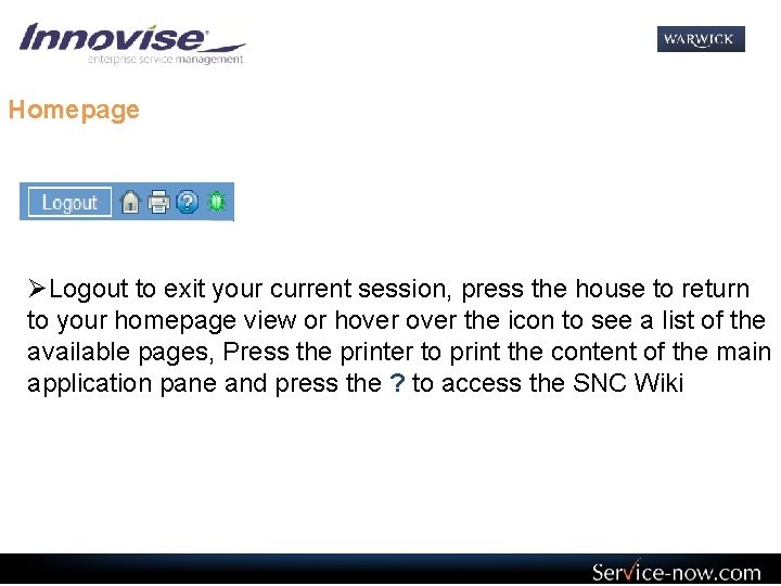
Homepage ØLogout to exit your current session, press the house to return to your homepage view or hover the icon to see a list of the available pages, Press the printer to print the content of the main application pane and press the ? to access the SNC Wiki

Homepage Global Search, this is where you can enter a word or phrase and have the system search through all the internal data to find any items that contain the details entered ØPress the magnifier after typing the search terms to initiate the search, press the down arrow to see your history of search terms. The up arrow on the far right will minimise the banner hearer and give a little more screen real-estate.

List Views

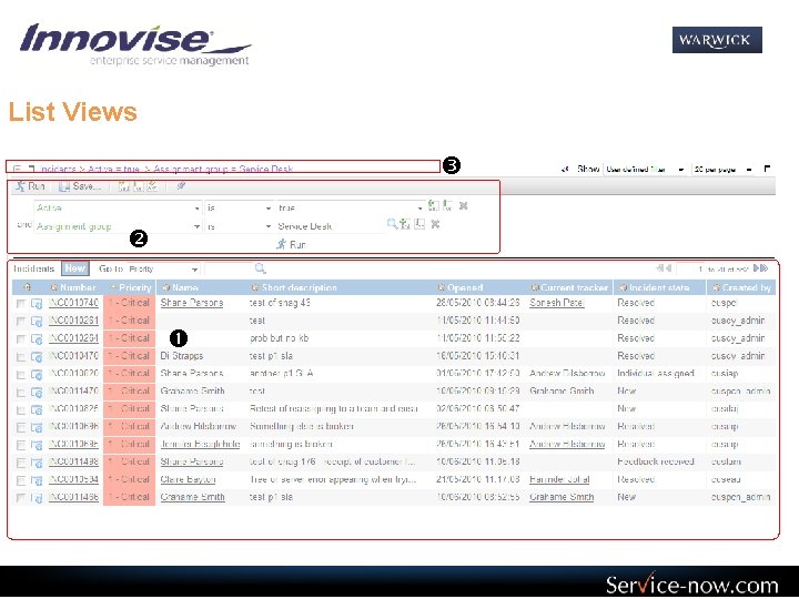
List Views The main list view that shows rows of data returned from the database for the particular query The Filter options allowing a user to filter data out of the list The Breadcrumb trail and the view options including grouping, predefined filters and lines per page

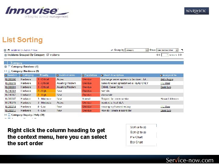
List Sorting Right click the column heading to get the context menu, here you can select the sort order

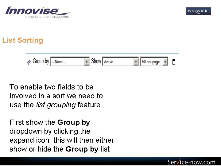
List Sorting To enable two fields to be involved in a sort we need to use the list grouping feature First show the Group by dropdown by clicking the expand icon this will then either show or hide the Group by list

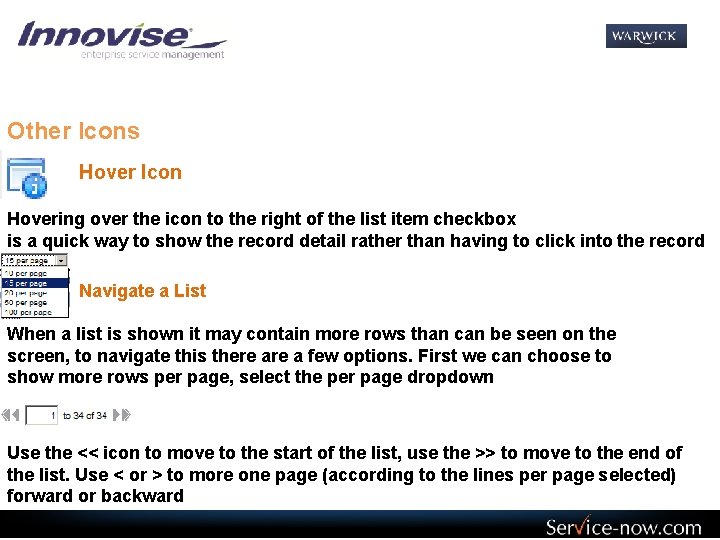
Other Icons Hover Icon Hovering over the icon to the right of the list item checkbox is a quick way to show the record detail rather than having to click into the record Navigate a List When a list is shown it may contain more rows than can be seen on the screen, to navigate this there a few options. First we can choose to show more rows per page, select the per page dropdown Use the << icon to move to the start of the list, use the >> to move to the end of the list. Use < or > to more one page (according to the lines per page selected) forward or backward

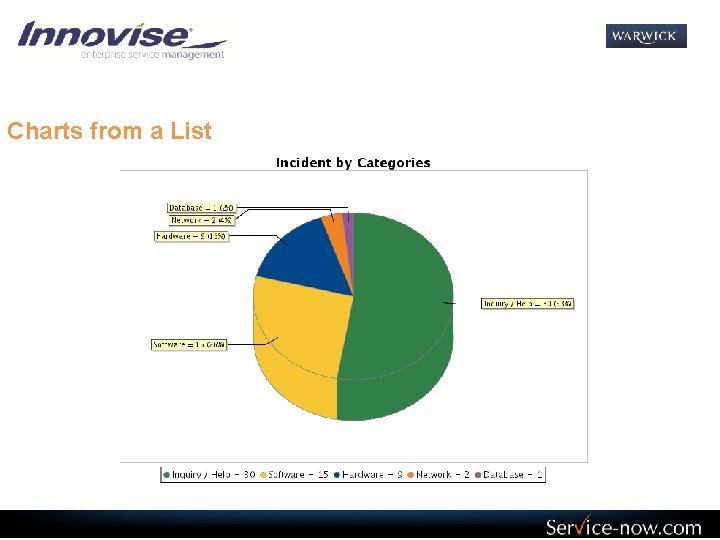
Charts from a List

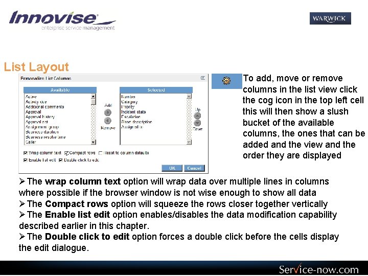
List Layout To add, move or remove columns in the list view click the cog icon in the top left cell this will then show a slush bucket of the available columns, the ones that can be added and the view and the order they are displayed ØThe wrap column text option will wrap data over multiple lines in columns where possible if the browser window is not wise enough to show all data ØThe Compact rows option will squeeze the rows closer together vertically ØThe Enable list edit option enables/disables the data modification capability described earlier in this chapter. ØThe Double click to edit option forces a double click before the cells display the edit dialogue.

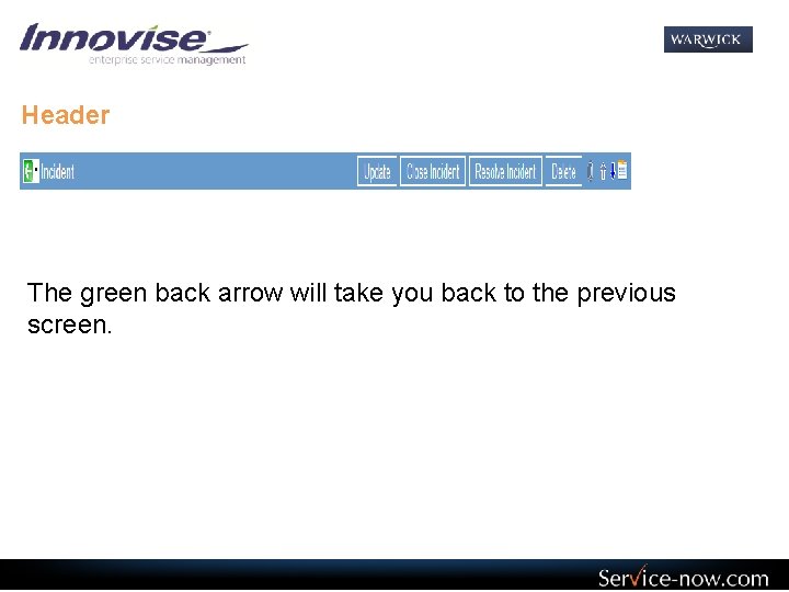
Header The green back arrow will take you back to the previous screen.

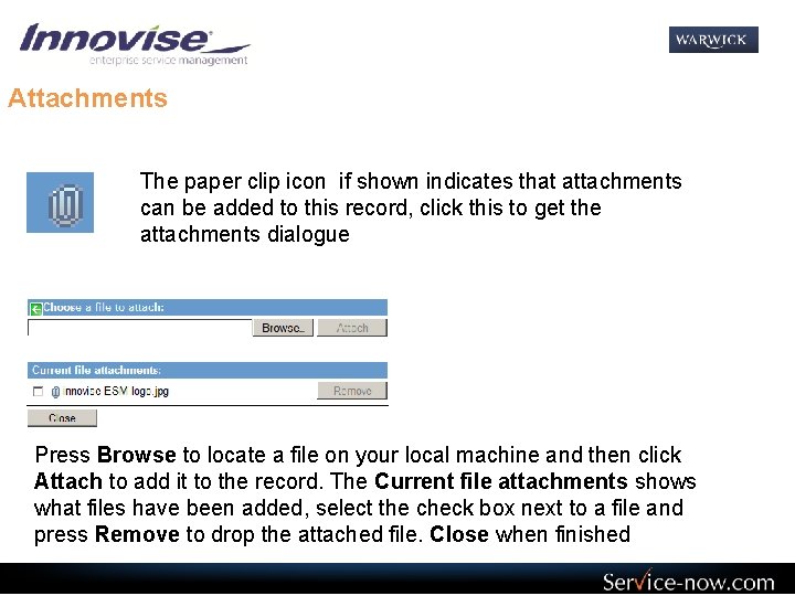
Attachments The paper clip icon if shown indicates that attachments can be added to this record, click this to get the attachments dialogue Press Browse to locate a file on your local machine and then click Attach to add it to the record. The Current file attachments shows what files have been added, select the check box next to a file and press Remove to drop the attached file. Close when finished

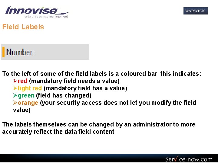
Field Labels To the left of some of the field labels is a coloured bar this indicates: Øred (mandatory field needs a value) Ølight red (mandatory field has a value) Øgreen (field has changed) Øorange (your security access does not let you modify the field value) The labels themselves can be changed by an administrator to more accurately reflect the data field content

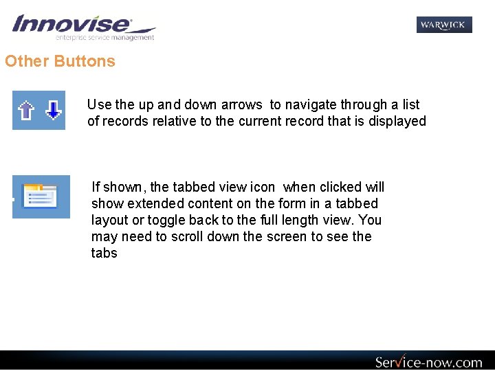
Other Buttons Use the up and down arrows to navigate through a list of records relative to the current record that is displayed If shown, the tabbed view icon when clicked will show extended content on the form in a tabbed layout or toggle back to the full length view. You may need to scroll down the screen to see the tabs

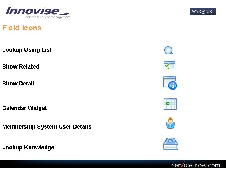
Field Icons Lookup Using List Show Related Show Detail Calendar Widget Membership System User Details Lookup Knowledge

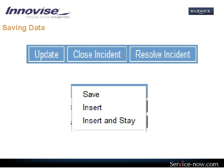
Saving Data