Grade FG Pie charts Interpret and construct pie
- Slides: 25

Grade F/G Pie charts Interpret and construct pie charts for categorical data If you have any questions regarding these resources or come across any errors, please contact helpful-report@pixl. org. uk

Key Vocabulary Pie chart Categorical data Qualitative data Discrete data Proportion Fraction

Pie charts are most usefully used when data is categorical (qualitative) or discrete. They are an alternative method to display data than Bar Charts and Vertical line charts. We draw a circle and split up the areas into the same ratio as the information we are representing.

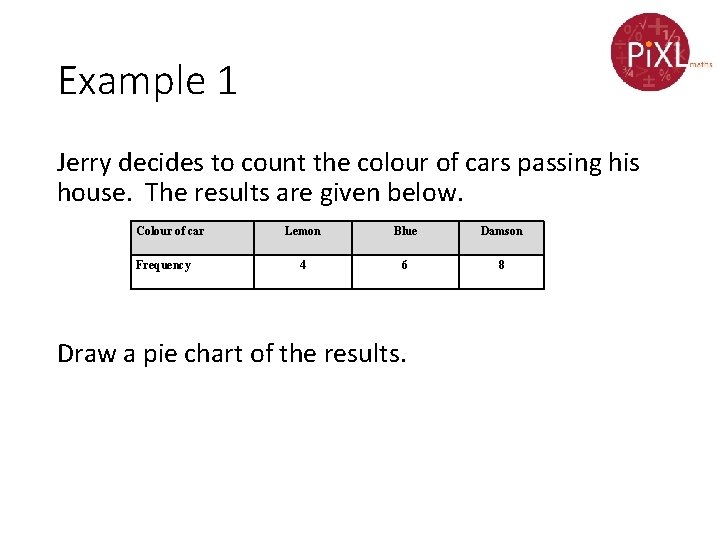
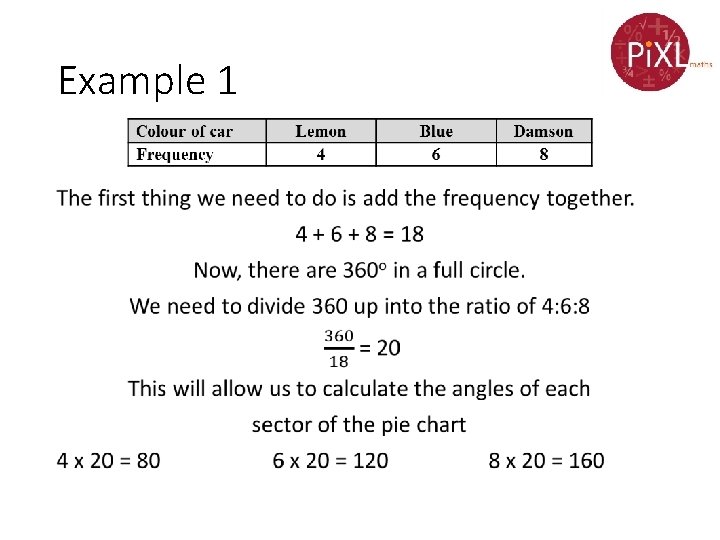
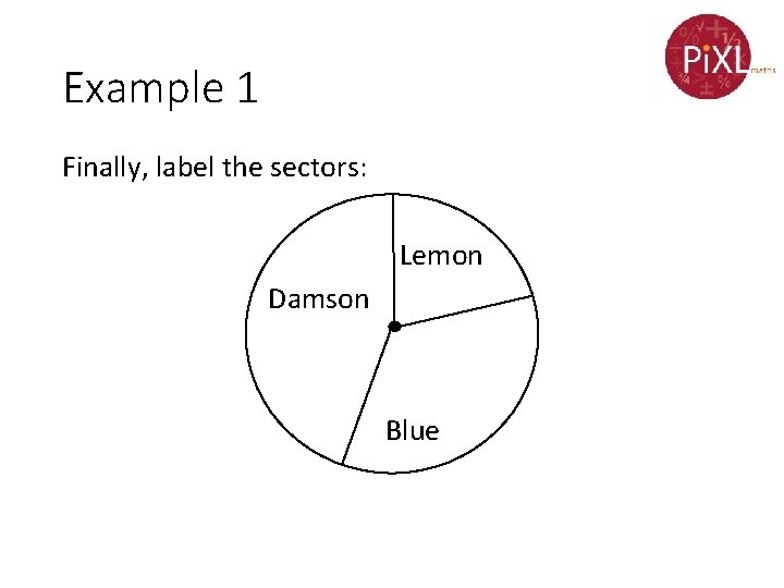
Example 1 Jerry decides to count the colour of cars passing his house. The results are given below. Colour of car Frequency Lemon Blue Damson 4 6 8 Draw a pie chart of the results.

Example 1 •

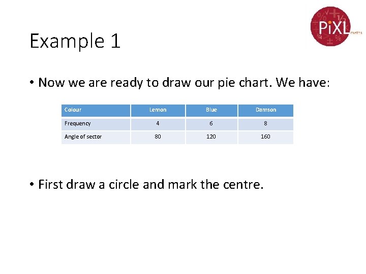
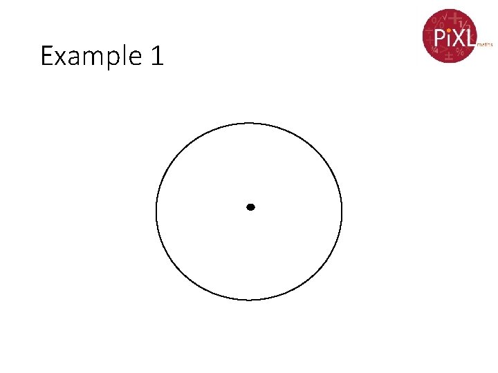
Example 1 • Now we are ready to draw our pie chart. We have: Colour Lemon Blue Damson Frequency 4 6 8 Angle of sector 80 120 160 • First draw a circle and mark the centre.

Example 1

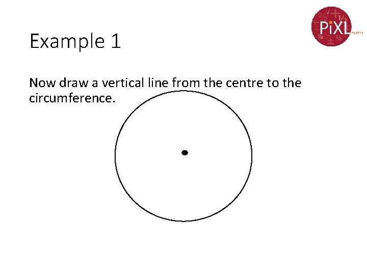
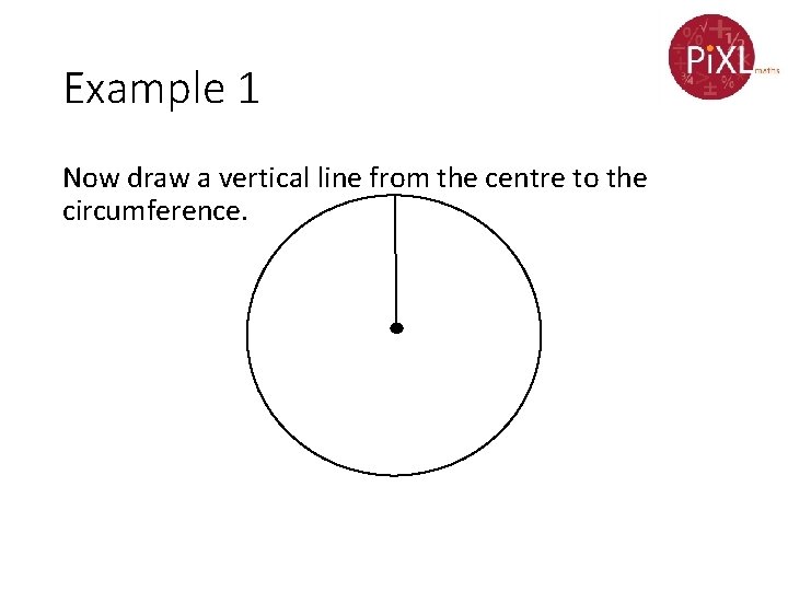
Example 1 Now draw a vertical line from the centre to the circumference.

Example 1 Now draw a vertical line from the centre to the circumference.

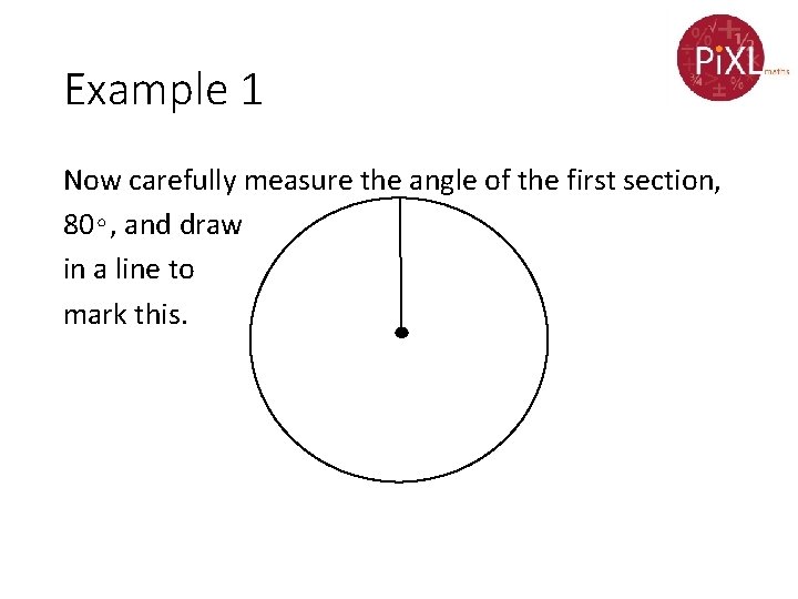
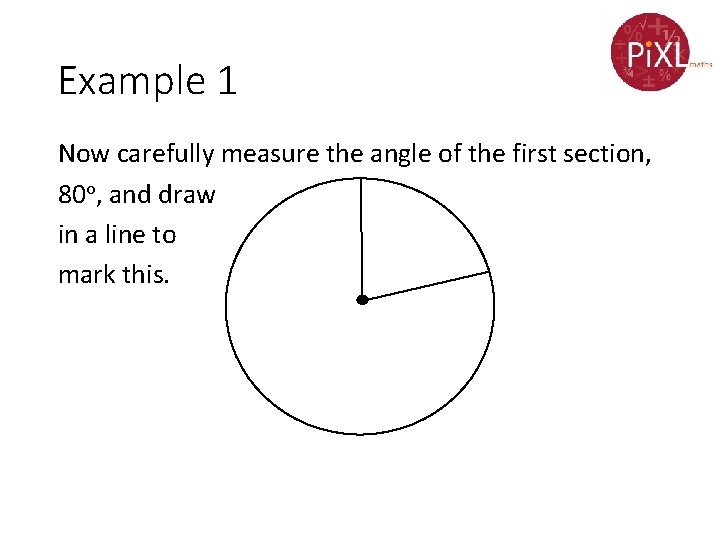
Example 1 Now carefully measure the angle of the first section, 80∘, and draw in a line to mark this.

Example 1 Now carefully measure the angle of the first section, 80 o, and draw in a line to mark this.

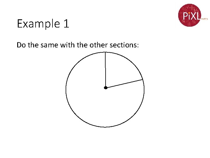
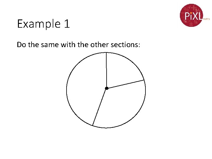
Example 1 Do the same with the other sections:

Example 1 Do the same with the other sections:

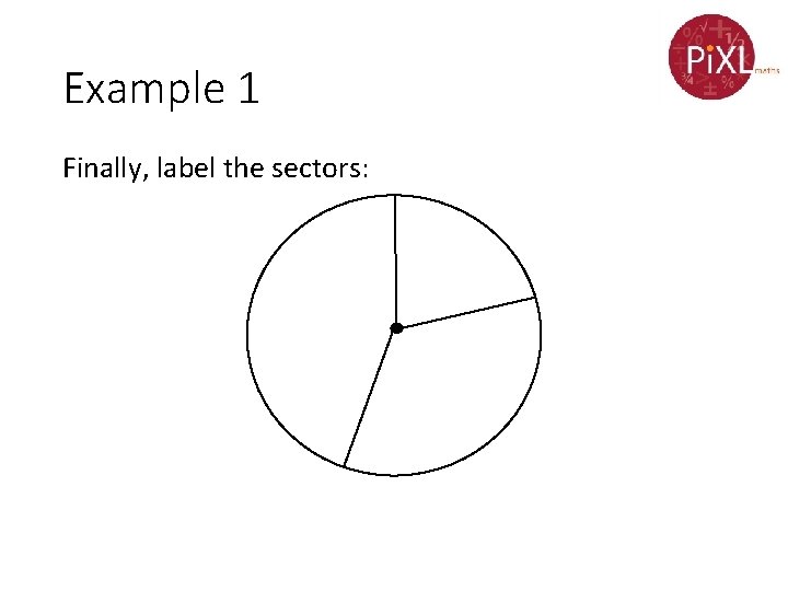
Example 1 Finally, label the sectors:

Example 1 Finally, label the sectors: Lemon Damson Blue

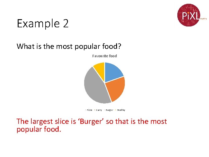
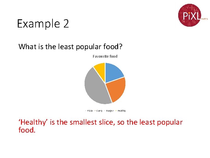
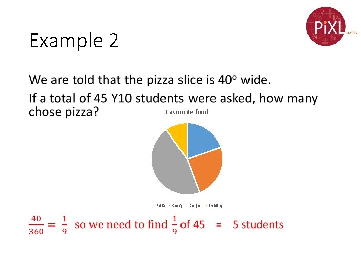
Example 2 Sometimes we are given the pie chart, and asked to answer questions about it. The following pie chart was used to display the data from a survey taken amongst a group of Y 10 students

Example 2 What is the most popular food? Favourite food Pizza Curry Burger Healthy The largest slice is ‘Burger’ so that is the most popular food.

Example 2 What is the least popular food? Favourite food Pizza Curry Burger Healthy ‘Healthy’ is the smallest slice, so the least popular food.

Example 2 • Favourite food Pizza Curry Burger Healthy

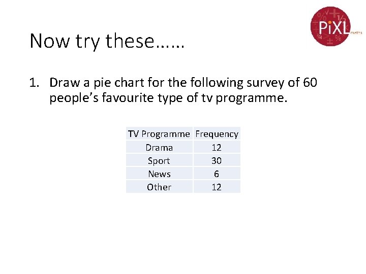
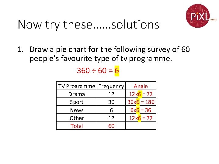
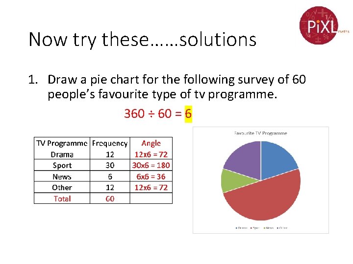
Now try these…… 1. Draw a pie chart for the following survey of 60 people’s favourite type of tv programme. TV Programme Frequency Drama 12 Sport 30 News 6 Other 12

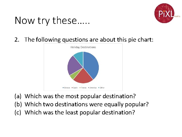
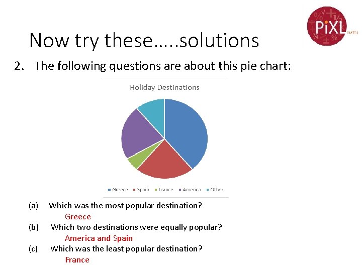
Now try these…. . 2. The following questions are about this pie chart: (a) Which was the most popular destination? (b) Which two destinations were equally popular? (c) Which was the least popular destination?

Now try these……solutions 1. Draw a pie chart for the following survey of 60 people’s favourite type of tv programme. 360 ÷ 60 = 6 TV Programme Frequency Angle Drama 12 12 x 6 = 72 Sport 30 30 x 6 = 180 News 6 6 x 6 = 36 Other 12 12 x 6 = 72 Total 60

Now try these……solutions 1. Draw a pie chart for the following survey of 60 people’s favourite type of tv programme. 360 ÷ 60 = 6

Now try these…. . solutions 2. The following questions are about this pie chart: (a) Which was the most popular destination? Greece (b) Which two destinations were equally popular? America and Spain (c) Which was the least popular destination? France

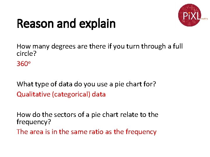
Reason and explain How many degrees are there if you turn through a full circle? 360 o What type of data do you use a pie chart for? Qualitative (categorical) data How do the sectors of a pie chart relate to the frequency? The area is in the same ratio as the frequency