COLOR How our eye Works Humans have three

- Slides: 22

COLOR

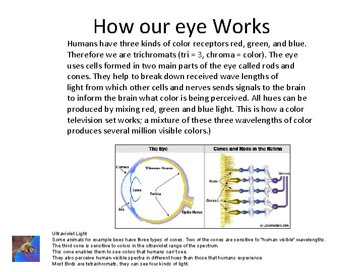
How our eye Works Humans have three kinds of color receptors red, green, and blue. Therefore we are trichromats (tri = 3, chroma = color). The eye uses cells formed in two main parts of the eye called rods and cones. They help to break down received wave lengths of light from which other cells and nerves sends signals to the brain to inform the brain what color is being perceived. All hues can be produced by mixing red, green and blue light. This is how a color television set works; a mixture of these three wavelengths of color produces several million visible colors. ) Ultraviolet Light Some animals for example bees have three types of cones. Two of the cones are sensitive to "human visible" wavelengths. The third cone is sensitive to colors in the ultraviolet range of the spectrum. This cone enables them to see colors that humans can’t see. They also perceive human-visible spectra in different hues than those that humans experience. Most Birds are tetrachromats, they can see four kinds of light.

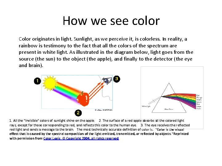
How we see color Color originates in light. Sunlight, as we perceive it, is colorless. In reality, a rainbow is testimony to the fact that all the colors of the spectrum are present in white light. As illustrated in the diagram below, light goes from the source (the sun) to the object (the apple), and finally to the detector (the eye and brain). 1. All the "invisible" colors of sunlight shine on the apple. 2. The surface of a red apple absorbs all the colored light rays, except for those corresponding to red, and reflects this color to the human eye. 3. The eye receives the reflected red light and sends a message to the brain. The most technically accurate definition of color is: "Color is the visual effect that is caused by the spectral composition of the light emitted, transmitted, or reflected by objects. "Reprinted with permission from Color Logic © Copyright 2004, all rights reserved

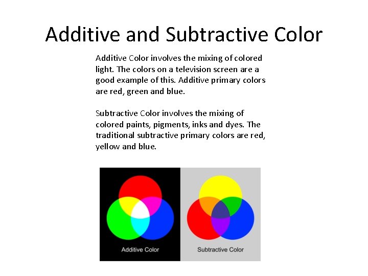
Additive and Subtractive Color Additive Color involves the mixing of colored light. The colors on a television screen are a good example of this. Additive primary colors are red, green and blue. Subtractive Color involves the mixing of colored paints, pigments, inks and dyes. The traditional subtractive primary colors are red, yellow and blue.

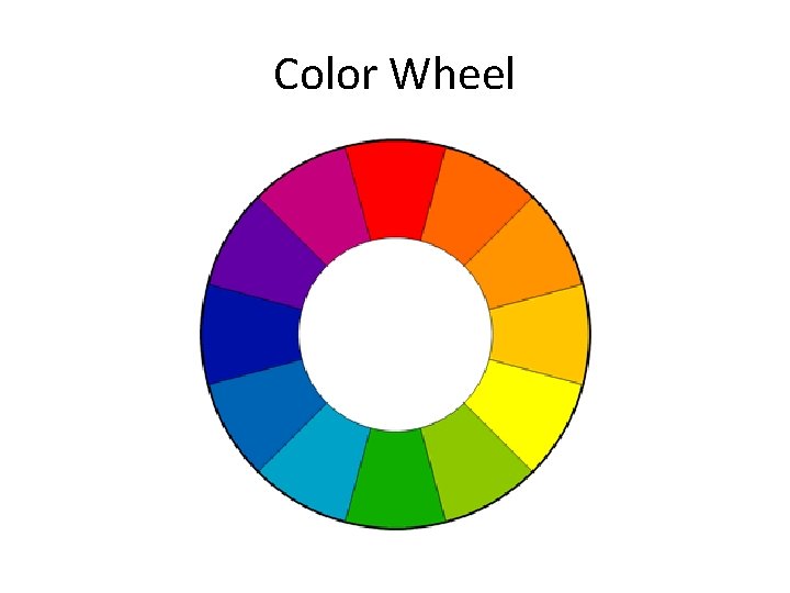
Color Wheel

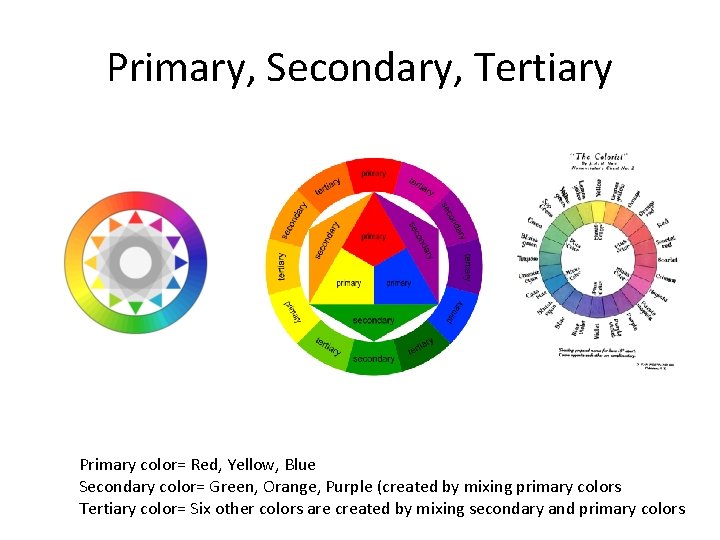
Primary, Secondary, Tertiary Primary color= Red, Yellow, Blue Secondary color= Green, Orange, Purple (created by mixing primary colors Tertiary color= Six other colors are created by mixing secondary and primary colors

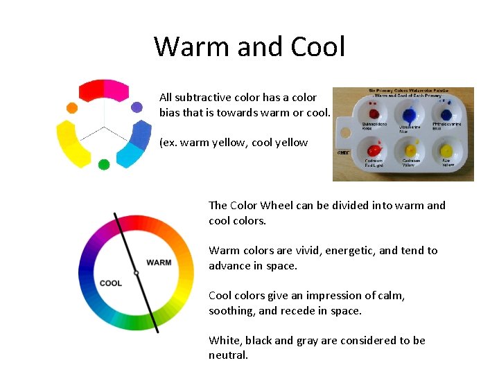
Warm and Cool All subtractive color has a color bias that is towards warm or cool. (ex. warm yellow, cool yellow The Color Wheel can be divided into warm and cool colors. Warm colors are vivid, energetic, and tend to advance in space. Cool colors give an impression of calm, soothing, and recede in space. White, black and gray are considered to be neutral.

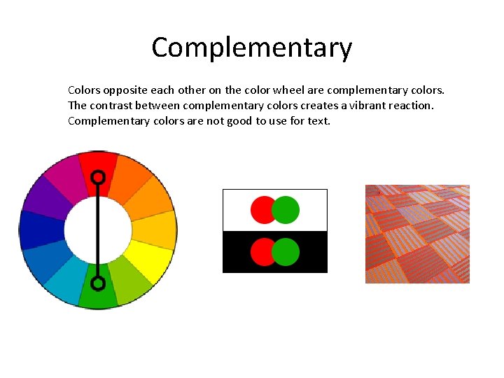
Complementary Colors opposite each other on the color wheel are complementary colors. The contrast between complementary colors creates a vibrant reaction. Complementary colors are not good to use for text.

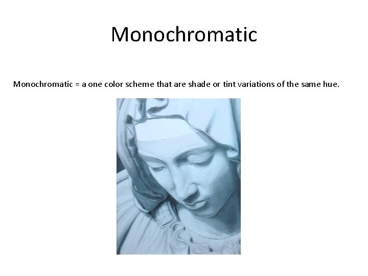
Monochromatic = a one color scheme that are shade or tint variations of the same hue.

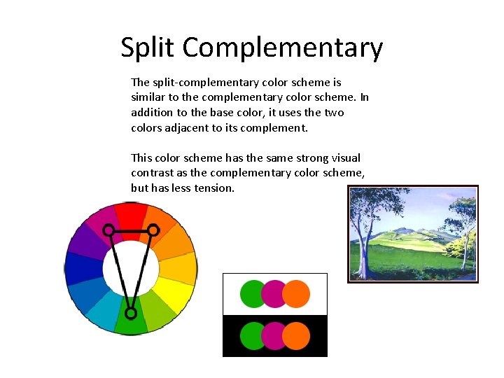
Split Complementary The split-complementary color scheme is similar to the complementary color scheme. In addition to the base color, it uses the two colors adjacent to its complement. This color scheme has the same strong visual contrast as the complementary color scheme, but has less tension.

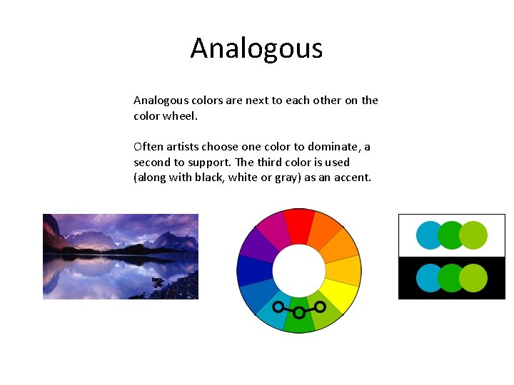
Analogous colors are next to each other on the color wheel. Often artists choose one color to dominate, a second to support. The third color is used (along with black, white or gray) as an accent.

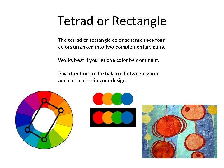
Tetrad or Rectangle The tetrad or rectangle color scheme uses four colors arranged into two complementary pairs. Works best if you let one color be dominant. Pay attention to the balance between warm and cool colors in your design.

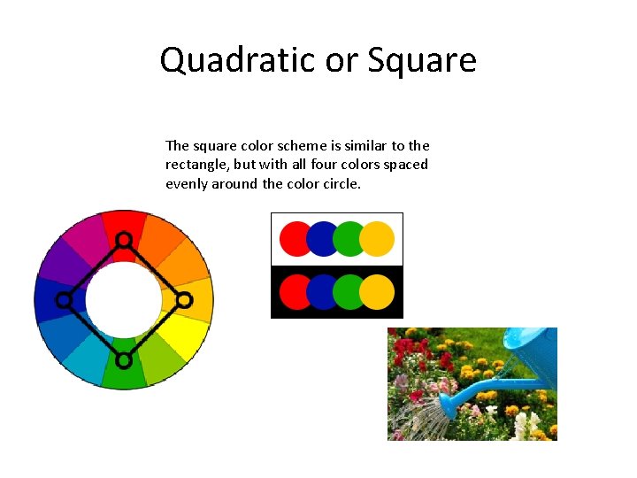
Quadratic or Square The square color scheme is similar to the rectangle, but with all four colors spaced evenly around the color circle.

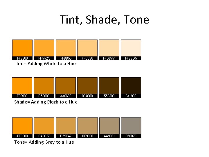
Tint, Shade, Tone Tint= Adding White to a Hue Shade= Adding Black to a Hue Tone= Adding Gray to a Hue

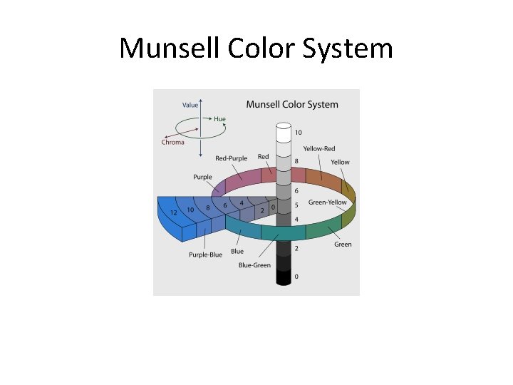
Munsell Color System

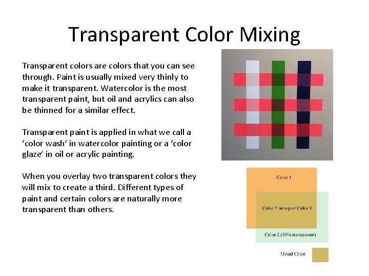
Transparent Color Mixing Transparent colors are colors that you can see through. Paint is usually mixed very thinly to make it transparent. Watercolor is the most transparent paint, but oil and acrylics can also be thinned for a similar effect. Transparent paint is applied in what we call a ‘color wash’ in watercolor painting or a ‘color glaze’ in oil or acrylic painting. When you overlay two transparent colors they will mix to create a third. Different types of paint and certain colors are naturally more transparent than others.

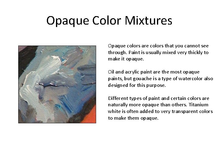
Opaque Color Mixtures Opaque colors are colors that you cannot see through. Paint is usually mixed very thickly to make it opaque. Oil and acrylic paint are the most opaque paints, but gouache is a type of watercolor also designed for this purpose. Different types of paint and certain colors are naturally more opaque than others. Titanium white is often added to very transparent colors to make them opaque.

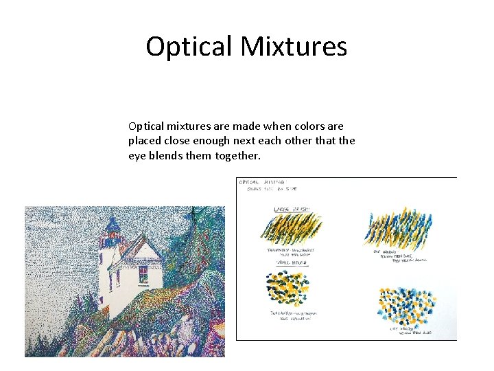
Optical Mixtures Optical mixtures are made when colors are placed close enough next each other that the eye blends them together.

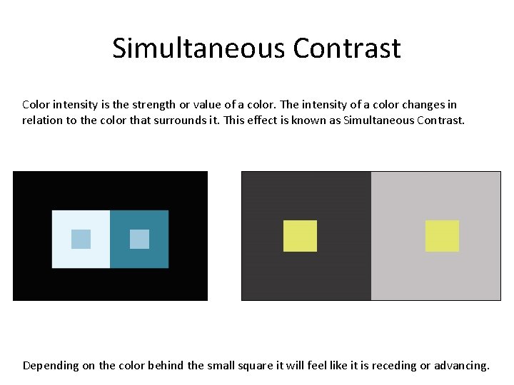
Simultaneous Contrast Color intensity is the strength or value of a color. The intensity of a color changes in relation to the color that surrounds it. This effect is known as Simultaneous Contrast. Depending on the color behind the small square it will feel like it is receding or advancing.

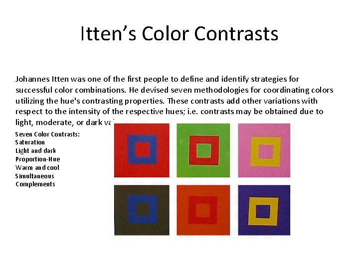
Itten’s Color Contrasts Johannes Itten was one of the first people to define and identify strategies for successful color combinations. He devised seven methodologies for coordinating colors utilizing the hue's contrasting properties. These contrasts add other variations with respect to the intensity of the respective hues; i. e. contrasts may be obtained due to light, moderate, or dark value. Seven Color Contrasts: Saturation Light and dark Proportion-Hue Warm and cool Simultaneous Complements

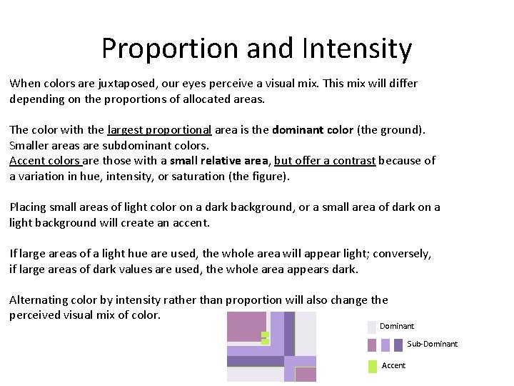
Proportion and Intensity When colors are juxtaposed, our eyes perceive a visual mix. This mix will differ depending on the proportions of allocated areas. The color with the largest proportional area is the dominant color (the ground). Smaller areas are subdominant colors. Accent colors are those with a small relative area, but offer a contrast because of a variation in hue, intensity, or saturation (the figure). Placing small areas of light color on a dark background, or a small area of dark on a light background will create an accent. If large areas of a light hue are used, the whole area will appear light; conversely, if large areas of dark values are used, the whole area appears dark. Alternating color by intensity rather than proportion will also change the perceived visual mix of color. Dominant Sub-Dominant Accent

Color Studies Colors of a complementary relationship assigned equal proportion. Colors reassigned with proportions allocated to dominant and subdominant areas. Color intensity and proportion modified. Using tints and shades of the original colors results in a moderate level of contrast and medium value. Color of a Triad Relationship Colors of a triad relationship assigned equal proportion. Colors reassigned with proportions allocated to dominant, subdominant, and accent areas. Color intensity and saturation modified - the whole area displays a moderately-high contrast level. Color intensity and saturation modified - the whole area displays a moderately low contrast level. Color intensity and saturation modified - the whole area displays a medium/dark value. Color intensity and saturation modified - the whole area displays a light value, http: //www. worqx. com/color/studies. htm