Color Wheel Color Values Color Schemes The color


.")


- Slides: 34
Color Wheel Color Values Color Schemes
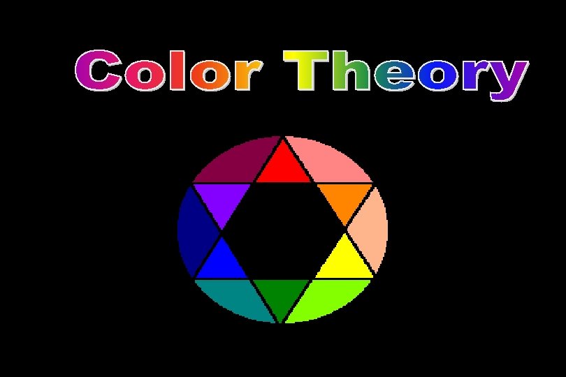
The color wheel fits together like a puzzle - each color in a specific place. Being familiar with the color wheel not only helps you mix colors when painting, but in adding color to all your art creations.
Primary Colors Primary colors are not mixed from other elements and they generate all other colors. • Red • Yellow • Blue
Secondary Colors By mixing two primary colors, a secondary color is created. • Yellow + Red = Orange • Yellow + Blue = Green • Red + Blue = Purple
Intermediate Colors Intermediate, or Tertiary, colors are created by mixing a primary and a secondary. • red-orange • yellow-green • blue-green • blue-purple • red-purple
Neutral Colors Black, white, gray and sometimes brown are considered "neutral”. Neutral colors help create depth, for they recede in space, or in other words make things look further away. You need good color rich neutrals in shadows or in the background! What colors can you mix to form a neutral?
• mixed to create dark neutrals: •
Color values are the lights and darks of a color created by using black and white the color. Make sure you mix them in the correct order! • white + color = tint • color + black = shade
Tints are lightened colors. Always begin with white and add a bit of color to the white until the desired tint is obtained. This is an example of a value scale for the tints of blue.
Shades are darkened colors. Always begin with the color and add just a bit of black at a time to get the desired shade of a color. This is an example of a value scale for the shades of blue.
Color Schemes are a systematic way of using the color wheel to put colors together… in your art work, putting together the clothes you wear, deciding what colors to paint your room…. . monochromatic, complementary, analogous, warm and cool.
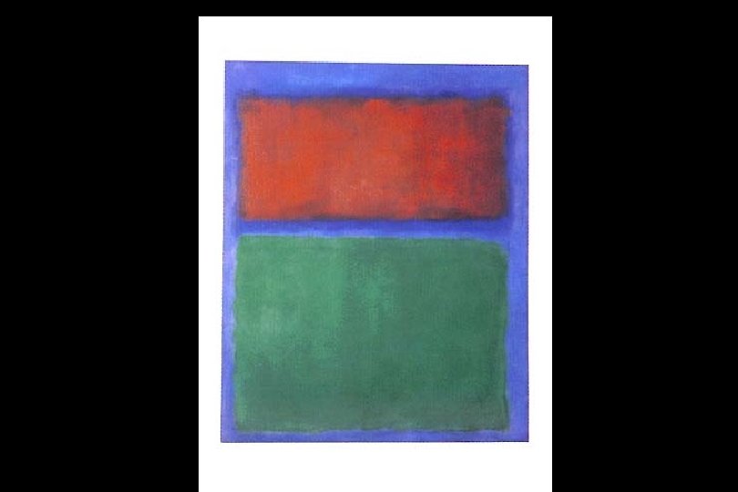
Monochromatic “Mono” means “one”, “chroma” means “color”… monochromatic color schemes have only one color and its values. The following slide shows a painting done in a monochromatic color scheme.
This non-objective painting has a monochromatic color scheme - blue and the values (tints and shades) of blue.
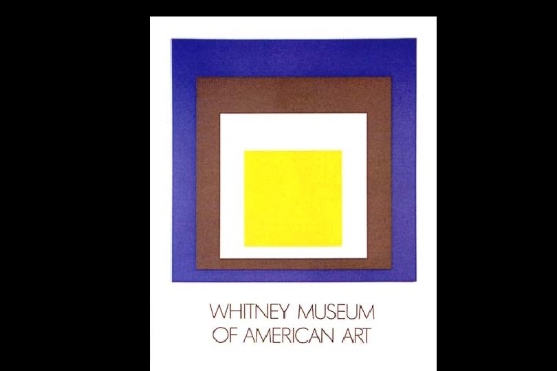
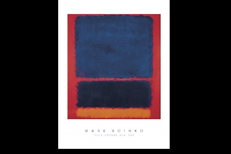
Complementary colors are opposite on the color wheel provided a high contrast – When you mix complements you will get a neutral color
This painting has complementary colors and their values - blues and oranges.
Analogous The analogous color scheme is 3 -5 colors adjacent to each other on the color wheel. This combination of colors provides very little contrast.
Analogous colors are illustrated here: yellow, yellow-green, green and blue-green.
Warm colors are found on the right side of the color wheel. Warm colors make objects look closer in a painting or drawing.
This is an illustration of the use of warm colors - reds, oranges and yellows.
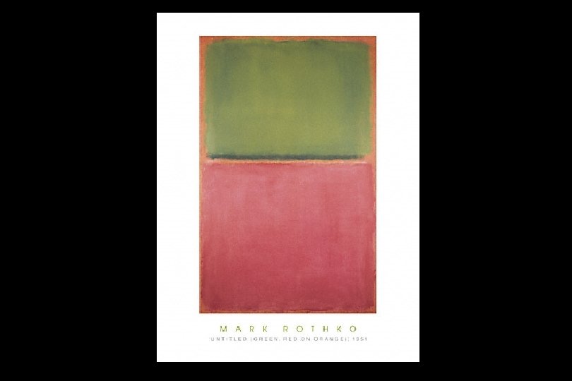
Cool colors are found on the left side of the color wheel. Cool colors tend to recede in a composition.
Note the cool color scheme in this painting (greens, purples and blues).
Th. There are many artist who use color as their main visual element… Paul Klee
JJosef Albers
Let’s Review • The primary colors are: red blue yellow • When you mix them they make secondary colors: orange green purple • When you mix secondary colors you get tertiary colors: red-orange and red-purple yellow- orange and yellow- green blue – green and blue-purple
Colors that work best in the Background: Cool, Co Neutral, and shades of the original colors Colors that work best in the Foreground: Warm and Bright Cool colors are in the blue family Warm colors are in the yellow and red family
• Color schemes help paintings look unified • By mixing a color with its compliment you get a neutralized version of the color: Red’s compliment is Green Yellow’s compliment is Purple Blue’s compliment is Orange Neutrals are not just brown! This is a neutral Blue This is a neutral Green , This is a neutral Orange, This is a neutral Red, This is a neutral Yellow • Mixing colors properly saves time and paint! Light pigment + darker pigment = correct color mixing technique
• The value of a color is the light or darkness of the color A TINT is the lighter version of a color A SHADE is a darker version of the color Value is used to add depth, 3 -D, and makes your art look more like real life! • Analogous colors have to touch each other, an easy way to remember is to name the primary, then the tertiary then secondary the color in a row!