Color Theory Color Theory Color Wheel Color Values

- Slides: 42

Color Theory

Color Theory Color Wheel Color Values Color Schemes

At its core, color is light. Light is composed of many different colors and the various mixtures of light compose the colors that we can see.

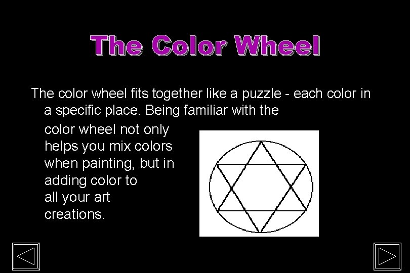
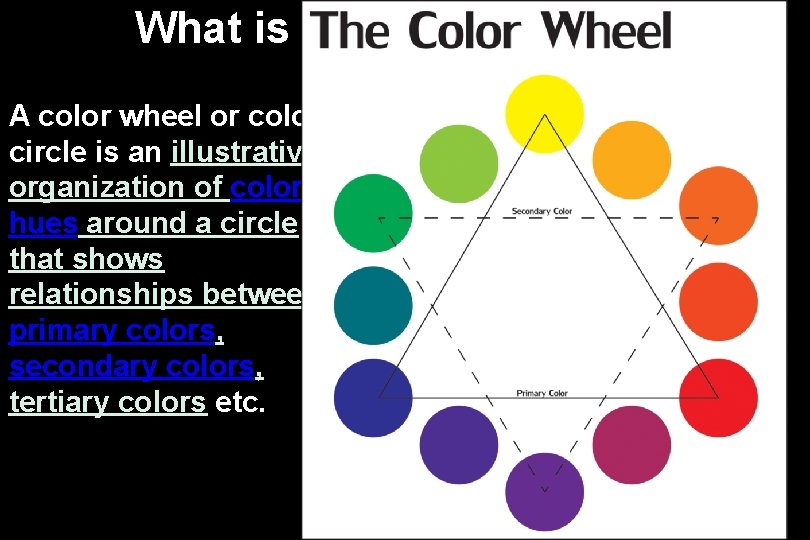
The Color Wheel The color wheel fits together like a puzzle - each color in a specific place. Being familiar with the color wheel not only helps you mix colors when painting, but in adding color to all your art creations.

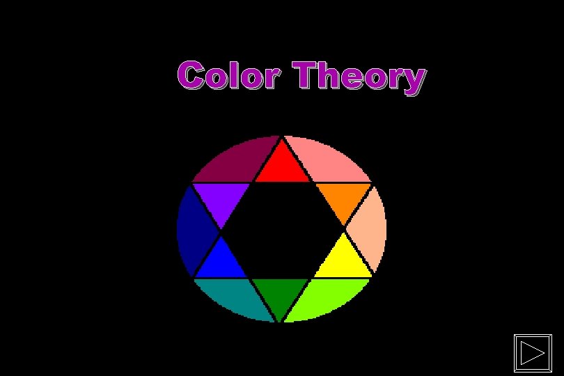
What is a Color Wheel? A color wheel or color circle is an illustrative organization of color hues around a circle that shows relationships between primary colors, secondary colors, tertiary colors etc. 5

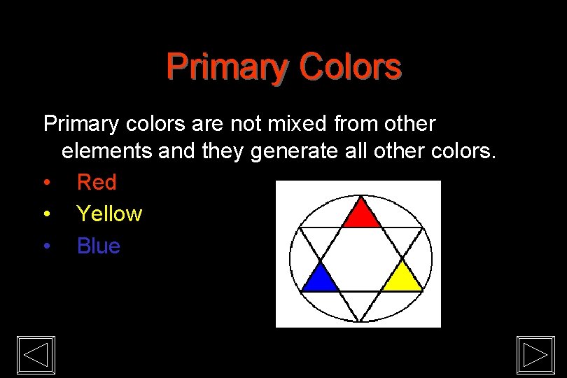
Primary Colors Primary colors are not mixed from other elements and they generate all other colors. • Red • Yellow • Blue

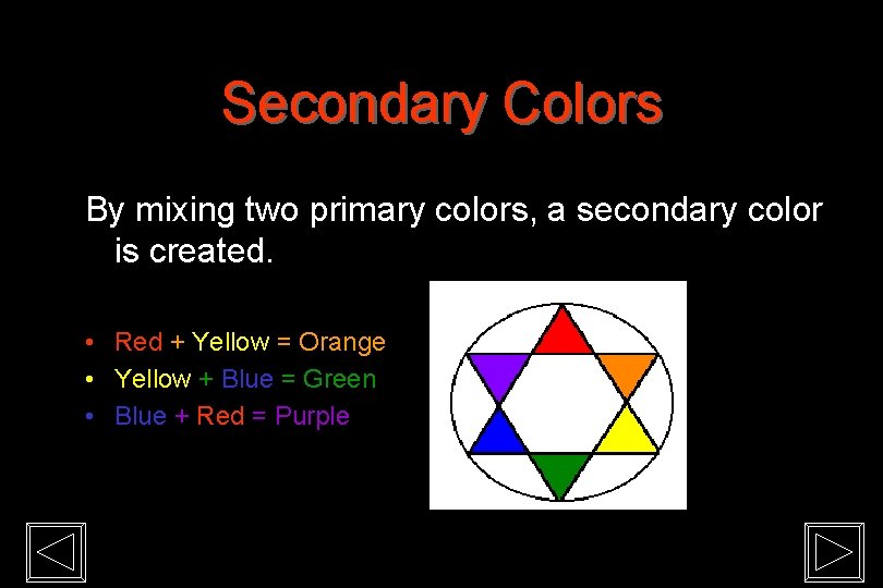
Secondary Colors By mixing two primary colors, a secondary color is created. • Red + Yellow = Orange • Yellow + Blue = Green • Blue + Red = Purple

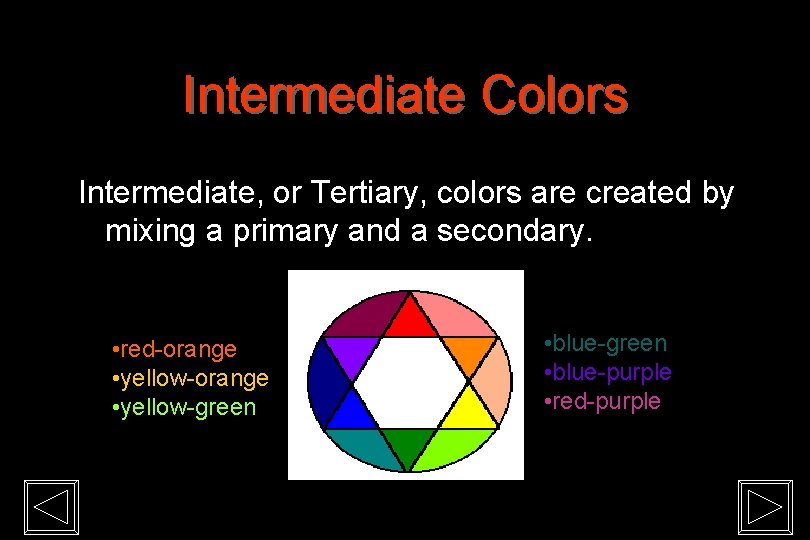
Intermediate Colors Intermediate, or Tertiary, colors are created by mixing a primary and a secondary. • red-orange • yellow-green • blue-green • blue-purple • red-purple

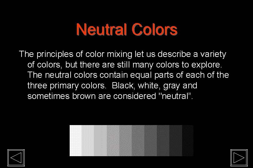
Neutral Colors The principles of color mixing let us describe a variety of colors, but there are still many colors to explore. The neutral colors contain equal parts of each of the three primary colors. Black, white, gray and sometimes brown are considered "neutral”.

Color Values Color values are the lights and darks of a color you create by using black and white (‘neutrals”) with a color. This makes hundreds of more colors from the basic 12 colors of the wheel. • white + color = tint • color + black = shade

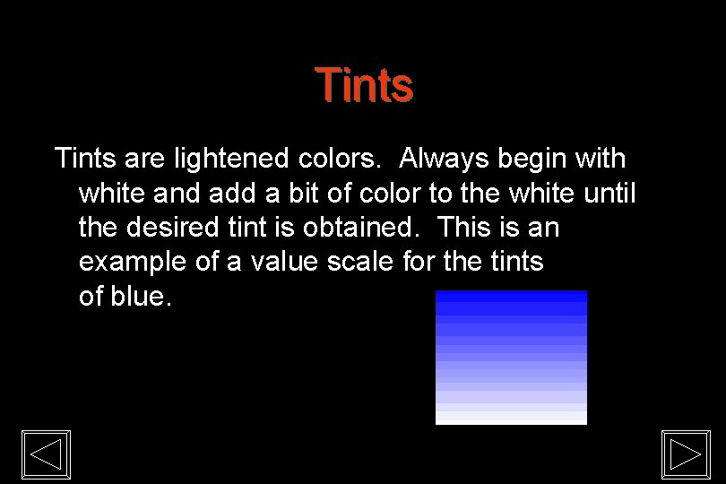
Tints are lightened colors. Always begin with white and add a bit of color to the white until the desired tint is obtained. This is an example of a value scale for the tints of blue.

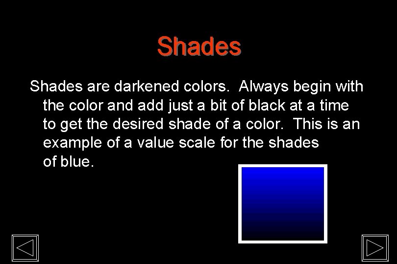
Shades are darkened colors. Always begin with the color and add just a bit of black at a time to get the desired shade of a color. This is an example of a value scale for the shades of blue.

Color Schemes are a systematic way of using the color wheel to put colors together… in your art work, putting together the clothes you wear, deciding what colors to paint your room…. . monochromatic, complementary, analogous, warm and cool.

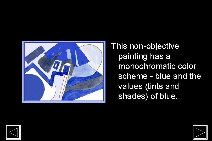
Monochromatic “Mono” means “one”, “chroma” means “color”… monochromatic color schemes have only one color and its values. The following slide shows a painting done in a monochromatic color scheme.

This non-objective painting has a monochromatic color scheme - blue and the values (tints and shades) of blue.

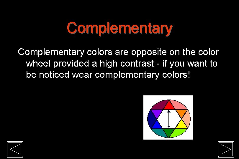
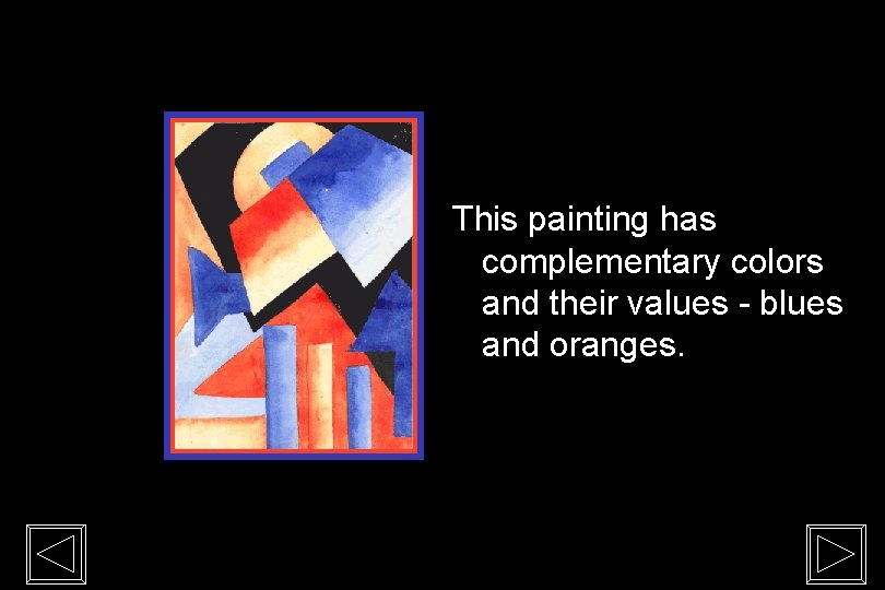
Complementary colors are opposite on the color wheel provided a high contrast - if you want to be noticed wear complementary colors!

This painting has complementary colors and their values - blues and oranges.

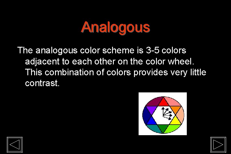
Analogous The analogous color scheme is 3 -5 colors adjacent to each other on the color wheel. This combination of colors provides very little contrast.

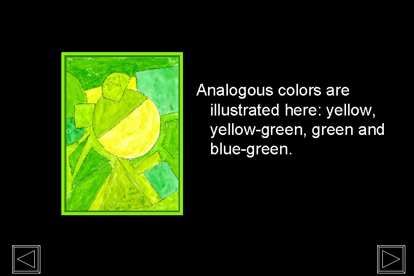
Analogous colors are illustrated here: yellow, yellow-green, green and blue-green.

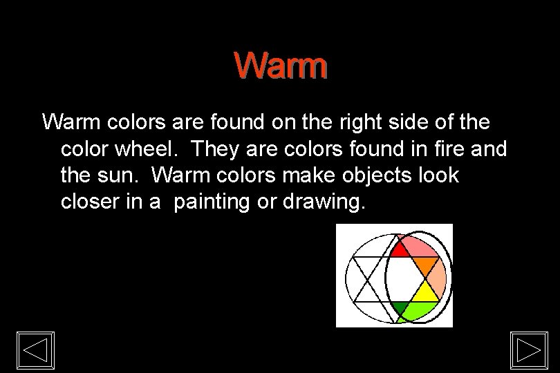
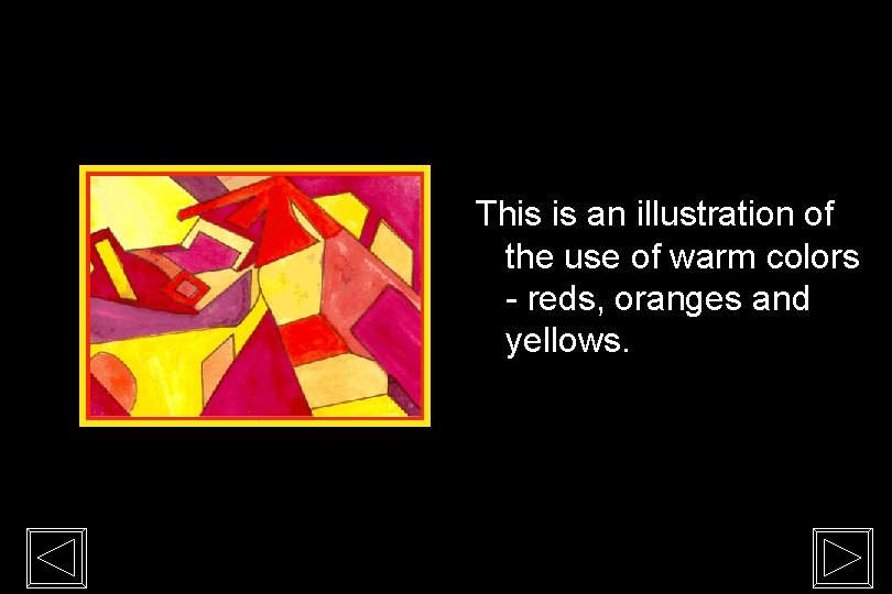
Warm colors are found on the right side of the color wheel. They are colors found in fire and the sun. Warm colors make objects look closer in a painting or drawing.

This is an illustration of the use of warm colors - reds, oranges and yellows.

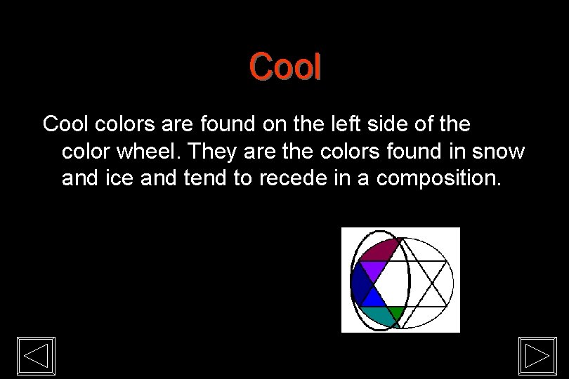
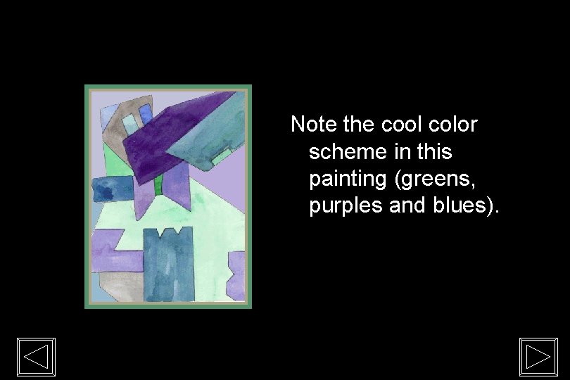
Cool colors are found on the left side of the color wheel. They are the colors found in snow and ice and tend to recede in a composition.

Note the cool color scheme in this painting (greens, purples and blues).

Rhetorical Color Contrast draws attention to the item that is most contrasting (or different) among a number of other design elements. Therefore, you can use color contrast to draw attention to an element of your design that is more important, relevant, or immediately pressing.

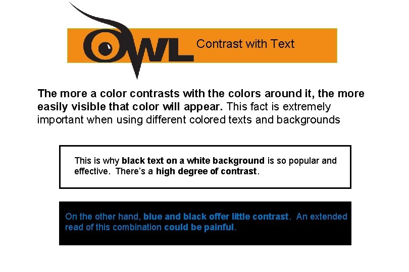
Contrast with Text The more a color contrasts with the colors around it, the more easily visible that color will appear. This fact is extremely important when using different colored texts and backgrounds This is whyblacktexton on aa white background and This is why backgroundisisso sopopular and effective. There’s a There’s high degree of contrast. effective. a high degree of contrast On the other hand, blue and black offer little contrast. An extended read of this combination could be painful.

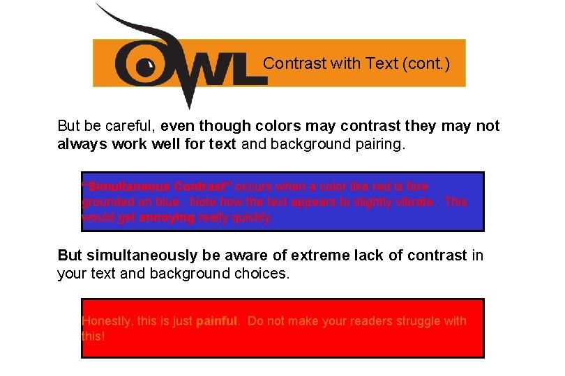
Contrast with Text (cont. ) But be careful, even though colors may contrast they may not always work well for text and background pairing. “Simultaneous Contrast” occurs when a color like red is fore grounded on blue. Note how the text appears to slightly vibrate. This would get annoying really quickly. But simultaneously be aware of extreme lack of contrast in your text and background choices. Honestly, this is just painful. Do not make your readers struggle with this!

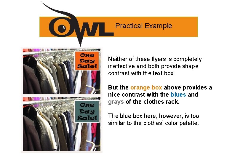
Practical Example Neither of these flyers is completely ineffective and both provide shape contrast with the text box. But the orange box above provides a nice contrast with the blues and grays of the clothes rack. The blue box here, however, is too similar to the clothes’ color palette.

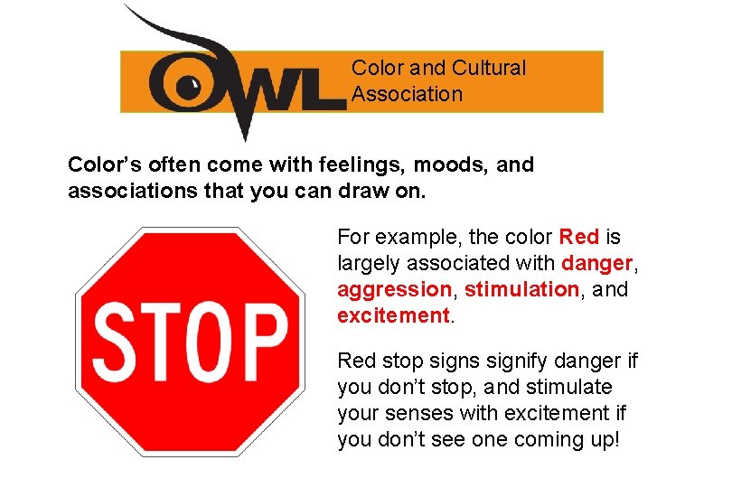
Color and Cultural Association Color’s often come with feelings, moods, and associations that you can draw on. For example, the color Red is largely associated with danger, aggression, stimulation, and excitement. Red stop signs signify danger if you don’t stop, and stimulate your senses with excitement if you don’t see one coming up!

Color and Cultural Association It’s an important to remember that these color associations do not come from the color itself. Without us to interpret it, red is simply light without any meaning laden characteristics. Because these associations depend on us, they can differ from culture to culture, and they can also change over time. For example, purple use to be associated with solely belonging to royalty. This Power. Point could now be beheaded if it weren’t made by a King or Queen!

Resources for Color Association There a number of sources that list and suggest color associations commonly agreed upon by many people. • Color in Motion: A particularly interesting and useful one, contains a number of fun Flash videos that illustrate these associations with music and animation.

Web Links • Clickable Color Wheel – Basic Color Schemes Color Wheel • Carmine’s Introduction to Color – This site uses fun rhymes to explain what primary, secondary, and intermediate colors are. Mix colors before moving to another page and complete a quiz on color wheels. • Sanford's Art. Edventures with Carmine Chameleon – During this online adventure kids can learn about the color wheel, primary, secondary, and intermediate colors. Students also can find out what colors create these secondary and tertiary colors. Includes interactive game for mixing colors online. • Color Factory – Visit the online color factory for fun activities. Select the "Sorting Sector" and practice your knowledge of the color wheel by selecting and placing right colors into the circle. Go to the "Mixing Room" and create secondary and intermediate colors using online mixing machine then go to the "Messy Area" to paint pictures. • Make a Splash with Color – Learn about color. Find out why and how we see colors. Discover how hue, saturation, and brightness effect an image. Click on the "Combining All Three" link to go to the part of the site with interactive color wheel for practicing use of hue and saturation. • The Science of Light: Made from Dots – Read how cyan, magenta, and yellow colored dots are mixed together to produce images on paper. Click on the "Go" link and use three swatches to mix and match colors. • The World of Color – Here are interactive applets that demonstrate how colors interact, mix with each other, and affect images. • Additive Color – Learn what color addition is and how it works. Use spotlights to practice mixing colors. • Subtractive Color – Find out how color subtraction works and mix some colors.

• Please click slide or… • Click to return to the first to exit this presentation.

1. 2. 3. 4. Graphics Tech 1 & 2 Go on web to www. weebly. com Sign up for a free website account using your e-mail address or use 1 from last year Pick a template -main theme Go to the PAGES tab a. Make 5 pages- HOME ABOUT My Work 2016(blog page) - Notes(blog page) CONTACT IF you have a website from last year, go and add the My Work 2016 Page (blog page)

Graphics Tech 1 & 2 • Home Page- put a pic of yourself Write a paragraph and answer these ? ? ’s a. Write your name, grade, age, and what class you are taking this period b. Explain why you took this class, and what you hope to learn from this class. c. Explain what you learned in the Arts & Comm Intro class.

Graphics Tech 1 & 2 • About Page- Put a pic on this page of your self and something that you like in this world Write a paragraph about when you graduate HS, and explain what your goals are after high school, Explain what your passions are, and explain the things you think you are good at. Write another paragraph explaining what skills you have for this class, and what you hope to learn here this year

Graphics Tech 1 & 2 • CONTACT PAGE- USE the CONTACT FORM (on the left columnunder the T Icon) and put your best contact info inside the form so it cant be seen to the public but so u can get info and mail from the form

Graphics Tech 1 & 2 • Notes Page- Go to the pages taband create a new BLOG Page-name it NOTES…. then save ands edit the page This will let you add entries each time we have notes to take in this class

Graphics Tech 1 & 2 • MY WORK 2016 - Go to the pages tab. . add a new BLOG page, name it-MY WORK 2016 This will let you add a new page entry each time you have new work to add to your page

Quiz Today 20 points • ELEMENTS AND PRINCIPLES OF ART • 4 THINGS WE SHOULD DO BEFORE WE BEGIN TO DESIGN • COLOR THEORY-

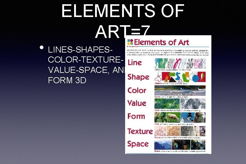
ELEMENTS OF ART=7 • LINES-SHAPES- COLOR-TEXTUREVALUE-SPACE, AND FORM 3 D

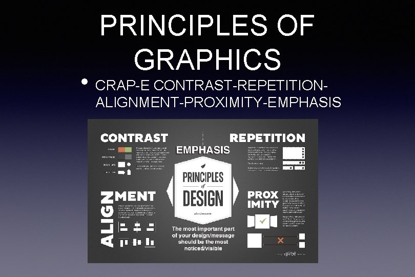
PRINCIPLES OF GRAPHICS • CRAP-E CONTRAST-REPETITION- ALIGNMENT-PROXIMITY-EMPHASIS

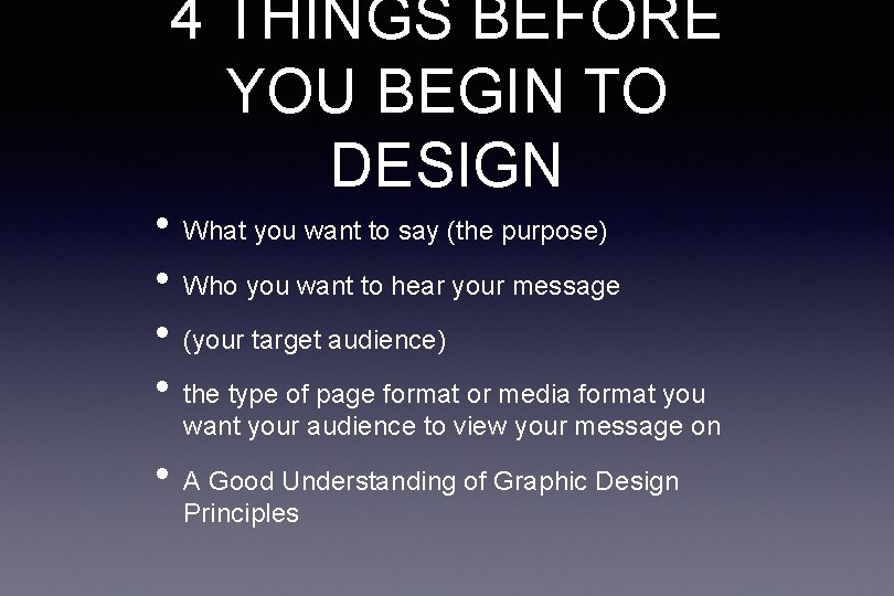
4 THINGS BEFORE YOU BEGIN TO DESIGN • What you want to say (the purpose) • Who you want to hear your message • (your target audience) • the type of page format or media format you want your audience to view your message on • A Good Understanding of Graphic Design Principles