Chapter 1 The Nature of Science Section 3


- Slides: 13
Chapter 1: The Nature of Science Section 3: Communicating with Graphs
Learning Goals �Identify three types of graphs and explain the ways they are used. �Distinguish between dependent and independent variables. �Analyze data using the various types of graphs.
A Visual Display �Graph: a visual display of information or data. Make it easier to understand patterns by displaying data in a visual manner.
y-axis Dependent Variable x-axis Independent Variable
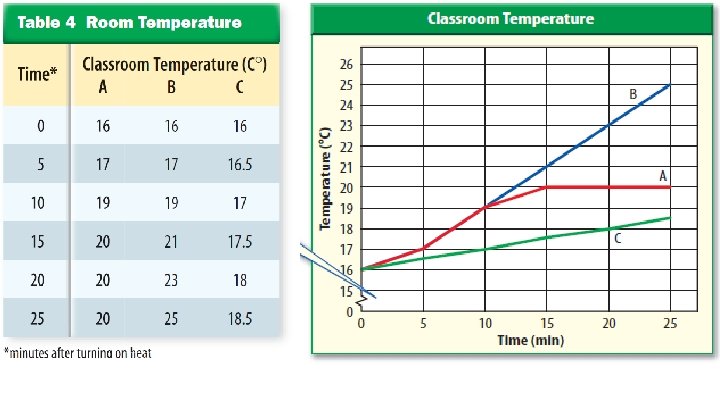
Line Graphs �Line graphs show any relationship where the dependent variable changes due to a change in the independent variable. Often show a relationship between variables changes over time.
Line Graphs �You can show more than one event on the same graph as long as the relationship between the variables is identical.
Line Graphs �Constructing Line Graphs: Choose appropriate scale x-axis should always show the independent variable y-axis should always show the dependent variable
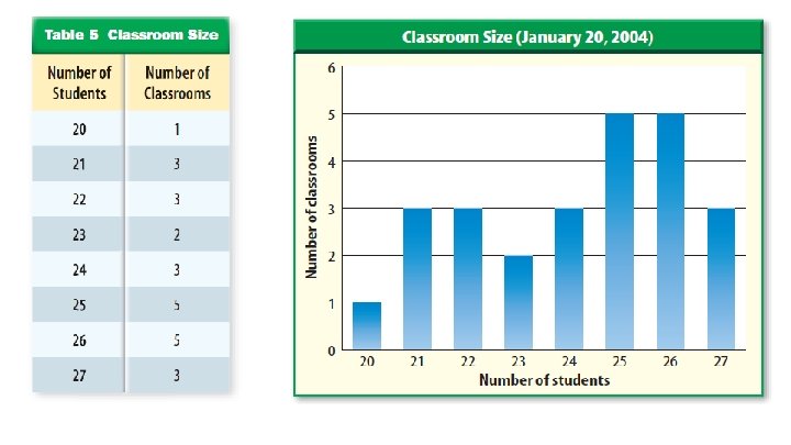
Bar Graphs �Bar graphs are useful for comparing information collected by counting. Each bar represents a quantity counted at a particular time. Independent variable is plotted on x-axis Dependent variable is plotted on y-axis
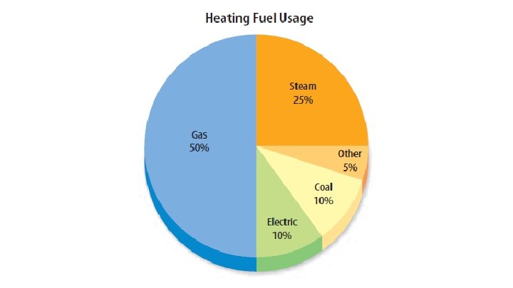
Circle Graphs �Circle graphs, or pie graphs, are used to show some fixed quantity is broken down into parts. Each part of the circle graph represents a percentage of the whole.
Check-in: �Which type of graph would best represent the results of a survey of 144 people where 75 ride a bus, 45 drive cars, 15 carpool, and 9 walk to work?