Yogiisms If you cant imitate him dont copy


 –")


 –")
")


 Form fill-in Menu Selection")
 Design • Dialog between the computer and the user • Supports work")
 typed in at")


 • Why do we have all those little rectangles on the screen?")


 • Keep them to")


 vs SDI")


 • 2. Make things visible – relations between user’s")


 Form fill-in Menu Selection")


 Pervasive")
 and Cooltown (HP) • Visionary approaches for developing novel")
- Slides: 66
Yogi-isms • • • "If you can't imitate him, don't copy him. " "Baseball is 90 percent mental. The other half is physical. " "You can observe a lot by watching. " "In baseball, you don't know nothing. " "A nickel ain't worth a dime anymore. " "It's deja vu all over again. " "If you come to a fork in the road, take it. " "I usually take a two-hour nap, from one o'clock to four. " "If the people don't want to come out to the park, nobody's going to stop them. " "Why buy good luggage? You only use it when you travel. " "Think! How the hell are you gonna think and hit at the same time? " "I didn't really say everything I said. "
Homework • Pick a common task – Start a car. Microwave some popcorn. . Etc. • List all the steps necessary to complete the task • Watch someone do the task • Did what they do match your task description?
The Task-Centered Design Process • figure out who's going to use the system to do what • choose representative tasks for taskcentered design • Plagiarize (intelligent borrowing) • rough out a design • think about it • create a mock-up or prototype
Summary • Getting requirements right is crucial • There are different kinds of requirement, each is significant for interaction design • The most commonly-used techniques for data gathering are: questionnaires, interviews, focus groups, direct observation, studying documentation and researching similar products • Personas, scenarios, use cases and essential use cases can be used to articulate existing and envisioned work practices. • Task analysis techniques such as HTA help to investigate existing systems and practices
Use Case A use case is a sequence of actions that provide a measurable value to an actor. Another way to look at it is a use case describes a way in which a real-world actor interacts with the system. In a system use case you include high-level implementation decisions. System use cases can be written in both an informal manner and a formal manner. Techniques for identifying use cases are discussed as well as how to remain agile when writing use cases. From http: //www. agilemodeling. com/artifacts/system. Use. Case. htm
Personas • Archetypal characters created to represent the needs and goals of the people for whom the product will be designed. • Defining functionality to satisfy the goals of a real person, rather than an abstract notion of "the user, " enables you to avoid development roadblocks caused by personal preferences or biases.
Personas • Describe how people behave – not job descriptions. – Multiple persons w/same job or same person w/multiple jobs. • Add life to the personas, but remember they're design tools first • Use the right goals – Life goals (e. g. retire at 50) • Use rarely – Experience goals (e. g. avoid feeling stupid) • Use when specific to the interface product – End goals ( e. g. produce nice looking report) • Should be the main focus • • Perfecting your personas Origin of Personas
Persona-based vs Use case • Use cases are expressed at the fuctional/ transactional level. – Low level: User action – System action • Persona-based are expressed at the behavioral level – How the system needs to order the presentation and react to user input is more important.
The Task-Centered Design Process • figure out who's going to use the system to do what • choose representative tasks for taskcentered design • Plagiarize (intelligent borrowing) • rough out a design • think about it • create a mock-up or prototype
Creating the Initial Design • The foundation of good interface design is: INTELLIGENT BORROWING. • Reasons: – unlikely that ideas you come up with will be as good as the best ideas you could borrow – many of your users may already understand interface features that you borrow – save you tremendous effort in design and implementation and often in maintenance as well
Legal issues • Things you certainly can copy (unless rights have been sold) – Anything produced by your company – Things you've written earlier for the your current company – Things recommended in the style guide for the system you're developing under – Things supplied as examples/prototypes in a commercial toolkit, programming language, or user-interface management system
Legal issues • Things you can probably copy – ``Common'' ideas, such as windows as the boundaries of concurrent work sessions, menus for selecting commands, an arrow-shaped pointer controlled by a mouse, graphical icons to represent software objects – Sequences or arrangements of menu items, commands, screens, etc. , if the original program clearly orders the sequence to improve usability or if there is only one or a very few other ways that it could be arranged – Icons ideas, commands, menu items, or other words that are obvious choices for the function they represent
Legal issues • Things you can probably not copy – Sequences or arrangements of menu items, commands, screens, etc. , if you're only copying the sequence order because it will make it easier for users of someone else's existing program to use your new program. – Iconns, commands, menu items, or other words that are not an obvious choice to describe their function, even if they would make your program more usable for users of the original program.
Legal issues • Things you can certainly not copy (unless you get permission) – Things you've written earlier for a different company – An entire interface from another company's program, even if you implement it with all new code – An entire detailed screen from another company's program – Source code or object code from another company's program, even if you translate it into a different language – Trademarks from other companies. – Patented features. Unfortunately, there's no easy way to discover what's patented – Exact bitmaps of icons, words, or fonts – Graphic details that define an interface's aesthetic look.
Work Within Existing Interface Frameworks • such as Macintosh, Motif, Windows, (Java for all) Manufactures encourage this. • advantages of working in an existing framework are overwhelming - think twice about participating in a project where you won't be using one • STYLE GUIDE describes the various interface features of the framework, such as menus, buttons, standard editable fields and the like Microsoft Guidelines
Make Use of Existing Applications • e. g. make your interface on top of Excel or Dbase
Copy Interaction Techniques From Other Systems • look at what other applications are doing • become familiar with leading applications • learn WHY things are done the way they are. – e. g. why tool palettes and not pull down menus
Conceptual Design? • I'm sorry, Cupertino, but Microsoft has nailed it. Windows Phone 7 feels like an i. Phone from the future. The UI has the simplicity and elegance of Apple's industrial design, while the i. Phone's UI still feels like a colorized Palm Pilot. • That doesn't mean that the Windows Phone 7's user experience would be better than Apple's. The two user interface concepts—data-centric vs function-centric—are very different, and the former is quite a radical departure from what people are used to.
Paradigms in HCI • The predominant 80 s paradigm was to design usercentred applications for the single user on the desktop • Shift in thinking occured in the mid 90 s • Many technological advances led to a new generation of user–computer environments – e. g. , virtual reality, multimedia, agent interfaces, ubiquitous computing • Effect of moving interaction design ‘beyond the desktop’ resulted in many new challenges, questions, and phenomena being considered
Interface types • Many, many kinds now 1980 s interfaces Command WIMP/GUI 1990 s interfaces Advanced graphical (multimedia, virtual reality, information visualization) Web Speech (voice) Pen, gesture, and touch Appliance 2000 s interfaces Mobile Multimodal Shareable Tangible Augmented and mixed reality Wearable Robotic
Traditional Interaction styles • • Command language (or command entry) Form fill-in Menu Selection Direct Manipulations
Interaction (Dialog) Design • Dialog between the computer and the user • Supports work & task flow analysis • Describes how the task will get done with the computer • Issues – – Freedom to choose or highly constrained Closure Modes Windows and Dialogs
Command interfaces • Commands such as abbreviations (e. g. , ls) typed in at the prompt to which the system responds (e. g. , listing current files) • Some are hard wired at keyboard, e. g. , delete • Efficient, precise, and fast • Large overhead to learning set of commands
Command language
Command Language Advantages • Flexible. • Appeals to expert users. • Supports creation of user-defined "scripts" or macros. • Is suitable for interacting with networked computers even with low bandwidth. Disadvantages • Retention of commands is generally very poor. • Learnability of commands is very poor. • Error rates are high. • Error messages and assistance are hard to provide because of the diversity of possibilities plus the complexity of mapping from tasks to interface concepts and syntax. • Not suitable for non-expert users.
Research and design issues • Form, name types and structure are key research questions • Consistency is most important design principle – e. g. , always use first letter of command • Command interfaces popular for web scripting
Form Fill-in Advantages • Simplifies data entry. • Shortens learning in that the fields are predefined and need only be 'recognized'. • Guides the user via the predefined rules. Disadvantages • Consumes screen space. • Usually sets the scene for rigid formalization of the business processes. Classic Modern
Windows (history) • Why do we have all those little rectangles on the screen? • Xerox PARC invented: mouse, rectangular window, scrollbar, push-button, objectoriented programming, pulldown menus… • Steve Jobs and Bill Gates saw and copied. – Apple: graphics Microsoft: objects
WIMP/GUI interfaces • Xerox Star first WIMP -> rise to GUIs • Windows – could be scrolled, stretched, overlapped, opened, closed, and moved around the screen using the mouse • Icons – represented applications, objects, commands, and tools that were opened when clicked on • Menus – offering lists of options that could be scrolled through and selected • Pointing device – a mouse controlling the cursor as a point of entry to the windows, menus, and icons on the screen
GUIs • Same basic building blocks as WIMPs but more varied – Color, 3 D, sound, animation, – Many types of menus, icons, windows • New graphical elements, e. g. , – toolbars, docks, rollovers
Windows • Windows were invented to overcome physical constraints of a computer display, enabling more information to be viewed and tasks to be performed • Scroll bars within windows also enable more information to be • Multiple windows can make it difficult to find desired one, so techniques used – Listing, iconising, shrinking
PARC’s Principles • Visual metaphor - pictures used to represent functions and commands • Modeless - mode: a state of the program that changes the effects of user actions – Considered extremely harmful (for commandline ui’s) • Overlapping Windows - clear way of moving from different parts of a program – but actually get in the way of usability when there are too many and get lost (thus the task bar)
Research and design issues • Window management – enabling users to move fluidly between different windows (and monitors) • How to switch attention between them to find information needed without getting distracted • Design principles of spacing, grouping, and simplicity should be used
Menu selection A menu is a set of options displayed on the screen where the selection and execution of one (or more) of the options results in a state change of the interface Advantages • Ideal for novice or intermittent users. • Can appeal to expert users if display and selection mechanisms are rapid and if appropriate "shortcuts" are implemented. • Affords exploration (users can "look around" in the menus for the appropriate command, unlike having to remember the name of a command its spelling when using command language. ) • Structures decision making. • Allows easy support of error handling as the user's input does not have to be parsed (as with command language). Disadvantages • Too many menus may lead to information overload or complexity of discouraging proportions. • May be slow for frequent users. • May not be suited for small graphic displays.
Menus • A number of menu interface styles – flat lists, drop-down, pop-up, contextual, and expanding ones, e. g. , scrolling and cascading • Flat menus – good at displaying a small number of options at the same time and where the size of the display is small, e. g. , i. Pods – but have to nest the lists of options within each other, requiring several steps to get to the list with the desired option – moving through previous screens can be tedious
i. Pod flat menu structure
Expanding menus • Enables more options to be shown on a single screen than is possible with a single flat menu • More flexible navigation, allowing for selection of options to be done in the same window • Most popular are cascading ones – primary, secondary and even tertiary menus – downside is that they require precise mouse control – can result in overshooting or selecting wrong options
Cascading menu
Contextual menus • Provide access to often-used commands that make sense in the context of a current task • Appear when the user presses the Control key while clicking on an interface element (or right mouse button) – e. g. , clicking on a photo in a website together with holding down the Control key results in options ‘open it in a new window, ’ ‘save it, ’ or ‘copy it’ • Helps overcome some of the navigation problems associated with cascading menus
Research and design issues • What are best names/labels/phrases to use? • Placement in list is critical – Quit and save need to be far apart • Many international guidelines exist emphasizing depth/breadth, structure and navigation – e. g. ISO 9241
Direct manipulation captures the idea of “direct manipulation of the object of interest” (Shneiderman 1983: p. 57), which means that objects of interest are represented as distinguishable objects in the UI and are manipulated in a direct fashion. Characteristics: • Visibility of the object of interest. • Rapid, reversible, incremental actions. • Replacement of complex command language syntax by direct manipulation of the object of interest. Drag and drop files
One of the earliest commercially available direct manipulation interfaces was Mac. Paint
Direct Manipulation • • Advantages Visually presents task concepts. Easy to learn. Errors can be avoided more easily. Encourages exploration. High subjective satisfaction. Recognition memory (as opposed to cued or free recall memory) Disadvantages • May be more difficult to program. • Not suitable for small graphic displays. • Spatial and visual representation is not always preferable. • Metaphors can be misleading since the “the essence of metaphor is understanding and experiencing one kind of thing in terms of another” (Lakoff and Johnson 1983: p. 5), which, by definition, makes a metaphor different from what it represents or points to. • Compact notations may better suit expert users.
“Don’t Mode me in” • UNIX ‘vi’ is an example of “evil” modes – same actions have different meanings depending on context – ‘edit’ replaces your file with ‘t’ • Paint programs are a good example of “good” modes. – Modes are visible
Rules for modes • • • Use modes consistently Do not initiate modes unexpectedly Make modes visible Make it easy to escape modes … without consequences.
Reasons the Mac was successful • It defined a tightly restricted but flexible vocabulary for users to communicate with applications, based on a very simple set of mouse actions. • It offered sophisticated direct manipulation of rich visual objects on the screen. • It used square pixels at high resolution, which enabled the screen to match printed out- put very closely, especially the output of Apple's other new product: the laser printer. (WYSIWYG)
Use interface idioms. The exam will be “a piece of cake” • One of the most important reasons why those first GUIs were better was that they were the first user interfaces to restrict the range of their vocabulary for communication with the user. A list of common English idioms
Interaction Design • Try to decide how many windows (dialogs) • Keep them to a minimum • Be careful of data-centric designs – interrupt task flow with data integrity tasks • Be careful of process-centric designs – may violate business rules • Look for user-centric designs – anticipating errors and likely situations Catalog number not found! Create Do youitem wantintothe add stock first it tocatalog the catalog Add Now Add. OK Later Change Item
Inteaction design issues • Minimum effort decision flow – make the most common path easy – may be contrary to keeping related things together – finding the common path is not easy and again requires that we understand the user • Decide what goes into each window – identify a “base state” for main window • main objects and functions • build function controls in the window where they are used – Stack or sequence of modal windows?
Allocating controls to windows • Good visibility -strong mapping imply: – # of controls match # of functions – minimize # of controls keeping easy appearance • Guidelines – present the minimum to complete the common path – provide clear cues for the exceptional cases
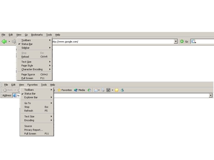
Terminology • • Modal, zoomed, maximized iconized, minimized, closed MDI (multi-document interface) vs SDI Tabbed dialogs to reduce complexity – also ‘fold-out’ panes
Message boxes • Not as easy to program as they look • Some rules – – message must be simple and use good grammar the answers must make sense as responses the answers must be distinguishable the message must contain all relevant information – the message should identify which application
Palettes Vs Menus • Palette selections can manage MODES – Good for doing one thing multiple times – Feedback though cursor change and palette – Easy to switch modes. • Menu selections should not change modes – Modes not as visible – Hard to specify graphical parameters of menu selections • So. . . use a tool palette in your application if: – you have operations that are often repeated consecutively – you can think of good icons for them – they require mouse interaction after the selection of the operation to specify fully what the operation does.
Toolbars Vs Menus • Toolbars are visible and immediate while menus are not • Menus are for the newcomer - Toolbars should be designed to provide fast access to frequent commands for the expert • Toolbars use icons for compactness Menus use words for explanation. • Therefore toolbars need explanation (tooltips) but Menus do not.
Two guidelines for design • 1. Provide a good conceptual model – allows user to predict the effects of our actions – problem: • designer’s conceptual model communicated to user through system image: – appearance, written instructions, system behaviour through interaction, – transfer, idioms and stereotypes • if system image does not make model clear and consistent, user will develop wrong conceptual model
Two guidelines for design (continued) • 2. Make things visible – relations between user’s intentions, required actions, and results are • sensible • non arbitrary • meaningful – visible affordances, mappings, and constraints – use visible cultural idioms – reminds person of what can be done and how to do it
Interface metaphors • Interface designed to be similar to a physical entity but also has own properties – e. g. desktop metaphor, web portals • Can be based on activity, object or a combination of both • Exploit user’s familiar knowledge, helping them to understand ‘the unfamiliar’ • Conjures up the essence of the unfamiliar activity, enabling users to leverage of this to understand more aspects of the unfamiliar functionality
Benefits of interface metaphors • Makes learning new systems easier • Helps users understand the underlying conceptual model • Can be very innovative and enable the realm of computers and their applications to be made more accessible to a greater diversity of users
Problems with interface metaphors • Break conventional and cultural rules – e. g. recycle bin placed on desktop • Can constrain designers in the way they conceptualize a problem space • Conflict with design principles • Forces users to only understand the system in terms of the metaphor • Designers can inadvertently use bad existing designs and transfer the bad parts over • Limits designers’ imagination in coming up with new conceptual models http: //www. cooper. com/articles/art_myth_of_metaphor. htm
Conceptual models: from interaction mode to style • Interaction mode: – what the user is doing when interacting with a system, e. g. instructing, talking, browsing or other • Interaction style: – the kind of interface used to support the mode, e. g. speech, menu-based, gesture
Traditional Interaction styles • • Command language (or command entry) Form fill-in Menu Selection Direct Manipulations
Many kinds of interaction styles available… • • • Command Speech Data-entry Form fill-in Query Graphical Web Pen Augmented reality Gesture
Which interaction style to choose? • Need to determine requirements and user needs • Take the budget and other constraints into account • Also will depend on suitability of technology for activity being supported • This topic will be covered more later when discuss how to actually design conceptual models
Examples of new paradigms • • • Ubiquitous computing (mother of them all) Pervasive computing Wearable computing Tangible bits, augmented reality Attentive environments Transparent computing – and many more….
Two examples: Blue. Eyes (IBM) and Cooltown (HP) • Visionary approaches for developing novel conceptual paradigms Almalden. ibm. com/cs/blueeyes/ cooltown. hp. com The real future?