Silkscreen Printing Introduction Color Theory Lesson 1 I
- Slides: 19

Silkscreen Printing: Introduction & Color Theory Lesson 1

I tried doing them by hand, but I find it easier to use a screen. This way, I don’t have to work on my objects at all. One of my assistants or anyone else, for that matter, can reproduce the design as well as I could. Andy Warhol, 1969 © The Andy Warhol Museum, one of the four Carnegie Museums of Pittsburgh. All rights reserved.

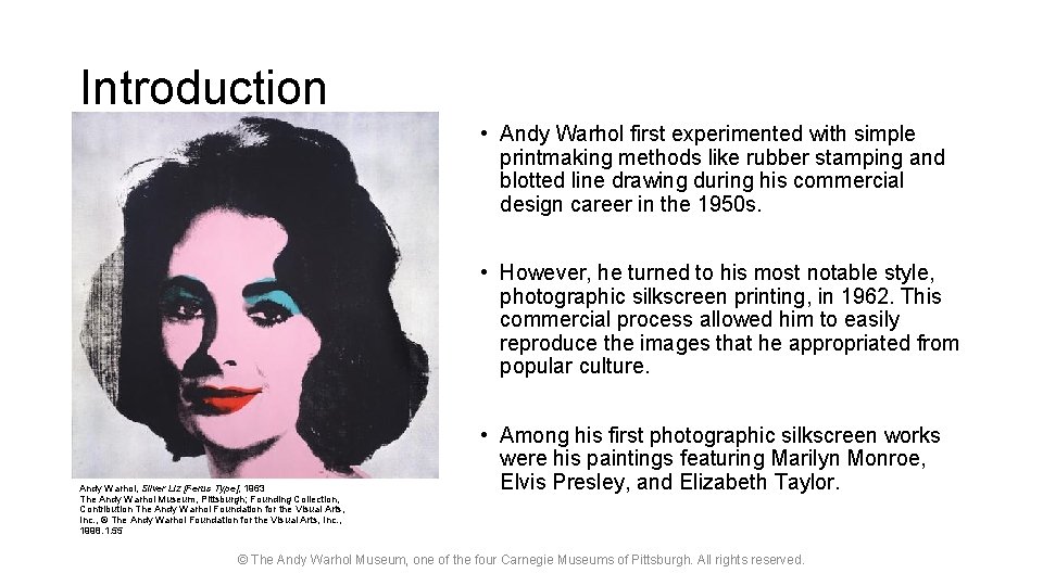
Introduction • Andy Warhol first experimented with simple printmaking methods like rubber stamping and blotted line drawing during his commercial design career in the 1950 s. • However, he turned to his most notable style, photographic silkscreen printing, in 1962. This commercial process allowed him to easily reproduce the images that he appropriated from popular culture. Andy Warhol, Silver Liz [Ferus Type], 1963 The Andy Warhol Museum, Pittsburgh; Founding Collection, Contribution The Andy Warhol Foundation for the Visual Arts, Inc. , © The Andy Warhol Foundation for the Visual Arts, Inc. , 1998. 1. 55 • Among his first photographic silkscreen works were his paintings featuring Marilyn Monroe, Elvis Presley, and Elizabeth Taylor. © The Andy Warhol Museum, one of the four Carnegie Museums of Pittsburgh. All rights reserved.

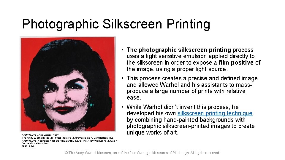
Photographic Silkscreen Printing • The photographic silkscreen printing process uses a light sensitive emulsion applied directly to the silkscreen in order to expose a film positive of the image, using a proper light source. • This process creates a precise and defined image and allowed Warhol and his assistants to massproduce a large number of prints with relative ease. Andy Warhol, Red Jackie, 1964 The Andy Warhol Museum, Pittsburgh; Founding Collection, Contribution The Andy Warhol Foundation for the Visual Arts, Inc. © The Andy Warhol Foundation for the Visual Arts, Inc. 1998. 1. 54 • While Warhol didn’t invent this process, he developed his own silkscreen printing technique by combining hand-painted backgrounds with photographic silkscreen-printed images to create unique works of art. © The Andy Warhol Museum, one of the four Carnegie Museums of Pittsburgh. All rights reserved.

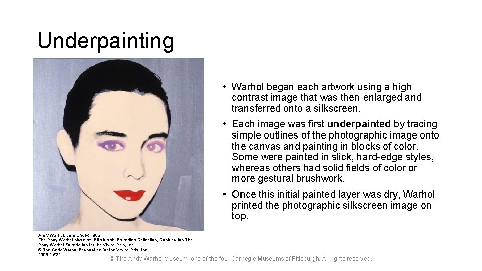
Underpainting • Warhol began each artwork using a high contrast image that was then enlarged and transferred onto a silkscreen. • Each image was first underpainted by tracing simple outlines of the photographic image onto the canvas and painting in blocks of color. Some were painted in slick, hard-edge styles, whereas others had solid fields of color or more gestural brushwork. • Once this initial painted layer was dry, Warhol printed the photographic silkscreen image on top. Andy Warhol, Tina Chow, 1985 The Andy Warhol Museum, Pittsburgh; Founding Collection, Contribution The Andy Warhol Foundation for the Visual Arts, Inc. © The Andy Warhol Foundation for the Visual Arts, Inc. 1998. 1. 521 © The Andy Warhol Museum, one of the four Carnegie Museums of Pittsburgh. All rights reserved.

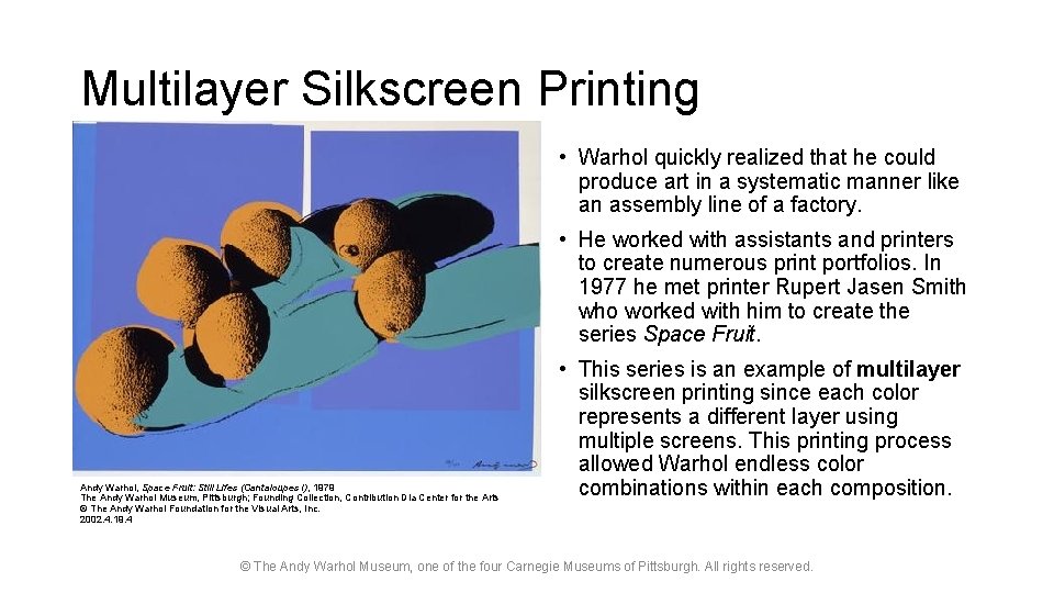
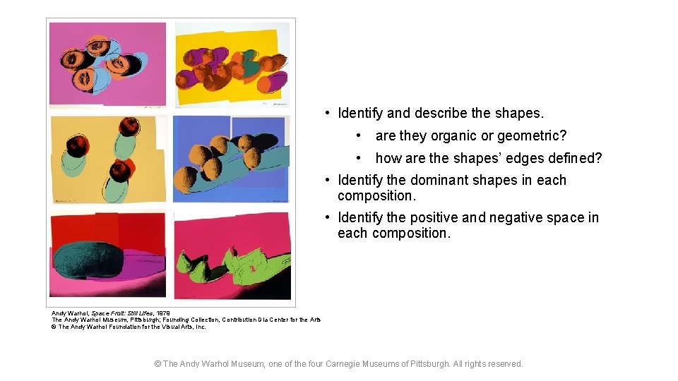
Multilayer Silkscreen Printing • Warhol quickly realized that he could produce art in a systematic manner like an assembly line of a factory. • He worked with assistants and printers to create numerous print portfolios. In 1977 he met printer Rupert Jasen Smith who worked with him to create the series Space Fruit. Andy Warhol, Space Fruit: Still Lifes (Cantaloupes I), 1979 The Andy Warhol Museum, Pittsburgh; Founding Collection, Contribution Dia Center for the Arts © The Andy Warhol Foundation for the Visual Arts, Inc. 2002. 4. 19. 4 • This series is an example of multilayer silkscreen printing since each color represents a different layer using multiple screens. This printing process allowed Warhol endless color combinations within each composition. © The Andy Warhol Museum, one of the four Carnegie Museums of Pittsburgh. All rights reserved.

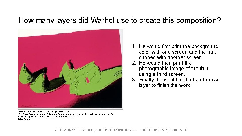
How many layers did Warhol use to create this composition? 1. He would first print the background color with one screen and the fruit shapes with another screen. 2. He would then print the photographic image of the fruit using a third screen. 3. Finally, he would add a hand-drawn layer to finish the work. Andy Warhol, Space Fruit: Still Lifes (Pears), 1979 The Andy Warhol Museum, Pittsburgh; Founding Collection, Contribution Dia Center for the Arts © The Andy Warhol Foundation for the Visual Arts, Inc. 2002. 4. 19. 6 © The Andy Warhol Museum, one of the four Carnegie Museums of Pittsburgh. All rights reserved.

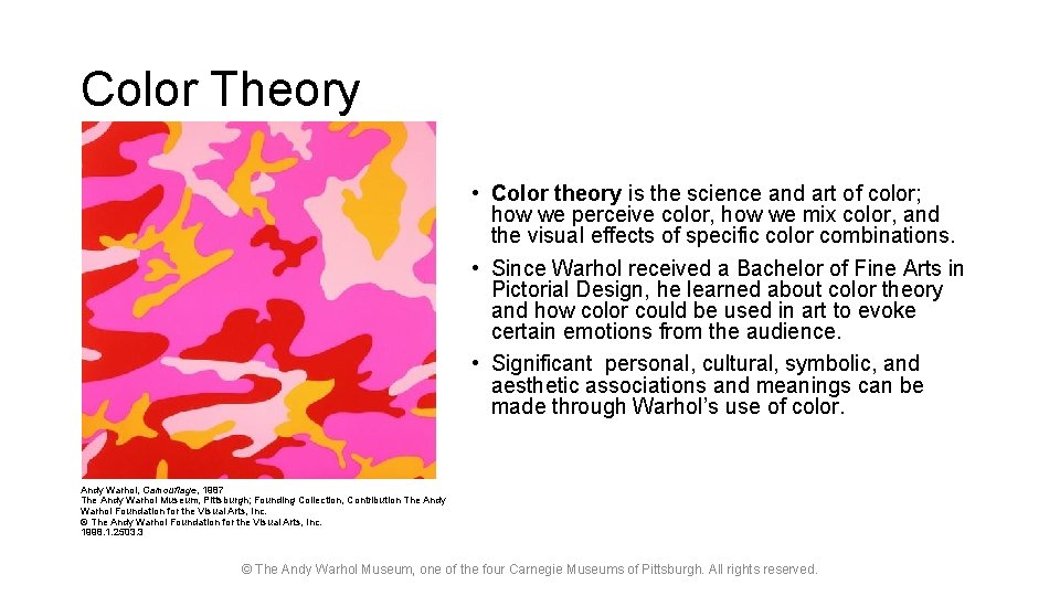
Color Theory • Color theory is the science and art of color; how we perceive color, how we mix color, and the visual effects of specific color combinations. • Since Warhol received a Bachelor of Fine Arts in Pictorial Design, he learned about color theory and how color could be used in art to evoke certain emotions from the audience. • Significant personal, cultural, symbolic, and aesthetic associations and meanings can be made through Warhol’s use of color. Andy Warhol, Camouflage, 1987 The Andy Warhol Museum, Pittsburgh; Founding Collection, Contribution The Andy Warhol Foundation for the Visual Arts, Inc. © The Andy Warhol Foundation for the Visual Arts, Inc. 1998. 1. 2503. 3 © The Andy Warhol Museum, one of the four Carnegie Museums of Pittsburgh. All rights reserved.

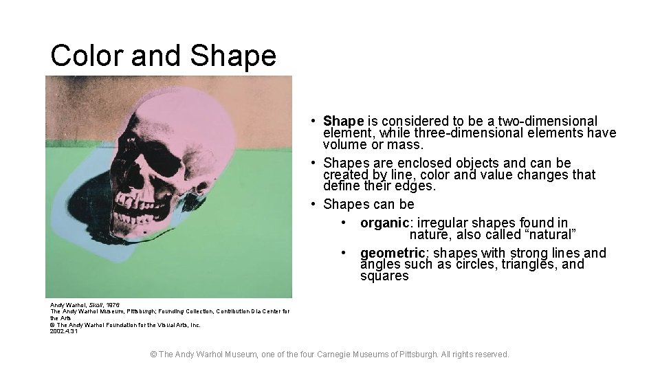
Color and Shape • Shape is considered to be a two-dimensional element, while three-dimensional elements have volume or mass. • Shapes are enclosed objects and can be created by line, color and value changes that define their edges. • Shapes can be • organic: irregular shapes found in nature, also called “natural” • geometric: shapes with strong lines and angles such as circles, triangles, and squares Andy Warhol, Skull, 1976 The Andy Warhol Museum, Pittsburgh; Founding Collection, Contribution Dia Center for the Arts © The Andy Warhol Foundation for the Visual Arts, Inc. 2002. 4. 31 © The Andy Warhol Museum, one of the four Carnegie Museums of Pittsburgh. All rights reserved.

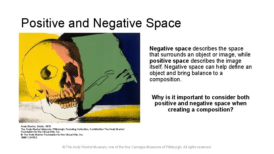
Positive and Negative Space Negative space describes the space that surrounds an object or image, while positive space describes the image itself. Negative space can help define an object and bring balance to a composition. Why is it important to consider both positive and negative space when creating a composition? Andy Warhol, Skulls, 1976 The Andy Warhol Museum, Pittsburgh; Founding Collection, Contribution The Andy Warhol Foundation for the Visual Arts, Inc. © The Andy Warhol Foundation for the Visual Arts, Inc. 1998. 1. 2416. 2 © The Andy Warhol Museum, one of the four Carnegie Museums of Pittsburgh. All rights reserved.

• Identify and describe the shapes. • are they organic or geometric? • how are the shapes’ edges defined? • Identify the dominant shapes in each composition. • Identify the positive and negative space in each composition. Andy Warhol, Space Fruit: Still Lifes, 1979 The Andy Warhol Museum, Pittsburgh; Founding Collection, Contribution Dia Center for the Arts © The Andy Warhol Foundation for the Visual Arts, Inc. © The Andy Warhol Museum, one of the four Carnegie Museums of Pittsburgh. All rights reserved.

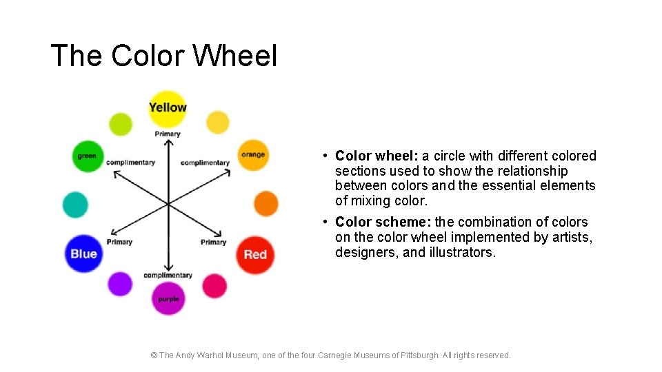
The Color Wheel • Color wheel: a circle with different colored sections used to show the relationship between colors and the essential elements of mixing color. • Color scheme: the combination of colors on the color wheel implemented by artists, designers, and illustrators. © The Andy Warhol Museum, one of the four Carnegie Museums of Pittsburgh. All rights reserved.

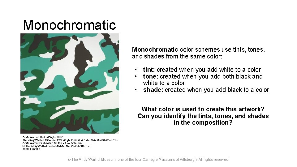
Monochromatic color schemes use tints, tones, and shades from the same color: • • • tint: created when you add white to a color tone: created when you add both black and white to a color shade: created when you add black to a color What color is used to create this artwork? Can you identify the tints, tones, and shades in the composition? Andy Warhol, Camouflage, 1987 The Andy Warhol Museum, Pittsburgh; Founding Collection, Contribution The Andy Warhol Foundation for the Visual Arts, Inc. © The Andy Warhol Foundation for the Visual Arts, Inc. 1998. 1. 2503. 1 © The Andy Warhol Museum, one of the four Carnegie Museums of Pittsburgh. All rights reserved.

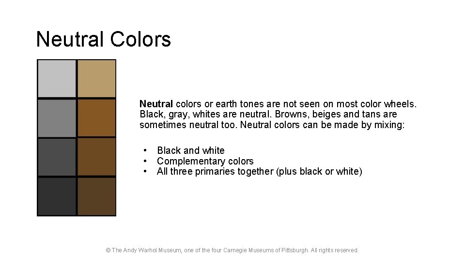
Neutral Colors Neutral colors or earth tones are not seen on most color wheels. Black, gray, whites are neutral. Browns, beiges and tans are sometimes neutral too. Neutral colors can be made by mixing: • • • Black and white Complementary colors All three primaries together (plus black or white) © The Andy Warhol Museum, one of the four Carnegie Museums of Pittsburgh. All rights reserved.

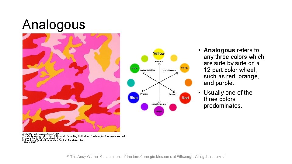
Analogous • Analogous refers to any three colors which are side by side on a 12 part color wheel, such as red, orange, and purple. • Usually one of the three colors predominates. Andy Warhol, Camouflage, 1987 The Andy Warhol Museum, Pittsburgh; Founding Collection, Contribution The Andy Warhol Foundation for the Visual Arts, Inc. © The Andy Warhol Foundation for the Visual Arts, Inc. 1998. 1. 2503. 3 © The Andy Warhol Museum, one of the four Carnegie Museums of Pittsburgh. All rights reserved.

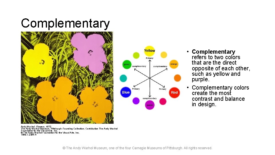
Complementary • Complementary refers to two colors that are the direct opposite of each other, such as yellow and purple. • Complementary colors create the most contrast and balance in design. Andy Warhol, Flowers, 1970 The Andy Warhol Museum, Pittsburgh; Founding Collection, Contribution The Andy Warhol Foundation for the Visual Arts, Inc. © The Andy Warhol Foundation for the Visual Arts, Inc. 1998. 1. 2395. 4 © The Andy Warhol Museum, one of the four Carnegie Museums of Pittsburgh. All rights reserved.

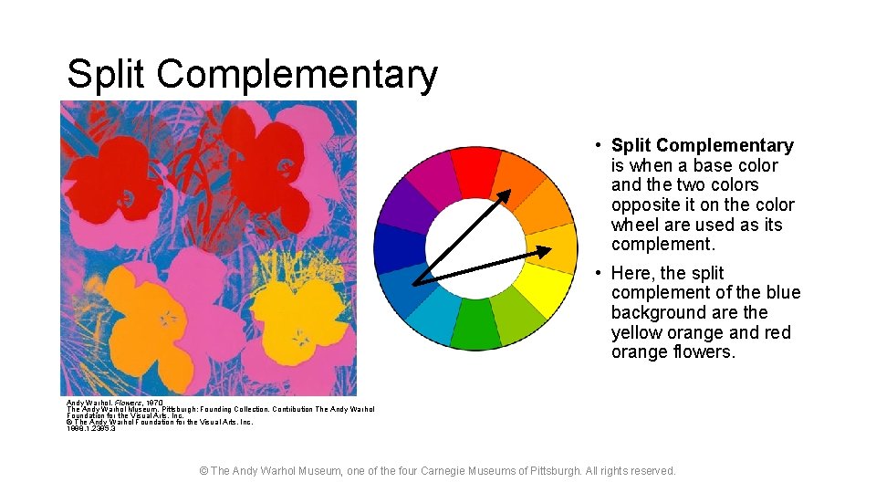
Split Complementary • Split Complementary is when a base color and the two colors opposite it on the color wheel are used as its complement. • Here, the split complement of the blue background are the yellow orange and red orange flowers. Andy Warhol, Flowers, 1970 The Andy Warhol Museum, Pittsburgh; Founding Collection, Contribution The Andy Warhol Foundation for the Visual Arts, Inc. © The Andy Warhol Foundation for the Visual Arts, Inc. 1998. 1. 2395. 3 © The Andy Warhol Museum, one of the four Carnegie Museums of Pittsburgh. All rights reserved.

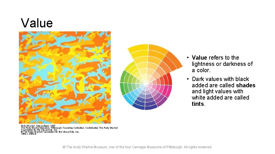
Value • Value refers to the lightness or darkness of a color. • Dark values with black added are called shades and light values with white added are called tints. Andy Warhol, Camouflage, 1987 The Andy Warhol Museum, Pittsburgh; Founding Collection, Contribution The Andy Warhol Foundation for the Visual Arts, Inc. © The Andy Warhol Foundation for the Visual Arts, Inc. 1998. 1. 2503. 8 © The Andy Warhol Museum, one of the four Carnegie Museums of Pittsburgh. All rights reserved.

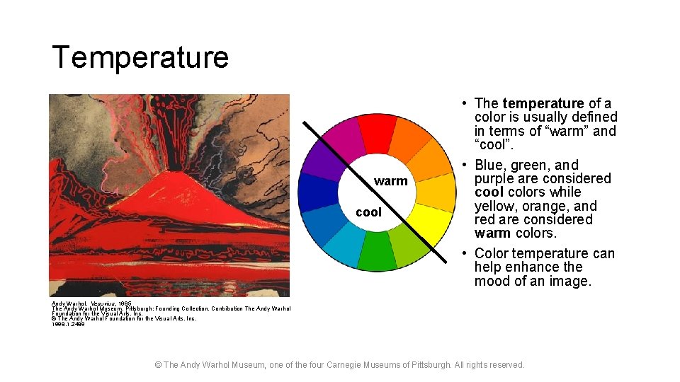
Temperature warm cool • The temperature of a color is usually defined in terms of “warm” and “cool”. • Blue, green, and purple are considered cool colors while yellow, orange, and red are considered warm colors. • Color temperature can help enhance the mood of an image. Andy Warhol, Vesuvius, 1985 The Andy Warhol Museum, Pittsburgh; Founding Collection, Contribution The Andy Warhol Foundation for the Visual Arts, Inc. © The Andy Warhol Foundation for the Visual Arts, Inc. 1998. 1. 2489 © The Andy Warhol Museum, one of the four Carnegie Museums of Pittsburgh. All rights reserved.