Chapter 3 User modelling in usercentred system design
- Slides: 22

Chapter 3 User modelling in user-centred system design (UCSD)

By the end of this chapter you should be able to. . . • • to define a user model develop a user model describe various ways of creating user models explain the Model Human Processor and Simplistic Theory • explain the Simplex One model • explain and apply Nielsen’s heuristics

3. 1 Introduction • A user model is a psychological way of depicting the people who will use the system – Considering users’ needs and preferences – Present psychological processes, individual differences, social context, culture, lifestyle, task objectives

3. 2 Types of user models 1. Psychological theories as user models – Human cognition is very complex – These theories expect a system analyst to be a psychologist 2. Task-based analysis for user models – Evaluation of core tasks could lead to consideration of how users will undertake these tasks – Behaviouristic approach which has been overtaken by cognitive science

3. Cut-down psychological theories as user models – Example is Model Human Processor theory (MHP) • Simpler, without irrelevant complexities of full-fledged theory • Developed directly to solve IT design problems – Assumes that information flows from user to system but not back 4. Simplistic psychological theories as user models – Conceptual framework for theories and research findings – To be used by both designers and computer scientists as guide without becoming psychologists Ø Simplex One as a simplistic theory (more details later) • Five modules of cognition – partially independent of each other • Each module has memory and local processing capacity

3. 3 User models and evaluation 3. 3. 1 Design principles (heuristics) for evaluation HCI has many principles or heuristics for design and evaluation Four kinds in order of ascending specificity: • Guidelines (they contain design principles) – – General & not prescriptive Describe usability concepts to assist in judging designs Cover a wide range of interface features and concepts Examples • Know the user population • Reduce cognitive load • Engineer for errors • Maintain consistency and clarity • Style guides – Developed by companies for internal use – Enhance usability through consistency, i. e. look and feel across product lines are maintained

• Rules – Precise & prescriptive recommendations about design aspects – Examples • never use red text on a blue background • always position the waste bin in the bottom right hand corner • always issue a warning before the user deletes a file • Standards – Imposed by regulatory bodies, e. g. ISO • Sometimes mandatory, i. e. legal requirement – could be sued if not kept • Part of contract – won’t be paid if not kept – Specific type of system in a particular industry

3. 3 User models and evaluation Dix’s design principles • Learnability – Humans learn through understanding and generalizing (i. e. have mental model) of the system as a whole • Predictability – User’s knowledge must be sufficient to work out what actions are possible next and what their consequences will be • Consistency – Essential and most widely applied design principle

• Flexibility – Extends the way in which user and system can exchange information • Recoverability – Humans learn by exploration: need a way to undo mistakes • Responsiveness – Rate of communication between user and system NB: Guidelines must be clear and unambiguous • Beware of “expert knowledge fallacy”

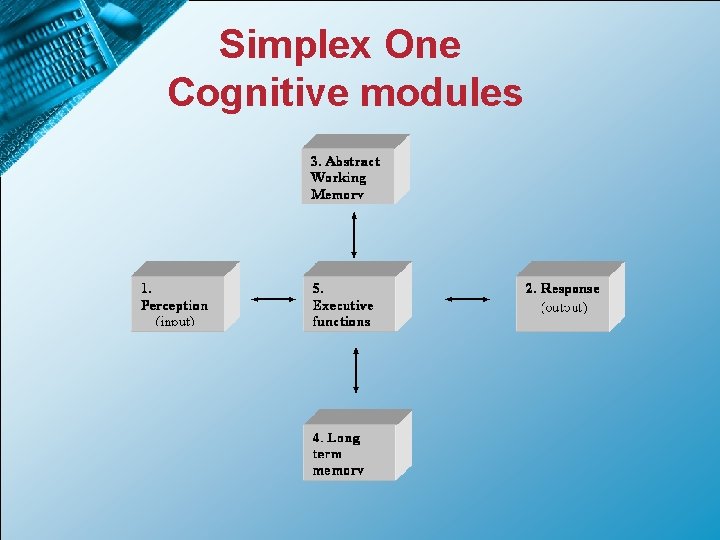
3. 3 User models and evaluation 3. 3. 2 Simplex One • Aim: Simplex One facilitates the design process – it assists in understanding key design issues in terms of the psychology of the user • Designed in two levels – Framework to understand research findings – Guide practical problem solving • Five cognitive modules that can take input from any other module via executive function • Theory can be used to generate simple questions on either – the strengths and weaknesses of users (3. 3. 3) – proposed design (3. 3. 4)

Simplex One Cognitive modules

3. 3 User models and evaluation Simplex One Cognitive modules: more detail • Perception (input) – Take in new information from the senses – Analyse & Store • Response (output) – Select, organise, time and implement appropriate responses • Abstract working memory – Take, hold, and process task-relevant memories – Limited in capacity, time and processing rates

• Long-term memory – Stores occurrence of key events and symbols – Freer of constraints – Builds over time as experience grows – Episodic memory: Remember episode in context – Semantic memory: Knowledge without context • Executive functions – – Information is switched between foregoing four modules Sequences of transfers are organised Functions of different modules are mediated Task requirements are organised and monitored

3. 3 User models and evaluation 3. 3. 3 Evaluating Users with Simplex One • Typical questions about users (refer to text book as well): • Perception: What are the perceptual skills of the user groups likely to be? – “How many users could have visual impairments? ” – “Do the symbols chosen make sense for the user groups? ” • Responses: What are user responses likely to be like? – Are there users with problems in responding, e. g. verbally or psycho motoric? – E. g. elderly people might have problems in controlling hand position. • Abstract working memory: What memory capabilities do the users have? – Taking into account limitations of human memory (capacity, time and processing rate), what can be done to make task execution easier for users? – Do some users have significantly different memory resources than the average user? E. g. users with learning difficulties or older users

• Long-term memory (LTM): How old are the average user? – Use metaphors to link prior knowledge with system elements – (Young users have less experience and may be less open to metaphors but more open to new ways of organising) • Executive functions: Might the users vary in executive functioning? – Some are better at learning than others and sometimes more and better training might be necessary – Some might need more system feedback than others – Some users might be unaware of problems while thinking that they are performing well while it is not the case.

3. 3 User models and evaluation 3. 3. 4 Evaluating Designs with Simplex One • Typical questions about the design (refer to text book as well): • Perception: Does the design allow information to be delivered in ways that will respect users’ sensory capabilities and perceptual skills? – E. g. “Does the system cater for users with age-related or specific sensory and perceptual deficits? • Responses: What response options are available for users? – Can users select, organise, time and implement appropriate responses? – Range of response media adequate? – Adequate support for users with specific problems with verbal and psychomotor responses? • Abstract working memory: Does the system respect limitations of human memory?

• Long-term memory (LTM): – Does the design rely on unjustified assumptions about users’ prior knowledge? – Did the designer assume that his/her own prior knowledge is representative of that of the users? • Executive functions: What demands do the design place on executive functions of users? – E. g. “What new tasks do the design expect users to learn? – Will users be expected to perform familiar tasks in unfamiliar or contradictory ways? – Do the users require special features to enable them to perform well?

3. 4 Heuristic evaluation • Heuristic: Search strategy • Not absolute – Involves interpretations and judgements – Checklist: Reminds the designer to be on the look-out for something – Example: There is an undo facility • Nielsen’s heuristics 1. Visibility of system status 2. Match between system and the real world 3. User control and freedom 4. Consistency and standards 5. Error prevention 6. Recognition rather than recall 7. Flexibility and efficiency of use 8. Aesthetic and minimalist design 9. Help users recognise, diagnose, and recover from errors 10. Help and documentation

3. 4 Nielsen’s Heuristics 1. Visibility of system status – – – 2. Keep the user informed about what is going on through providing appropriate feedback in a reasonable time Must be timely, visible and meaningful Message boxes, progress bars, hour glass, pop up hints, animations, clipboard, depressed buttons, borders around selected items, etc. Match between system and the real world – – 3. Speak the user’s language (phrases and concepts from the user’s world rather than system-oriented terms) • Avoid: “cache”, “database”, “compile”, etc. System should look and behave in ways that are familiar to the user • Use metaphors User control and freedom – – Emergency exits: Provide a way to escape from places where users unexpectedly find themselves Users must feel confident to explore

3. 4 Nielsen’s Heuristics (continued) 4. Consistency and standards – Don’t use the same word for different meanings or describe the same thing with different words Support users’ expectations Experience with a small part of the system should facilitate easier learning of the rest of the system Users have good spatial memory – – – • • 5. Screen arrangement should be consistent Positioning of features should be consistent, e. g. links, index, search, etc. Error prevention – – If possible, prevent errors in the first place System errors • • – E. g. run-time errors, erroneous processing, etc. Unforgivable HCI-errors • • – Misleading terminology, e. g. user selecting wrong menu option is not necessarily user error Lack of feedback cause user to reselect a submit payment option User errors • • E. g. typing errors, poor mouse handling, weak understanding of the system Enforce constraints, e. g. limit typo’s by providing dropdown list as far as possible, masks for dates and currency

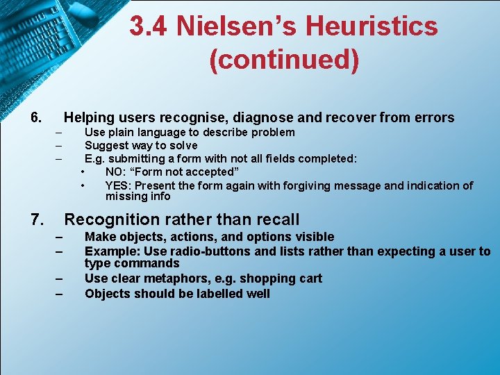
3. 4 Nielsen’s Heuristics (continued) 6. Helping users recognise, diagnose and recover from errors – – – 7. Use plain language to describe problem Suggest way to solve E. g. submitting a form with not all fields completed: • NO: “Form not accepted” • YES: Present the form again with forgiving message and indication of missing info Recognition rather than recall – – Make objects, actions, and options visible Example: Use radio-buttons and lists rather than expecting a user to type commands Use clear metaphors, e. g. shopping cart Objects should be labelled well

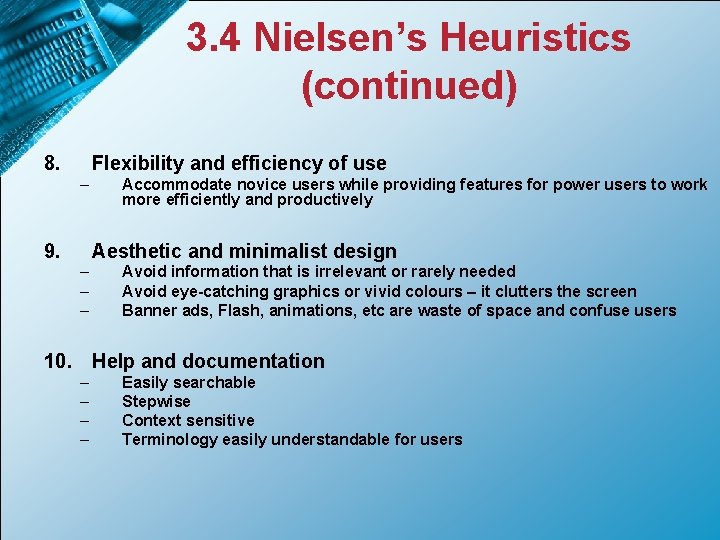
3. 4 Nielsen’s Heuristics (continued) 8. Flexibility and efficiency of use – 9. Accommodate novice users while providing features for power users to work more efficiently and productively Aesthetic and minimalist design – – – Avoid information that is irrelevant or rarely needed Avoid eye-catching graphics or vivid colours – it clutters the screen Banner ads, Flash, animations, etc are waste of space and confuse users 10. Help and documentation – – Easily searchable Stepwise Context sensitive Terminology easily understandable for users