Power Point Presentation Guidelines TIPS FOR DEVELOPING ENGAGING

- Slides: 17

Power. Point Presentation Guidelines TIPS FOR DEVELOPING ENGAGING PRESENTATIONS

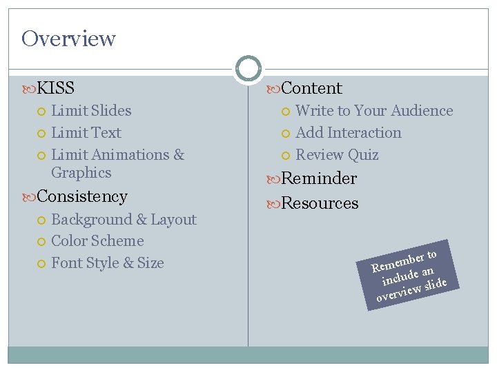
Overview KISS Limit Slides Limit Text Limit Animations & Graphics Content Write to Your Audience Add Interaction Review Quiz Consistency Background & Layout Color Scheme Font Style & Size Resources Reminder r to e b m Reme e an includ slide iew overv

KISS KEEP IT SHORT & SIMPLE

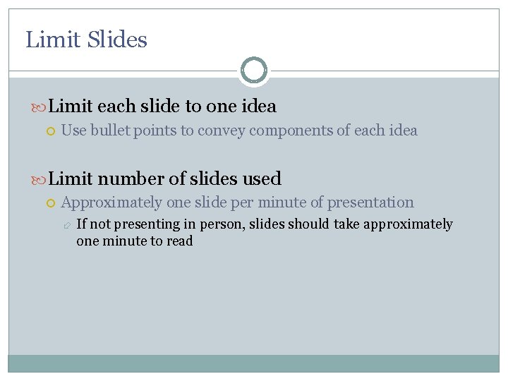
Limit Slides Limit each slide to one idea Use bullet points to convey components of each idea Limit number of slides used Approximately one slide per minute of presentation If not presenting in person, slides should take approximately one minute to read

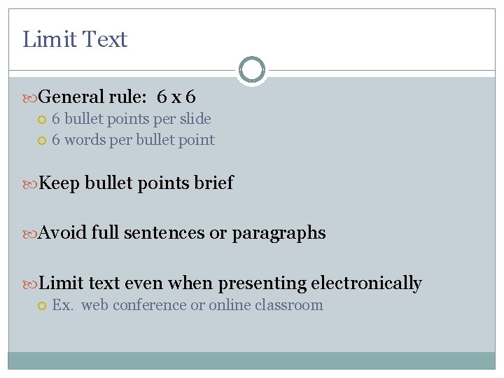
Limit Text General rule: 6 x 6 6 bullet points per slide 6 words per bullet point Keep bullet points brief Avoid full sentences or paragraphs Limit text even when presenting electronically Ex. web conference or online classroom

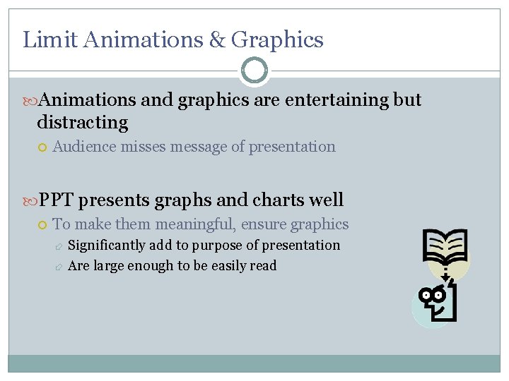
Limit Animations & Graphics Animations and graphics are entertaining but distracting Audience misses message of presentation PPT presents graphs and charts well To make them meaningful, ensure graphics Significantly add to purpose of presentation Are large enough to be easily read

CONSISTENCY is Key DESIGN TEMPLATES HELP MAINTAIN CONSISTENCY BACKGROUND – LAYOUT – COLOR SCHEME – FONT STYLE & SIZE

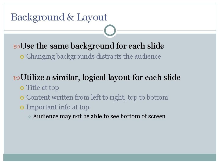
Background & Layout Use the same background for each slide Changing backgrounds distracts the audience Utilize a similar, logical layout for each slide Title at top Content written from left to right, top to bottom Important info at top Audience may not be able to see bottom of screen

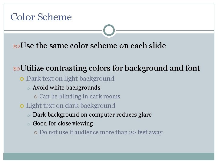
Color Scheme Use the same color scheme on each slide Utilize contrasting colors for background and font Dark text on light background Avoid white backgrounds Can be blinding in dark rooms Light text on dark background Dark background on computer reduces glare Good for close viewing Do not use if audience more than 20 feet away

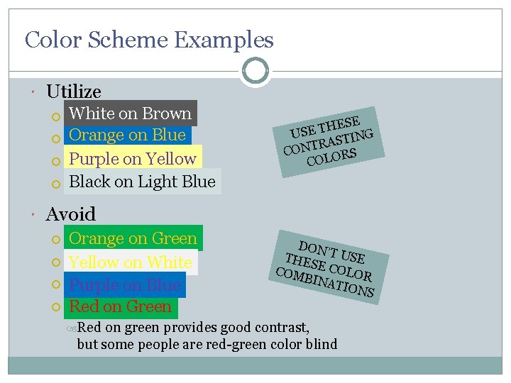
Color Scheme Examples Utilize Whiteon on. Brown White Orangeon on. Blue Orange Purpleon on. Purple Yellow Blackon on. Light. Blue Black Avoid Orangeon on. Green Yellowon on. White Purpleon on. Blue Redon on. Green Red ESE H T E US TING S A R CONT ORS COL DON THES ’T USE COM E COLOR BINA TION S on green provides good contrast, but some people are red-green color blind

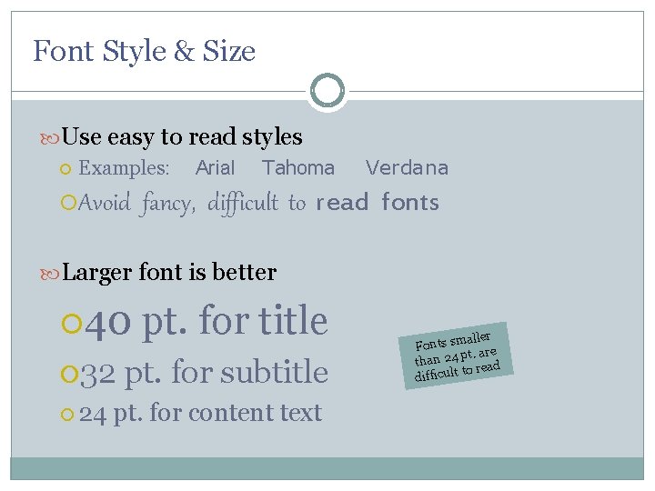
Font Style & Size Use easy to read styles Examples: Avoid Arial Tahoma Verdana fancy, difficult to read fonts Larger font is better 40 32 24 pt. for title pt. for subtitle pt. for content text aller Fonts sm are pt. than 24 to read difficult

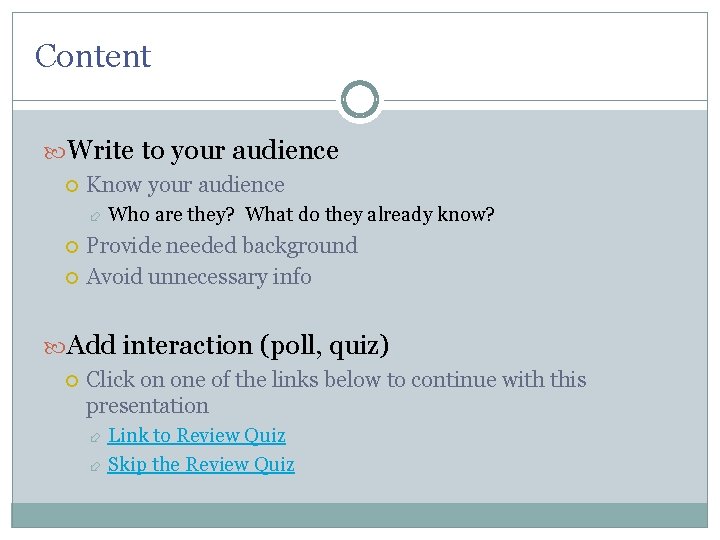
Content Write to your audience Know your audience Who are they? What do they already know? Provide needed background Avoid unnecessary info Add interaction (poll, quiz) Click on one of the links below to continue with this presentation Link to Review Quiz Skip the Review Quiz

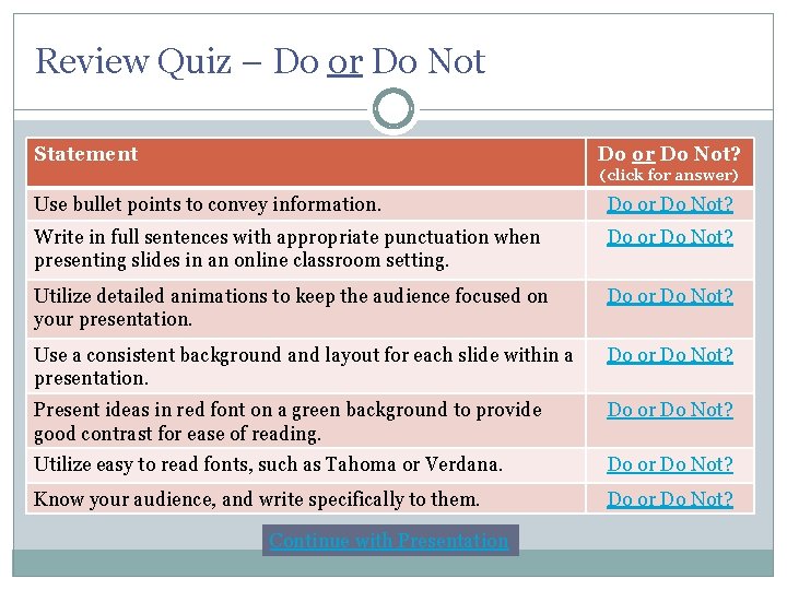
Review Quiz – Do or Do Not Statement Do or Do Not? (click for answer) Use bullet points to convey information. Do or Do Not? Write in full sentences with appropriate punctuation when presenting slides in an online classroom setting. Do or Do Not? Utilize detailed animations to keep the audience focused on your presentation. Do or Do Not? Use a consistent background and layout for each slide within a presentation. Do or Do Not? Present ideas in red font on a green background to provide good contrast for ease of reading. Do or Do Not? Utilize easy to read fonts, such as Tahoma or Verdana. Do or Do Not? Know your audience, and write specifically to them. Do or Do Not? Continue with Presentation

Review Quiz – Answer DO Continue with Presentation Back to Quiz

Review Quiz – Answer DO NOT Continue with Presentation Back to Quiz

REMINDER The media (PPT) does not constitute your presentation. It only enhances it.

Resources ARMA International. PPT Guidelines. (2009, August 4). Retrieved August 5, 2009 from http: //www. arma. org/learningcenter/facilitator/index. cfm Kaminski, Steven. Power. Point Presentations: The Good, The Bad and The Ugly. Retrieved August 19, 2009 from http: //www. shkaminski. com/Classes/Handouts/powerpoint. htm Russel, Wendy. 9 Presentation Tips for Students. Retrieved August 19, 2009 from http: //presentationsoft. about. com/od/classrooms/tp/student_tips. ht m Scheel, Nicole. 8 Power. Point Tips for the Online Classroom. (2009, July 22). Retrieved August 19, 2009 from http: //owl. english. purdue. edu/owl/resource/560/10/ Don’ t forget to cite your sources