Power Point Design Guidelines Making Your Power Point


- Slides: 32

Power. Point Design Guidelines Making Your Power. Point Presentations Accessible to All Learners

General Design Guidelines § Use plenty of white space. § Keep slide content brief. § Relate graphics/effects to content. § Use color for meaning and contrast. § Use fonts appropriately.

UDL Priorities § Utilize readable fonts and font sizes. § Use plenty of white space. § Provide sufficient visual contrast. § Minimize distractions: § Background sounds and effects. § Animated graphics. § Power. Point-provided effects. § Visual crowding.

Use Plenty of White Space in the Power. Point Slide So That Things Are Very Clear § Too much filler will overwhelm the viewer § Makes your eyes tired - you won’t bother to read it § If you have a lot of information to share in a slide, consider either using Power. Point to display the point and you discuss it, or break things up in to several slides § You need a place for the view to focus on as you discuss a point - otherwise, he or she could just read it themselves. . . Compare with next slide.

Use Plenty of White Space § Don’t overwhelm § Place for focus § Keep things short § Break up into several slides

Keep Slide Content Brief § Highlight primary speaking points. § Use only a few words. § List items in order. § Include no extraneous data. Compare with next slide.

Keep Slide Content Brief § Highlight only your primary speaking points. Do not write down everything you will say on the slide. Otherwise, what will you talk about? You will only end up reading the slide at the class. § Use only a few words for each bulleted point. Remember, you will elaborate on these points as you present the material. § List items in order you will present them to the class. That way the group can follow your presentation. § Include no extraneous data that you will not refer to in your presentation.

Relate graphics/effects to content § Always relate graphics and effects to content. § Attention-getters are OK. But don’t overuse! § Use graphics & effects for instructional effectiveness.

Keep it simple `Content is center stage < Draw attention to presentation, not special effects 4 Text ¤Graphics èSound f. Background i Co l o rs e. Consistency - slides, bullets, fonts Compare with next slide.

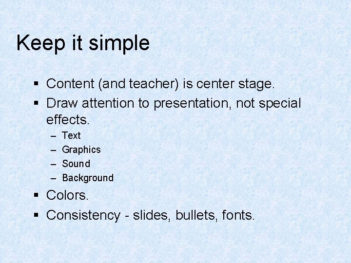
Keep it simple § Content (and teacher) is center stage. § Draw attention to presentation, not special effects. – – Text Graphics Sound Background § Colors. § Consistency - slides, bullets, fonts.

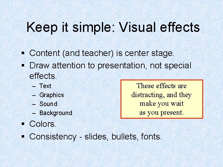
Keep it simple: Visual effects § Content (and teacher) is center stage. § Draw attention to presentation, not special effects. – – Text Graphics Sound Background These effects are distracting, and they make you wait as you present. § Colors. § Consistency - slides, bullets, fonts.

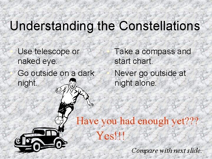
Understanding the Constellations • Use telescope or naked eye. • Go outside on a dark night. • Take a compass and start chart. • Never go outside at night alone. Have you had enough yet? ? ? Yes!!! Compare with next slide.

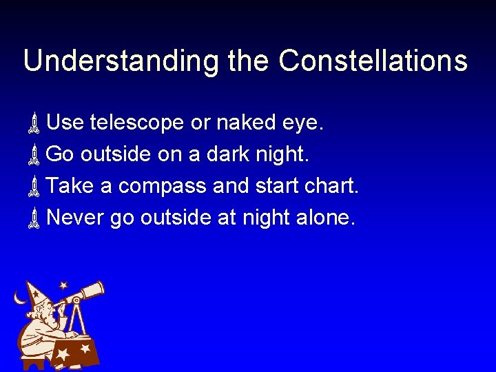
Understanding the Constellations ùUse telescope or naked eye. ùGo outside on a dark night. ùTake a compass and start chart. ùNever go outside at night alone.

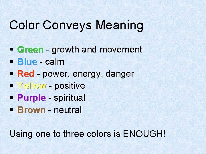
Color Conveys Meaning § § § Green - growth and movement Blue - calm Red - power, energy, danger Yellow - positive Purple - spiritual Brown - neutral Using one to three colors is ENOUGH!

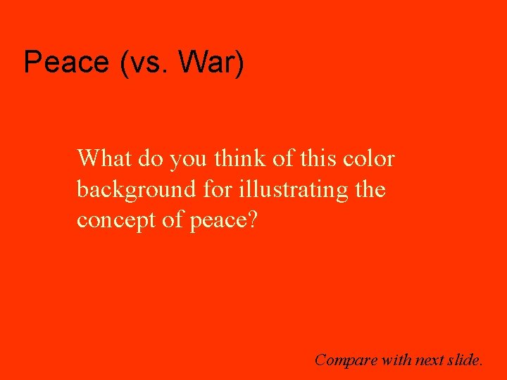
Peace (vs. War) What do you think of this color background for illustrating the concept of peace? Compare with next slide.

Peace (vs. War) What do you think of using this color instead to illustrate peace?

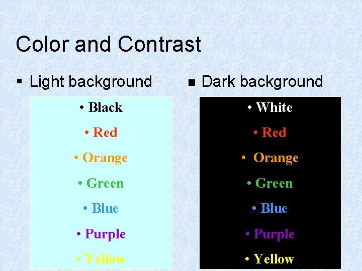
Color and Contrast § Light background n Dark background • Black • White • Red • Orange • Green • Blue • Purple • Yellow

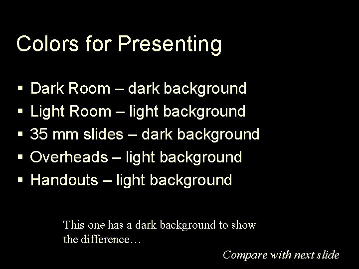
Colors for Presenting § § § Dark Room – dark background Light Room – light background 35 mm slides – dark background Overheads – light background Handouts – light background This one has a dark background to show the difference… Compare with next slide.

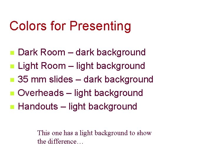
Colors for Presenting n n n Dark Room – dark background Light Room – light background 35 mm slides – dark background Overheads – light background Handouts – light background This one has a light background to show the difference…

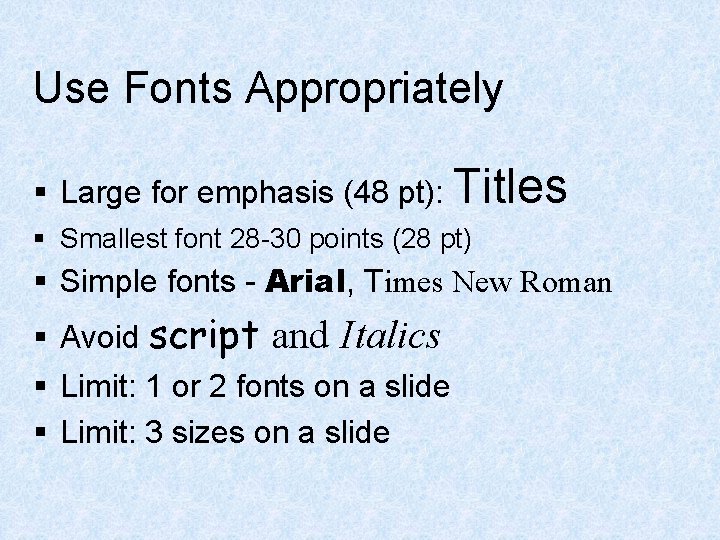
Use Fonts Appropriately § Large for emphasis (48 pt): Titles § Smallest font 28 -30 points (28 pt) § Simple fonts - Arial, Times New Roman § Avoid script and Italics § Limit: 1 or 2 fonts on a slide § Limit: 3 sizes on a slide

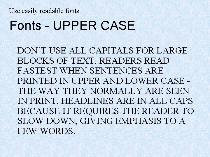
Use easily readable fonts Fonts - UPPER CASE DON’T USE ALL CAPITALS FOR LARGE BLOCKS OF TEXT. READERS READ FASTEST WHEN SENTENCES ARE PRINTED IN UPPER AND LOWER CASE THE WAY THEY NORMALLY ARE SEEN IN PRINT. HEADLINES ARE IN ALL CAPS BECAUSE IT REQUIRES THE READER TO SLOW DOWN, GIVING EMPHASIS TO A FEW WORDS.

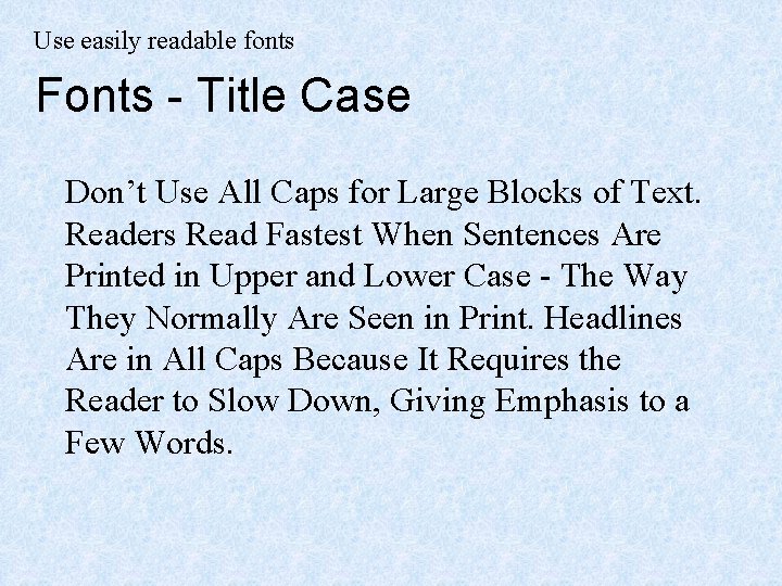
Use easily readable fonts Fonts - Title Case Don’t Use All Caps for Large Blocks of Text. Readers Read Fastest When Sentences Are Printed in Upper and Lower Case - The Way They Normally Are Seen in Print. Headlines Are in All Caps Because It Requires the Reader to Slow Down, Giving Emphasis to a Few Words.

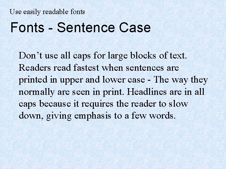
Use easily readable fonts Fonts - Sentence Case Don’t use all caps for large blocks of text. Readers read fastest when sentences are printed in upper and lower case - The way they normally are seen in print. Headlines are in all caps because it requires the reader to slow down, giving emphasis to a few words.

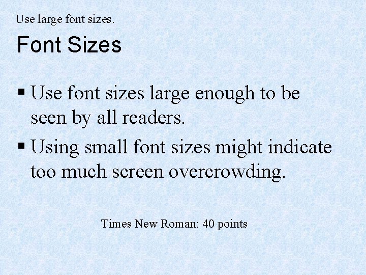
Use large font sizes. Font Sizes § Use font sizes large enough to be seen by all readers. § Using small font sizes might indicate too much screen overcrowding. Times New Roman: 40 points

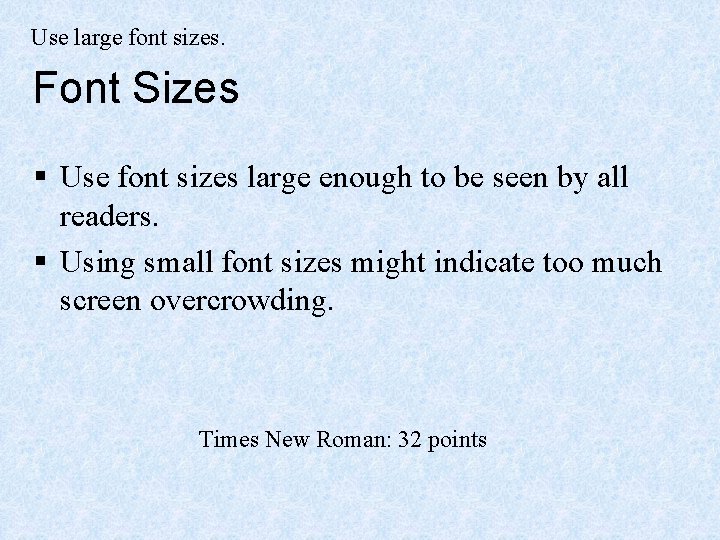
Use large font sizes. Font Sizes § Use font sizes large enough to be seen by all readers. § Using small font sizes might indicate too much screen overcrowding. Times New Roman: 32 points

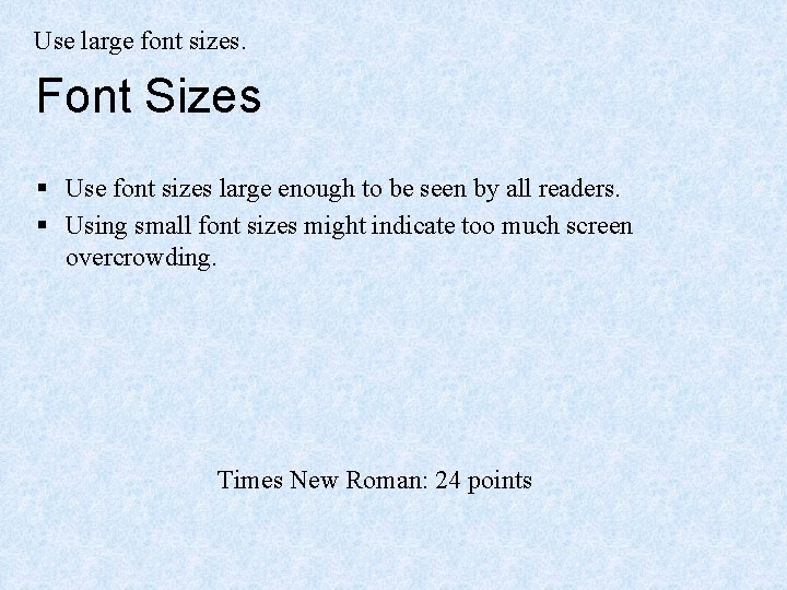
Use large font sizes. Font Sizes § Use font sizes large enough to be seen by all readers. § Using small font sizes might indicate too much screen overcrowding. Times New Roman: 24 points

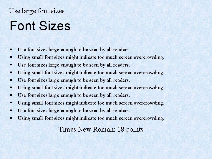
Use large font sizes. Font Sizes § § § § § Use font sizes large enough to be seen by all readers. Using small font sizes might indicate too much screen overcrowding. Times New Roman: 18 points

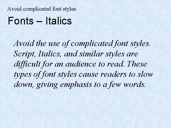
Avoid complicated font styles. Fonts – Italics Avoid the use of complicated font styles. Script, Italics, and similar styles are difficult for an audience to read. These types of font styles cause readers to slow down, giving emphasis to a few words.

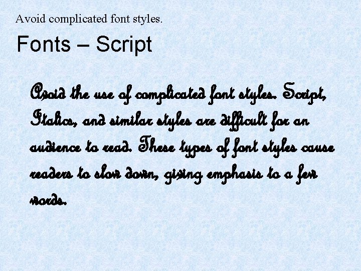
Avoid complicated font styles. Fonts – Script Avoid the use of complicated font styles. Script, Italics, and similar styles are difficult for an audience to read. These types of font styles cause readers to slow down, giving emphasis to a few words.

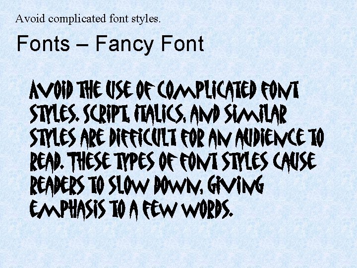
Avoid complicated font styles. Fonts – Fancy Font Avoid the use of complicated font styles. Script, Italics, and similar styles are difficult for an audience to read. These types of font styles cause readers to slow down, giving emphasis to a few words.

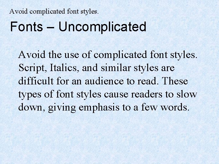
Avoid complicated font styles. Fonts – Uncomplicated Avoid the use of complicated font styles. Script, Italics, and similar styles are difficult for an audience to read. These types of font styles cause readers to slow down, giving emphasis to a few words.

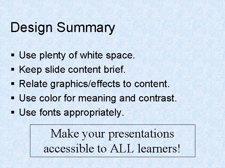
Design Summary § § § Use plenty of white space. Keep slide content brief. Relate graphics/effects to content. Use color for meaning and contrast. Use fonts appropriately. Make your presentations accessible to ALL learners!