Paper 3 Geographical skills key terms statistics Key
- Slides: 9

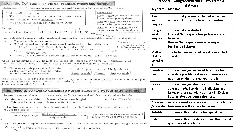
Paper 3 – Geographical skills – key terms & statistics Key term Meaning Aim of your enquiry This is what you wanted to find out in your enquiry. This is in the form of a question. Geograp hical enquiry This is what you studied. Physical Geography – footpath erosion at Bakewell Human Geography – economic impact of tourism on Bakewell Methods The technique you used to help you collect of data your data. collectio n Conclusi ons This is where you will need to explain how your data provides evidence to answer your question or aim (sum up your results) Evaluatio n This is where you identify any problems in your methods. Explain the limitations and issues of accuracy with your results. Explain how reliable your conclusions are. Accuracy Accurate results are as near as possible to the /accurate true answer – they have few errors. Reliable This means that data can be reproduced. Valid This means that the data answers the original question and is reliable.

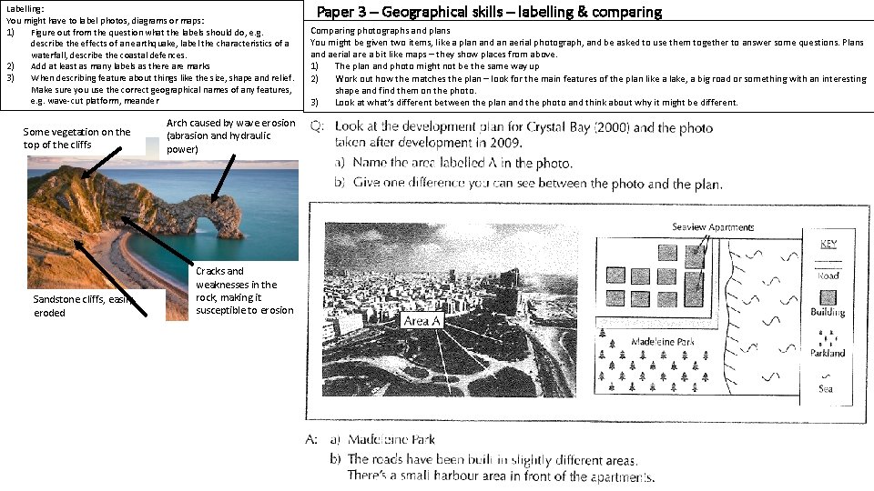
Labelling: You might have to label photos, diagrams or maps: 1) Figure out from the question what the labels should do, e. g. describe the effects of an earthquake, label the characteristics of a waterfall, describe the coastal defences. 2) Add at least as many labels as there are marks 3) When describing feature about things like the size, shape and relief. Make sure you use the correct geographical names of any features, e. g. wave-cut platform, meander Some vegetation on the top of the cliffs Sandstone cliffs, easily eroded Arch caused by wave erosion (abrasion and hydraulic power) Cracks and weaknesses in the rock, making it susceptible to erosion Paper 3 – Geographical skills – labelling & comparing Comparing photographs and plans You might be given two items, like a plan and an aerial photograph, and be asked to use them together to answer some questions. Plans and aerial are a bit like maps – they show places from above. 1) The plan and photo might not be the same way up 2) Work out how the matches the plan – look for the main features of the plan like a lake, a big road or something with an interesting shape and find them on the photo. 3) Look at what’s different between the plan and the photo and think about why it might be different.

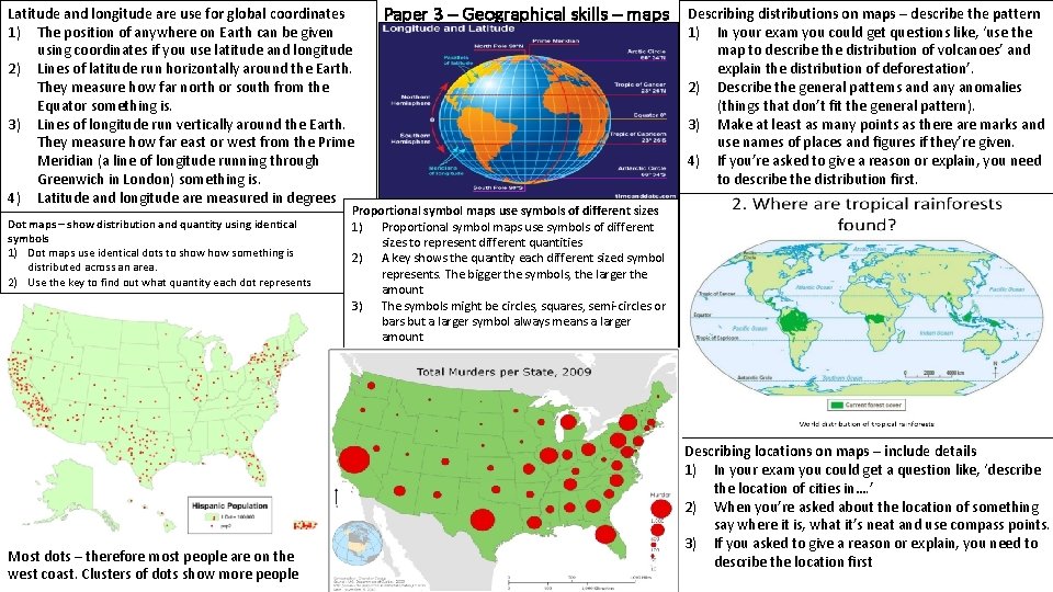
Latitude and longitude are use for global coordinates 1) The position of anywhere on Earth can be given using coordinates if you use latitude and longitude 2) Lines of latitude run horizontally around the Earth. They measure how far north or south from the Equator something is. 3) Lines of longitude run vertically around the Earth. They measure how far east or west from the Prime Meridian (a line of longitude running through Greenwich in London) something is. 4) Latitude and longitude are measured in degrees Dot maps – show distribution and quantity using identical symbols 1) Dot maps use identical dots to show something is distributed across an area. 2) Use the key to find out what quantity each dot represents Most dots – therefore most people are on the west coast. Clusters of dots show more people Paper 3 – Geographical skills – maps Describing distributions on maps – describe the pattern 1) In your exam you could get questions like, ‘use the map to describe the distribution of volcanoes’ and explain the distribution of deforestation’. 2) Describe the general patterns and any anomalies (things that don’t fit the general pattern). 3) Make at least as many points as there are marks and use names of places and figures if they’re given. 4) If you’re asked to give a reason or explain, you need to describe the distribution first. Proportional symbol maps use symbols of different sizes 1) Proportional symbol maps use symbols of different sizes to represent different quantities 2) A key shows the quantity each different sized symbol represents. The bigger the symbols, the larger the amount 3) The symbols might be circles, squares, semi-circles or bars but a larger symbol always means a larger amount Describing locations on maps – include details 1) In your exam you could get a question like, ‘describe the location of cities in…. ’ 2) When you’re asked about the location of something say where it is, what it’s neat and use compass points. 3) If you asked to give a reason or explain, you need to describe the location first

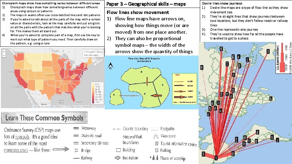
Choropleth maps show something varies between different areas 1) Choropleth maps show something varies between different areas using colours or patterns 2) The maps in exams often use cross-hatched lines and dot patterns 3) If you’re asked to talk about all the parts of the map with a certain value or characteristic, look at the map carefully and put a big tick on all the parts with the pattern that matches what you’re looking for. This makes them all stand out 4) When you’re asked to complete part of a map, first use the key to work out what type of pattern you need. Then carefully draw on the pattern, e. g. using a ruler Paper 3 – Geographical skills – maps Flow lines show movement 1) Flow line maps have arrows on, showing how things move (or are moved) from one place another. 2) They can also be proportional symbol maps – the width of the arrows show the quantity of things Desire lines show journeys 1) Desire line maps are a type of flow line as they show movement too. 2) They’re straight lines that show journeys between two locations, but they don’t follow roads or railway lines 3) One line represents one journey 4) They’re used to show far all the people have travelled to get to a place.

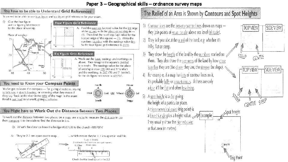
Paper 3 – Geographical skills – ordnance survey maps

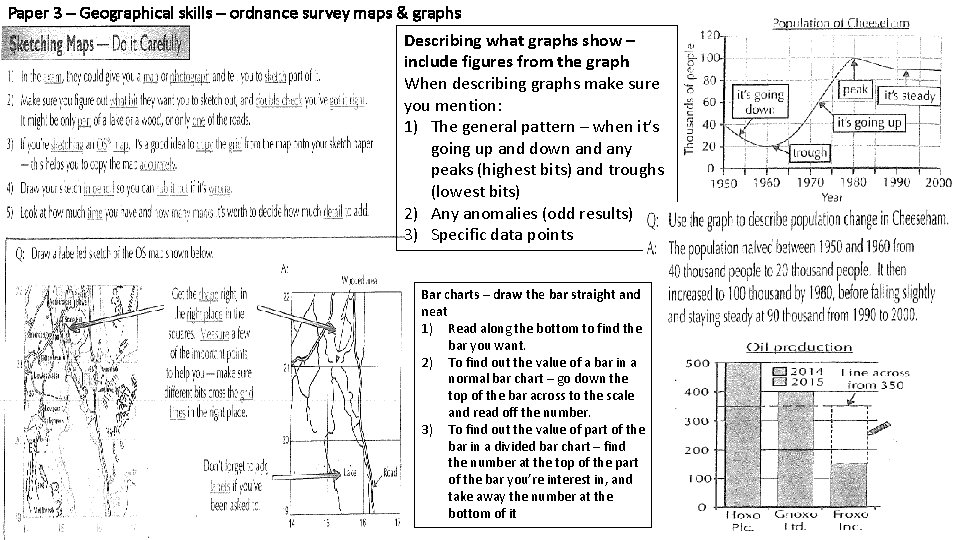
Paper 3 – Geographical skills – ordnance survey maps & graphs Describing what graphs show – include figures from the graph When describing graphs make sure you mention: 1) The general pattern – when it’s going up and down and any peaks (highest bits) and troughs (lowest bits) 2) Any anomalies (odd results) 3) Specific data points Bar charts – draw the bar straight and neat 1) Read along the bottom to find the bar you want. 2) To find out the value of a bar in a normal bar chart – go down the top of the bar across to the scale and read off the number. 3) To find out the value of part of the bar in a divided bar chart – find the number at the top of the part of the bar you’re interest in, and take away the number at the bottom of it

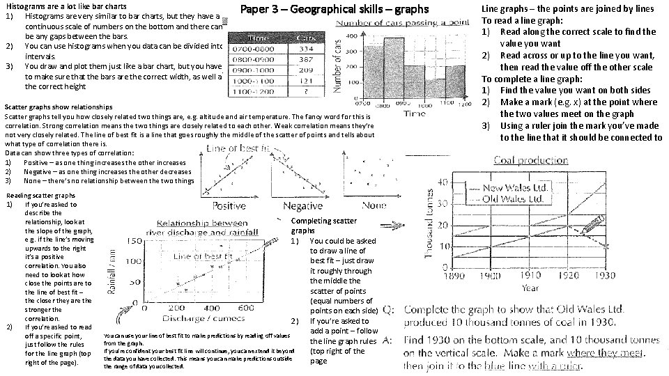
Histograms are a lot like bar charts 1) Histograms are very similar to bar charts, but they have a continuous scale of numbers on the bottom and there can’t be any gaps between the bars. 2) You can use histograms when you data can be divided into intervals. 3) You draw and plot them just like a bar chart, but you have to make sure that the bars are the correct width, as well as the correct height Paper 3 – Geographical skills – graphs Scatter graphs show relationships Scatter graphs tell you how closely related two things are, e. g. altitude and air temperature. The fancy word for this is correlation. Strong correlation means the two things are closely related to each other. Weak correlation means they’re not very closely related. The line of best fit is a line that goes roughly the middle of the scatter of points and tells about what type of correlation there is. Data can show three types of correlation: 1) Positive – as one thing increases the other increases 2) Negative – as one thing increases the other decreases 3) None – there’s no relationship between the two things Reading scatter graphs 1) If you’re asked to describe the relationship, look at the slope of the graph, e. g. if the line’s moving upwards to the right it’s a positive correlation. You also need to look at how close the points are to the line of best fit – the closer they are the stronger the correlation. 2) If you’re asked to read off a specific point, just follow the rules for the line graph (top right of the page). Completing scatter graphs 1) You could be asked to draw a line of best fit – just draw it roughly through the middle the scatter of points (equal numbers of points on each side) 2) If you’re asked to add a point – follow You can use your line of best fit to make predictions by reading off values the line graph rules from the graph. If you’re confident your best fit line will continue, you can extend it beyond (top right of the data you have collected. This means you can make predictions outside page the range of data you collected. Line graphs – the points are joined by lines To read a line graph: 1) Read along the correct scale to find the value you want 2) Read across or up to the line you want, then read the value off the other scale To complete a line graph: 1) Find the value you want on both sides 2) Make a mark (e. g. x) at the point where the two values meet on the graph 3) Using a ruler join the mark you’ve made to the line that it should be connected to

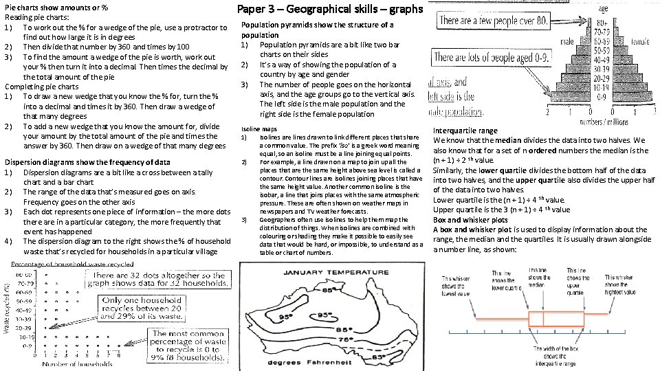
Pie charts show amounts or % Reading pie charts: 1) To work out the % for a wedge of the pie, use a protractor to find out how large it is in degrees 2) Then divide that number by 360 and times by 100 3) To find the amount a wedge of the pie is worth, work out your % then turn it into a decimal. Then times the decimal by the total amount of the pie Completing pie charts 1) To draw a new wedge that you know the % for, turn the % into a decimal and times it by 360. Then draw a wedge of that many degrees 2) To add a new wedge that you know the amount for, divide your amount by the total amount of the pie and times the answer by 360. Then draw on a wedge of that many degrees Dispersion diagrams show the frequency of data 1) Dispersion diagrams are a bit like a cross between a tally chart and a bar chart 2) The range of the data that’s measured goes on axis. Frequency goes on the other axis 3) Each dot represents one piece of information – the more dots there are in a particular category, the more frequently that event has happened 4) The dispersion diagram to the right shows the % of household waste that’s recycled for households in a particular village Paper 3 – Geographical skills – graphs Population pyramids show the structure of a population 1) Population pyramids are a bit like two bar charts on their sides 2) It’s a way of showing the population of a country by age and gender 3) The number of people goes on the horizontal axis, and the age groups go to the vertical axis. The left side is the male population and the right side is the female population Isoline maps 1) Isolines are lines drawn to link different places that share a common value. The prefix 'iso' is a greek word meaning equal, so an isoline must be a line joining equal points. 2) For example, a line drawn on a map to join up all the places that are the same height above sea level is called a contour. Contour lines are isolines joining places that have the same height value. Another common isoline is the isobar, a line that joins places with the same atmospheric pressure. These are often shown on weather maps in newspapers and TV weather forecasts. 3) Geographers often use isolines to help them map the distribution of things. When isolines are combined with colouring or shading they make it possible to easily see data that would be hard, or impossible, to understand as a table or chart of numbers. Interquartile range We know that the median divides the data into two halves. We also know that for a set of n ordered numbers the median is the (n + 1) ÷ 2 th value. Similarly, the lower quartile divides the bottom half of the data into two halves, and the upper quartile also divides the upper half of the data into two halves. Lower quartile is the (n + 1) ÷ 4 th value. Upper quartile is the 3 (n + 1) ÷ 4 th value Box and whisker plots A box and whisker plot is used to display information about the range, the median and the quartiles. It is usually drawn alongside a number line, as shown:

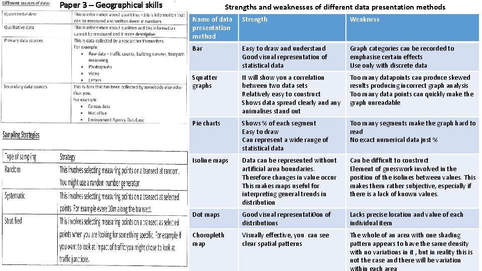
Paper 3 – Geographical skills Strengths and weaknesses of different data presentation methods Name of data presentation method Strength Weakness Bar Easy to draw and understand Good visual representation of statistical data Graph categories can be recorded to emphasise certain effects Use only with discrete data Squatter graphs It will show you a correlation between two data sets Relatively easy to construct Shows data spread clearly and any animalises stand out Too many datapoints can produce skewed results producing incorrect graph analysis Too many data points can quickly make the graph unreadable Pie charts Shows % of each segment Easy to draw Can represent a wide range of statistical data Too many segments make the graph hard to read No exact numerical data just % Isoline maps Data can be represented without artificial area boundaries. Therefore changes in value occur This makes maps useful for interpreting general trends in distribution Can be difficult to construct Element of guesswork involved in the position of the isolines between values. This makes them rather subjective, especially if there is a lack of known values. Dot maps Good visual representati 0 on of distributions Lacks precise location and value of each individual item Choropleth map Visually effective, you can see clear spatial patterns The whole of an area with one shading pattern appears to have the same density with no variations in it , but in reality this is not the case and there will be variation