Nesting and Floating Nesting and Floating Elements To
- Slides: 9

Nesting and Floating

Nesting and Floating Elements To make our page content appear the way we want, and to make the best use of screen space, we can nest and float XHTML elements. n Nesting merely refers to placing elements inside other elements. n As in real life, smaller boxes can be nested into larger boxes. We will use this frequently when laying out our web page. n Floating in XHTML refers to causing elements, such as <div> containers, to stay to the right or left side of the page, while other elements appear to their side, rather than just above and below. Let's build some examples of nesting and floating to make each of these concepts clearer.

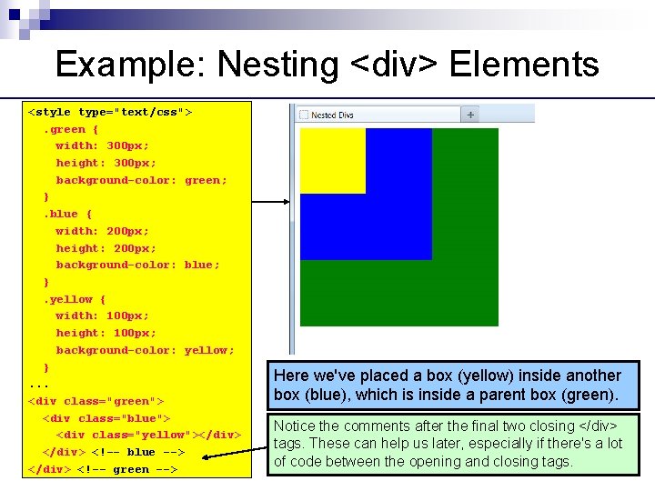
Example: Nesting <div> Elements <style type="text/css">. green { width: 300 px; height: 300 px; background-color: green; }. blue { width: 200 px; height: 200 px; background-color: blue; }. yellow { width: 100 px; height: 100 px; background-color: yellow; }. . . <div class="green"> <div class="blue"> <div class="yellow"></div> <!-- blue --> </div> <!-- green --> Here we've placed a box (yellow) inside another box (blue), which is inside a parent box (green). Notice the comments after the final two closing </div> tags. These can help us later, especially if there's a lot of code between the opening and closing tags.

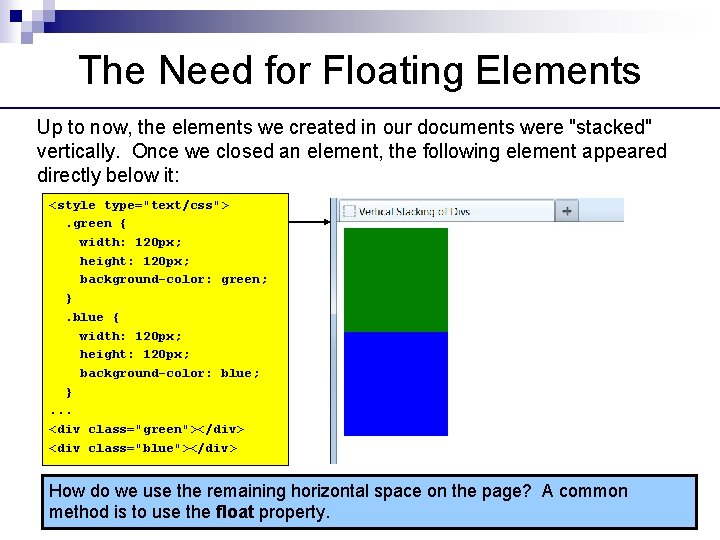
The Need for Floating Elements Up to now, the elements we created in our documents were "stacked" vertically. Once we closed an element, the following element appeared directly below it: <style type="text/css">. green { width: 120 px; height: 120 px; background-color: green; }. blue { width: 120 px; height: 120 px; background-color: blue; }. . . <div class="green"></div> <div class="blue"></div> How do we use the remaining horizontal space on the page? A common method is to use the float property.

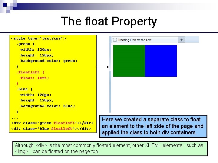
The float Property <style type="text/css">. green { width: 120 px; height: 120 px; background-color: green; }. floatleft { float: left; }. blue { width: 120 px; height: 120 px; background-color: blue; }. . . <div class="green floatleft"></div> <div class="blue floatleft"></div> Here we created a separate class to float an element to the left side of the page and applied the class to both div containers. Although <div> is the most commonly floated element, other XHTML elements - such as <img> - can be floated on the page too.

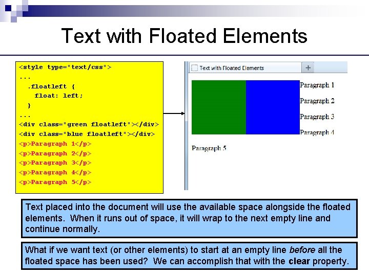
Text with Floated Elements <style type="text/css">. . floatleft { float: left; }. . . <div class="green floatleft"></div> <div class="blue floatleft"></div> <p>Paragraph 1</p> <p>Paragraph 2</p> <p>Paragraph 3</p> <p>Paragraph 4</p> <p>Paragraph 5</p> Text placed into the document will use the available space alongside the floated elements. When it runs out of space, it will wrap to the next empty line and continue normally. What if we want text (or other elements) to start at an empty line before all the floated space has been used? We can accomplish that with the clear property.

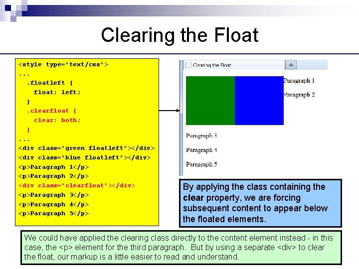
Clearing the Float <style type="text/css">. . floatleft { float: left; }. clearfloat { clear: both; }. . . <div class="green floatleft"></div> <div class="blue floatleft"></div> <p>Paragraph 1</p> <p>Paragraph 2</p> <div class="clearfloat"></div> <p>Paragraph 3</p> <p>Paragraph 4</p> <p>Paragraph 5</p> By applying the class containing the clear property, we are forcing subsequent content to appear below the floated elements. We could have applied the clearing class directly to the content element instead - in this case, the <p> element for the third paragraph. But by using a separate <div> to clear the float, our markup is a little easier to read and understand.

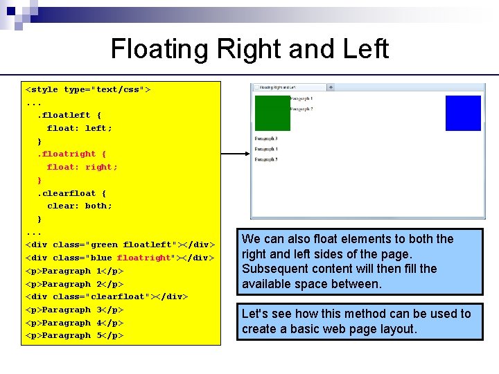
Floating Right and Left <style type="text/css">. . floatleft { float: left; }. floatright { float: right; }. clearfloat { clear: both; }. . . <div class="green floatleft"></div> <div class="blue floatright"></div> <p>Paragraph 1</p> <p>Paragraph 2</p> <div class="clearfloat"></div> <p>Paragraph 3</p> <p>Paragraph 4</p> <p>Paragraph 5</p> We can also float elements to both the right and left sides of the page. Subsequent content will then fill the available space between. Let's see how this method can be used to create a basic web page layout.

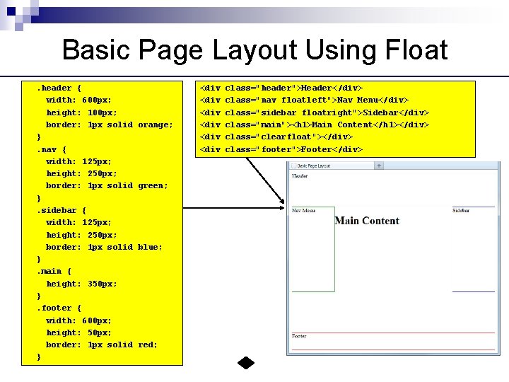
Basic Page Layout Using Float. header { width: 600 px; height: 100 px; border: 1 px solid }. nav { width: 125 px; height: 250 px; border: 1 px solid }. sidebar { width: 125 px; height: 250 px; border: 1 px solid }. main { height: 350 px; }. footer { width: 600 px; height: 50 px; border: 1 px solid } orange; green; blue; red; <div <div class="header">Header</div> class="nav floatleft">Nav Menu</div> class="sidebar floatright">Sidebar</div> class="main"><h 1>Main Content</h 1></div> class="clearfloat"></div> class="footer">Footer</div>