Graphing Your Data Showing patterns trends Lets review

- Slides: 18

Graphing Your Data Showing patterns & trends Let’s review !

What is the purpose of a graph? • A graph is a visual representation of a relationship between two variables, dependent and independent. A picture is worth a thousand words!

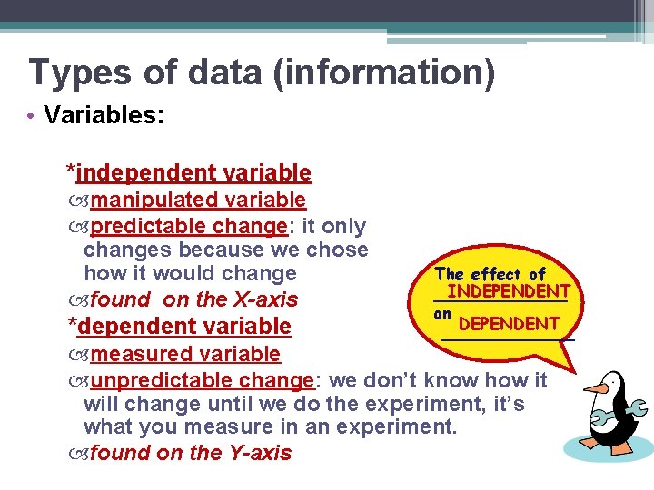
Types of data (information) • Variables: *independent variable manipulated variable predictable change: it only changes because we chose how it would change found on the X-axis *dependent variable The effect of INDEPENDENT _______ on DEPENDENT _______ measured variable unpredictable change: we don’t know how it will change until we do the experiment, it’s what you measure in an experiment. found on the Y-axis

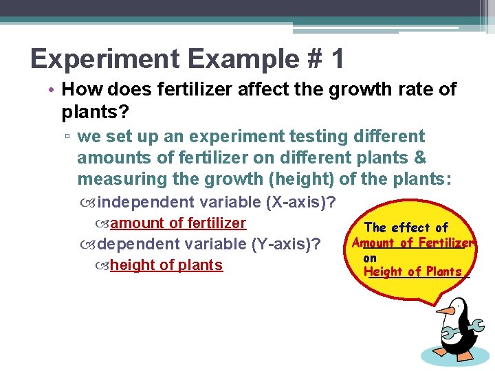
Experiment Example # 1 • How does fertilizer affect the growth rate of plants? ▫ we set up an experiment testing different amounts of fertilizer on different plants & measuring the growth (height) of the plants: independent variable (X-axis)? amount of fertilizer dependent variable (Y-axis)? height of plants The effect of Amount of Fertilizer _______ on Height of Plants _______

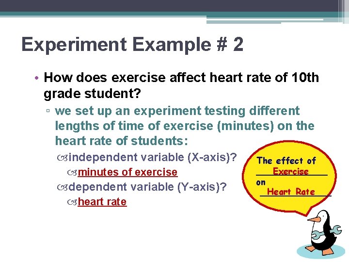
Experiment Example # 2 • How does exercise affect heart rate of 10 th grade student? ▫ we set up an experiment testing different lengths of time of exercise (minutes) on the heart rate of students: independent variable (X-axis)? minutes of exercise dependent variable (Y-axis)? heart rate The effect of Exercise _______ on Heart Rate _______

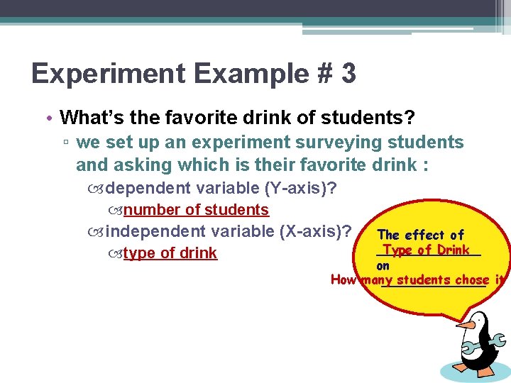
Experiment Example # 3 • What’s the favorite drink of students? ▫ we set up an experiment surveying students and asking which is their favorite drink : dependent variable (Y-axis)? number of students independent variable (X-axis)? type of drink The effect of Type of Drink _______ on How many students chose it _______

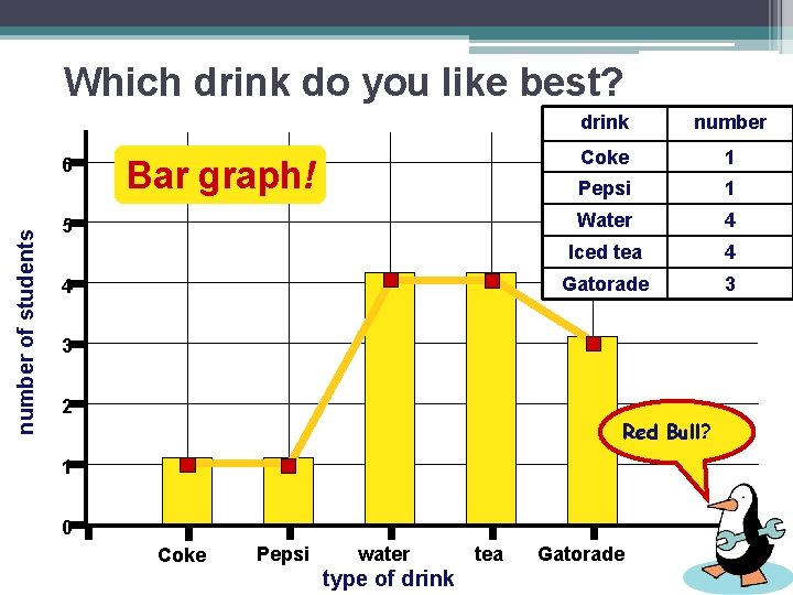
Which drink do you like best? number of students 6 Bar graph! 5 4 drink number Coke 1 Pepsi 1 Water 4 Iced tea 4 Gatorade 3 3 2 Red Bull? 1 0 Coke Pepsi water type of drink tea Gatorade

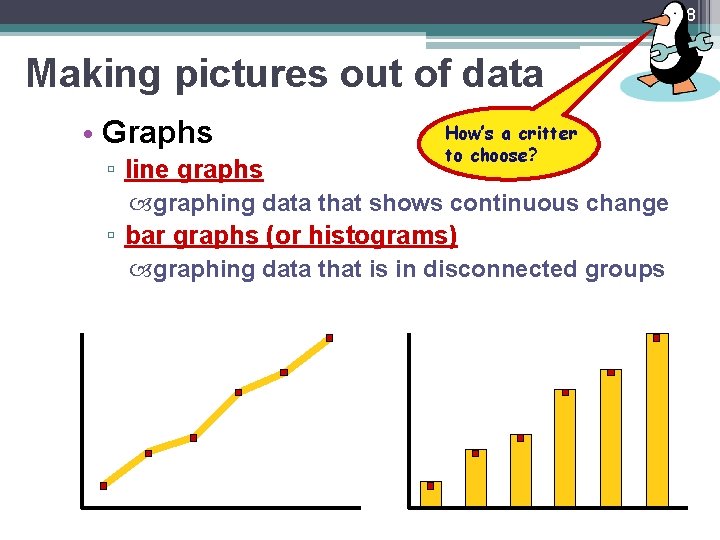
8 Making pictures out of data • Graphs ▫ line graphs How’s a critter to choose? graphing data that shows continuous change ▫ bar graphs (or histograms) graphing data that is in disconnected groups

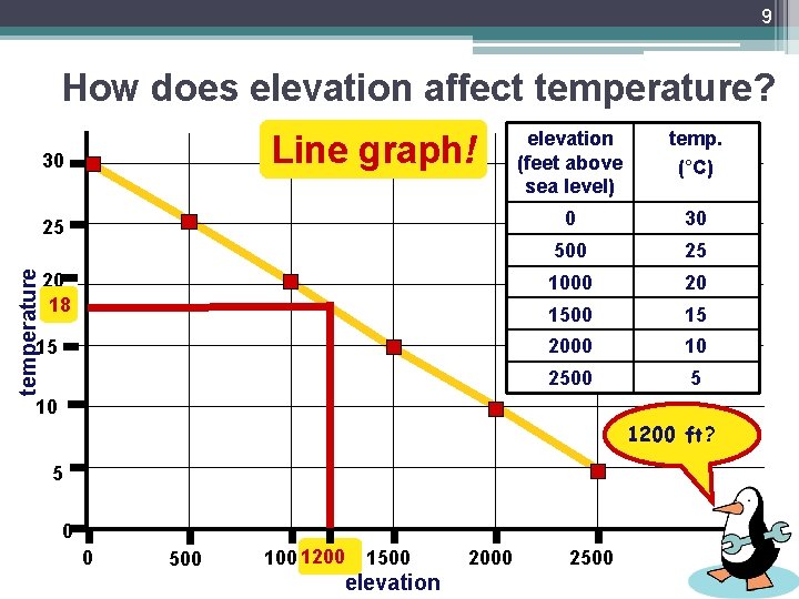
9 How does elevation affect temperature? Line graph! 30 temperature 25 20 18 15 elevation (feet above sea level) temp. (°C) 0 30 500 25 1000 20 1500 15 2000 10 2500 5 10 1200 ft? 5 0 0 500 10001200 1500 elevation 2000 2500

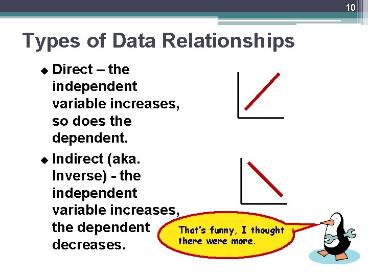
10 Types of Data Relationships Direct – the independent variable increases, so does the dependent. u Indirect (aka. Inverse) - the independent variable increases, the dependent That’s funny, I thought there were more. decreases. u

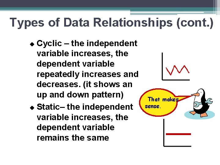
Types of Data Relationships (cont. ) Cyclic – the independent variable increases, the dependent variable repeatedly increases and decreases. (it shows an up and down pattern) u Static– the independent variable increases, the dependent variable remains the same u That makes sense.

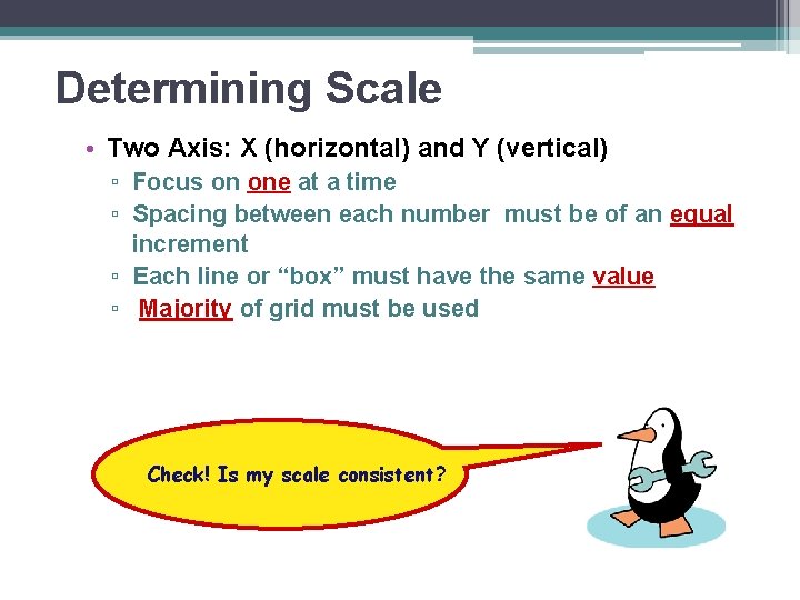
Determining Scale • Two Axis: X (horizontal) and Y (vertical) ▫ Focus on one at a time ▫ Spacing between each number must be of an equal increment ▫ Each line or “box” must have the same value ▫ Majority of grid must be used Check! Is my scale consistent?

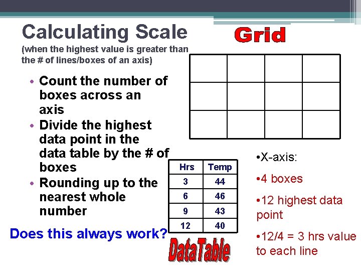
Calculating Scale (when the highest value is greater than the # of lines/boxes of an axis) • Count the number of boxes across an axis • Divide the highest data point in the data table by the # of boxes • Rounding up to the nearest whole number Does this always work? Hrs Temp 3 44 6 46 9 43 12 40 • X-axis: • 4 boxes • 12 highest data point • 12/4 = 3 hrs value to each line

Exceptions 1) When the data is not numerical value ie: Dates, Categories…. OR 1. 2) The highest data point is LESS than the # of boxes/lines on an axis-round down Ok! Let’s Practice!

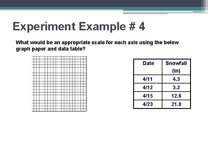
Experiment Example # 4 What would be an appropriate scale for each axis using the below graph paper and data table? Date Snowfall (in) 4/11 4. 3 4/12 3. 2 4/15 12. 6 4/23 21. 8

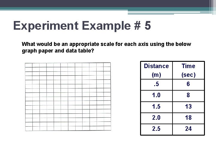
Experiment Example # 5 What would be an appropriate scale for each axis using the below graph paper and data table? Distance (m) Time (sec) . 5 6 1. 0 8 1. 5 13 2. 0 18 2. 5 24

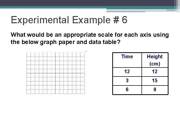
Experimental Example # 6 What would be an appropriate scale for each axis using the below graph paper and data table? Time Height (cm) 12 12 3 15 6 9

Any Questions? ?