Displaying Quantitative Data with Graphs Section 1 1





- Slides: 20

Displaying Quantitative Data with Graphs Section 1. 1

What you’ll learn To create and interpret the following graphs: n n Dotplot Stem and leaf Regular Stem and Leaf Back-to-Back Stem and Leaf n Histogram

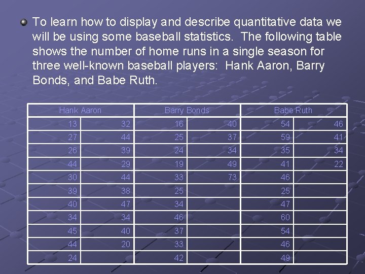
To learn how to display and describe quantitative data we will be using some baseball statistics. The following table shows the number of home runs in a single season for three well-known baseball players: Hank Aaron, Barry Bonds, and Babe Ruth. Hank Aaron Barry Bonds Babe Ruth 13 32 16 40 54 46 27 44 25 37 59 41 26 39 24 34 35 34 44 29 19 49 41 22 30 44 33 73 46 39 38 25 25 40 47 34 34 46 60 45 40 37 54 44 20 33 46 42 49 24

Dotplot Label the horizontal axis with the name of the variable and title the graph Scale the axis based on the values of the variable Mark a dot (we’ll use x’s) above the number on the axis corresponding to each data value

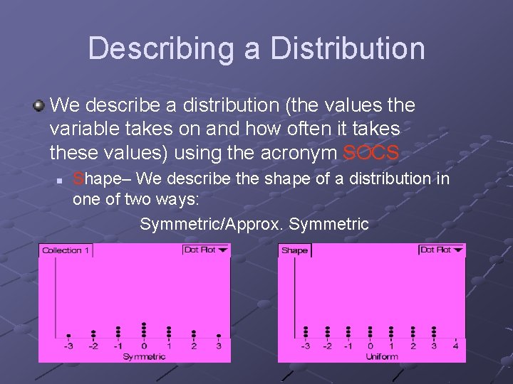
Describing a Distribution We describe a distribution (the values the variable takes on and how often it takes these values) using the acronym SOCS n Shape– We describe the shape of a distribution in one of two ways: Symmetric/Approx. Symmetric

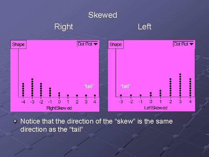
Skewed Right Left “tail” Notice that the direction of the “skew” is the same direction as the “tail”

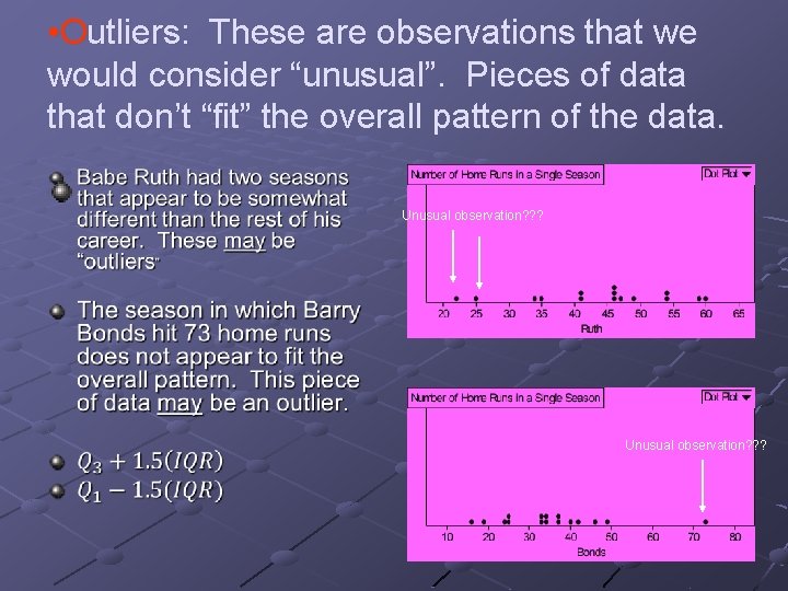
• Outliers: These are observations that we would consider “unusual”. Pieces of data that don’t “fit” the overall pattern of the data. Unusual observation? ? ?

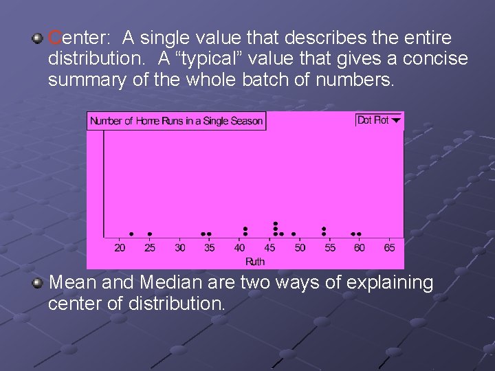
Center: A single value that describes the entire distribution. A “typical” value that gives a concise summary of the whole batch of numbers. Mean and Median are two ways of explaining center of distribution.

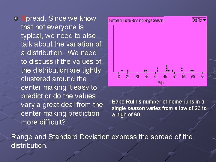
Spread: Since we know that not everyone is typical, we need to also talk about the variation of a distribution. We need to discuss if the values of the distribution are tightly clustered around the center making it easy to predict or do the values vary a great deal from the center making prediction more difficult? Babe Ruth’s number of home runs in a single season varies from a low of 23 to a high of 60. Range and Standard Deviation express the spread of the distribution.

Distribution Description using SOCS The distribution of Babe Ruth’s number of home runs in a single season is approximately symmetric 1 with two possible unusual observations at 23 and 25 home runs. 2 He typically hits about 463 home runs in a season. Over his career, the number of home runs has varied from a low of 23 to a high of 60. 4 1 -Shape 2 -Outliers 3 -Center 4 -Spread

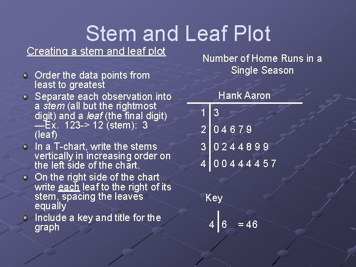
Stem and Leaf Plot Creating a stem and leaf plot Order the data points from least to greatest Separate each observation into a stem (all but the rightmost digit) and a leaf (the final digit) —Ex. 123 -> 12 (stem): 3 (leaf) In a T-chart, write the stems vertically in increasing order on the left side of the chart. On the right side of the chart write each leaf to the right of its stem, spacing the leaves equally Include a key and title for the graph Number of Home Runs in a Single Season Hank Aaron 1 3 2 04679 3 0244899 4 00444457 Key 4 6 = 46

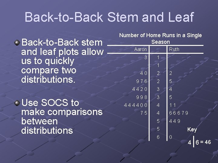
Back-to-Back Stem and Leaf Back-to-Back stem and leaf plots allow us to quickly compare two distributions. Use SOCS to make comparisons between distributions Number of Home Runs in a Single Season Aaron 3 Ruth 1 1 40 2 2 976 2 5 4420 3 4 998 3 5 444400 4 11 75 4 66679 5 449 5 6 Key 0 4 6 = 46

Advantages and Disadvantages of dotplots/stem and leaf plots Advantages n n Preserves each piece of data Shows features of the distribution with regards to shape— such as clusters, gaps, outliers, etc Disadvantages n n If creating by hand, large data sets can be cumbersome Data that is widely varied may be difficult to graph

Histograms A histogram is one of the most common graphs used for quantitative variables. Although a histogram looks like a bar chart there are some important differences n n n In a histogram, the “bars” touch each other Histograms do not necessarily preserve individual data pieces Changing the “scale” or “bin width” can drastically alter the picture of the distribution, so caution must be used when describing a distribution when only a histogram has been used

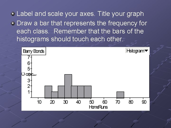
Creating a histogram Divide the range of data into classes of equal width. Count the number of observations in each class. (Remember that the width is somewhat arbitrary and you might choose a different width than someone else) Barry Bonds: n Data Ranges from 16 to 73, so we choose for our classes 15 ≤ # of HR ≤ 19. . . n 70 ≤ # of HR ≤ 75 We can then determine the counts for each “bin”

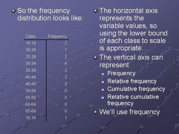
So the frequency distribution looks like: The horizontal axis represents the variable values, so using the lower bound of each class to scale is appropriate. The vertical axis can represent Class Frequency 15 -19 2 20 -24 1 25 -29 2 30 -34 4 35 -39 2 40 -44 2 45 -49 2 n 50 -54 0 n 55 -59 0 n 60 -64 0 65 -69 0 70 -74 1 n Frequency Relative frequency Cumulative frequency Relative cumulative frequency We’ll use frequency

Label and scale your axes. Title your graph Draw a bar that represents the frequency for each class. Remember that the bars of the histograms should touch each other.

Interpretation We interpret a histogram in the same way we interpret a dotplot or stem and leaf plot. ALWAYS use SOCS Shape Center Outliers Spread

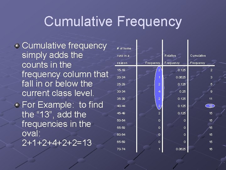
Cumulative Frequency Cumulative frequency simply adds the counts in the frequency column that fall in or below the current class level. For Example: to find the “ 13”, add the frequencies in the oval: 2+1+2+4+2+2=13 # of home runs in a season Frequency Relative Cumulative Frequency 15 -19 2 0. 125 2 20 -24 1 0. 0625 3 25 -29 2 0. 125 5 30 -34 4 0. 25 9 35 -39 2 0. 125 11 40 -44 2 0. 125 13 45 -49 2 0. 125 15 50 -54 0 0 15 55 -59 0 0 15 60 -64 0 0 15 65 -69 0 0 15 70 -74 1 0. 0625 16
