Principles of Design Principles of Design Generally all

- Slides: 16

+ Principles of Design

Principles of Design Generally, all the principles of design apply to any piece you may create. They are the ways that artists use the Elements of Art to create good Compositions (artwork). How you apply those principles determines how effective your design is in conveying the desired message and how attractive it appears. There is seldom only one correct way to apply each principle.

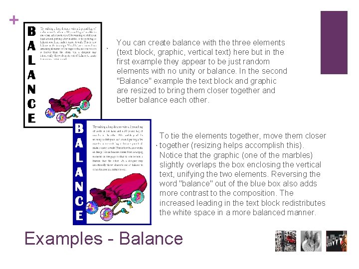
+ Try walking a long distance with a 2 pound bag of rocks in one hand a 10 pound bag of marbles in the other. After awhile you'll be wanting to shift your load around, putting a few marbles in the rock bag to balance your load, make it easier to walk. This is how balance works in design. Visual balance comes from arranging elements on the page so that no one section is heavier than the other. Or, a designer may intentionally throw elements out of balance to create tension or a certain mood. There are two types of balance. Symmetrical balance is mirror image balance. Asymmetrical balance occurs when several smaller items on one side are balanced by a large item on the other side, or smaller items are placed further away from the center of the screen than larger items. One darker item may need to be balanced by several lighter items. Balance

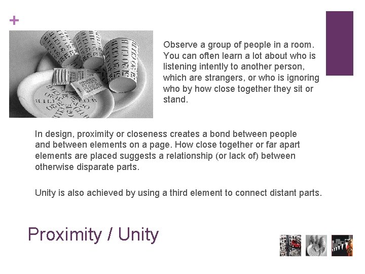
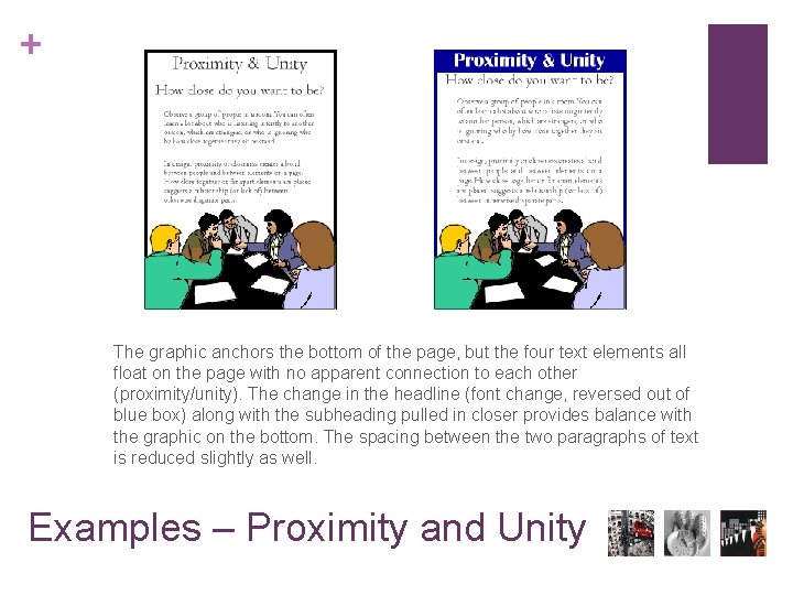
+ Observe a group of people in a room. You can often learn a lot about who is listening intently to another person, which are strangers, or who is ignoring who by how close together they sit or stand. In design, proximity or closeness creates a bond between people and between elements on a page. How close together or far apart elements are placed suggests a relationship (or lack of) between otherwise disparate parts. Unity is also achieved by using a third element to connect distant parts. Proximity / Unity

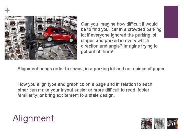
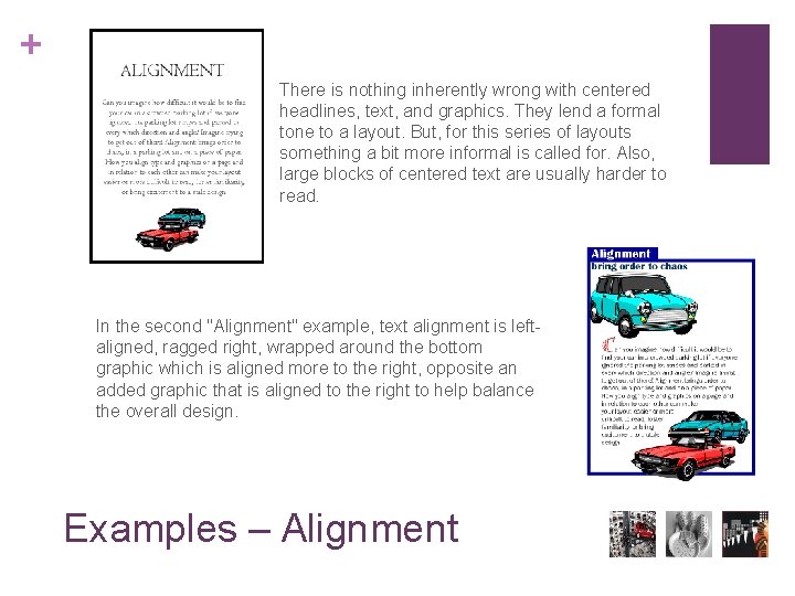
+ Can you imagine how difficult it would be to find your car in a crowded parking lot if everyone ignored the parking lot stripes and parked in every which direction and angle? Imagine trying to get out of there! Alignment brings order to chaos, in a parking lot and on a piece of paper. How you align type and graphics on a page and in relation to each other can make your layout easier or more difficult to read, foster familiarity, or bring excitement to a stale design. Alignment

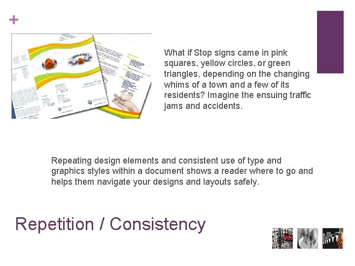
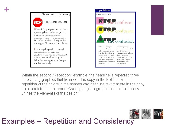
+ What if Stop signs came in pink squares, yellow circles, or green triangles, depending on the changing whims of a town and a few of its residents? Imagine the ensuing traffic jams and accidents. Repeating design elements and consistent use of type and graphics styles within a document shows a reader where to go and helps them navigate your designs and layouts safely. Repetition / Consistency

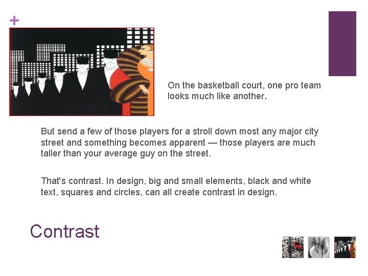
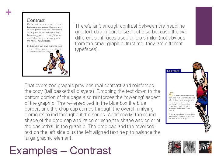
+ On the basketball court, one pro team looks much like another. But send a few of those players for a stroll down most any major city street and something becomes apparent — those players are much taller than your average guy on the street. That's contrast. In design, big and small elements, black and white text, squares and circles, can all create contrast in design. Contrast

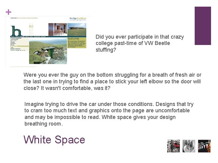
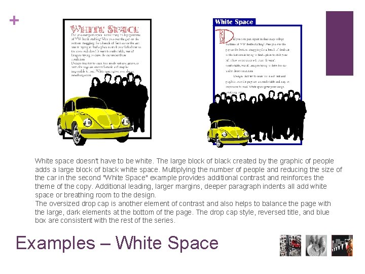
+ Did you ever participate in that crazy college past-time of VW Beetle stuffing? Were you ever the guy on the bottom struggling for a breath of fresh air or the last one in trying to find a place to stick your left elbow so the door will close? It wasn't comfortable, was it? Imagine trying to drive the car under those conditions. Designs that try to cram too much text and graphics onto the page are uncomfortable and may be impossible to read. White space gives your design breathing room. White Space

+ You can create balance with the three elements (text block, graphic, vertical text) here but in the first example they appear to be just random elements with no unity or balance. In the second "Balance" example the text block and graphic are resized to bring them closer together and better balance each other. To tie the elements together, move them closer together (resizing helps accomplish this). Notice that the graphic (one of the marbles) slightly overlaps the box enclosing the vertical text, unifying the two elements. Reversing the word "balance" out of the blue box also adds more contrast to the composition. The increased leading in the text block redistributes the white space in a more balanced manner. Examples - Balance

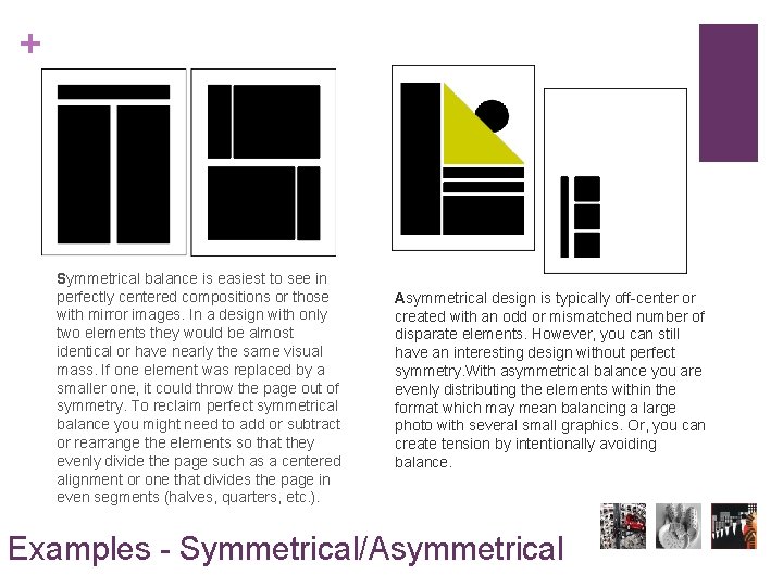
+ Symmetrical balance is easiest to see in perfectly centered compositions or those with mirror images. In a design with only two elements they would be almost identical or have nearly the same visual mass. If one element was replaced by a smaller one, it could throw the page out of symmetry. To reclaim perfect symmetrical balance you might need to add or subtract or rearrange the elements so that they evenly divide the page such as a centered alignment or one that divides the page in even segments (halves, quarters, etc. ). Asymmetrical design is typically off-center or created with an odd or mismatched number of disparate elements. However, you can still have an interesting design without perfect symmetry. With asymmetrical balance you are evenly distributing the elements within the format which may mean balancing a large photo with several small graphics. Or, you can create tension by intentionally avoiding balance. Examples - Symmetrical/Asymmetrical

+ The graphic anchors the bottom of the page, but the four text elements all float on the page with no apparent connection to each other (proximity/unity). The change in the headline (font change, reversed out of blue box) along with the subheading pulled in closer provides balance with the graphic on the bottom. The spacing between the two paragraphs of text is reduced slightly as well. Examples – Proximity and Unity

+ There is nothing inherently wrong with centered headlines, text, and graphics. They lend a formal tone to a layout. But, for this series of layouts something a bit more informal is called for. Also, large blocks of centered text are usually harder to read. In the second "Alignment" example, text alignment is leftaligned, ragged right, wrapped around the bottom graphic which is aligned more to the right, opposite an added graphic that is aligned to the right to help balance the overall design. Examples – Alignment

+ Within the second "Repetition" example, the headline is repeated three times using graphics that tie in with the copy in the text blocks. The repetition of the colors in the shapes and headline text that are in the copy help to reinforce theme. Overlapping the graphic and text elements unifies the elements of the design. Examples – Repetition and Consistency

+ There's isn't enough contrast between the headline and text due in part to size but also because the two different serif faces used or too similar (not obvious from the small graphic, trust me, they are different typefaces). That oversized graphic provides real contrast and reinforces the copy (tall basketball players). Dropping the text down to the bottom portion of the page also reinforces the 'towering' aspect of the graphic. The reversed text in the blue box, the blue border, and the drop carries through the overall unifying elements found throughout the series. Additionally, the round shape of the drop cap and its color echo the shape and color of the basketball in the graphic. The drop cap and the reversed text on the left side plus the left-aligned text help to balance the large graphic element. Examples – Contrast

+ White space doesn't have to be white. The large block of black created by the graphic of people adds a large block of black white space. Multiplying the number of people and reducing the size of the car in the second "White Space" example provides additional contrast and reinforces theme of the copy. Additional leading, larger margins, deeper paragraph indents all add white space or breathing room to the design. The oversized drop cap is another element of contrast and also helps to balance the page with the large, dark elements at the bottom of the page. The drop cap style, reversed title, and blue box are consistent with the rest of the series. Examples – White Space

Repeat the slide show