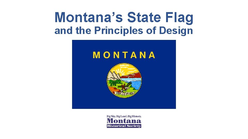
Montanas State Flag and the Principles of Design

- Slides: 12
Montana’s State Flag and the Principles of Design
The Five Basic Principles of Flag Design Taken from the North American Vexillological Association, Good Flag, Bad Flag: How to Design a Great Flag, by Ted Kaye, comp. Accessed online: http: //www. ausflag. com. au/assets/images/Good. Flag-Bad-Flag. pdf , August 29, 2017)
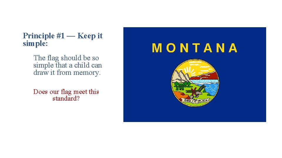
Principle #1 — Keep it simple: The flag should be so simple that a child can draw it from memory. Does our flag meet this standard?
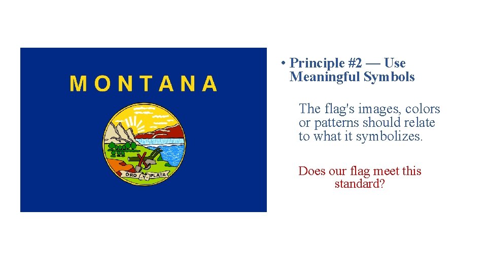
• Principle #2 — Use Meaningful Symbols The flag's images, colors or patterns should relate to what it symbolizes. Does our flag meet this standard?
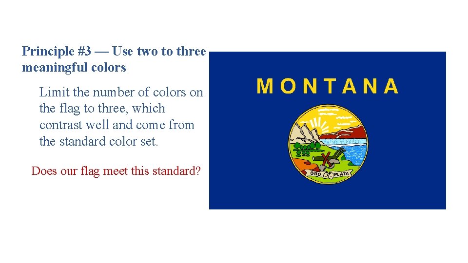
Principle #3 — Use two to three meaningful colors Limit the number of colors on the flag to three, which contrast well and come from the standard color set. Does our flag meet this standard?
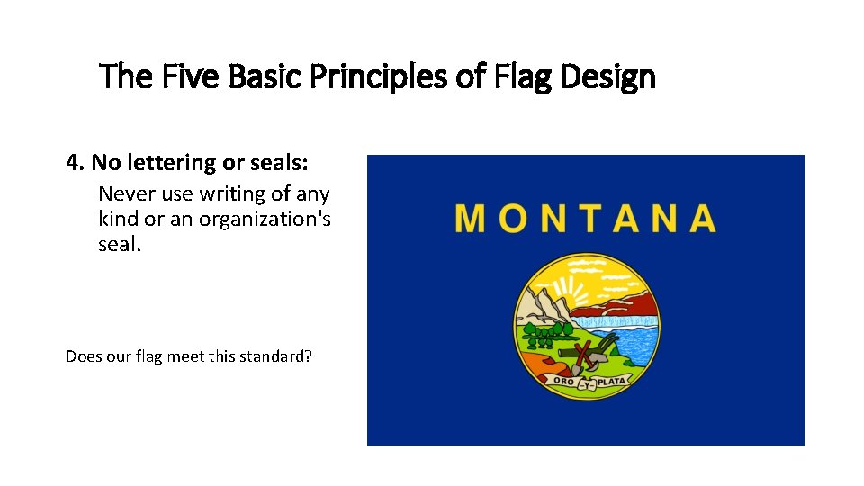
The Five Basic Principles of Flag Design 4. No lettering or seals: Never use writing of any kind or an organization's seal. Does our flag meet this standard?
The Five Basic Principles of Flag Design 5. Be distinctive or be related: Avoid duplicating other flags, but use similarities to show connections. Does our flag meet this standard?
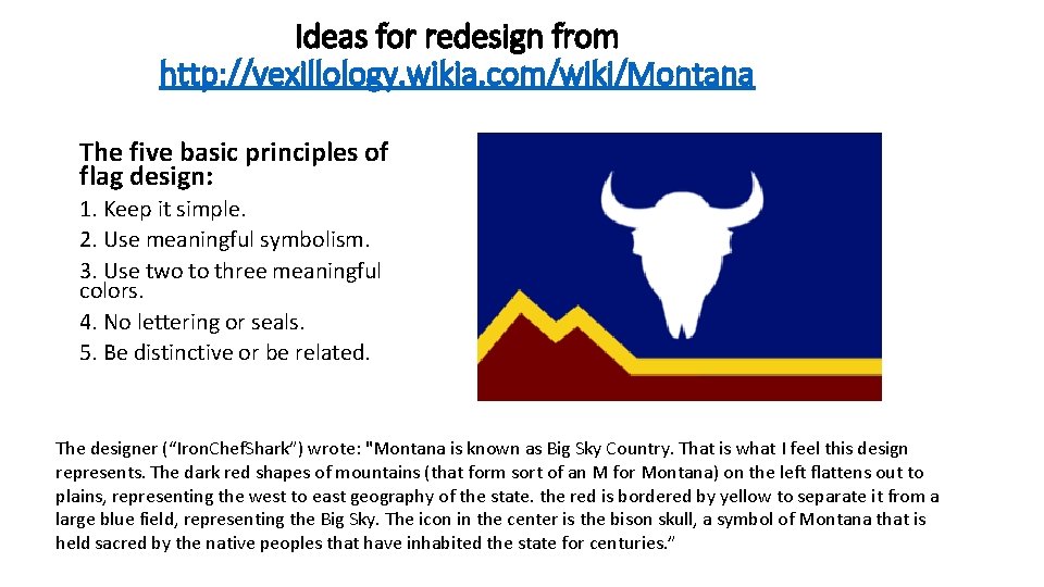
Ideas for redesign from http: //vexillology. wikia. com/wiki/Montana The five basic principles of flag design: 1. Keep it simple. 2. Use meaningful symbolism. 3. Use two to three meaningful colors. 4. No lettering or seals. 5. Be distinctive or be related. The designer (“Iron. Chef. Shark”) wrote: "Montana is known as Big Sky Country. That is what I feel this design represents. The dark red shapes of mountains (that form sort of an M for Montana) on the left flattens out to plains, representing the west to east geography of the state. the red is bordered by yellow to separate it from a large blue field, representing the Big Sky. The icon in the center is the bison skull, a symbol of Montana that is held sacred by the native peoples that have inhabited the state for centuries. ”
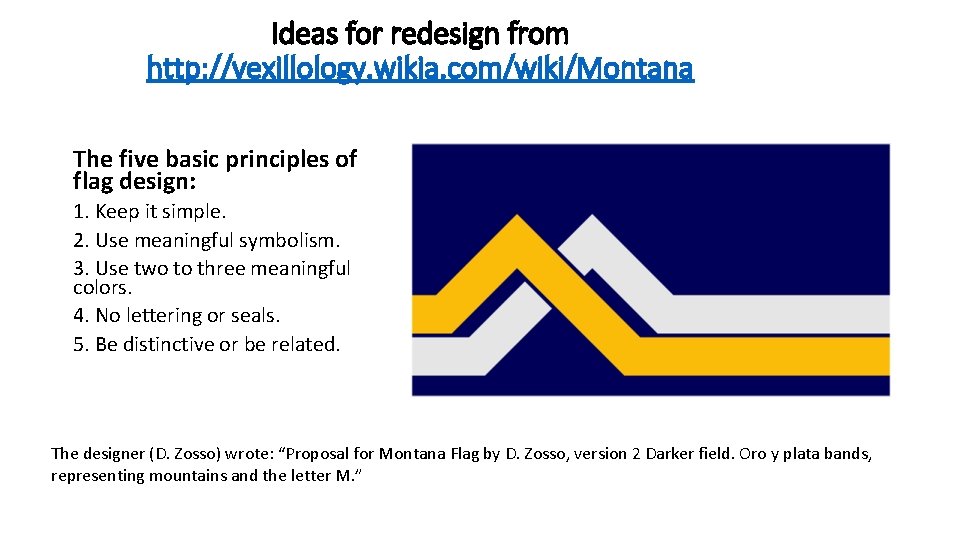
Ideas for redesign from http: //vexillology. wikia. com/wiki/Montana The five basic principles of flag design: 1. Keep it simple. 2. Use meaningful symbolism. 3. Use two to three meaningful colors. 4. No lettering or seals. 5. Be distinctive or be related. The designer (D. Zosso) wrote: “Proposal for Montana Flag by D. Zosso, version 2 Darker field. Oro y plata bands, representing mountains and the letter M. ”
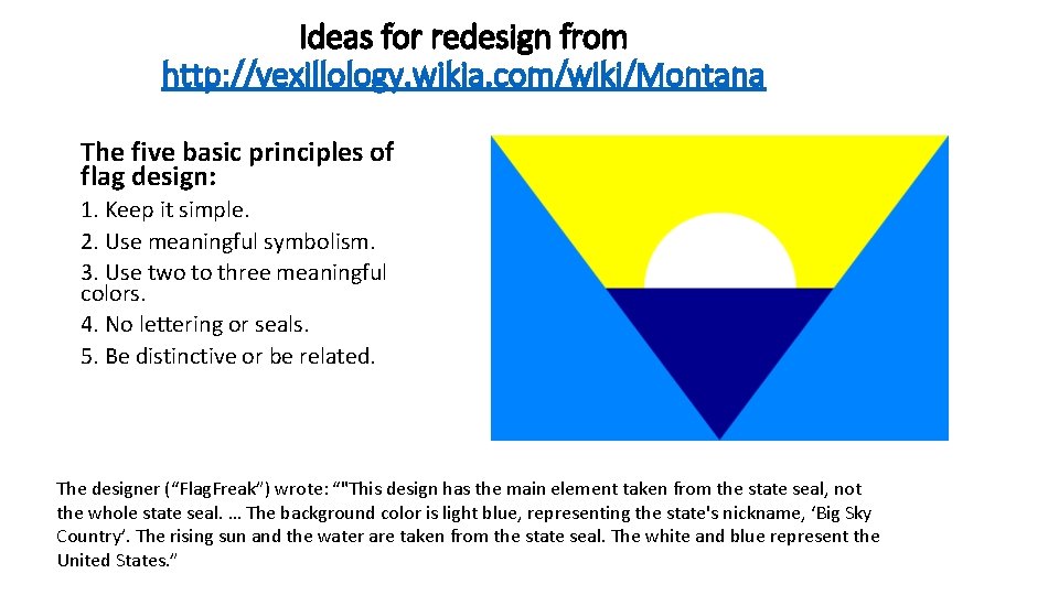
Ideas for redesign from http: //vexillology. wikia. com/wiki/Montana The five basic principles of flag design: 1. Keep it simple. 2. Use meaningful symbolism. 3. Use two to three meaningful colors. 4. No lettering or seals. 5. Be distinctive or be related. The designer (“Flag. Freak”) wrote: “"This design has the main element taken from the state seal, not the whole state seal. … The background color is light blue, representing the state's nickname, ‘Big Sky Country’. The rising sun and the water are taken from the state seal. The white and blue represent the United States. ”
Let’s Try It… Design a flag for the state of Montana following the Five Principles of Flag Design. Remember: Your flag shouldn’t just be beautiful. It must use MEANINGFUL SYMBOLISM. Draw your flag and then write three sentences explaining your symbolism and other choices. The five basic principles of flag design. 1. Keep it simple. 2. Use meaningful symbolism. 3. Use two to three meaningful colors. 4. No lettering or seals. 5. Be distinctive or be related.
Montana’s State Flag Was produced by the Montana Historical Society to be used with our hands-on history footlocker, the Symbols of Montana. For more information visit: http: //mhs. mt. gov/education/Handson. History or phone 406 -444 -4789