JOURNEY WITH THE TITANIC A GRAPHICS DESIGN PROJECT


- Slides: 12
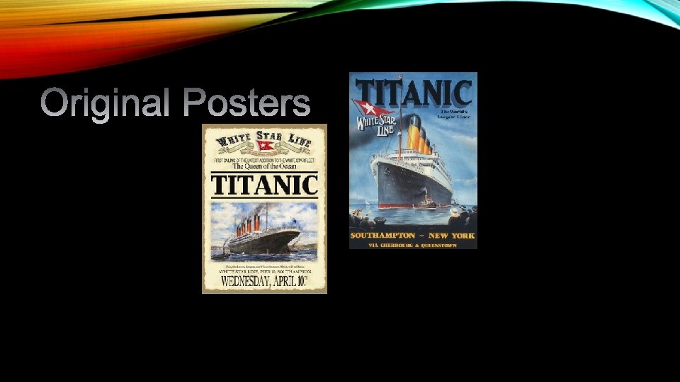
JOURNEY WITH THE TITANIC A GRAPHICS DESIGN PROJECT FOR MIDDLE SCHOOL
NEWS FLASH: THE TITANIC IS BACK!
http: //edition. cnn. com/videos/living/2016/02/11/titanic-ii -announcement-em-vstop-orig. cnn Link TITANIC II IS A PROPOSED OCEAN LINER, BEING BUILT AS A MODERN-DAY REPLICA OF THE OLYMPIC CLASS RMS TITANIC. THE NEW SHIP WILL HAVE A GROSS TONNAGE OF 56, 000 WHILE THE ORIGINAL SHIP MEASURED ABOUT 46, 000 GT. IT IS BEING FUNDED BY AUSTRALIAN BILLIONAIRE CLIVE PALMER, AS THE FLAGSHIP OF A PROPOSED CRUISE COMPANY BLUE STAR LINE PTY. LTD. OF BRISBANE, AUSTRALIA. THE INTENDED LAUNCH DATE WAS ORIGINALLY SET IN 2016, WITH THE SHIP SAILING FROM SOUTHAMPTON TO NEW YORK WITHIN THE SAME YEAR. THE LAUNCH HAS BEEN DELAYED UNTIL 2018.
Here is where you come in… https: //artslc. wordpress. com/year-8/ Your project is to review the power point on line, research for ideas & then create a poster for the Titanic II. The size of the poster will be A 3. You may use Word, a paint, or similar program or both to help you develop your ideas. You are expected to work out your ideas in your sketchbook. This will count as 50% of your mark. The final product, however, must be made by hand on the card provided.
Sketchbook required to have investigated: o 3 different lettering fonts, o 2 related images for stenceling o 2 layout designs The Final A 3 work must have as following: o The Words “Titanic II” , “Journey” and “Summer 2016” o A suitable stencil within the overall design.
Images Lettering.
how to stencil
Poster Layout Design Ideas: http: //www. howdesign. com/design-creativity/ten-poster-design-tips/ http: //1 stwebdesigner. com/conventions-poster-design-inspiration/ http: //www. huffingtonpost. com/2013/11/27/evan-robertson_n_4325295. html http: //www. creativebloq. com/print-design/how-design-poster-pro-tips-7133634
How to Make a Great Poster: Ideas and tips to make a professional poster. People have to read it. Use big letters, suggested fonts are 36 or 48 for text and 72 or bigger for titles. It may seem like the type is large enough, but beware. As a rule people should be able to read your poster from four feet away, and the title should be able to be read from at least ten feet away. Don’t challenge people’s eyes. If you choose to use a background, use a light coloured background and dark letters for contrast. Avoid dark backgrounds with light letters - very tiring to read. Don’t make small pictures really big, they will show the pixels instead of the image, and it’s distracting. Don’t use funky font, there’s a reason Times New Roman and Arial fonts are used commonly, because they are easy to read. If you’re presenting your poster don't read the poster to the audience. Instead, give the big picture of what you did, explain why the subject is important, and use the graphics to illustrate and support your key points.
Setup is important- Balance the placement of text and graphics making it visually attractive. Use white space creatively to define the flow of information. Column format makes poster easier to read in a crowd. Your graphs should look professional and have labels. Determine how big your poster really needs to be, just because you can print a big poster doesn’t always mean you always should. Check how much information you have, and then think about what size you should use. Take time in your creation. This is a poster about something you have taking the time to study, take the time to present your information professionally. Spell Check. Proofread. Get feedback before printing. Take time to make a practice poster (maybe not even about the subject your presenting on), this will help you get used to the tools of making better posters. If you take the time to make your poster interesting, people might just get interested.