Graphical User Interface Components Chapter 14 What You
- Slides: 21

Graphical User Interface Components Chapter 14

What You Will Learn Text Areas n Sliders n Menus n – With frames – Pop up menus n Look and feel options 2

JText. Area for manipulating multiple lines of text n Extends JText. Component n – Inherits from that class View Figure 14. 1 n Note n – Creation of box – Creation of two JText. Area objects – Copy of marked text to other text area 3

Subclass of JPanel n A JPanel can – Aggregate a set of GUI components – Create dedicated drawing areas – Create areas that receive mouse events n Subclass of a JPanel should – Override method paint. Component – Call the superclass version as first statement n Note the customized JPanel subclass, Figure 14. 2 4

Demonstration of Customized JPanel Now view Figure 14. 3 n Note n – Declaration, instantiation of the Custom. Panel – Method draw used in action. Performed methods 5

Another Customized JPanel Class Possible for the (sub)class to handle its own events n Note Self. Contained. Panel class, Figure 14. 4 n This class has n – Mouse activity handlers – Preferred dimension specified – Call to paint. Component method n Figure 14. 5 uses this customized subclass 6

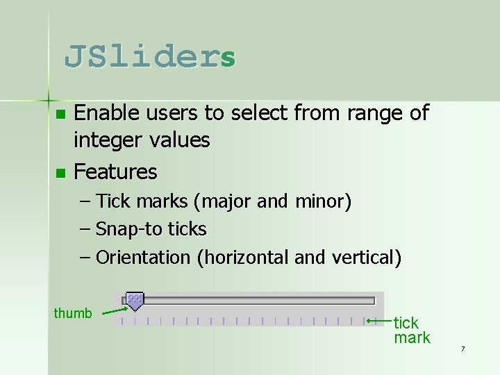
JSliders Enable users to select from range of integer values n Features n – Tick marks (major and minor) – Snap-to ticks – Orientation (horizontal and vertical) thumb tick mark 7

JSliders JPanel subclass for drawing circles, Figure 14. 7 n JSlider used to control size of a circle graphic, Figure 14. 8 n Note n – Slider declaration, implementation – Registration of listener for the slider 8

Using Menus with Frames Allows for performing actions with cluttering GUI n Contained by menu bar – JMenu. Bar n Comprised of menu items – Menu. Item n Note Figure 14. 9 n – Declares menu items – Populates the menus – Specifies actions for menu choices 9

JPopup. Menu n Menus that are context-sensitive – Right click and popup menu appears n In Swing, use JPopup. Menu – Provide options specific to component – Popup trigger event occurs when object right mouse clicked n Demonstration of JPopup. Menu shown in Figure 14. 10 10

Pluggable Look-and-Feel n Recall that Java is designed to run on variety of platforms – GUI components on a Mac, look different from those on a PC or on a UNIX platform n Look-and-Feel capability – Java program on a particular platform looks like other programs on the same platform – Also possible to specify the look-and-feel of a Swing GUI 11

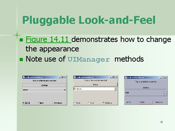
Pluggable Look-and-Feel Figure 14. 11 demonstrates how to change the appearance n Note use of UIManager methods n 12

JDesktop. Pane and JInternal. Frame n Multiple document interface – Main (parent) window – Child windows View Figure 14. 12 which demonstrates this n Note n – Declaration, instantiation of JDesktop. Pane object – Choosing and painting of the icons 13

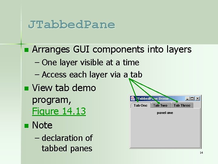
JTabbed. Pane n Arranges GUI components into layers – One layer visible at a time – Access each layer via a tab View tab demo program, Figure 14. 13 n Note n – declaration of tabbed panes 14

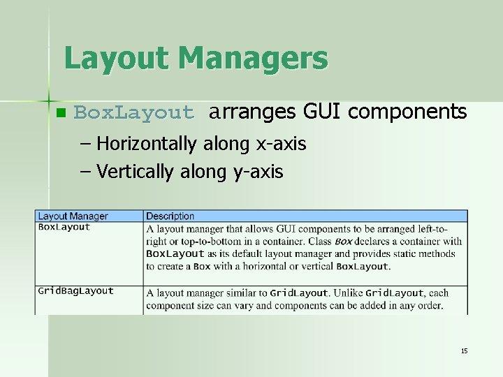
Layout Managers n Box. Layout arranges GUI components – Horizontally along x-axis – Vertically along y-axis 15

Box. Layout n Demonstrated in Figure 14. 15 – Also uses the tabs – Offers several different options for laying out three JButtons n Note – Creation of boxes – Adding of buttons 16

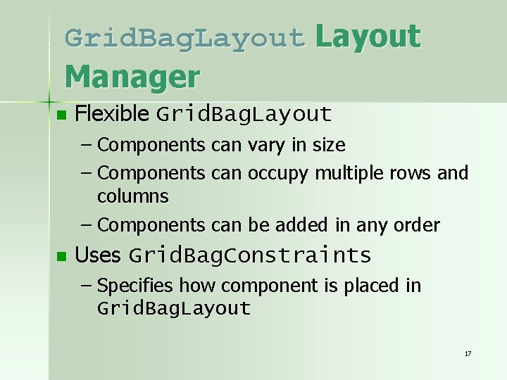
Grid. Bag. Layout Manager n Flexible Grid. Bag. Layout – Components can vary in size – Components can occupy multiple rows and columns – Components can be added in any order n Uses Grid. Bag. Constraints – Specifies how component is placed in Grid. Bag. Layout 17

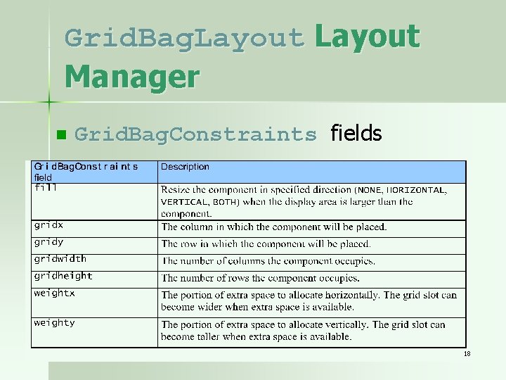
Grid. Bag. Layout Manager n Grid. Bag. Constraints fields 18

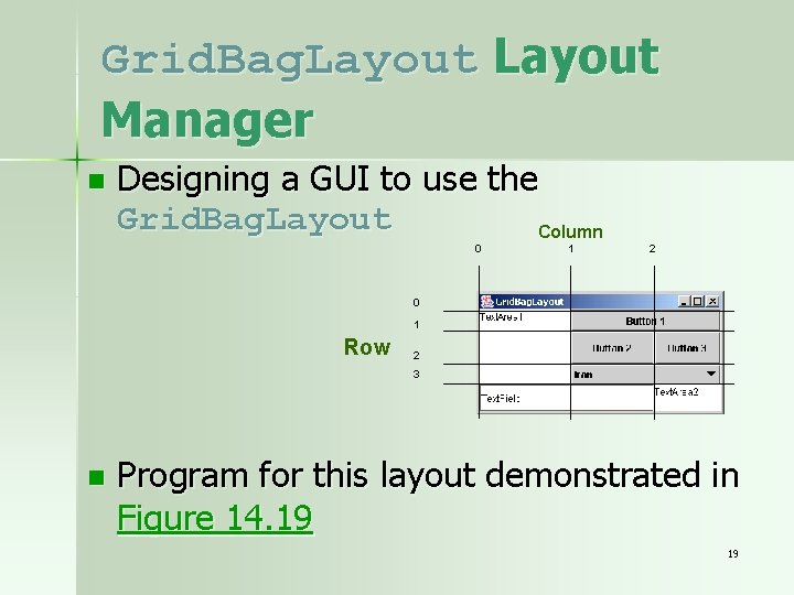
Grid. Bag. Layout Manager n Designing a GUI to use the Grid. Bag. Layout Column 0 1 2 0 1 Row 2 3 n Program for this layout demonstrated in Figure 14. 19 19

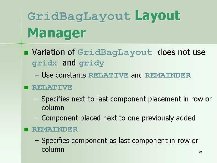
Grid. Bag. Layout Manager n n Variation of Grid. Bag. Layout does not use gridx and gridy – Use constants RELATIVE and REMAINDER RELATIVE – Specifies next-to-last component placement in row or column – Component placed next to one previously added n REMAINDER – Specifies component as last component in row or column 20

Grid. Bag. Layout Manager Use of constraints demonstrated in Figure 14. 20 n Note n – Setting constraint weights – Setting grid width – Adding buttons – The add. Component method 21