Adaptive UI in UWP XAML Andy Wigley Senior








- Slides: 33


Adaptive UI in UWP XAML Andy Wigley Senior Developer Evangelist, Microsoft


Agenda • • How Windows makes adaptive UI easier What am I designing? Techniques to adapt Adaptive Tooling – Visual State Triggers – Relative Panel

How Windows makes adaptive UI easier

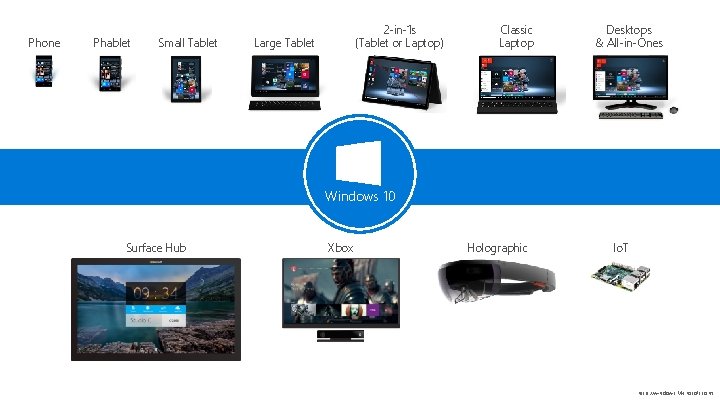
Phone Phablet Small Tablet 2 -in-1 s (Tablet or Laptop) Large Tablet Classic Laptop Desktops & All-in-Ones Windows 10 Surface Hub Xbox Holographic Io. T http: //windows. Microsoft. com

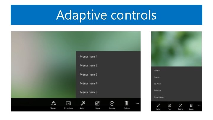
Adaptive controls

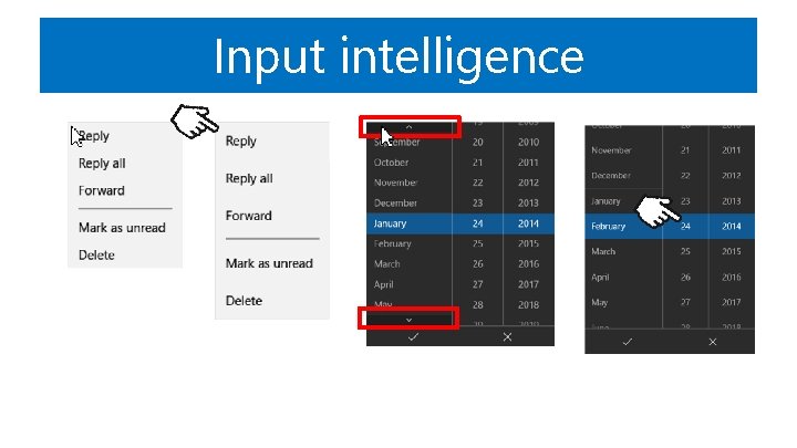
Input intelligence

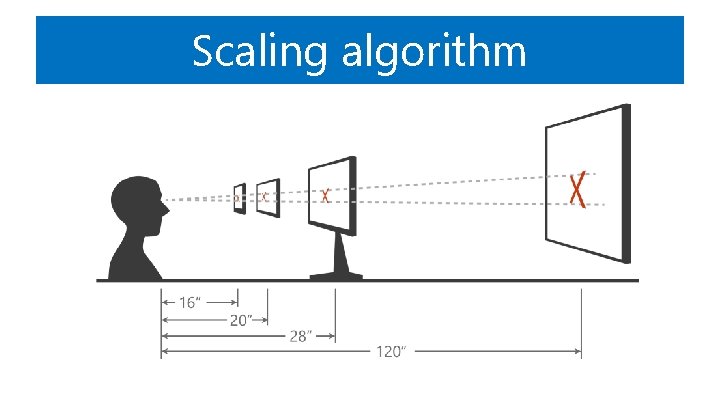
Scaling algorithm

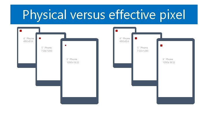
Physical versus effective pixel 4” Phone 480 x 854 5” Phone 720 x 1280 6” Phone 1080 x 1920

Ignore scale, resolution, & dpi. Design in Effective Pixels

What am I designing?

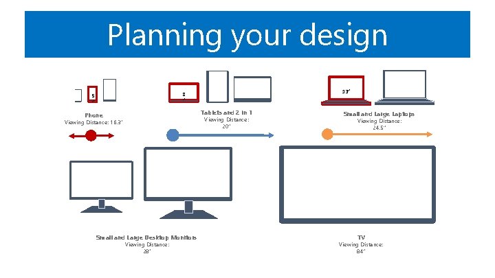
Planning your design 13” 8 ” 5 ” Tablets and 2 in 1 Phone Viewing Distance: 20” Viewing Distance: 16. 3” Small and Large Desktop Monitors Viewing Distance: 28” Small and Large Laptops Viewing Distance: 24. 5” TV Viewing Distance: 84”

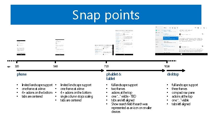
Snap points epx 320 548 720 phone • • limited landscape support one frame at a time 4+ actions on the bottom tabs are centered 1024 phablet & tablet • • • limited landscape support one frame at a time 4+ actions on the bottom single column stops scaling tabs are centered • • • full landscape support two frames actions at the top one “…” visible - TBD tabs are left aligned Show search field if search was represented as an icon on smaller devices desktop • • • full landscape support three frames compact nav pane actions at the top one “…” visible tabs left aligned

The weather app DEMO

Adaptive techniques

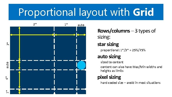
Proportional layout with Grid 7* 2* 1* auto Rows/columns – 3 types of sizing: star sizing proportional: 1*/3* = 25%/75% 4* auto sizing sized to content can also have Max/Min widths and heights as limits pixel sizing 1* hard-coded size – avoid in most situations

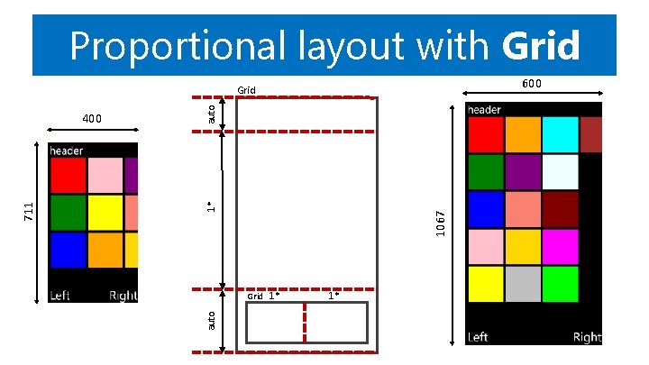
Proportional layout with Grid 600 1067 1* Grid 1* auto 711 400 auto Grid 1*

Visual States • Define differing XAML layouts – Unique layout for distinct states • Simplify animation – Automatically implement state transitions • Build in Blend – Design and preview states and transitions

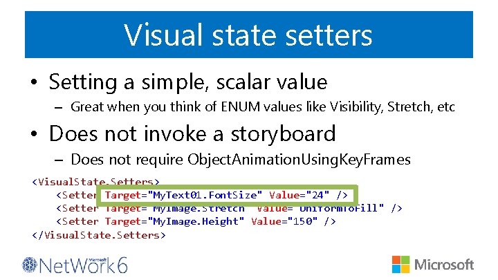
Visual state setters • Setting a simple, scalar value – Great when you think of ENUM values like Visibility, Stretch, etc • Does not invoke a storyboard – Does not require Object. Animation. Using. Key. Frames <Visual. State. Setters> <Setter Target="My. Text 01. Font. Size" Value="24" /> <Setter Target="My. Image. Stretch" Value="Uniform. To. Fill" /> <Setter Target="My. Image. Height" Value="150" /> </Visual. State. Setters>

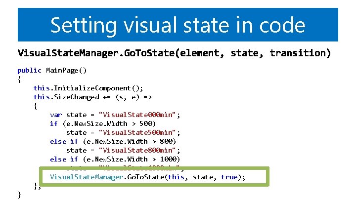
Setting visual state in code public Main. Page() { this. Initialize. Component(); this. Size. Changed += (s, e) => { var state = "Visual. State 000 min"; if (e. New. Size. Width > 500) state = "Visual. State 500 min"; else if (e. New. Size. Width > 800) state = "Visual. State 800 min"; else if (e. New. Size. Width > 1000) state = "Visual. State 1000 min"; Visual. State. Manager. Go. To. State(this, state, true); }; }

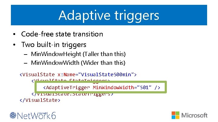
Adaptive triggers • Code-free state transition • Two built-in triggers – Min. Window. Height (Taller than this) – Min. Window. Width (Wider than this) <Visual. State x: Name="Visual. State 500 min"> <Visual. State. Triggers> <Adaptive. Trigger Min. Window. Width="501" /> </Visual. State. Triggers> </Visual. State>


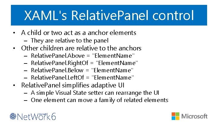
XAML's Relative. Panel control • A child or two act as a anchor elements – They are relative to the panel • Other children are relative to the anchors – – Relative. Panel. Above = "Element. Name" Relative. Panel. Right. Of = "Element. Name" Relative. Panel. Below = "Element. Name" Relative. Panel. Left. Of = "Element. Name" • Relative. Panel simplifies adaptive UI – A simple Visual State setter can rearrange the UI – One element can move a family of related elements

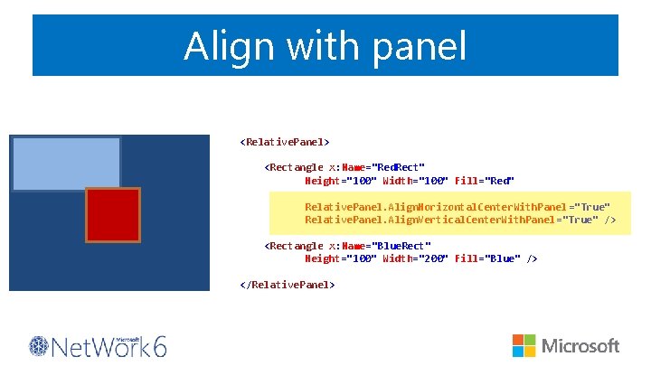
Align with panel <Relative. Panel> <Rectangle x: Name="Red. Rect" Height="100" Width="100" Fill="Red" Relative. Panel. Align. Horizontal. Center. With. Panel ="True" Relative. Panel. Align. Vertical. Center. With. Panel ="True" /> <Rectangle x: Name="Blue. Rect" Height="100" Width="200" Fill="Blue" /> </Relative. Panel>

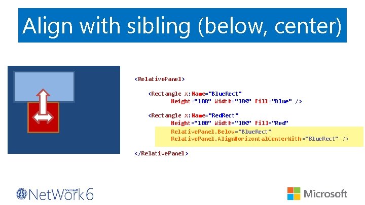
Align with sibling (below, center) <Relative. Panel> <Rectangle x: Name="Blue. Rect" Height="100" Width="100" Fill="Blue" /> <Rectangle x: Name="Red. Rect" Height="100" Width="100" Fill="Red" Relative. Panel. Below="Blue. Rect" Relative. Panel. Align. Horizontal. Center. With ="Blue. Rect" /> </Relative. Panel>


XAML Views • XAML page that ‘inherits’ the code-behind of a parent page • Used – rarely! – to provide per-device customisations


Developers have many tools to build an adaptive UI

Ne zaboravite ispuniti upitnike. Čekaju vas vrijedne nagrade!
