Professional Power Point Presentations Dos and Donts Text
- Slides: 10

Professional Power. Point Presentations Do’s and Don’ts

Text l DO l l l Keep slides concise Font size should range between 18 to 48 l According to importance Use fonts that are easy to read l Arial, Helvetica, Times New Roman, etc. . l DON'T l l l Don’t include too many details and data l No more than 7 words to a line and 7 lines to a slide Don’t crowd the information Don’t use flashy or curvy fonts

Text l DO l l l Use uppercase letters for the first letter Use statements, not sentences l Convert paragraphs to sentences, sentences into phrases, phrases into keywords Use keywords to help the audience focus on your message l DON'T l l Don’t use all uppercase letters l Difficult to read and will appear as yelling Don’t use abbreviations or acronyms l l People don’t always know what you’re talking about Don’t use punctuation marks for bulleted items

Noise Effects l DO l l Use sound to help convey, complement, or enhance the message Sound should have a purpose l DON'T l l Don’t use sounds when they aren’t appropriate Sounds can be distracting l Make your presentation less effective

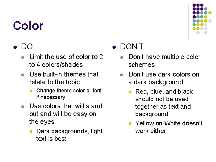
Color l DO l l Limit the use of color to 2 to 4 colors/shades Use built-in themes that relate to the topic l l l Change theme color or font if necessary Use colors that will stand out and will be easy on the eyes l Dark backgrounds, light text is best DON'T l l Don’t have multiple color schemes Don’t use dark colors on a dark background l Red, blue, and black should not be used together as text and background l Yellow on White doesn’t work either

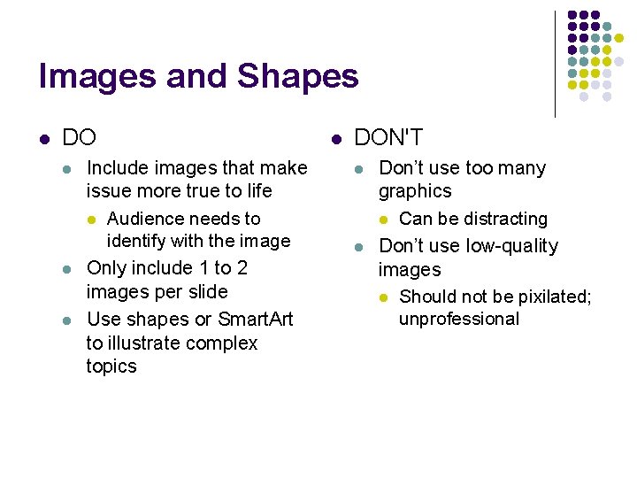
Images and Shapes l DO l l l Include images that make issue more true to life l Audience needs to identify with the image Only include 1 to 2 images per slide Use shapes or Smart. Art to illustrate complex topics l DON'T l l Don’t use too many graphics l Can be distracting Don’t use low-quality images l Should not be pixilated; unprofessional

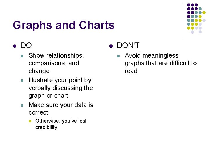
Graphs and Charts l DO l l Show relationships, comparisons, and change Illustrate your point by verbally discussing the graph or chart Make sure your data is correct l Otherwise, you’ve lost credibility DON'T l Avoid meaningless graphs that are difficult to read

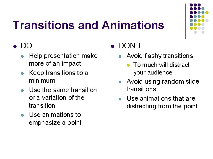
Transitions and Animations l DO l l Help presentation make more of an impact Keep transitions to a minimum Use the same transition or a variation of the transition Use animations to emphasize a point l DON'T l l l Avoid flashy transitions l To much will distract your audience Avoid using random slide transitions Use animations that are distracting from the point

Practice Your Presentation l DO l l View your presentation ahead of time l Is it easy to read the text? l Is the amount of information on each slide kept to a minimum? l Are there any distracting elements? Ask others for feedback l DON'T l l l Don’t read material directly from the screen l Use slides as prompts or conversation points, not cue cards Don’t use words you can’t pronounce Don’t leave all the lights on l Be sure people can actually see the screen

6 Ways to ruin your Power. Point 1. 2. 3. 4. 5. 6. Too much text Too much “art” Too flashy Spellign/gramer errers and FUN punctuation!!!!!!! Comic Sans Can’t read it