Graphic Communication National Colour Theory Graphic Communication National

- Slides: 12

Graphic Communication National Colour Theory

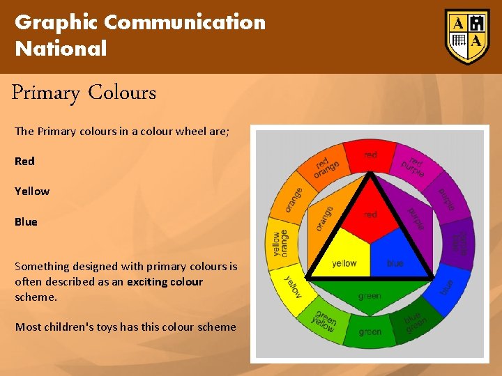
Graphic Communication National Primary Colours The Primary colours in a colour wheel are; Red Yellow Blue Something designed with primary colours is often described as an exciting colour scheme. Most children's toys has this colour scheme

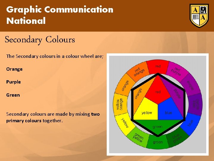
Graphic Communication National Secondary Colours The Secondary colours in a colour wheel are; Orange Purple Green Secondary colours are made by mixing two primary colours together.

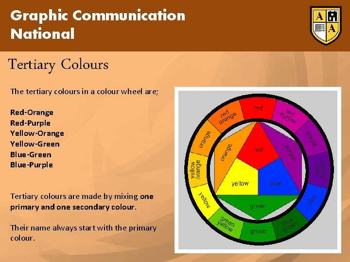
Graphic Communication National Tertiary Colours The tertiary colours in a colour wheel are; Red-Orange Red-Purple Yellow-Orange Yellow-Green Blue-Purple Tertiary colours are made by mixing one primary and one secondary colour. Their name always start with the primary colour.

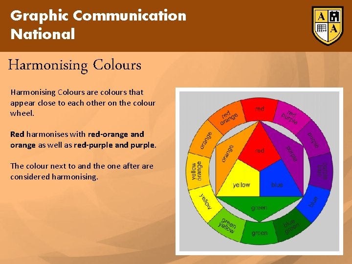
Graphic Communication National Harmonising Colours are colours that appear close to each other on the colour wheel. Red harmonises with red-orange and orange as well as red-purple and purple. The colour next to and the one after are considered harmonising.

Graphic Communication National Contrasting Colours are colours that appear on the opposite side of the colour wheel. Blue contrasts with orange, Red contrasts with green and yellow contrasts with purple. Colours opposite contrast.

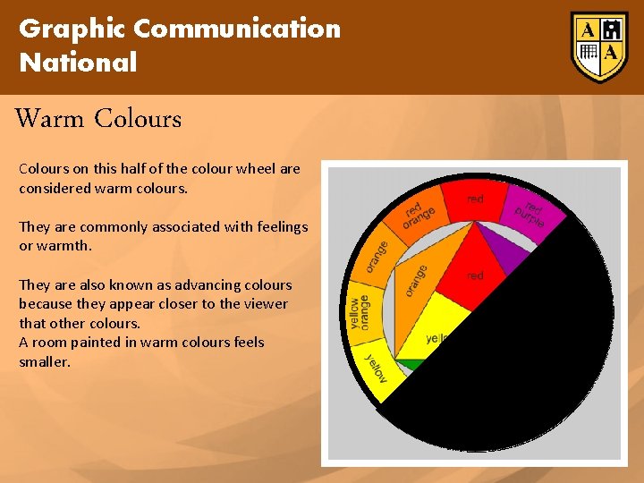
Graphic Communication National Warm Colours on this half of the colour wheel are considered warm colours. They are commonly associated with feelings or warmth. They are also known as advancing colours because they appear closer to the viewer that other colours. A room painted in warm colours feels smaller.

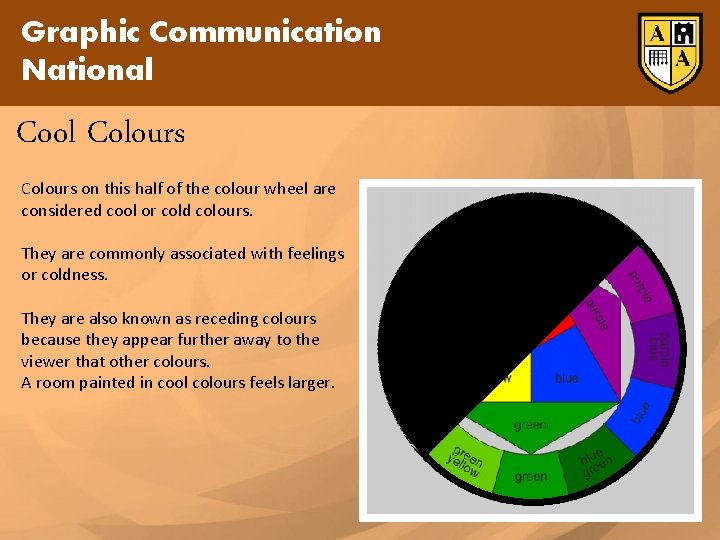
Graphic Communication National Cool Colours on this half of the colour wheel are considered cool or cold colours. They are commonly associated with feelings or coldness. They are also known as receding colours because they appear further away to the viewer that other colours. A room painted in cool colours feels larger.

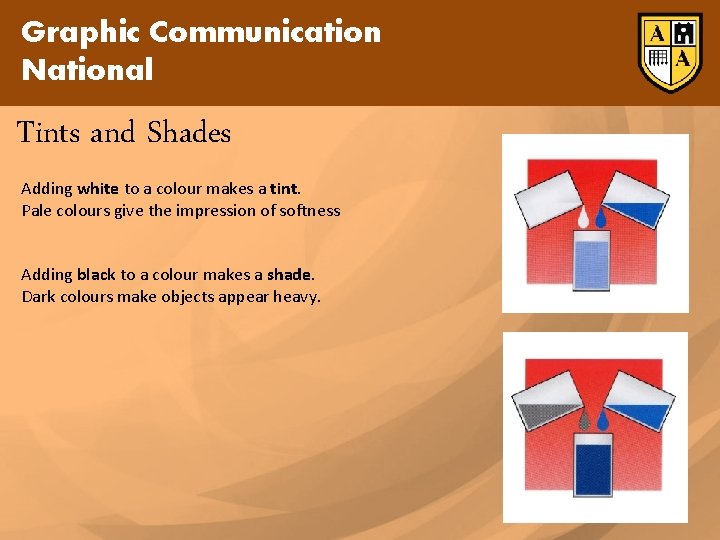
Graphic Communication National Tints and Shades Adding white to a colour makes a tint. Pale colours give the impression of softness Adding black to a colour makes a shade. Dark colours make objects appear heavy.

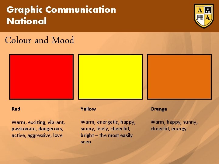
Graphic Communication National Colour and Mood Red Yellow Orange Warm, exciting, vibrant, passionate, dangerous, active, aggressive, love Warm, energetic, happy, sunny, lively, cheerful, bright – the most easily seen Warm, happy, sunny, cheerful, energy

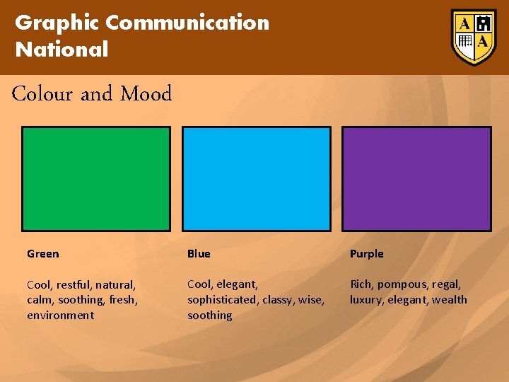
Graphic Communication National Colour and Mood Green Blue Purple Cool, restful, natural, calm, soothing, fresh, environment Cool, elegant, sophisticated, classy, wise, soothing Rich, pompous, regal, luxury, elegant, wealth

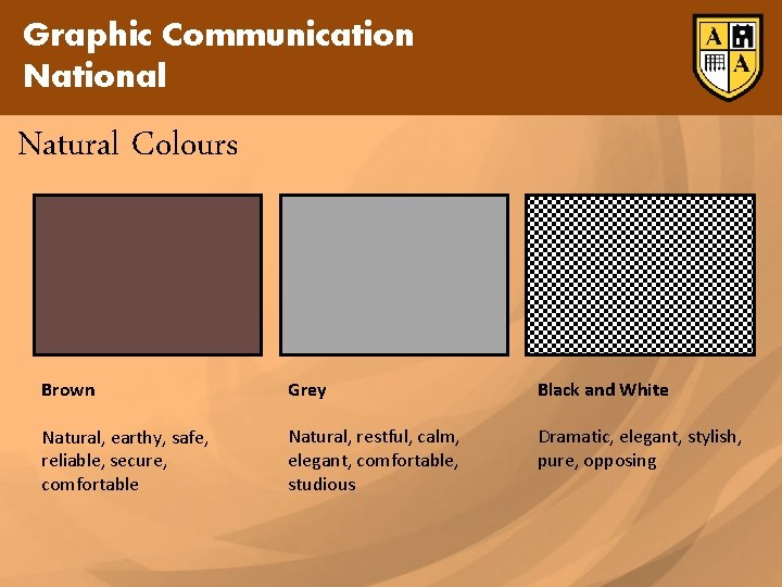
Graphic Communication National Natural Colours Brown Grey Black and White Natural, earthy, safe, reliable, secure, comfortable Natural, restful, calm, elegant, comfortable, studious Dramatic, elegant, stylish, pure, opposing