COLOUR Colour What is Colour Try to answer

 - Color is the element")


 'The Bridge at Maincy', 1879 (oil on canvas) Green •")


 'Shoes', 1888 (oil on canvas) • Brown is")


 'Suprematist Composition: White on White ', 1918 (oil on")

 • How")


 'The Tragedy', 1903 (oil on canvas) •")


- Slides: 39
COLOUR Colour
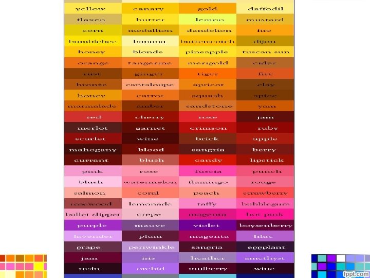
What is Colour? • Try to answer… • (noun) - Color is the element of art that is produced when light, striking an object, is reflected back to the eye. • There are three (3) properties to color. First is hue, which simply means the name we give to a color (red, yellow, blue, etc. ). • The second property is intensity, which refers to the strength and vividness of the color. For example, we may describe the color blue as "royal" (bright, rich, vibrant) or "dull" (grayed). • The third and final property of color is its value, meaning its lightness or darkness. The terms shade and tint are in reference to value changes in colors.
What is colour? • Colour is light. • Sir Isaac Newton was one of the first scientists to investigate color theory. Around 1671 -72 he discovered the origin of color when he shone a beam of light through an angular prism and split it into the spectrum - the various colors of the rainbow. This simple experiment demonstrates that color comes from light - in fact, that color is light. Scientists investigate the properties of color theory whereas artists explore its visual effects.
Seeing Colour • https: //www. youtube. com/watc h? v=l 8_f. ZPHasdo • By the way: Remember stereopsis? Seeing in 3 -D from our two eyeballs (approx. 60 mm apart)
• But visible light is part of a larger spectrum of electromagnetic radiation
Colour Theory • A knowledge of Color Terms helps us to understand how color is used in art and design. It gives us the vocabulary to help express ideas and emotions about an artwork or design.
Additive and Subtractive Colour • Additive Color involves the mixing of colored light. The colors on a television screen are a good example of this. Additive primary colors are red, green and blue. • Subtractive Color involves the mixing of colored paints, pigments, inks and dyes. The traditional subtractive primary colors are red, yellow and blue.
• “A painter should begin every canvas with a wash of black, because all things in nature are dark except where exposed by the light. ” Leonardo da Vinci
The Spectrum • The spectrum is the colors of the rainbow arranged in their natural order: Red - Orange - Yellow Green - Blue - Indigo - Violet. The mnemonic for this is ROY G BIV.
Hues • A hue is one of the colors of the spectrum. Hues have a circular order as illustrated in the color wheel above. The color wheel is a useful device to help us explain the relationships between Primary, Secondary and Tertiary colors.
Primary Colours • Red, Yellow and Blue are the primary colors. These are three basic colors that are used to mix all hues.
Secondary Colours • Orange, Green and Purple are the secondary colors. They are achieved by mixing two primary colors together.
Tertiary Colours • Tertiary colors are more subtle hues which are achieved by mixing a primary and a secondary color that are adjacent on the color wheel.
Analogous Colours • Analogous colors sit next to one another on the color wheel. These colors are in harmony with one another.
• Opposite and Complementary Colours Opposite colors are diagonally opposite one another on the color wheel. Opposite colors create the maximum contrast with one another. You can work out the opposite color to any primary color by taking the other two primaries and mixing them together. The result will be its opposite or ‘complementary’ color.
Video Break!!! • “We don't make mistakes, just happy little accidents. ” • Bob Ross video – https: //www. youtube. c om/watch? v=kas. GRkf ki. PM – https: //www. youtube. c om/watch? v=YLO 7 t. Cd BVr. A
Colour as Symbol • Examples of colours meaning something? • Colours representing something?
Colour as Symbol • Color has always been recognized for its symbolic power • An appreciation of this reaches back to ancient times. • However, the understanding and interpretation of color symbolism has changed over time and varies from culture to country.
Clarifying with Video Content • Colours and Symbols – https: //www. youtube. com/watch? v=qx 37 x. Ecd COo • What do Colors Mean? – https: //www. youtube. com/watch? v=K 2 K 8 p. PW a. GSU&t=59 s
• Red through its association with fire and blood is used to represent danger, anger and violence. For the same reason it is also associated with affairs of the heart: love and passion. • In Paul Gauguin's 'Vision after the Sermon', Jacob wrestles with the angel in a blood red field of spiritual battle, an apt metaphor for his internal struggle against the will of God. Red PAUL GAUGUIN (1848 -1903) 'Vision After The Sermon', 1888 (oil on canvas
• Orange symbolizes creativity, change, energy and endurance. It is the color that represents Autumn. As a secondary color it combines elements of the colors used to mix it: the creative passion of red with the energy and joy of yellow. • Mark Rothko, the American abstract expressionist artist, encouraged viewers to stand close to his large paintings so that they became spiritually immersed in the experience of color. 'Orange and Yellow' is the door to an inferno of color with a radiant energy that invites the spectator to open their emotions to "a spiritual kinship with primitive and archaic art". Orange MARK ROTHKO (1903 -1970) 'Orange and Yellow', 1956 (oil on canvas)
• Yellow is the color of the sun - the life support for our planet. As such it has come to represent life, energy, happiness, hope and wisdom. • Vincent Van Gogh's 'Sunflowers' is painted almost entirely with yellow and without any shadows. It expresses the radiance of sunshine rather than giving us a detailed description of what the flowers look like. Van Gogh also uses yellow as the symbol of hope and friendship as the 'Sunflower' series was painted to welcome his friend Paul Gauguin to the Yellow House in Arles. Van Gogh painted two series of 'Sunflowers' between August 1888 and January 1889. This example is from the Van Gogh Museum in Amsterdam and is a copy of an earlier version which is in the National Gallery in London. VINCENT VAN GOGH (1853 -1890) Yellow 'Sunflowers', 1889 (oil on canvas)
PAUL CÉZANNE (1839 -1906) 'The Bridge at Maincy', 1879 (oil on canvas) Green • Green, as the color of plants and grass, is the color of nature and all that is associated with health and growth. However, it is also used to represent more negative traits such as envy and inexperience. • Cézannes painting of 'The Bridge at Maincy' is a formal composition of horizontal, vertical and diagonal lines whose rigor is somewhat relieved by the curves of the bridge. What turns this steadfast structure into a woodland sanctuary is the myriad of greens which bathe scene in a magical emerald light. Paul Cézanne called his paintings, 'constructions after nature''. He saw painting in abstract terms as the construction and arrangement of color on a twodimensional surface. The composition was simply a vehicle to assist with the realization of this surface structure of pattern and color.
• Blue is the coolest and most calming of all the colors. As the color of the sky, it has been used since ancient times to represent heaven. In classical mythology, blue was the color associated with the gods, Venus and Jupiter. In Christianity, it becomes the symbol of the Virgin Mary as Queen of Heaven. As the color of the ocean, it is also suggests qualities like freshness, purity and hygiene. • The calmness of blue is seldom more visible than in this 'nocturne' of the River Thames by Whistler. The view is at twilight from Battersea looking across to Chelsea. The style is strongly influence by the Japanese art of 'ukiyo-e' which translates as 'pictures of the floating world'. Blue JAMES MCNEIL WHISTLER (1834 -1903) 'Nocturne, Blue and Silver: Chelsea', 1871 (oil on wood)
• Purple is the color of royalty, wealth and power. In times past, purple dyes were rare and expensive. Only the rich and powerful could afford to wear clothes of this luxurious color. • Catherine II, known as Catherine the Great, supported the development of the arts, literature and education in Russia. Her personal art collection became the foundation of the Hermitage Museum in St. Petersburg. She is portrayed here wearing a gown of the finest purple silk draped with ermine robes, clothes worthy of her noble status. Purple FYODOR ROKOTOV (1736 -1808) Catherine the Great (1780)
Brown VINCENT VAN GOGH (1853 -1890) 'Shoes', 1888 (oil on canvas) • Brown is the color of earth, wood and stone. As such, it evokes craftsmanship and the great outdoors. It is also used to represent humility: a down to earth virtue. • Although this painting is from Vincent Van Gogh's later body of work which is noted for the brilliance of its color, he reverts to the darker palette of his earlier work to reflect the humility of the subject matter. These are the tired old shoes of a humble peasant. Van Gogh paints this image in rugged earthy browns to suggest the hardship of their owner's life and to pay respect to the dignity of manual labour.
• Black and its association with darkness is used to represent death, evil, witchcraft, fear and mourning. • 'The Widow' by Käthe Kollwitz is one of a series of prints from a portfolio called Kreig (War) which deals with the wretched human tragedy of World War 1. This is a desolate image of a grief stricken wife who is embracing the memory of her departed husband. Black is the only appropriate color for such a sad and distressing subject. KÄTHE KOLLWITZ (1867 -1945) 'The Widow', 1922 -23 (woodcut) Black
Grey is the natural color of some metals and stone, but it also has some negative associations with the weather, boredom, decay and old age. Grey is a mixture of black (death) and white (peace) and is the color of ashes and dust. As such it is also associated with death and mourning. • • 'Goat Skull, Bottle and Candle' by Pablo Picasso is a modern 'Vanitas' still life - a traditional genre that addresses the idea of our mortality. Vanitas still lifes depicted objects that had a symbolic meaning: a skull as a symbol of death or a candle as the transient flame of life. Picasso often painted in monochrome to heighten the emotional tone of his work. He is noted for his blue and rose periods as well as the unifying brown tones of analytical cubism. However, he seems to reserve painting in grey tones (grisaille) for his images of death and oppression: 'Guernica' (1937), 'The Charnel House' (c. 1944 -48), the Goya inspired 'Massacre in Korea' (1951) and 'Goat Skull, Bottle and Candle' (1952) which is, in essence, an elegy for Nikos Beloyannis. Grey PABLO PICASSO (1881 -1973) 'Goat Skull, Bottle and Candle', 1952 (oil on canvas)
White KAZIMIR MALEVICH (1887 -1935) 'Suprematist Composition: White on White ', 1918 (oil on canvas) • White and its association with light is used to represent peace, purity and goodness. • In 1915, the Russian artist Kazimir Malevich developed a geometric style of abstract art which he called Suprematism. He believed that pure abstract form had a spiritual power with an ability to open the mind to ‘the supremacy of pure feeling’ and there was no purer color for that purpose than white.
Colour as Emotion
Colour Emotion • How Does Color Affect How You Feel? (About. com) • How filmmakers manipulate our emotions using color – https: //www. youtub e. com/watch? v=0 Z Zgi. SUy. PDY (Start at 11 sec. )
Colour as Emotion • A knowledge of color theory helps us to express our feelings in an artwork. The language of color has even entered our vocabulary to help us describe our emotions. You can be ‘red’ with rage or ‘green’ with envy. We often speak of bright cheerful colors as well as sad or dull ones. A ‘grey’ day may be depressing and result in a feeling of the ‘blues’. • The following are a few examples …
• The paintings of Vincent Van Gogh show an instinctive understanding of the emotive properties of color. In this version of 'Sunflowers' from the National Gallery in London, he uses warm yellows to create an energetic image that radiates feelings of hope and joy. On the gallery wall this painting is surrounded by a thick dark brown frame and glows like a backlit image from within. Hope and Joy VINCENT VAN GOGH (1853 -1890) 'Sunflowers', 1888 (oil on canvas)
Sadness and Despair PABLO PICASSO (1881 -1873) 'The Tragedy', 1903 (oil on canvas) • Another effective use of emotive color is found in the paintings of Pablo Picasso. Between 1901 and 1904, Picasso painted in monochrome tones of blue which reflected his low psychological state. This was triggered by the death of his friend, the Spanish painter Carlos Casagemas, who shot himself because of his unrequited love for the artists' model Germaine Pichot. This chapter of his work became known as his 'blue period'. In 'The Tragedy' (1903) he uses cool blues to evoke the chill of sadness and despair in a typically gloomy subject from this period.
• André Derain uses the clash between contrasting warm and cool colors to express the noise and activity of this busy dockyard. He creates the illusion of depth in the painting by using warmer colors in the foreground which gradually become cooler towards the background. This organized arrangement of colors in a landscape is called Aerial Perspective. • The function of color in their painting was not to describe their subject matter, but to express the artist's feelings about it. Noise and Activity ANDRÉ DERAIN (1880 -1954) 'The Pool of London', 1906 (oil on canvas)
• Jim Dine is an artist who uses common objects and shapes as templates, in and around which he can explore and develop his ideas about drawing and painting. Although his personal iconography is associated with the Pop Art movement, he is a difficult artist to categorize. His images transcend any narrow description as they retain elements of figuration, Abstraction, Dada and Expressionism. • In 'The Circus #3', he applies vibrant primary colors with expressive brushstrokes in a color chart of emotion both inside and around the symbolic arena of the heart, evoking the excitement of the crowd, the energy of the performers and the fun of the show. Fun and Excitement JIM DINE (b. 1935) 'The Circus #3', 2007 (acrylic and charcoal on canvas)
• This work generates the radiant energy of color as the subject matter of the picture. The artist uses a simple perspective grid with a graduated blend of transparent colors ranging across the spectrum to create an abstract image of refracted color. Radiant Energy JOHN MACTAGGART (b. 1952) 'Rainbox', 2005 (Giclée print)