Bootstrap TextTypography h 1h 6 Bootstrap 14 px
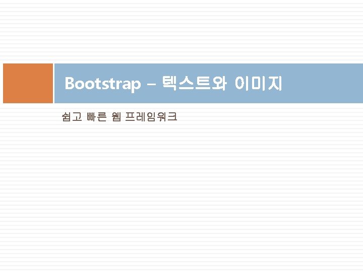

Bootstrap Text/Typography <h 1>~<h 6> Bootstrap의 기본 글자 크기는 14 px <div class="container"> <h 1>h 1 Bootstrap heading <h 2>h 2 Bootstrap heading <h 3>h 3 Bootstrap heading <h 4>h 4 Bootstrap heading <h 5>h 5 Bootstrap heading <h 6>h 6 Bootstrap heading </div> (36 px)</h 1> (30 px)</h 2> (24 px)</h 3> (18 px)</h 4> (14 px)</h 5> (12 px)</h 6>

Bootstrap Text/Typography <small> <div class="container"> <h 1>Lighter, Secondary Text</h 1> <p> small 태그는 좀 더 밝게 표시 </p> <h 1>h 1 heading <small>secondary text</small></h 1> <h 2>h 2 heading <small>secondary text</small></h 2> <h 3>h 3 heading <small>secondary text</small></h 3> <h 4>h 4 heading <small>secondary text</small></h 4> <h 5>h 5 heading <small>secondary text</small></h 5> <h 6>h 6 heading <small>secondary text</small></h 6> </div>

Bootstrap Text/Typography <mark> <div class="container"> <h 1>Highlight Text</h 1> <p> mark 태그 <mark>highlight</mark> 사용 </p> </div>

Bootstrap Text/Typography <abbr> <div class="container"> <h 1>약어</h 1> <p> abbr 태그는 약어표시 설명에 사용 </p> <p>The <abbr title="World Health Organiz ation">WHO</abbr> was founded in 1948. </p> </div>

Bootstrap Text/Typography <kbd> <div class="container"> <h 1>Keyboard Inputs</h 1> <p> kbd 태그는 키보드 입력 표시에 사용 </p> <p>Use <kbd>ctrl + p</kbd> to open the Print dialog box. </p> </div>

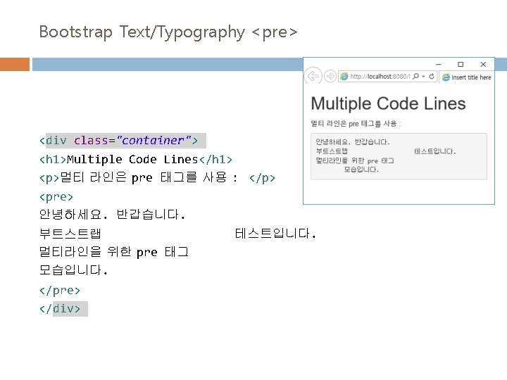
Bootstrap Text/Typography <code> <div class="container"> <h 1>Code Snippets</h 1> <p>다음 HTML 태그: <code>span</code>, <code>section</code>, and <code>div</code> 는 문서의 섹션을 정의한다. </p> </div>
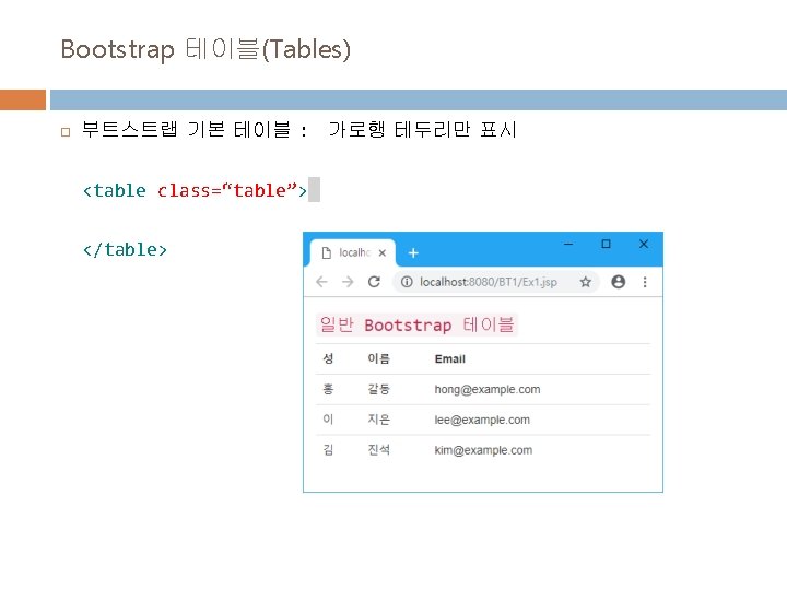
 일반 테이블")
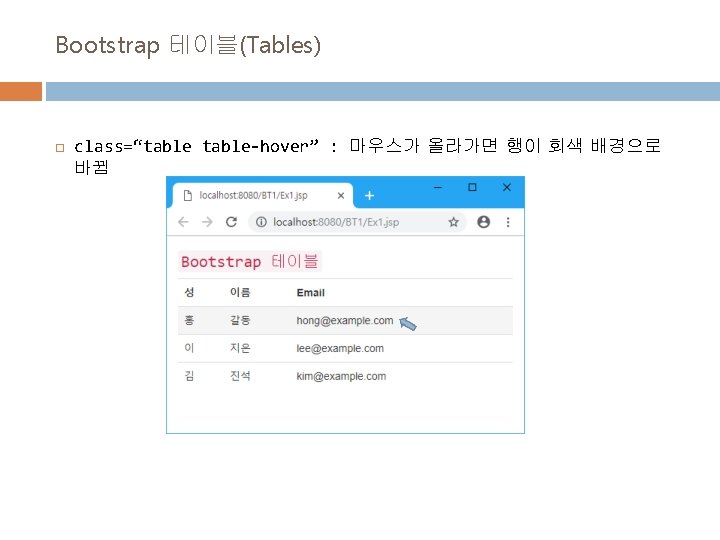
Bootstrap 테이블(Tables) 일반 테이블
 class=“table-bordered” : 둥근 코너와 바깥쪽 테두리 추가")
Bootstrap 테이블(Tables) class=“table-bordered” : 둥근 코너와 바깥쪽 테두리 추가
 class=“table-striped” : 홀수행에 밝은 회색 배경 추가")
Bootstrap 테이블(Tables) class=“table-striped” : 홀수행에 밝은 회색 배경 추가
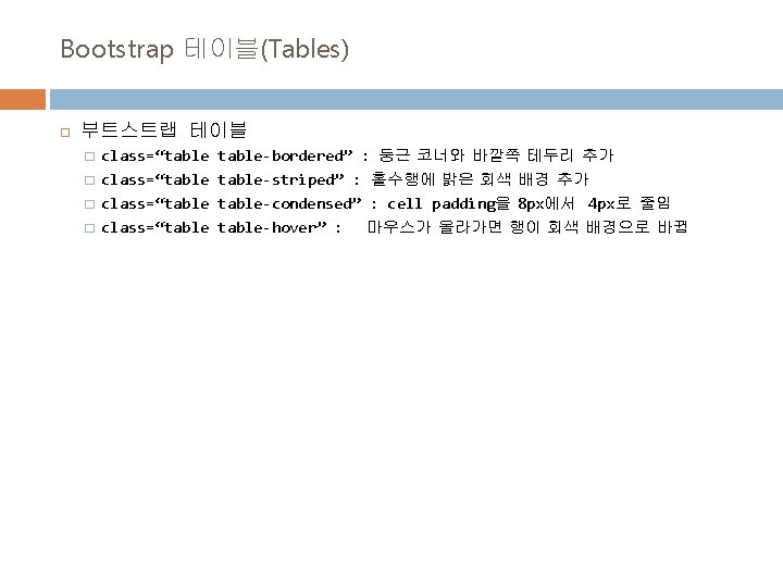
 class=“table-condensed” : cell padding을 8 px에서 4 px로 줄임")
Bootstrap 테이블(Tables) class=“table-condensed” : cell padding을 8 px에서 4 px로 줄임
 반응형 테이블 작성 �<div class=“table-responsive”>안에 테이블 작성 : small device(768 px 이하)일")
Bootstrap 테이블(Tables) 반응형 테이블 작성 �<div class=“table-responsive”>안에 테이블 작성 : small device(768 px 이하)일 경우 수평 스크롤바 자동 생성 <div class="table-responsive"> <table class="table"> </table> </div>
 Bootstrap Image Shapes")
Bootstrap 이미지(Image) Bootstrap Image Shapes
 Bootstrap Image Shapes <img src=\"cinqueterre. jpg\" class=\"img-rounded\"> <img src=\"cinqueterre. jpg\" class=\"img-circle\"> <img")
Bootstrap 이미지(Image) Bootstrap Image Shapes <img src="cinqueterre. jpg" class="img-rounded"> <img src="cinqueterre. jpg" class="img-circle"> <img src="cinqueterre. jpg" class="img-thumbnail">
 Responsive Image Shapes : 반응형 이미지는 스크린 사이즈에 맞게 자동으로 크기가 조절된다.")
Bootstrap 이미지(Image) Responsive Image Shapes : 반응형 이미지는 스크린 사이즈에 맞게 자동으로 크기가 조절된다. max size는 원본 사이즈임. <img src="cinqueterre. jpg" class="img-responsive">
 Bootstrap Image Shapes <div class=\"thumbnail\"> <img src=\"cinqueterre. jpg\" style=\"width: 100%\"> <div")
Bootstrap 이미지(Image 갤러리) Bootstrap Image Shapes <div class="thumbnail"> <img src="cinqueterre. jpg" style="width: 100%"> <div class="caption"> <p>이미지 갤러리</p> </div>
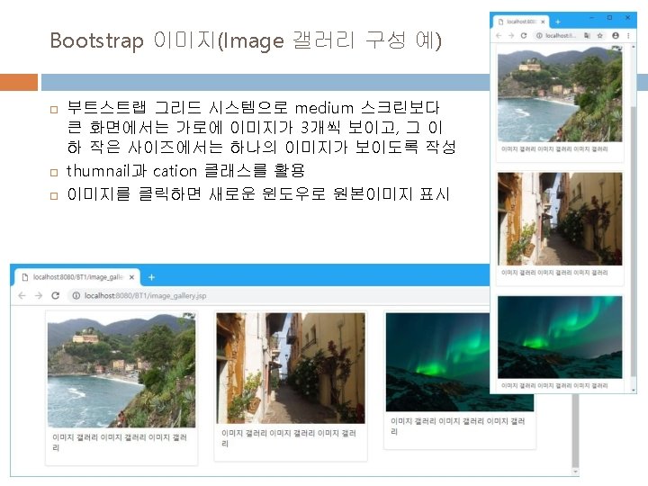

Image 갤러리 Grid 구성 예 <div class="container"> <h 2>Image Gallery</h 2> <div class="row"> <div class="col-md-4 col-sm-6" style="background-color: lavender; "> 이미지1 </div> <div class="col-md-4 col-sm-6" style="background-color: lavenderblush; "> 이미지2 </div> <div class="col-md-4 col-sm-6" style="background-color: lavender; "> 이미지3 </div>
- Slides: 23