Data Analysis Choosing the Appropriate Graph Essential Question


- Slides: 17
Data Analysis Choosing the Appropriate Graph
Essential Question • Can you pick the correct graph to use when given certain information?
Choosing Appropriate Graphs • Pictograph – Visual display of data “Eye Catching” ***Key Features: Must use a symbol to represent data items
Choosing Appropriate Graphs… • Bar Graph - categorical data “categories” and comparing Type of Fish Swimming Speed Carp 6 Cod 8 Mackerel 11 Pike 6 A Legend tells you what each bar represent.
Choosing Appropriate Graphs… • Line Graph – change over a period of time
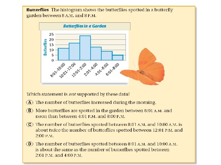
Choosing Appropriate Graphs… • Histogram – a special type of bar graph that displays intervals or ranges Key Features: Ranges and Bars connect
Choosing Appropriate Graphs… Box plot – shows measures of variation of data and quartiles. The box tells you that about half of the people own 2 to 4 pairs of sunglasses
Choosing Appropriate Graphs… Circle Graph – displays percents or fractional parts
Choosing Appropriate Graphs… • Stem-and-leaf Plot – lists numerical data in order from least to greatest ex) Ordered Plot • Line Plot – shows data above number line displayed with “X’s” (outliers and mode easily identified)
What type of graph? 1. A car dealership sells seven makes of cars. Which data display(s) could be used to compare sales for each make of car last year? 2. 3. 4. The ages of 16 school teachers are: 48, 52, 46, 58, 25, 48, 55, 51, 58, 49, 60, 53, 30, 27, 42, 49 Postage Stamp Rate Year U. S. Letter Rate (cents per oz. ) 1992 1994 1996 1998 2000 2002 2004 29 29 32 32 34 37 40
5. Would you use a bar graph or a stem-and-leaf plot to display the ages of 30 people buying a movie ticket? Explain. 6. Select an appropriate display to compare the percent of ethanol production by state. Justify your reasoning. Ethanol Production by State per year State Iowa Nebraska Illinois Minnesota Indiana Other Gallons (millions) 3534 1665 1135 1102 5098 1074 7. Recreation football sign-ups are complete. The following number of boys registered in each age group are listed below: 7 to 8 year olds - 48 boys 9 to 10 year olds – 73 boys 11 to 12 year olds – 68 boys What type of graph would you use to display this information?
EXAMPLE 1 Choosing an Effective Display Stamps Which graph is more effective in comparing the percent of people who prefer sports stamps to the total number of people?
EXAMPLE 3 Choosing an Appropriate Display Weather The data displays organize the daily high temperatures during a recent month in Boston, Massachusetts. Which display can you use to find the median high temperature? 3 6 4 0 1 4 5 7 8 99 9 5 3 3 3 4 6 6 6 88 6 0 0 2 3 5 5 7 7 2 3 8 4 5 Key: 3 6 = 36 ºF
GUIDED PRACTICE 1. for Examples 1, 2, and 3 What If? Suppose you want to compare people preferring art stamps to people preferring animal stamps. Which graph is more effective? Explain.
Appropriate Data Displays Which graph would be most appropriate to show the method of travel used by most people? Which graph compares the number of people who ride the bus to the entire population? Brain. Pop: Graphs
Appropriate Data Displays Which graph would be best to show the change in average temperatures?

 Choosing an appropriate graph
 Choosing an appropriate graph
 Typical room height appropriate metric unit
 Costas level of questioning
 Characteristics of lipids
 Essential questions for figurative language
 Formula hipotenusa triangle rectangle
 Essential question generator
 Essential questions for pythagorean theorem
 Language
 Essential question about identity
 Context clues essential questions
 What is the essential question in cornell notes
 Asking essential questions
 Essential questions for multiplication
 Essential question gif
 Internal character traits
 What is the cornell way


