ART 101 2 D DESIGN COLOR THEORY 1




- Slides: 26
ART 101 2 D DESIGN & COLOR THEORY 1) What’s New on the Class Blog 2) Rhythm Review 3) Rhythm Assignment Critique 4) Emphasis in Visual Communications 5) Emphasis Assignment
ART 101 2 D DESIGN & COLOR THEORY REVIEW What are the Properties of Rhythm? and why are they important in the field of visual communications?
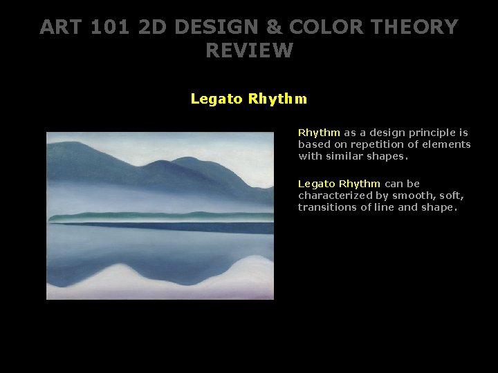
ART 101 2 D DESIGN & COLOR THEORY REVIEW Legato Rhythm as a design principle is based on repetition of elements with similar shapes. Legato Rhythm can be characterized by smooth, soft, transitions of line and shape.
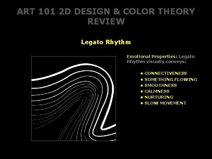
ART 101 2 D DESIGN & COLOR THEORY REVIEW Legato Rhythm Emotional Properties: Legato Rhythm visually conveys: • • • CONNECTIVENESS SOMETHING FLOWING SMOOTHNESS CALMNESS NURTURING SLOW MOVEMENT
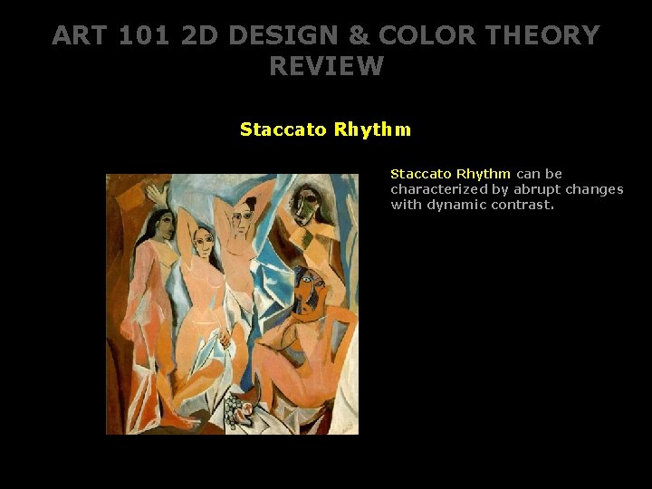
ART 101 2 D DESIGN & COLOR THEORY REVIEW Staccato Rhythm can be characterized by abrupt changes with dynamic contrast.
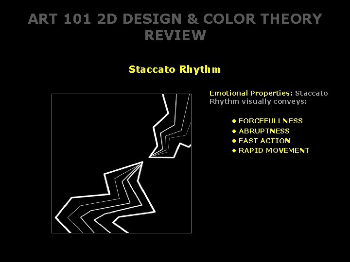
ART 101 2 D DESIGN & COLOR THEORY REVIEW Staccato Rhythm Emotional Properties: Staccato Rhythm visually conveys: • • FORCEFULLNESS ABRUPTNESS FAST ACTION RAPID MOVEMENT
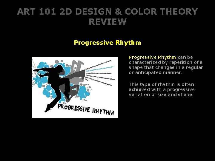
ART 101 2 D DESIGN & COLOR THEORY REVIEW Progressive Rhythm can be characterized by repetition of a shape that changes in a regular or anticipated manner. This type of rhythm is often achieved with a progressive variation of size and shape.
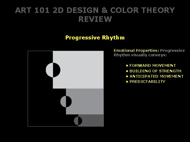
ART 101 2 D DESIGN & COLOR THEORY REVIEW Progressive Rhythm Emotional Properties: Progressive Rhythm visually conveys: • • FORWARD MOVEMENT BUILDING OF STRENGTH ANTICIPATED MOVEMENT PREDICTABILITY
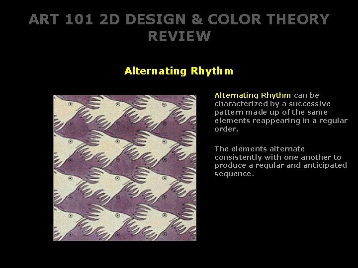
ART 101 2 D DESIGN & COLOR THEORY REVIEW Alternating Rhythm can be characterized by a successive pattern made up of the same elements reappearing in a regular order. The elements alternate consistently with one another to produce a regular and anticipated sequence.
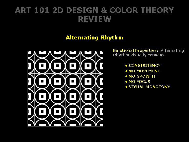
ART 101 2 D DESIGN & COLOR THEORY REVIEW Alternating Rhythm Emotional Properties: Alternating Rhythm visually conveys: • • • CONSISITENCY NO MOVEMENT NO GROWTH NO FOCUS VISUAL MONOTONY
ART 101 2 D DESIGN & COLOR THEORY What is Emphasis? and why is it important in the field of Visual Communications?
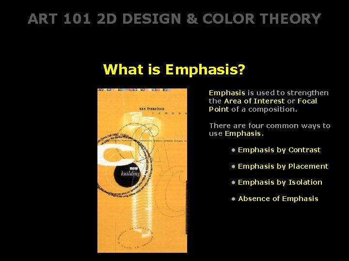
ART 101 2 D DESIGN & COLOR THEORY What is Emphasis? Emphasis is used to strengthen the Area of Interest or Focal Point of a composition. There are four common ways to use Emphasis. • Emphasis by Contrast • Emphasis by Placement • Emphasis by Isolation • Absence of Emphasis
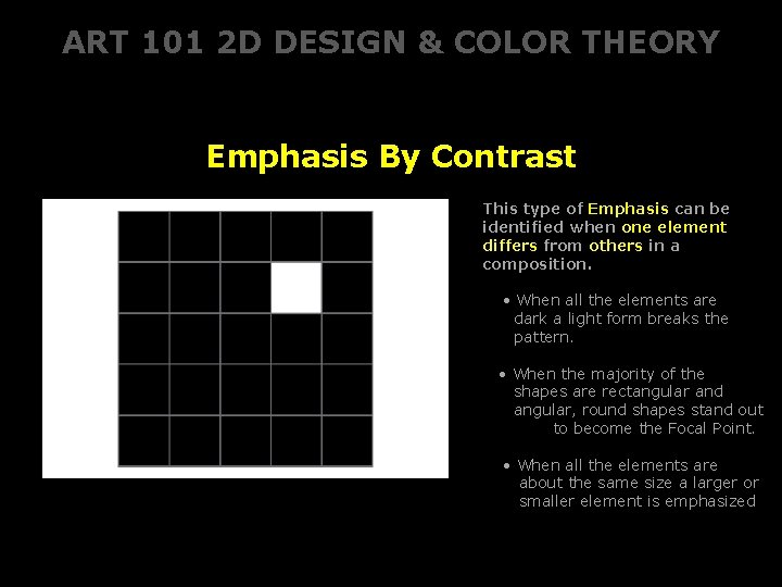
ART 101 2 D DESIGN & COLOR THEORY Emphasis By Contrast This type of Emphasis can be identified when one element differs from others in a composition. • When all the elements are dark a light form breaks the pattern. • When the majority of the shapes are rectangular and angular, round shapes stand out to become the Focal Point. • When all the elements are about the same size a larger or smaller element is emphasized
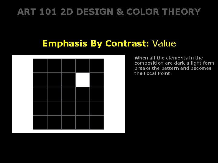
ART 101 2 D DESIGN & COLOR THEORY Emphasis By Contrast: Value When all the elements in the composition are dark a light form breaks the pattern and becomes the Focal Point.
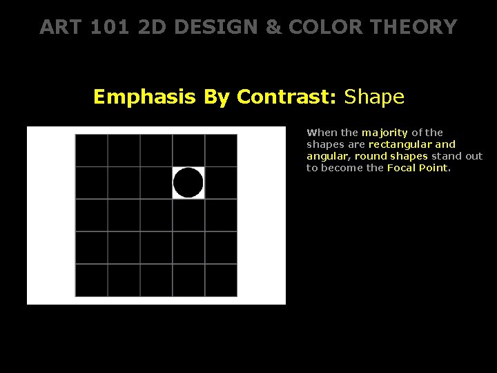
ART 101 2 D DESIGN & COLOR THEORY Emphasis By Contrast: Shape When the majority of the shapes are rectangular and angular, round shapes stand out to become the Focal Point.
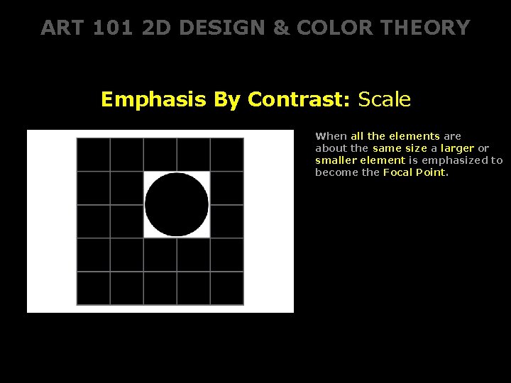
ART 101 2 D DESIGN & COLOR THEORY Emphasis By Contrast: Scale When all the elements are about the same size a larger or smaller element is emphasized to become the Focal Point.
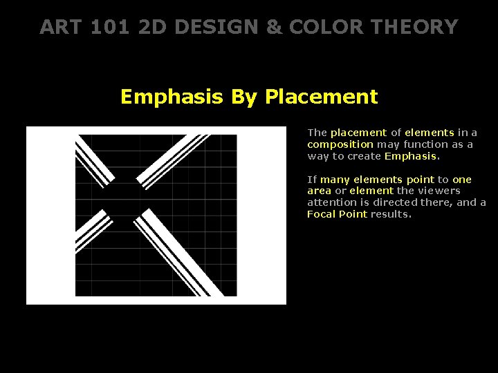
ART 101 2 D DESIGN & COLOR THEORY Emphasis By Placement The placement of elements in a composition may function as a way to create Emphasis. If many elements point to one area or element the viewers attention is directed there, and a Focal Point results.
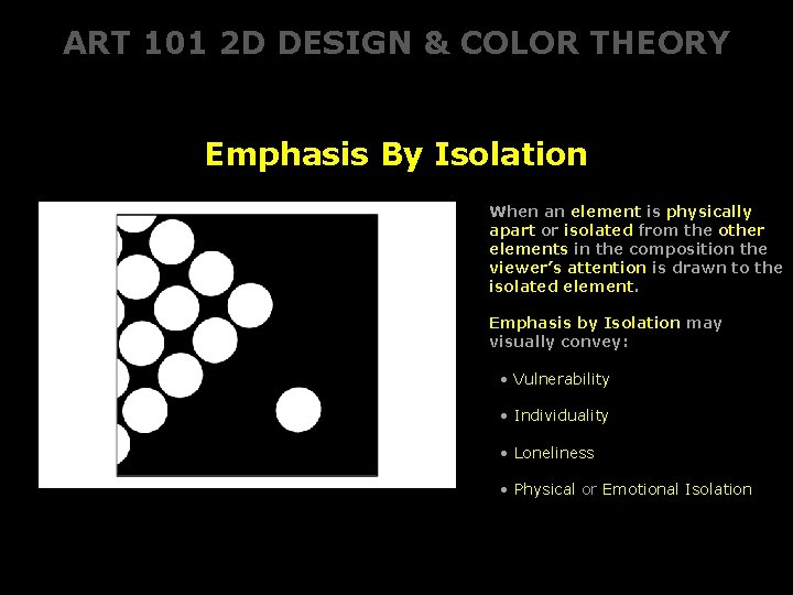
ART 101 2 D DESIGN & COLOR THEORY Emphasis By Isolation When an element is physically apart or isolated from the other elements in the composition the viewer’s attention is drawn to the isolated element. Emphasis by Isolation may visually convey: • Vulnerability • Individuality • Loneliness • Physical or Emotional Isolation
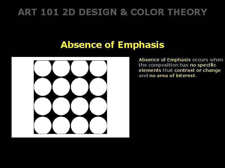
ART 101 2 D DESIGN & COLOR THEORY Absence of Emphasis occurs when the composition has no specific elements that contrast or change and no area of interest.
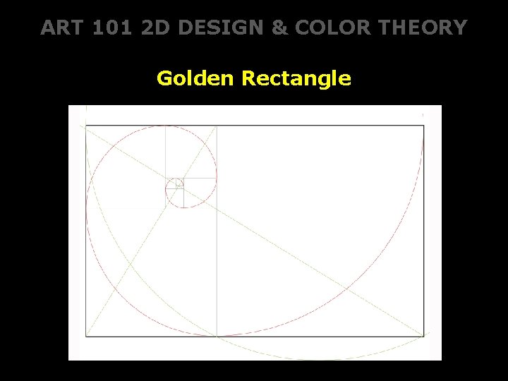
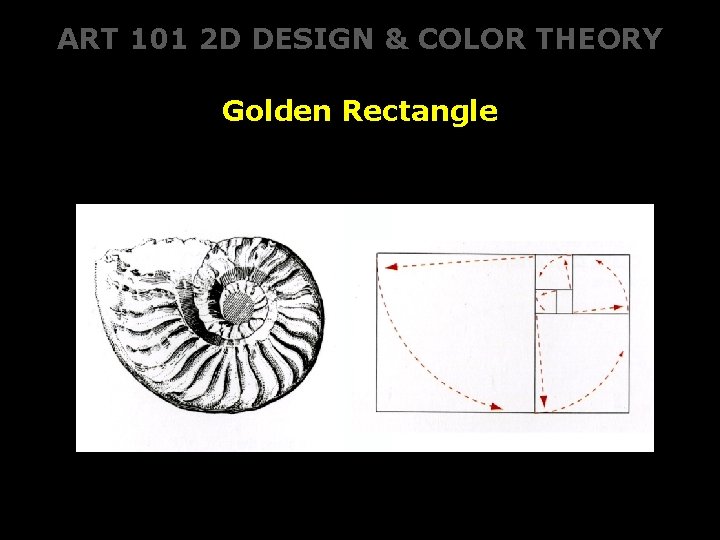
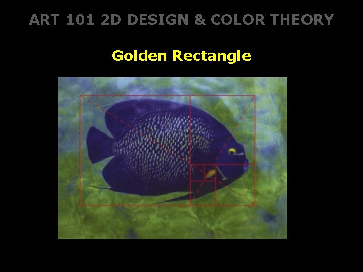
ART 101 2 D DESIGN & COLOR THEORY Golden Rectangle
ART 101 2 D DESIGN & COLOR THEORY Golden Rectangle
ART 101 2 D DESIGN & COLOR THEORY Golden Rectangle