Recall the chisquare test for association discussed last
- Slides: 14

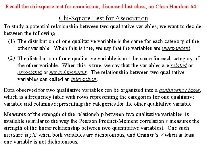
Recall the chi-square test for association, discussed last class, on Class Handout #4: Chi-Square Test for Association To study a potential relationship between two qualitative variables, we want to decide between the following: (1) The distribution of one qualitative variable is the same for each category of the other variable. When this is true, we say that the variables are independent. (2) The distribution of one qualitative variable is not the same for each category of the other variable. When this is true, we say that the variables are related or associated or not independent. The relationship between two qualitative variables can called an interaction. Data observed for two qualitative variables can be organized into a contingency table, which is a frequency table with rows representing the categories for one qualitative variable and columns representing the categories for the other qualitative variable. Measures of the strength of the relationship between two qualitative variables is available (similar to the way the Pearson Product-Moment correlation r measures the strength of the linear relationship between two quantitative variables). One such measure is phi when both variables are dichotomous, and Cramer’s V when at least one variable is not dichotomous.

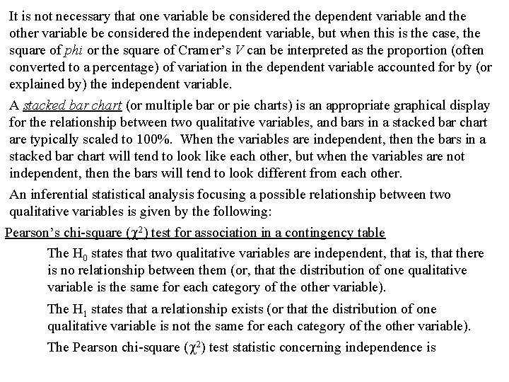
It is not necessary that one variable be considered the dependent variable and the other variable be considered the independent variable, but when this is the case, the square of phi or the square of Cramer’s V can be interpreted as the proportion (often converted to a percentage) of variation in the dependent variable accounted for by (or explained by) the independent variable. A stacked bar chart (or multiple bar or pie charts) is an appropriate graphical display for the relationship between two qualitative variables, and bars in a stacked bar chart are typically scaled to 100%. When the variables are independent, then the bars in a stacked bar chart will tend to look like each other, but when the variables are not independent, then the bars will tend to look different from each other. An inferential statistical analysis focusing a possible relationship between two qualitative variables is given by the following: Pearson’s chi-square ( 2) test for association in a contingency table The H 0 states that two qualitative variables are independent, that is, that there is no relationship between them (or, that the distribution of one qualitative variable is the same for each category of the other variable). The H 1 states that a relationship exists (or that the distribution of one qualitative variable is not the same for each category of the other variable). The Pearson chi-square ( 2) test statistic concerning independence is

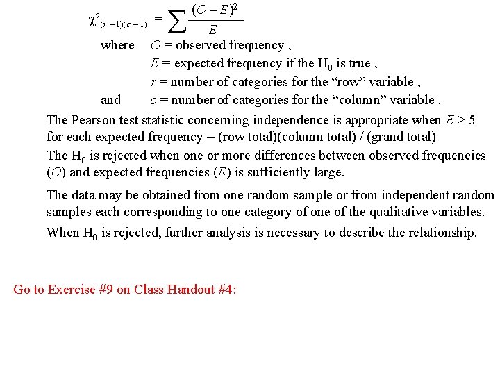
2 (O – E) 2(r – 1)(c – 1) = ———— E where O = observed frequency , E = expected frequency if the H 0 is true , r = number of categories for the “row” variable , and c = number of categories for the “column” variable. The Pearson test statistic concerning independence is appropriate when E 5 for each expected frequency = (row total)(column total) / (grand total) The H 0 is rejected when one or more differences between observed frequencies (O) and expected frequencies (E) is sufficiently large. The data may be obtained from one random sample or from independent random samples each corresponding to one category of one of the qualitative variables. When H 0 is rejected, further analysis is necessary to describe the relationship. Go to Exercise #9 on Class Handout #4:

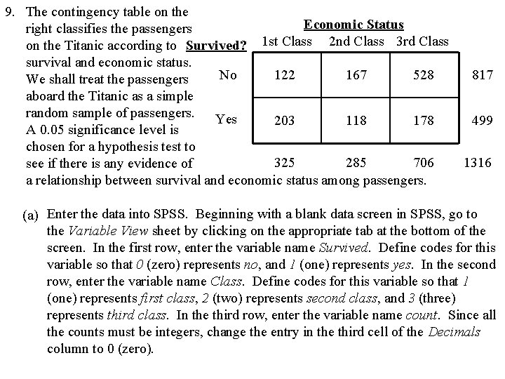
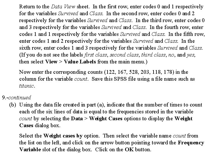
9. The contingency table on the Economic Status right classifies the passengers on the Titanic according to Survived? 1 st Class 2 nd Class 3 rd Class survival and economic status. No 122 167 528 We shall treat the passengers aboard the Titanic as a simple random sample of passengers. Yes 203 118 178 A 0. 05 significance level is chosen for a hypothesis test to 325 285 706 see if there is any evidence of a relationship between survival and economic status among passengers. 817 499 1316 (a) Enter the data into SPSS. Beginning with a blank data screen in SPSS, go to the Variable View sheet by clicking on the appropriate tab at the bottom of the screen. In the first row, enter the variable name Survived. Define codes for this variable so that 0 (zero) represents no, and 1 (one) represents yes. In the second row, enter the variable name Class. Define codes for this variable so that 1 (one) represents first class, 2 (two) represents second class, and 3 (three) represents third class. In the third row, enter the variable name count. Since all the counts must be integers, change the entry in the third cell of the Decimals column to 0 (zero).

Return to the Data View sheet. In the first row, enter codes 0 and 1 respectively for the variables Survived and Class. In the second row, enter codes 0 and 2 respectively for the variables Survived and Class. In the third row, enter codes 0 and 3 respectively for the variables Survived and Class. In the fourth row, enter codes 1 and 1 respectively for the variables Survived and Class. In the fifth row, enter codes 1 and 2 respectively for the variables Survived and Class. In the sixth row, enter codes 1 and 3 respectively for the variables Survived and Class. (If you do not see the labels first class, second class, third class, no, and yes, then select View > Value Labels from the main menu. ) Now enter the corresponding counts (122, 167, 528, 203, 118, 178) in the column for the variable count. Save this SPSS file using a file name such as titanic. 9. -continued (b) Using the data file created in part (a), indicate that the number of times to count each of the six lines of data is equal to the frequencies stored in the variable count by selecting the Data > Weight Cases options to display the Weight Cases dialog box. Select the Weight cases by option. Then select the variable name count from the list on the left, and click on the arrow button pointing toward the Frequency Variable slot of the dialog box. Click on the OK button.

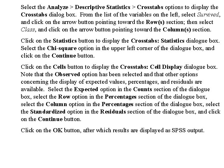
Select the Analyze > Descriptive Statistics > Crosstabs options to display the Crosstabs dialog box. From the list of the variables on the left, select Survived, and click on the arrow button pointing toward the Row(s) section; then select Class, and click on the arrow button pointing toward the Column(s) section. Click on the Statistics button to display the Crosstabs: Statistics dialogue box. Select the Chi-square option in the upper left corner of the dialogue box, and click on the Continue button. Click on the Cells button to display the Crosstabs: Cell Display dialogue box. Note that the Observed option has been selected and that other options concerning the display of expected values, percentages, and residuals are available. Select the Expected option in the Counts section of the dialogue box, select the Row option in the Percentages section of the dialogue box, select the Column option in the Percentages section of the dialogue box, select the Standardized option in the Residuals section of the dialogue box, and click on the Continue button. Click on the OK button, after which results are displayed as SPSS output.

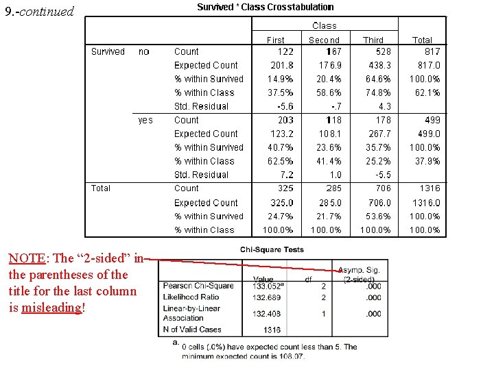
9. -continued NOTE: The “ 2 -sided” in the parentheses of the title for the last column is misleading!

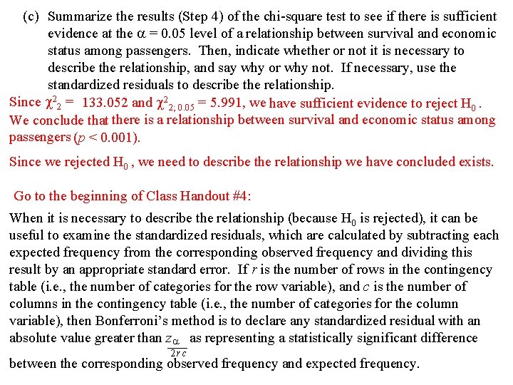
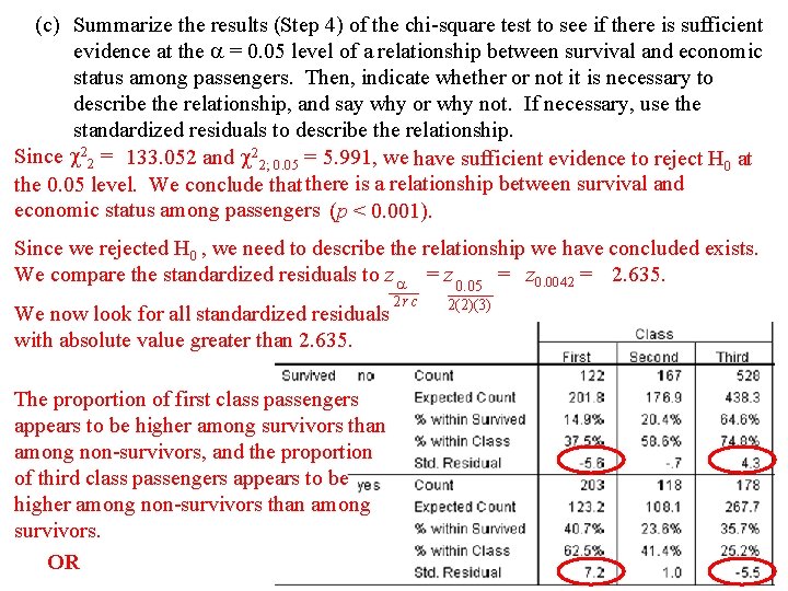
(c) Summarize the results (Step 4) of the chi-square test to see if there is sufficient evidence at the = 0. 05 level of a relationship between survival and economic status among passengers. Then, indicate whether or not it is necessary to describe the relationship, and say why or why not. If necessary, use the standardized residuals to describe the relationship. Since 22 = 133. 052 and 22; 0. 05 = 5. 991, we have sufficient evidence to reject H 0. We conclude that there is a relationship between survival and economic status among passengers (p < 0. 001). Since we rejected H 0 , we need to describe the relationship we have concluded exists. Go to the beginning of Class Handout #4: When it is necessary to describe the relationship (because H 0 is rejected), it can be useful to examine the standardized residuals, which are calculated by subtracting each expected frequency from the corresponding observed frequency and dividing this result by an appropriate standard error. If r is the number of rows in the contingency table (i. e. , the number of categories for the row variable), and c is the number of columns in the contingency table (i. e. , the number of categories for the column variable), then Bonferroni’s method is to declare any standardized residual with an absolute value greater than z as representing a statistically significant difference —— 2 rc between the corresponding observed frequency and expected frequency.

(c) Summarize the results (Step 4) of the chi-square test to see if there is sufficient evidence at the = 0. 05 level of a relationship between survival and economic status among passengers. Then, indicate whether or not it is necessary to describe the relationship, and say why or why not. If necessary, use the standardized residuals to describe the relationship. Since 22 = 133. 052 and 22; 0. 05 = 5. 991, we have sufficient evidence to reject H 0 at the 0. 05 level. We conclude that there is a relationship between survival and economic status among passengers (p < 0. 001). Since we rejected H 0 , we need to describe the relationship we have concluded exists. We compare the standardized residuals to z = z 0. 05 = z 0. 0042 = 2. 635. —— 2 rc We now look for all standardized residuals with absolute value greater than 2. 635. The proportion of first class passengers appears to be higher among survivors than among non-survivors, and the proportion of third class passengers appears to be higher among non-survivors than among survivors. OR ——— 2(2)(3)

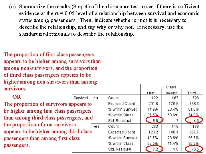
(c) Summarize the results (Step 4) of the chi-square test to see if there is sufficient evidence at the = 0. 05 level of a relationship between survival and economic status among passengers. Then, indicate whether or not it is necessary to describe the relationship, and say why or why not. If necessary, use the standardized residuals to describe the relationship. The proportion of first class passengers appears to be higher among survivors than among non-survivors, and the proportion of third class passengers appears to be higher among non-survivors than among survivors. OR The proportion of survivors appears to be higher among first class passengers than among third class passengers, and the proportion of non-survivors appears to be higher among third class passengers than among first class passengers.

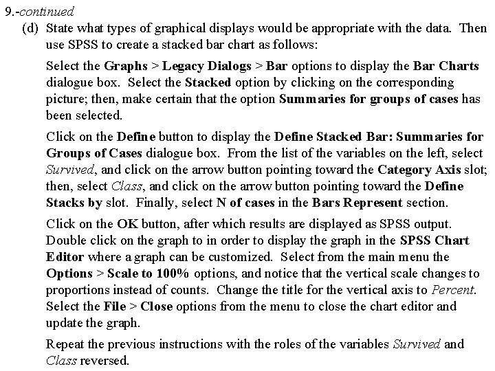
9. -continued (d) State what types of graphical displays would be appropriate with the data. Then use SPSS to create a stacked bar chart as follows: Select the Graphs > Legacy Dialogs > Bar options to display the Bar Charts dialogue box. Select the Stacked option by clicking on the corresponding picture; then, make certain that the option Summaries for groups of cases has been selected. Click on the Define button to display the Define Stacked Bar: Summaries for Groups of Cases dialogue box. From the list of the variables on the left, select Survived, and click on the arrow button pointing toward the Category Axis slot; then, select Class, and click on the arrow button pointing toward the Define Stacks by slot. Finally, select N of cases in the Bars Represent section. Click on the OK button, after which results are displayed as SPSS output. Double click on the graph to in order to display the graph in the SPSS Chart Editor where a graph can be customized. Select from the main menu the Options > Scale to 100% options, and notice that the vertical scale changes to proportions instead of counts. Change the title for the vertical axis to Percent. Select the File > Close options from the menu to close the chart editor and update the graph. Repeat the previous instructions with the roles of the variables Survived and Class reversed.

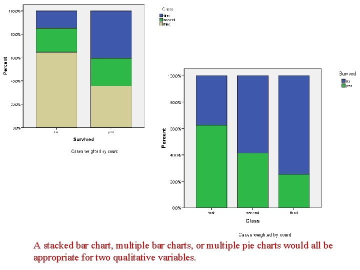
A stacked bar chart, multiple bar charts, or multiple pie charts would all be appropriate for two qualitative variables.

Go to beginning of Class Handout #4: This Pearson’s chi-square ( 2) test for association and the Pearson’s chi-square ( 2) goodness-of-fit-test are somewhat similar in that they are both based on the comparison of observed and expected values; however, the goodness of fit test concerns one qualitative variable while the test for association concerns two qualitative variables. Both tests are often considered to be nonparametric tests. A numerical measure of the strength of the relationship (or association) between two qualitative variables is available and somewhat similar to the way the Pearson correlation r measures the strength of the relationship between two quantitative variables. For two qualitative variables, SPSS will calculate phi which is used when each of the qualitative variables is dichotomous, and will calculate Cramer’s V when at least one of the qualitative variables is not dichotomous. Go to Exercise #10 on Class Handout #4:

10. Obtain the SPSS output for the example on pages 16 to 18 of the textbook by first selecting the Analyze > Descriptive Statistics > Crosstabs options, choosing Gender to be in the Row(s) section, choosing Weight to be in the Column(s) section, using the Statistics button to select the Chi-square option and the Phi and Cramer’s V option, and using the Cells button to see that observed counts, expected counts, percents of total, and standardized residuals are displayed. Compare the syntax file commands generated by the output with those shown in the textbook. Look at the Analysis: SPSS output section on pages 16 and 18 of the textbook. The results concerning the chi-square test for association stated in the text continue to use, as in the past, conventions and formats that are popular in the social sciences. Notice that the information displayed is as in the past with incomplete information about the p-value. Also, notice that the description of the relationship is made in terms of significant differences between observed and expected frequencies from standardized residuals. Finally, notice how the association is described and the measure of association Cramer’s V is discussed.