Graphs in Economics Appendix to Chapter 2 Udayan

- Slides: 18

Graphs in Economics Appendix to Chapter 2 Udayan Roy 1

Graphing: a brief review • Graphs’ purposes: – Visually express ideas that might be less clear if described with equations or words – Powerful way of finding and interpreting patterns • Graphs of a single variable – Pie chart – Bar graph – Time-series graph 2

Figure A-1 The pie chart in panel (a) shows how U. S. national income in 2008 was derived from various sources. 3

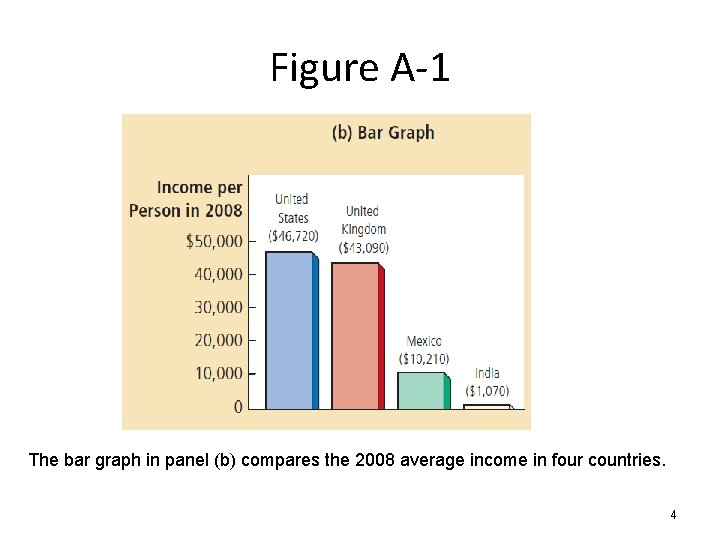
Figure A-1 The bar graph in panel (b) compares the 2008 average income in four countries. 4

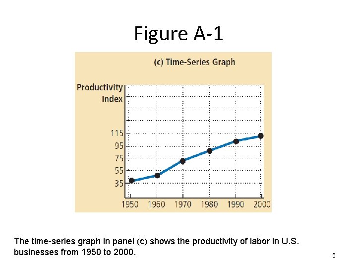
Figure A-1 The time-series graph in panel (c) shows the productivity of labor in U. S. businesses from 1950 to 2000. 5

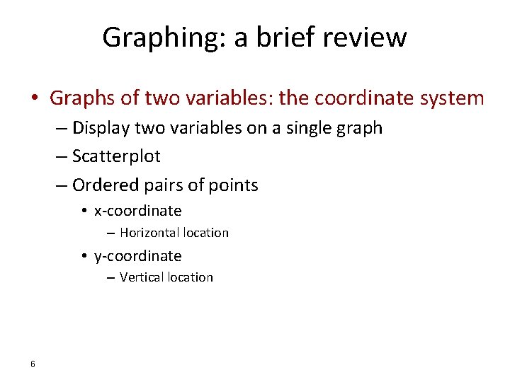
Graphing: a brief review • Graphs of two variables: the coordinate system – Display two variables on a single graph – Scatterplot – Ordered pairs of points • x-coordinate – Horizontal location • y-coordinate – Vertical location 6

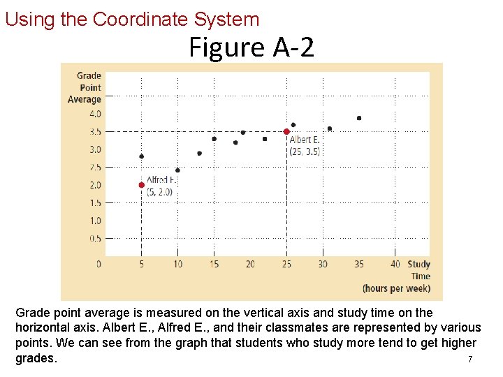
Using the Coordinate System Figure A-2 Grade point average is measured on the vertical axis and study time on the horizontal axis. Albert E. , Alfred E. , and their classmates are represented by various points. We can see from the graph that students who study more tend to get higher grades. 7

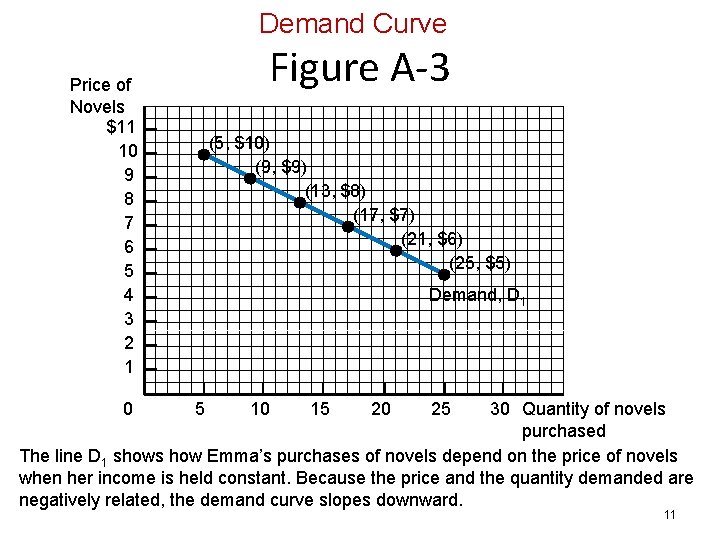
Graphing: a brief review • Curves in the coordinate system • Data – Number of novels – Price of novels – Income • Demand curve – Effect of a good’s price – On the quantity of the good consumers want to buy – For a given income 8

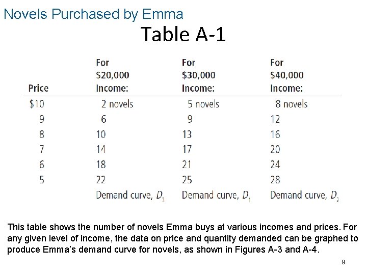
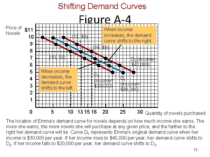
Novels Purchased by Emma Table A-1 This table shows the number of novels Emma buys at various incomes and prices. For any given level of income, the data on price and quantity demanded can be graphed to produce Emma’s demand curve for novels, as shown in Figures A-3 and A-4. 9

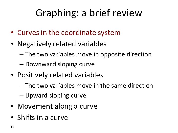
Graphing: a brief review • Curves in the coordinate system • Negatively related variables – The two variables move in opposite direction – Downward sloping curve • Positively related variables – The two variables move in the same direction – Upward sloping curve • Movement along a curve • Shifts in a curve 10

Demand Curve Figure A-3 Price of Novels $11 10 9 8 7 6 5 4 3 2 1 (5, $10) (9, $9) (13, $8) (17, $7) (21, $6) (25, $5) Demand, D 1 30 Quantity of novels purchased The line D 1 shows how Emma’s purchases of novels depend on the price of novels when her income is held constant. Because the price and the quantity demanded are negatively related, the demand curve slopes downward. 0 5 10 15 20 25 11

Shifting Demand Curves Figure A-4 Price of $11 Novels 10 9 8 7 6 5 4 3 2 1 0 (13, $8) When income increases, the demand curve shifts to the right. (16, $8) (10, $8) D 2 (income= $40, 000) When income decreases, the demand curve shifts to the left. 5 D 3 (income= $20, 000) 10 13 15 16 20 D 1 (income= $30, 000) 25 30 Quantity of novels purchased The location of Emma’s demand curve for novels depends on how much income she earns. The more she earns, the more novels she will purchase at any given price, and the farther to the right her demand curve will lie. Curve D 1 represents Emma’s original demand curve when her income is $30, 000 per year. If her income rises to $40, 000 per year, her demand curve shifts to D 2. If her income falls to $20, 000 per year, her demand curve shifts to D 3. 12

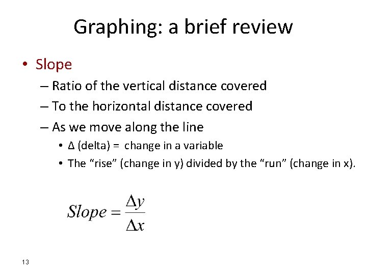
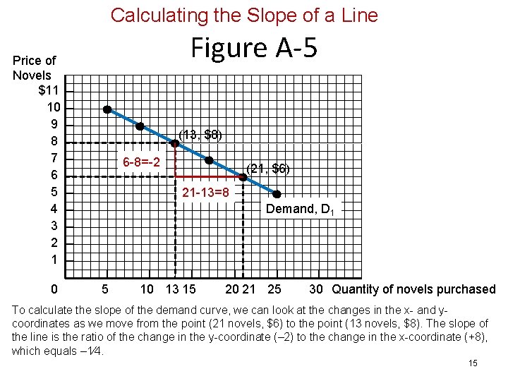
Graphing: a brief review • Slope – Ratio of the vertical distance covered – To the horizontal distance covered – As we move along the line • Δ (delta) = change in a variable • The “rise” (change in y) divided by the “run” (change in x). 13

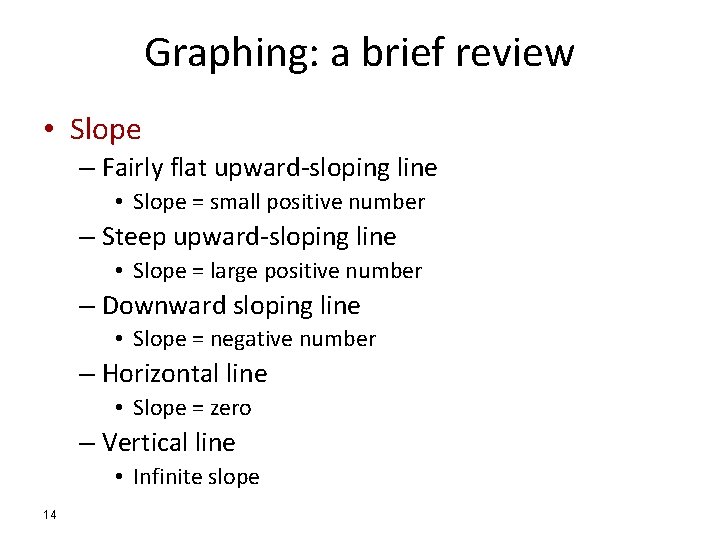
Graphing: a brief review • Slope – Fairly flat upward-sloping line • Slope = small positive number – Steep upward-sloping line • Slope = large positive number – Downward sloping line • Slope = negative number – Horizontal line • Slope = zero – Vertical line • Infinite slope 14

Calculating the Slope of a Line Figure A-5 Price of Novels $11 10 9 8 7 6 5 4 3 2 1 0 (13, $8) 6 -8=-2 (21, $6) 21 -13=8 Demand, D 1 5 10 13 15 20 21 25 30 Quantity of novels purchased To calculate the slope of the demand curve, we can look at the changes in the x- and ycoordinates as we move from the point (21 novels, $6) to the point (13 novels, $8). The slope of the line is the ratio of the change in the y-coordinate (– 2) to the change in the x-coordinate (+8), which equals – 1⁄4. 15

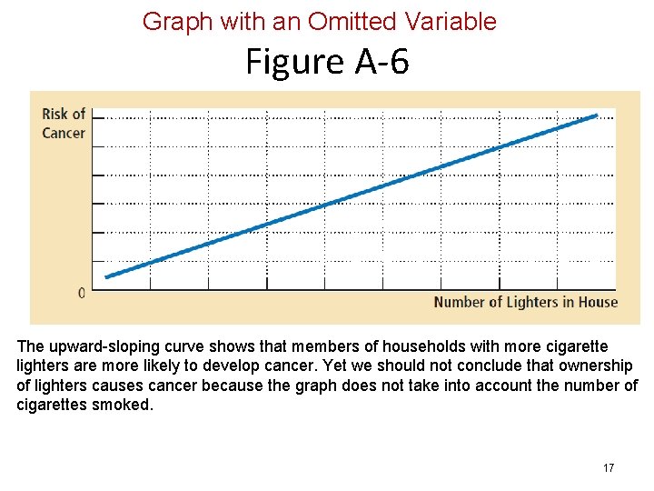
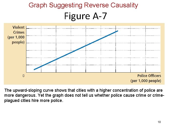
Graphing: a brief review • Cause and effect – One set of events • Causes another set of events – Omitted variables • Lead to a deceptive graph – Reverse causality • Decide that event A causes event B • Facts: event B causes event A 16

Graph with an Omitted Variable Figure A-6 The upward-sloping curve shows that members of households with more cigarette lighters are more likely to develop cancer. Yet we should not conclude that ownership of lighters causes cancer because the graph does not take into account the number of cigarettes smoked. 17

Graph Suggesting Reverse Causality Figure A-7 The upward-sloping curve shows that cities with a higher concentration of police are more dangerous. Yet the graph does not tell us whether police cause crime or crimeplagued cities hire more police. 18