ggplotcancer 106 aesreordercity sum sum 100 geombarstatidentity fill


), (技 友司 機/sum(技 友司機)) * 100")
數位化長期照護 醫護職業數據分析 ggplot(cancer 106, aes(reorder(city, -技 友司機/sum(技 友司機)), (技 友司 機/sum(技 友司機)) * 100 )) + geom_bar(stat="identity", fill= 'blue')+ theme(axis. text. x = element_text(angle = -90, vjust=0, hjust=1))+ ggtitle('106年各縣市技 友司機百分比 例')+ theme(plot. title = element_text(hjust = 0. 5, size = 20, face = "bold", colour='red'))+ labs(x='縣市', y='百分比')+ theme(axis. text. y = element_text(vjust=0. 5, hjust=1, colour=' green'))+ theme(axis. title. x = element_text(face = "italic", color = "rosybrown"))+ theme(axis. title. y = element_text(face = "bold. italic", color = "royalblue"))+ #將圖片區的背景色設置為pink, 邊框為紅色 , 邊框寬度為 3 theme(panel. background = element_rect(fill = "pink", colour = "red", size = 3))
), (家數/sum(家數)) * 100 )) + geom_bar(stat=\"identity\", fill= 'blue')+")
數位化長期照護 醫護職業數據分析 ggplot(hospital, aes(reorder(地區, -家數 /sum(家數)), (家數/sum(家數)) * 100 )) + geom_bar(stat="identity", fill= 'blue')+ theme(axis. text. x = element_text(angle = -90, vjust=0, hjust=1))+ ggtitle('106年各縣市醫院家數比例')+ theme(plot. title = element_text(hjust = 0. 5, size = 20, face = "bold", colour='red'))+ labs(x='縣市', y='百分比')+ theme(axis. text. y = element_text(vjust=0. 5, hjust=1, colour=' green'))+ theme(axis. title. x = element_text(face = "italic", color = "rosybrown"))+ theme(axis. title. y = element_text(face = "bold. italic", color = "royalblue"))
, 醫師 數)) + geom_bar(stat=\"identity\")+ ggtitle('106年各縣市醫院醫師數')+ theme(plot. title =")
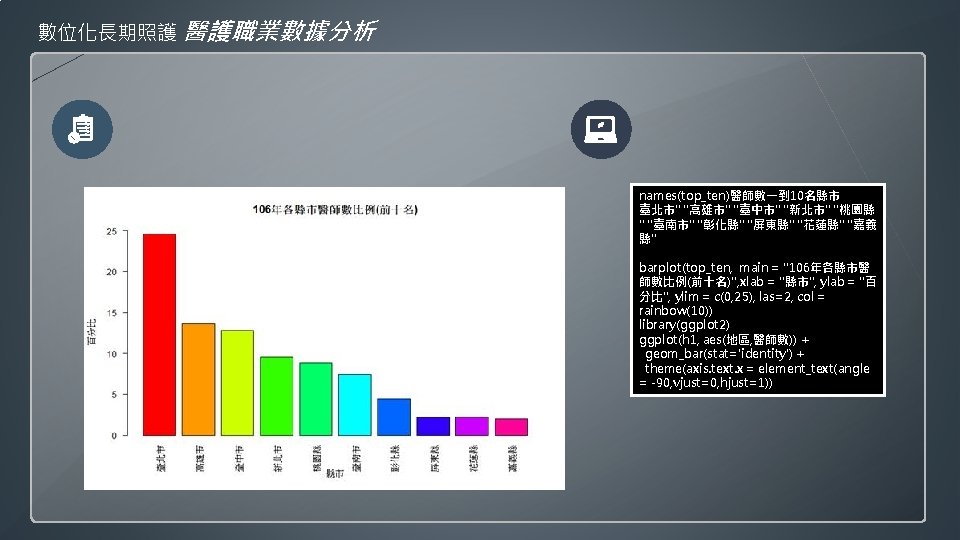
數位化長期照護 醫護職業數據分析 ggplot(h 1, aes(reorder(地區, -醫師數), 醫師 數)) + geom_bar(stat="identity")+ ggtitle('106年各縣市醫院醫師數')+ theme(plot. title = element_text(hjust = 0. 5, size = 20, face = "bold", colour='sienna 2'))+ theme(axis. text. x = element_text(angle = -90, vjust=0, hjust=1, colour='blue'))+ theme(axis. text. y = element_text(vjust=0. 5, hjust=1, colour=' darkgreen'))+ labs(x='縣市', y='醫師數')+ theme(axis. title. x = element_text(face = "italic", color = "rosybrown"))+ theme(axis. title. y = element_text(face = "bold. italic", color = "royalblue"))
, 職能治療師)) + geom_bar(stat=\"identity\")+ ggtitle('106年各縣市醫院醫師數')+ theme(plot. title =")
數位化長期照護 醫護職業數據分析 ggplot(cancer 106, aes(reorder(city, -職能 治療師), 職能治療師)) + geom_bar(stat="identity")+ ggtitle('106年各縣市醫院醫師數')+ theme(plot. title = element_text(hjust = 0. 5, size = 20, face = "bold", colour='sienna 2'))+ theme(axis. text. x = element_text(angle = -90, vjust=0, hjust=1, colour='blue'))+ theme(axis. text. y = element_text(vjust=0. 5, hjust=1, colour=' darkgreen'))+ labs(x='縣市', y='職能治療師數')+ theme(axis. title. x = element_text(face = "italic", color = "rosybrown"))+ theme(axis. title. y = element_text(face = "bold. italic", color = "royalblue"))
, 人數)) + geom_bar(stat=\"identity\")+ ggtitle('106年各類型醫師人數末十名')+")
數位化長期照護 醫護職業數據分析 ggplot(h 106. df. 1. ten, aes(reorder(類型, 人 數), 人數)) + geom_bar(stat="identity")+ ggtitle('106年各類型醫師人數末十名')+ theme(plot. title = element_text(hjust = 0. 5, size = 20, face = "bold", colour='red'))+ theme(axis. text. x = element_text(angle = -60, vjust=0, hjust=1, colour='blue'))+ theme(axis. text. y = element_text(vjust=0. 5, hjust=1, colour=' deepskyblue'))+ labs(x='類型', y='人數')+ theme(axis. title. x = element_text(face = "italic", color = "rosybrown"))+ theme(axis. title. y = element_text(face = "bold. italic", color = "royalblue"))
) + geom_bar(stat=\"identity\")+ ggtitle('106年各類型人數前十名')+ theme(plot. title")
數位化長期照護 醫護職業數據分析 ggplot(h 106. df. 2. ten, aes(reorder(類型, 人數)) + geom_bar(stat="identity")+ ggtitle('106年各類型人數前十名')+ theme(plot. title = element_text(hjust = 0. 5, size = 20, face = "bold", colour='red'))+ theme(axis. text. x = element_text(angle = -90, vjust=0, hjust=1, colour='blue'))+ theme(axis. text. y = element_text(vjust=0. 5, hjust=1, colour=' dimgray'))+ labs(x='類型', y='人數')+ theme(axis. title. x = element_text(face = "italic", color = "rosybrown"))+ theme(axis. title. y = element_text(face = "bold. italic", color = "royalblue"))
![數位化長期照護 醫護職業數據分析 type. 2 <- sort(h 106 cs, decreasing = TRUE)[1: 10] pie(type. 2)](http://slidetodoc.com/presentation_image_h2/a7e98aa02304af6c487384578588e313/image-12.jpg "數位化長期照護 醫護職業數據分析 type. 2 <- sort(h 106 cs, decreasing = TRUE)[1: 10] pie(type. 2)")
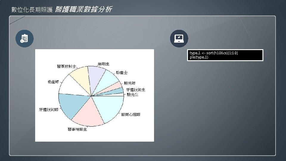
數位化長期照護 醫護職業數據分析 type. 2 <- sort(h 106 cs, decreasing = TRUE)[1: 10] pie(type. 2)

- Slides: 13