Forest Fragmentation in Sproul State Forest Assessing Land

- Slides: 10

Forest Fragmentation in Sproul State Forest Assessing Land Cover change in Sproul State Forest due to gas drilling in the 21 st century

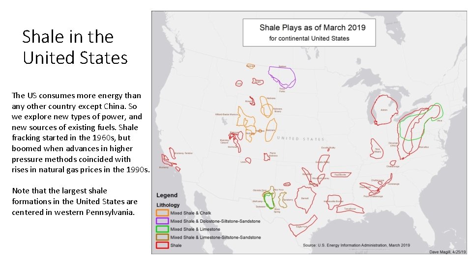
Shale in the United States The US consumes more energy than any other country except China. So we explore new types of power, and new sources of existing fuels. Shale fracking started in the 1960 s, but boomed when advances in higher pressure methods coincided with rises in natural gas prices in the 1990 s. Note that the largest shale formations in the United States are centered in western Pennsylvania.

Marcellus Shale in Pennsylvania The Marcellus shale formation is mostly on the north/west side of the Appalachians. ‘State Impact Pennsylvania’ has information about drilling in this formation, including an interactive map here: http: //stateimpact. npr. org/ pennsylvania/drilling/

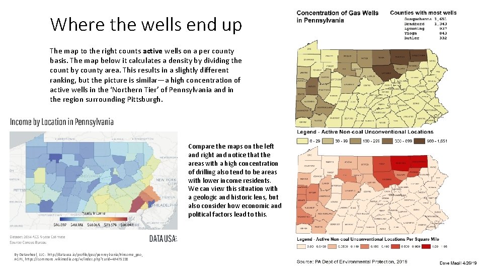
Where the wells end up The map to the right counts active wells on a per county basis. The map below it calculates a density by dividing the count by county area. This results in a slightly different ranking, but the picture is similar—a high concentration of active wells in the ‘Northern Tier’ of Pennsylvania and in the region surrounding Pittsburgh. Compare the maps on the left and right and notice that the areas with a high concentration of drilling also tend to be areas with lower income residents. We can view this situation with a geologic and historic lens, but also consider how economic and political factors lead to this. By Datawheel, LLC - http: //datausa. io/profile/geo/pennsylvania/#income_geo, AGPL, https: //commons. wikimedia. org/w/index. php? curid=49475238

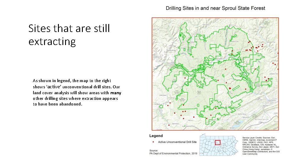
Sites that are still extracting As shown in legend, the map to the right shows ‘active’ unconventional drill sites. Our land cover analysis will show areas with many other drilling sites where extraction appears to have been abandoned.

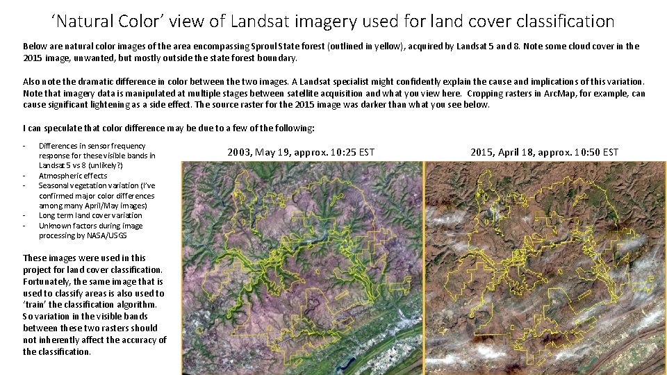
‘Natural Color’ view of Landsat imagery used for land cover classification Below are natural color images of the area encompassing Sproul State forest (outlined in yellow), acquired by Landsat 5 and 8. Note some cloud cover in the 2015 image, unwanted, but mostly outside the state forest boundary. Also note the dramatic difference in color between the two images. A Landsat specialist might confidently explain the cause and implications of this variation. Note that imagery data is manipulated at multiple stages between satellite acquisition and what you view here. Cropping rasters in Arc. Map, for example, can cause significant lightening as a side effect. The source raster for the 2015 image was darker than what you see below. I can speculate that color difference may be due to a few of the following: - Differences in sensor frequency response for these visible bands in Landsat 5 vs 8 (unlikely? ) Atmospheric effects Seasonal vegetation variation (I’ve confirmed major color differences among many April/May images) Long term land cover variation Unknown factors during image processing by NASA/USGS These images were used in this project for land cover classification. Fortunately, the same image that is used to classify areas is also used to ‘train’ the classification algorithm. So variation in the visible bands between these two rasters should not inherently affect the accuracy of the classification. 2003, May 19, approx. 10: 25 EST 2015, April 18, approx. 10: 50 EST

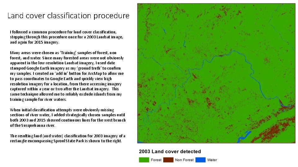
Land cover classification procedure I followed a common procedure for land cover classification, stepping through this procedure once for a 2003 Landsat image, and again for 2015 imagery. Many areas were chosen as ‘Training’ samples of forest, non forest, and water. Since many forested areas were not obviously apparent in the low resolution Landsat imagery, I used date stamped Google Earth imagery as my ‘ground truth’ to confirm my samples. I created an ‘add in’ button for Arc. Map to allow me to pass coordinates to Google Earth and quickly view high resolution imagery for a location, from there accessing imagery captured within a year or two after the Landsat imagery. This same technique allowed me to reliably exclude islands from my training sample for river waters. When initial classification attempts were obviously missing sections of river water, I added strategically chosen samples until both 2003 and 2015 showed continuous lines for the west branch of the Susquehanna river. The resulting land (and water) classification for 2003 imagery of a rectangle encompassing Sproul State Park is shown to the right.

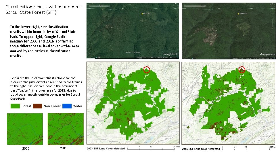
Classification results within and near Sproul State Forest (SFF) To the lower right, see classification results within boundaries of Sproul State Park. To upper right, Google Earth imagery for 2005 and 2016, confirming some differences in land cover within area marked by red circles in classification results. Below are the land cover classifications for the entire rectangular extents as defined by the frames to the right. I’m not confident in the accuracy of classification in the lower area for 2015, due to cloud cover, mostly outside boundaries for Sproul State Park. 2003 2015

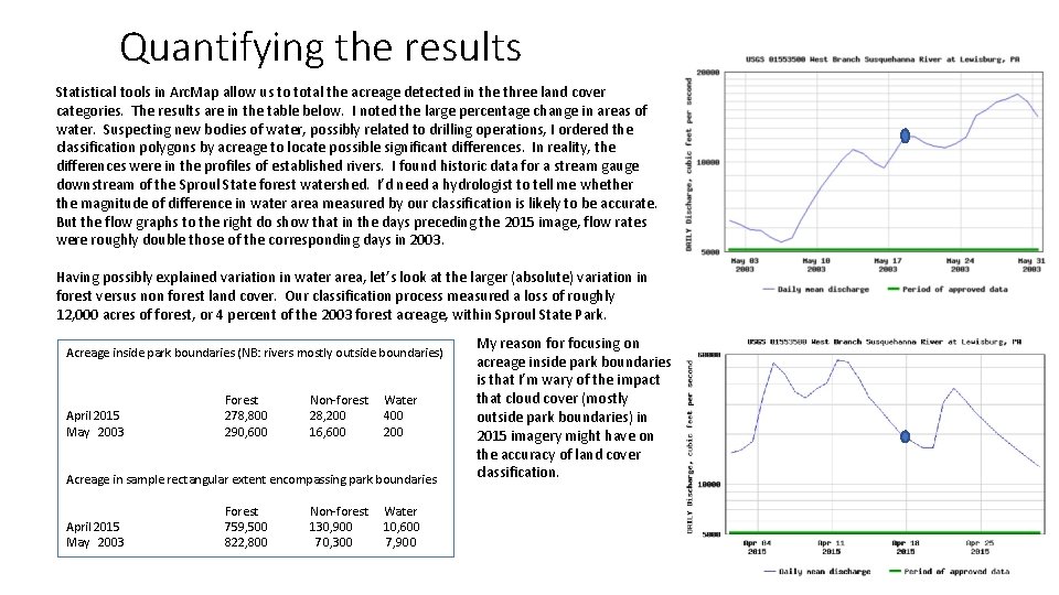
Quantifying the results Statistical tools in Arc. Map allow us to total the acreage detected in the three land cover categories. The results are in the table below. I noted the large percentage change in areas of water. Suspecting new bodies of water, possibly related to drilling operations, I ordered the classification polygons by acreage to locate possible significant differences. In reality, the differences were in the profiles of established rivers. I found historic data for a stream gauge downstream of the Sproul State forest watershed. I’d need a hydrologist to tell me whether the magnitude of difference in water area measured by our classification is likely to be accurate. But the flow graphs to the right do show that in the days preceding the 2015 image, flow rates were roughly double those of the corresponding days in 2003. Having possibly explained variation in water area, let’s look at the larger (absolute) variation in forest versus non forest land cover. Our classification process measured a loss of roughly 12, 000 acres of forest, or 4 percent of the 2003 forest acreage, within Sproul State Park. Acreage inside park boundaries (NB: rivers mostly outside boundaries) April 2015 May 2003 Forest 278, 800 290, 600 Non-forest 28, 200 16, 600 Water 400 200 Acreage in sample rectangular extent encompassing park boundaries April 2015 May 2003 Forest 759, 500 822, 800 Non-forest 130, 900 70, 300 Water 10, 600 7, 900 My reason for focusing on acreage inside park boundaries is that I’m wary of the impact that cloud cover (mostly outside park boundaries) in 2015 imagery might have on the accuracy of land cover classification.

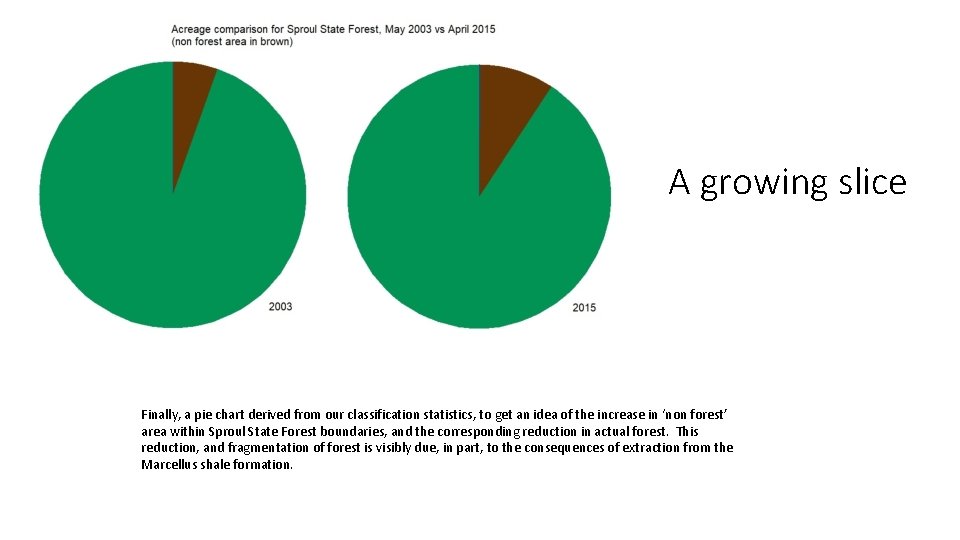
A growing slice Finally, a pie chart derived from our classification statistics, to get an idea of the increase in ‘non forest’ area within Sproul State Forest boundaries, and the corresponding reduction in actual forest. This reduction, and fragmentation of forest is visibly due, in part, to the consequences of extraction from the Marcellus shale formation.