ANATOMY OF A PARETO CHART Pareto Charts are

- Slides: 1

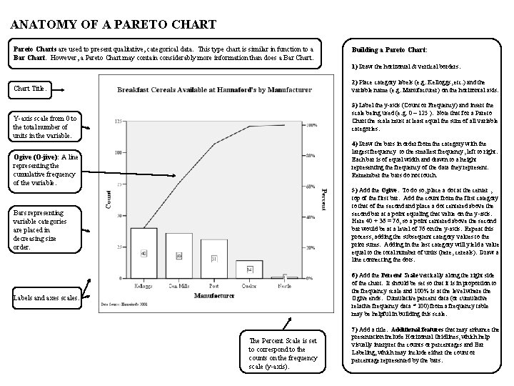
ANATOMY OF A PARETO CHART Pareto Charts are used to present qualitative, categorical data. This type chart is similar in function to a Bar Chart. However, a Pareto Chart may contain considerably more information than does a Bar Chart. Building a Pareto Chart: 1) Draw the horizontal & vertical borders. 2) Place category labels (e. g. Kelloggs, etc. ) and the variable name (e. g. Manufacturer) on the horizontal axis. Chart Title. 3) Label the y-axis (Count or Frequency) and insert the scale being used (e. g. 0 – 125 ). Note that for a Pareto Chart the scale must at least equal the sum of all variable categories. Y-axis scale from 0 to the total number of units in the variable. 4) Draw the bars in order from the category with the largest frequency to the smallest frequency, left to right. Each bar is of equal width and drawn to a height representing the frequency of the data they represent. Remember the bars do not touch. Ogive (O-jive): A line representing the cumulative frequency of the variable. 5) Add the Ogive. To do so, place a dot at the center , top of the first bar. Add the count from the first category to that of the second and place a dot centered above the second bar at a point equaling that value on the y-axis. Here 40 + 36 = 76, so a point centered above the second bar would be at a level of 76 on the y-axis. Repeat this process, adding the subsequent category values to the prior sums. Adding in the last category will yield a value equal to the total number of units (here, cereals). Draw a line connecting the dots. Bars representing variable categories are placed in decreasing size order. 6) Add the Percent Scale vertically along the right side of the chart. It should be set so that it is in proportion to the frequency scale and 100% is at the level where the Ogive ends. Cumulative percent data (or cumulative relative frequency data * 100) from a frequency table may be helpful in building this scale. Labels and axes scales. The Percent Scale is set to correspond to the counts on the frequency scale (y-axis). 7) Add a title. Additional features that may enhance the presentation include Horizontal Gridlines, which help visually interpret the counts or percentages and Bar Labeling, which may include either the count or percentage represented by the bars.