You and Your Data Digging Deeper and Doing
- Slides: 32

You and Your Data: Digging Deeper and Doing More Date place holder

Learning Objectives • Understand the role of performance data in choosing a quality improvement (QI) project • Understand the ways you can collect and analyze data to provide direction and guidance • Become familiar with basic tools that help analyze your performance data 2

Why Data Are Important • Data are the first step in any improvement project • Data allow you to be proactive; to get in front of trends • Data offer concrete evidence • Data provide guidance and direction 3

Data Basics • Each organization should have a data collection plan • Collect data that you will actually use • Consider how the data will be shared and with whom • Use tools to analyze your data 4

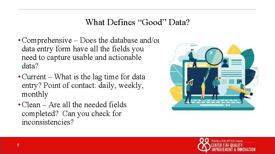
What Defines “Good” Data? • Comprehensive – Does the database and/or data entry form have all the fields you need to capture usable and actionable data? • Current – What is the lag time for data entry? Point of contact: daily, weekly, monthly • Clean – Are all the needed fields completed? Can you check for inconsistencies? 5

The Consequences of “Poor” Data • Inaccurate picture of your current performance status • Strong and weak points may not be correctly identified • The QI project you choose may not the most appropriate • The intervention you choose may not lead to any improvements • If success is not realized, frustration, as well as a waste of time, energy, money, and resources may result • That spark to do good QI work may be extinguished 6

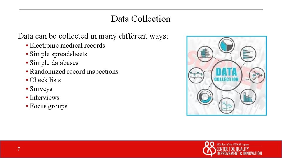
Data Collection Data can be collected in many different ways: • Electronic medical records • Simple spreadsheets • Simple databases • Randomized record inspections • Check lists • Surveys • Interviews • Focus groups 7

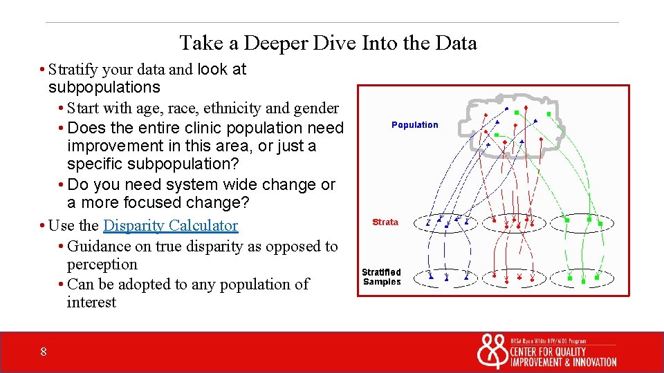
Take a Deeper Dive Into the Data • Stratify your data and look at subpopulations • Start with age, race, ethnicity and gender • Does the entire clinic population need improvement in this area, or just a specific subpopulation? • Do you need system wide change or a more focused change? • Use the Disparity Calculator • Guidance on true disparity as opposed to perception • Can be adopted to any population of interest 8

Analyze Your Data to Determine Your Improvement Priorities 9

Analyzing the Data • Standardize with the HIV/AIDS Bureau measures • Run the data and identify areas that could use improvement • Narrow your choices to 3 or 4 areas 10

Process versus Outcome Data? Which is more useful? • Both are equally useful • Analyzing a process helps you make it more efficient • Both use different tools to perform different analyses 11

Process Analysis Tools 12

Flowchart • A step-by-step sequence of a process • Illustrates where workflow may be redundant, overlapping, or where it can be improved • Use Post-It notes to help make edits • Involve everyone familiar with the process to be mapped • Click here to download the Game Guide and review the Peanut Butter and Jelly exercise (pp. 43 -45) ® 13

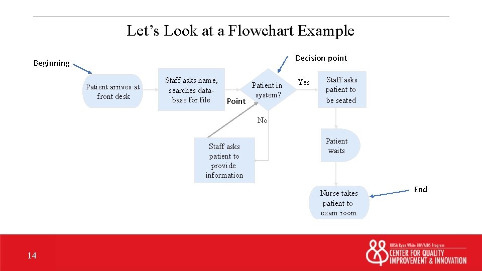
Let’s Look at a Flowchart Example Decision point Beginning Patient arrives at front desk Staff asks name, Patient in searches datasystem? base for file Decision Point Yes Staff asks patient to be seated No Staff asks patient to provide information Patient waits Nurse takes patient to exam room 14 End

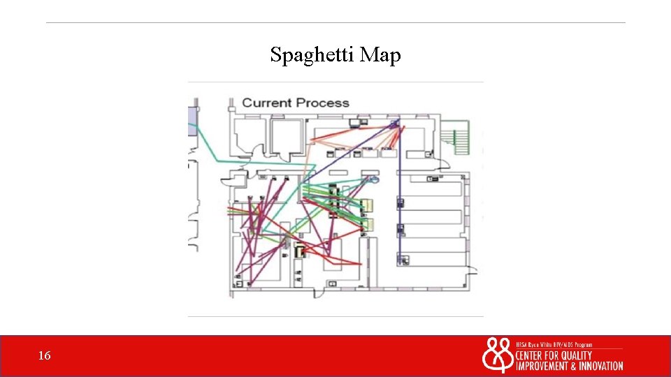
Spaghetti Map • Think of the Spaghetti Map as a more graphic flow chart • This is another way of looking at the flow of work in a process • It tells a story without words • Check out this video titled “Lean Spaghetti Diagramming Case Study of Hospital Lab” on You. Tube. Continue 15

Spaghetti Map 16

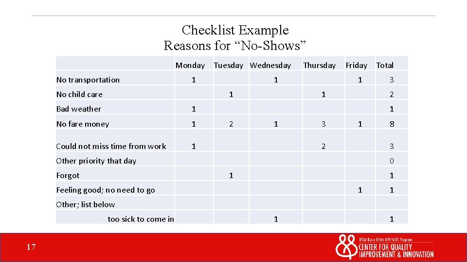
Checklist Example Reasons for “No-Shows” Monday No transportation Tuesday Wednesday 1 No child care 1 1 Bad weather 1 No fare money 1 Could not miss time from work 1 Thursday Friday Total 1 1 2 1 3 1 2 8 3 Other priority that day Forgot 3 0 1 1 Feeling good; no need to go 1 1 Other; list below too sick to come in 17 1 1

Outcome Analysis Tools 18

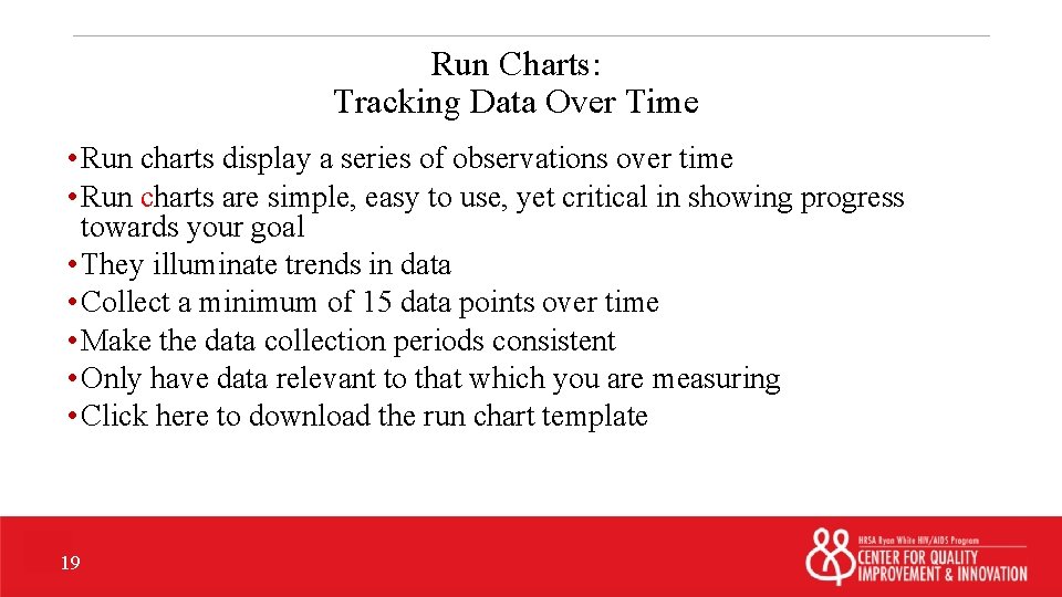
Run Charts: Tracking Data Over Time • Run charts display a series of observations over time • Run charts are simple, easy to use, yet critical in showing progress towards your goal • They illuminate trends in data • Collect a minimum of 15 data points over time • Make the data collection periods consistent • Only have data relevant to that which you are measuring • Click here to download the run chart template 19

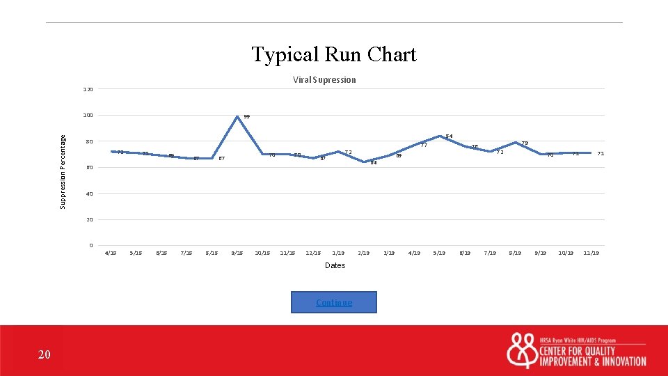
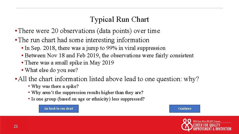
Typical Run Chart Viral Supression 120 Suppression Percentage 100 99 84 80 72 71 69 67 70 77 72 69 64 60 79 76 70 71 71 40 20 0 4/18 5/18 6/18 7/18 8/18 9/18 10/18 11/18 12/18 1/19 Dates Continue 20 2/19 3/19 4/19 5/19 6/19 7/19 8/19 9/19 10/19 11/19

Typical Run Chart • There were 20 observations (data points) over time • The run chart had some interesting information • In Sep. 2018, there was a jump to 99% in viral suppression • Between Nov 18 and Feb 2019, the observations were fairly consistent • There was a small spike in May 2019 • What else do you see? • All the chart information listed above lead to one question: why? • Why was there a spike? • Why aren’t the suppression results higher than they are? • Is one group (based on age or ethnicity) less suppressed? Go back to run chart 21 Continue

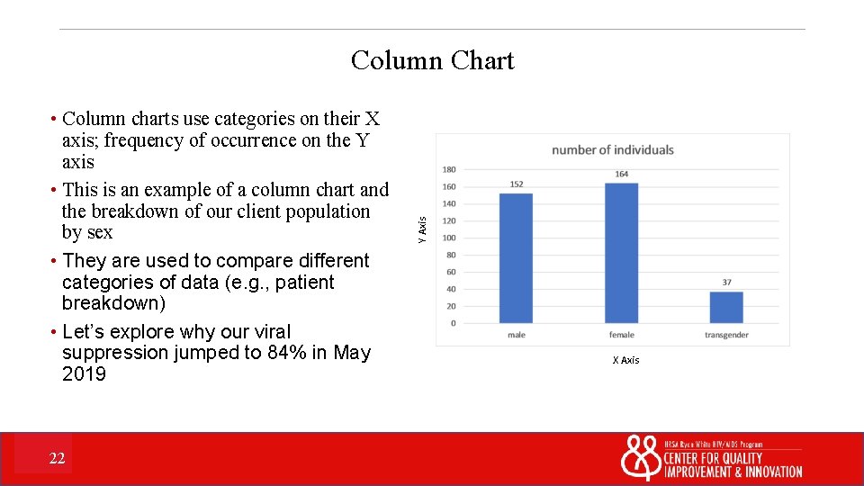
• Column charts use categories on their X axis; frequency of occurrence on the Y axis • This is an example of a column chart and the breakdown of our client population by sex • They are used to compare different categories of data (e. g. , patient breakdown) • Let’s explore why our viral suppression jumped to 84% in May 2019 22 Y Axis Column Chart X Axis

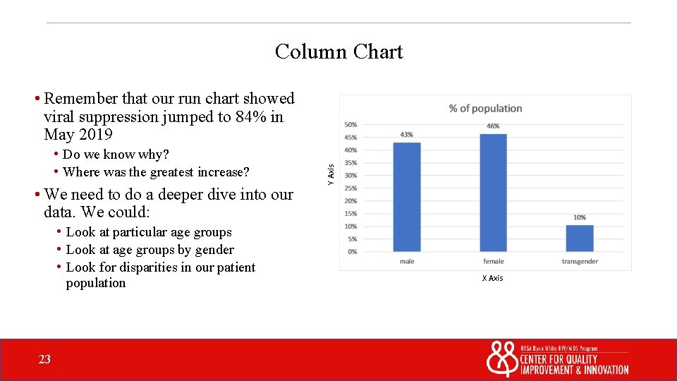
Column Chart • Do we know why? • Where was the greatest increase? • We need to do a deeper dive into our data. We could: • Look at particular age groups • Look at age groups by gender • Look for disparities in our patient population 23 Y Axis • Remember that our run chart showed viral suppression jumped to 84% in May 2019 X Axis

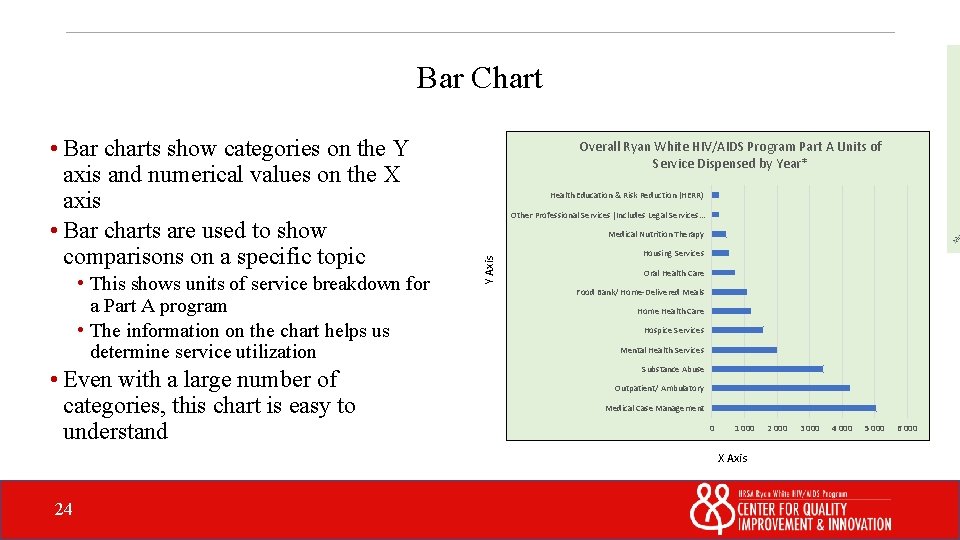
Bar Chart • This shows units of service breakdown for a Part A program • The information on the chart helps us determine service utilization • Even with a large number of categories, this chart is easy to understand Overall Ryan White HIV/AIDS Program Part A Units of Service Dispensed by Year* Health Education & Risk Reduction (HERR) Other Professional Services [Includes Legal Services. . . Medical Nutrition Therapy Y Axis • Bar charts show categories on the Y axis and numerical values on the X axis • Bar charts are used to show comparisons on a specific topic Housing Services Oral Health Care Food Bank/ Home-Delivered Meals Home Health Care Hospice Services Mental Health Services Substance Abuse Outpatient/ Ambulatory Medical Case Management 0 1 000 X Axis 24 2 000 3 000 4 000 5 000 6 000

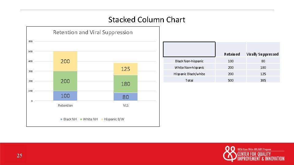
Stacked Column Chart Retention and Viral Suppression 600 500 400 200 125 300 200 100 0 200 180 100 80 Retention VLS Black NH 25 White NH Hispanic B/W Retained Virally Suppressed Black Non-hispanic 100 80 White Non-hispanic 200 180 Hispanic Black/white 200 125 Total 500 385

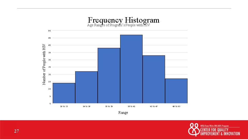
Histograms • You should have a minimum of 50 data points for a histogram • Used for one continuous variable, such as: • Average viral suppression by week • Number of intakes done by day • Uses categories called bins (or classes) to show data • There are no gaps between the bars in a histogram • Microsoft Excel is useful to build a histogram 26

Frequency Histogram Age Ranges of Program’s People with HIV 50 Number of People with HIV 45 40 35 30 25 20 15 10 5 0 18 to 23 24 to 29 30 to 35 36 to 41 Range 27 42 to 47 48 to 53

Data Analysis Tools • There a plethora of data analysis tools to assist you • Your choice of tools should be guided by the type of data you have and what you’re trying to discover • See the resource slide for help with finding helpful resources on tools 28

What do we know so far? • You have analyzed your data • You have identified an area for improvement • You have possibly selected a sub-population of focus 29

What’s Next? • Put your data to use • Next week: Structuring the improvement project 30

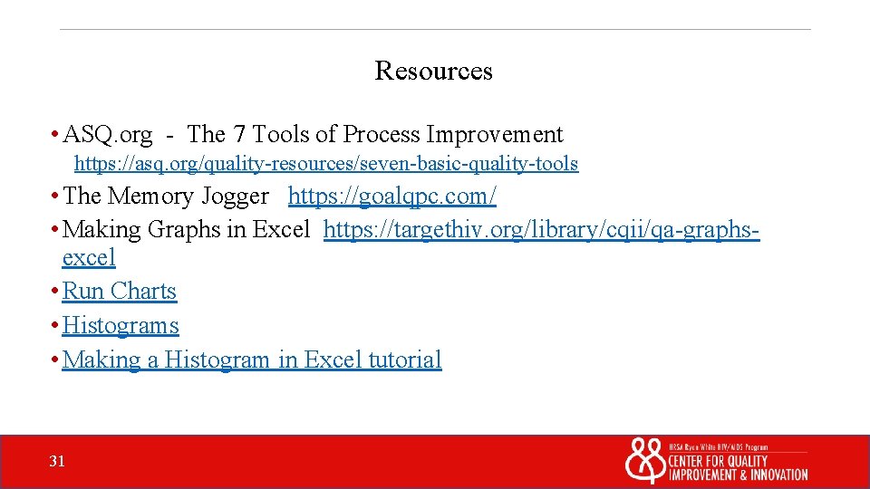
Resources • ASQ. org - The 7 Tools of Process Improvement https: //asq. org/quality-resources/seven-basic-quality-tools • The Memory Jogger https: //goalqpc. com/ • Making Graphs in Excel https: //targethiv. org/library/cqii/qa-graphsexcel • Run Charts • Histograms • Making a Histogram in Excel tutorial 31

Properties On passing, 'Finish' button: Goes to next slide On failing, 'Finish' button: Goes to next slide Allow user to leave quiz: After user has completed quiz User may view slides after quiz: Any time Show quiz in menu as: Edit in Quizmaker Multiple Items Edit Properties