Writing for Computer science Chapter 6 Graphs figures
- Slides: 12

Writing for Computer science ——Chapter 6 Graphs, figures, and tables Tao Yang 2008 -04 -18

Outline n n n Graphs Visualization of results Diagrams Tables Captions and labels Axes, labels, and headings

Visualization of results n We use computers to produce results, and can also use computers to digest them Apply statistics ¨ Use visualization ¨ n Graphs can also be used to interpret data from a variety perspectives n Good visualization requires inventiveness and care

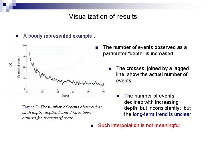
Visualization of results n A poorly represented example : n The number of events observed as a parameter “depth” is increased n The crosses, joined by a jagged line, show the actual number of events n Figure 7. The number of events observed at each depth; depths 1 and 2 have been omitted for reasons of scale n The number of events declines with increasing depth, but inconsistently; but the long-term trend is unclear Such interpolation is not meaningful

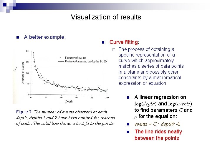
Visualization of results n A better example: n Curve fitting: ¨ The process of obtaining a specific representation of a curve which approximately matches a series of data points in a plane and possibly other constraints by a mathematical expression or equation n Figure 7. The number of events observed at each depth; depths 1 and 2 have been omitted for reasons of scale. The solid line shows a best-fit to the points n n A linear regression on log(depth) and log(events) to find parameters C and p for the equation: events = C · depthp -1 The line rides neatly between the points

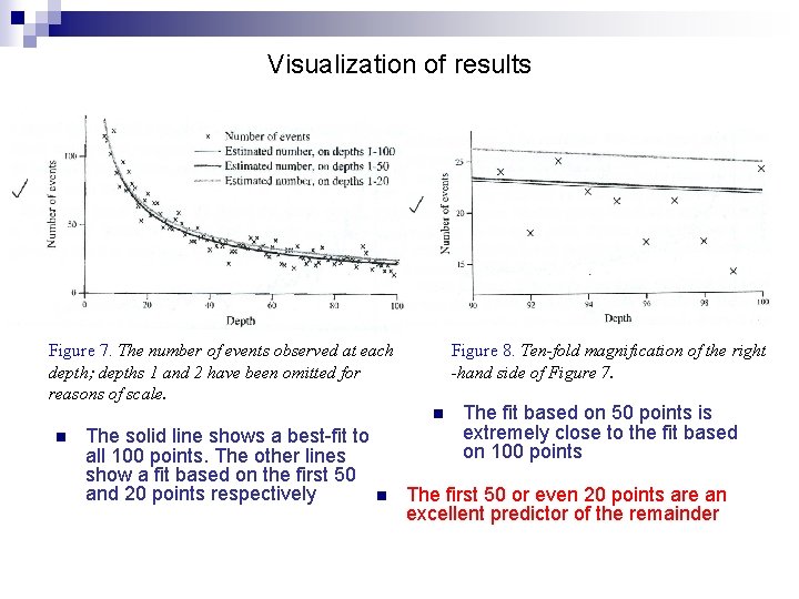
Visualization of results Figure 7. The number of events observed at each depth; depths 1 and 2 have been omitted for reasons of scale. Figure 8. Ten-fold magnification of the right -hand side of Figure 7. n n The solid line shows a best-fit to all 100 points. The other lines show a fit based on the first 50 and 20 points respectively n The fit based on 50 points is extremely close to the fit based on 100 points The first 50 or even 20 points are an excellent predictor of the remainder

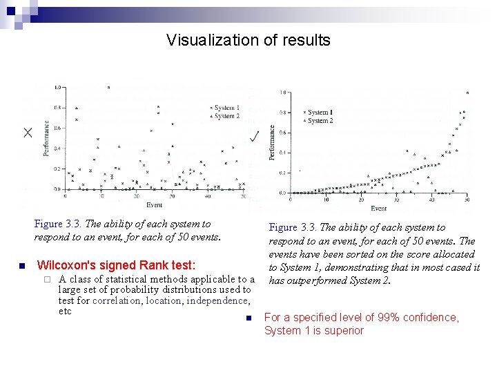
Visualization of results Figure 3. 3. The ability of each system to respond to an event, for each of 50 events. n Wilcoxon's signed Rank test: ¨ A class of statistical methods applicable to a large set of probability distributions used to test for correlation, location, independence, etc n Figure 3. 3. The ability of each system to respond to an event, for each of 50 events. The events have been sorted on the score allocated to System 1, demonstrating that in most cased it has outperformed System 2. For a specified level of 99% confidence, System 1 is superior

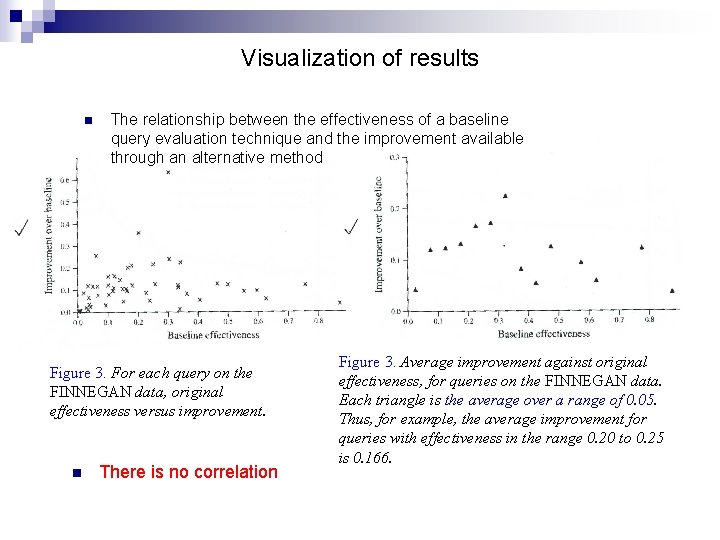
Visualization of results n The relationship between the effectiveness of a baseline query evaluation technique and the improvement available through an alternative method Figure 3. For each query on the FINNEGAN data, original effectiveness versus improvement. n There is no correlation Figure 3. Average improvement against original effectiveness, for queries on the FINNEGAN data. Each triangle is the average over a range of 0. 05. Thus, for example, the average improvement for queries with effectiveness in the range 0. 20 to 0. 25 is 0. 166.

Diagrams n Illustrate processes or architectures, explain data structures and algorithms, present relationships, and show examples of interfaces n Guidelines ¨ ¨ ¨ Be careful with the symbolism Diagrams should not be too dark; keep it as open as possible Take care about using colour in pictures Font should not be too small Lines should not be too heavy Revise diagrams as often as we would our writing

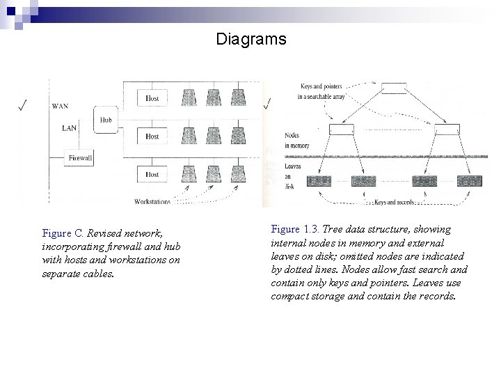
Diagrams Figure C. Revised network, incorporating firewall and hub with hosts and workstations on separate cables. Figure 1. 3. Tree data structure, showing internal nodes in memory and external leaves on disk; omitted nodes are indicated by dotted lines. Nodes allow fast search and contain only keys and pointers. Leaves use compact storage and contain the records.

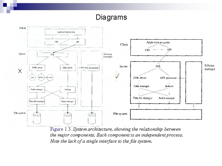
Diagrams Figure 1. 3. System architecture, showing the relationship between the major components. Each component is an independent process. Note the lack of a single interface to the file system.

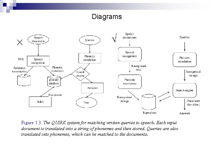
Diagrams Figure 1. 3. The QUIRK system for matching written queries to speech. Each input document is translated into a string of phonemes and then stored. Queries are also translated into phonemes, which can be matched to the documents.