WPF Features Panels Layouts like the previous page


 one window • Controls are")


- Slides: 24
WPF Features
Panels • Layouts, like the previous page, can use: • Canvas • Simplest, placement relative to two edges • Stack. Panel • Horizontal or vertical stacking • Grid • Uses rows and columns • Dock. Panel • Dock to top, right, bottom, left, and all else fills remaining space • Wrap. Panel • Horizontal stacking with wrap on overflow • All of these can be nested, any one in another
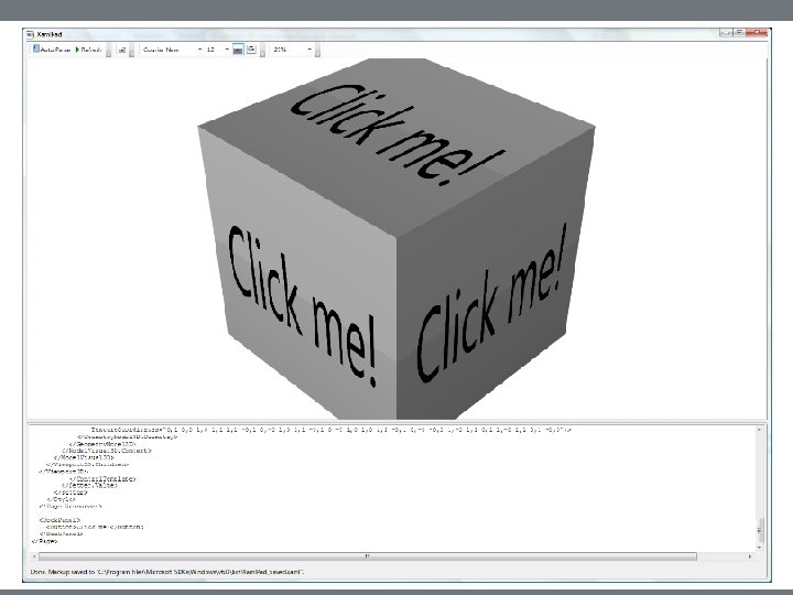
Vector Graphics • In WPF there is only (usually) one window • Controls are not windows! • There are no handles—really, no handles. • A button is a shape with border, fill, text, animation, and events, like click. • There is a Button class, but it is not a. Net control in the traditional sense nor an Active. X control. • Just markup, lines, fills, and events
Parse Tree • XAML gets rendered into a parse tree, just like XML—it is XML. • Inherited properties are based on parent-child relationships in the markup tree. • Events bubble is based on those relationships as well. • You have direct and simple control over that structure. • The world is yours!
What Makes WPF Unique? • Vector graphics with parse-tree structure derived from markup • Routed events bubble up the parse tree • Pervasive publish-and-subscribe model • Data binding • Dependency properties • Layered on top of Direct. X • Strong 2 D and 3 D graphics • Animation • Layout and styles model similar to the best of the web
3 D Hit Testing
3 D Perspective Camera
Routed Events • WPF maps markup elements to UIElements, which derive from Content. Control. • That means that almost everything can hold content—only one thing unless it’s a panel. • How does a mouse click event on any one of a control’s content elements get routed to the control? • By walking the XAML parse tree until it finds a parent that handles that event.
Adding Event Handlers • You will find that property sheets show events as well as properties. • Click on the lightning bolt to see the event sheet. • You subscribe by clicking on an event entry. • You can also add event handlers quickly in XAML: • Go to the XAML, then type a space after the tag for the element you want to handle the event. • That gets you a context menu (via Intelli. Sense) and you just double-click on the desired event, which adds an event attribute.
Attached Properties • Buttons, List. Boxes, Images, etc. , do not have Dock properties. • However, when you place one of these in a Dock. Panel, you find that it has had Dock properties attached. <Image Source=". /help. png" Dock. Panel. Dock="Top" Height="213" Image. Failed="Image_Image. Failed" />
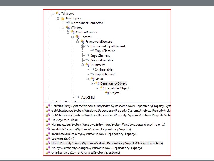
Dependency. Object Class • Attached properties work because all WPF controls derive from the Dependency. Object class. • Dependency. Object class supports adding an arbitrary number of dependency properties.
Dependency Properties • A dependency property is a property that is registered with the WPF dependency property system. Two uses: • Backing an object property with a dependency property, provides support for data binding, styling, and animation. Examples include Background and Font. Size properties. • Creating attached properties. Attached properties are properties that can be set on any Dependency. Object types. An example is the Dock property. • You can find an example of the definition and use of a custom dependency property here. • Dependency properties are a publish-and-subscribe system.
Property Syntax • Two syntax forms: • XAML attribute: <button Tool. Tip=“Button Tip /> • Property element syntax: <Button> <Button. Background> <Solid. Color. Brush Color=“#FF 4444 FF” /> </Button. Background> Some Button Text </Button>
Markup Extensions • Sometimes you need to assign a property from some source at run-time. For that you use markup extensions: <Button Foreground=“{x: static System. Colors. Active. Caption. Brush}” > Some text </Button>
Inline Styles • Collections of property values: • <Button. Style> <Setter Property=“Button. Font. Size” Value=“ 32 pt” /> <Setter Property=“Button. Font. Weight” Value=“Bold” /> </Style> </Button. Style>
Named Styles • Collections of property values: • <Window. Resources> <Style x: Key=“my. Style” Target. Type=“{x: Type Control}”> <Setter Property=“Font. Size” Value=“ 32 pt” /> <Setter Property=“Font. Weight” Value=“Bold” /> </Style> </Window>
Binding • Binding infrastructure allows you to set up a one-way or two-way updating of property values that happens when the source changes. • This requires two things: • A dependency object • Has its own dispatcher thread • Support for INotify. Property. Changed interface
Binding • Objects that implement INotify. Property. Changed interface raise events when the property has changed. • Data binding is the process of registering two properties with the data-binding engine and letting the engine keep them synchronized. • You will find an example in the Wpf_Attached. Properties demo code.
Control Templates • With control templates you can change the look and feel of existing controls and support making your own controls: • <Button. Template> <Control. Template> <Grid><Rectangle /></Grid> </Control. Template> </Button. Template>
Navigation • You can use instances of the Page and Frame classes to set up a navigation structure resembling web applications. • Pages go in Navigation. Window instances and Frames go in Windows and Pages. • This is a good alternative to tabbed displays.
Special Classes • Content. Control • All UIElements derive from this • Content can be text, a tree of elements, or a. Net object which can be displayed using a data template • Dependency object • Derives from Dispatcher. Object • Supports data binding, styling, animation, property inheritance, and property change notifications • Windows. Forms. Host • Supports hosting controls based on HWNDs