WPF Ashima Wadhwa Windows Presentation Framework Windows Presentation


- Slides: 16
WPF Ashima Wadhwa
Windows Presentation Framework • Windows Presentation Framework is a next generation UI framework to create applications with a rich user experience. • It is part of the. NET framework 3. 0 and higher. • It includes application UI, 2 D graphics, 3 D graphics and multimedia. • WPF makes the UI faster, scalable and resolution independent.
Features of WPF
Resolution Independence • WPF is resolution independence since all measures in WPF are logical units not pixels. A logical unit is a 1/96 of an inch. So, with changing the screen resolution setting in WPF each control will look same for each resolution. It is not based on Dots per inch (DPI) setting of the device.
Separation of appearance and behaviors • WPF separates the appearance of an UI from its behavior. The appearance is specified by XAML and behavior is specified by a managed programming language like C# or VB.
Built-In support for graphics and animation • WPF applications run within Direct. X environment, hence it has major support of graphics and animation capabilities. WPF has a separate set of classes that are specifically deal with animation effects and graphics.
Supports for Audio and Video • WPF has support for playing any audio or video file supported by Windows Media Player. It also gives you the tools to integrate video content into your rich UI such as placing a video window on a spinning 3 -D cube.
Highly customizable • WPF supports separation of appearance and behaviors; hence you can easily change the look of a control or a set of controls. This concept of styling controls in WPF, is almost like CSS in HTML. • In WPF, you can store styles, controls, animations, and even any object as a resource and you may associate that resource to the controls. Each resource is declared once when the form loads itself.
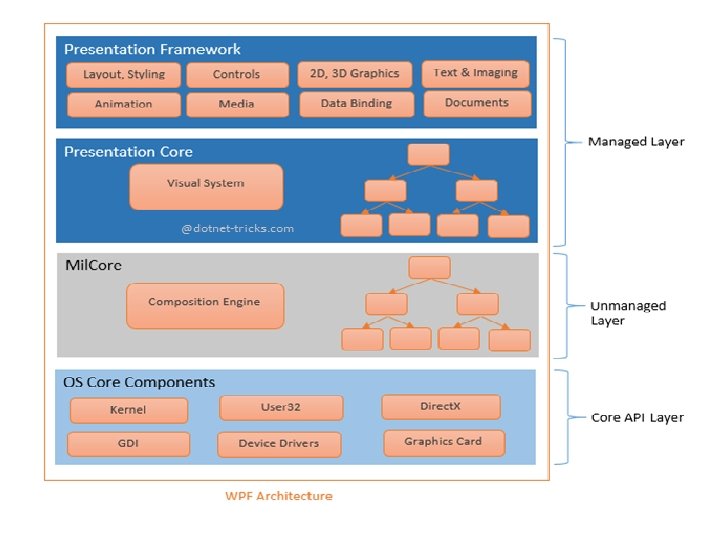
WPF Architecture • It is part of the. NET framework 3. 0 and higher. WPF architecture is a layered architecture which have Managed, Unmanaged and Core API layers as shown in below figure.
Managed Layer • Managed layer has two main components – Presentation Framework and Presentation Core. • Presentation Framework provides the required functionalities that we need to build the WPF applications such as controls, data bindings, styling, shapes, media, documents, annotations, animation and more. Presentation. Famework. dll is responsible for this purpose. • Presentation Core acts as a managed wrapper around MILCore and provides public interface for MIL. Presentation Core is the home for WPF Visual System and provides classes for creating application visual tree. The Visual System creates visual tree which contains applications Visual Elements and rendering instructions. Presentation. Core. dll is responsible for this purpose.
Unmanaged Layer • This layer is also called milcore or Media Integration Library Core. Mil. Core is written in unmanaged code in order to enable tight integration with Direct. X engine is underlying technology used in WPF to display all graphics, allowing for efficient hardware and software rendering. MIL has Composition System that receives rendering instructions from Visual System and translates into data that can be understood by Direct. X to render user interface.
Core API Layer • This layer has OS core components like Kernel, User 32, GDI, Device Drivers, Graphic cards etc. These components are used by the application to access low level APIs. User 32 manages memory and process separation.
Types of Templates • Control Template • This template specifies the appearance of a Control; if a control does not have a Control Template, the Control will not appear in your application. • For Example - When you will add the template defines as below to your application as a resource then all the buttons in the application will appear as ellipses but will still function as buttons.
Data Template • This template specifies a group of characteristics for how data should be displayed. This template is particularly useful when you are binding an Items. Control such as a List. Box to an entire collection. • For Example – The Template defined as below, is used to display the items of a List. Box. The data template contains Text. Block controls that bind to the First. Name, Last. Name, and Address properties.
Different Types of Triggers in WPF • Triggers are used to change the style of a control when control’s property value changes or event fires. Triggers create visual effects on controls. By using triggers you can also change the appearance of framework elements. • Property Trigger • This trigger gets active when UIElements property value changes. • Event Trigger • This trigger gets active when Routed. Event of Framework. Element raise. Event Trigger is generally used to perform some animation on control like as color. Animation, double. Anumation using Key. Frame etc. • Data Trigger • This trigger gets active when Binding Data matches specified condition. Below Data. Trigger is created on Picture property of binding data.