Worksheet 2 INFLATION STATS RATIOS AND STATS CI
- Slides: 16

Worksheet 2 INFLATION, STATS & RATIOS, AND STATS & CI

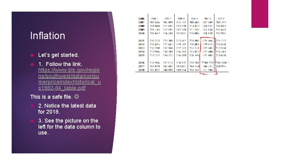
Inflation Let’s get started. 1. Follow the link. https: //www. bls. gov/regio ns/southwest/data/consu merpriceindexhistorical_u s 1982 -84_table. pdf This is a safe file. 2. Notice the latest data for 2018. 3. See the picture on the left for the data column to use.

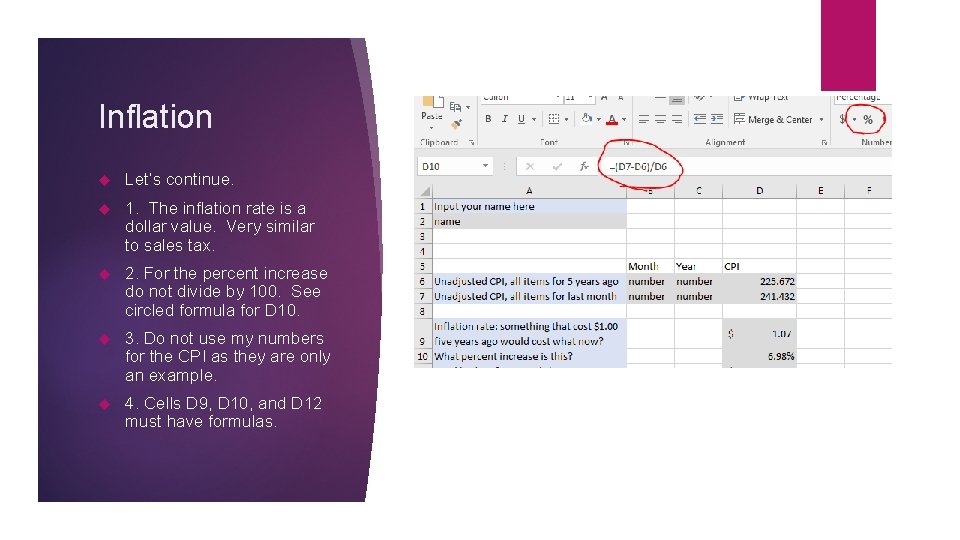
Inflation Let’s continue. 1. The inflation rate is a dollar value. Very similar to sales tax. 2. For the percent increase do not divide by 100. See circled formula for D 10. 3. Do not use my numbers for the CPI as they are only an example. 4. Cells D 9, D 10, and D 12 must have formulas.

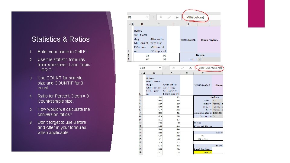
Statistics & Ratios 1. Enter your name in Cell F 1. 2. Use the statistic formulas from worksheet 1 and Topic 1 DQ 2. 3. Use COUNT for sample size and COUNTIF for 0 count. 4. Ratio for Percent Clean = 0 Count/sample size. 5. How would we calculate the conversion ratios? 6. Don’t forget to use Before and After in your formulas when applicable.

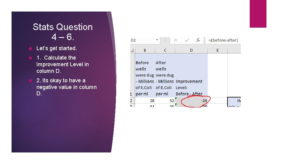
Stats Question 4 – 6. Let’s get started. 1. Calculate the Improvement Level in column D. 2. Its okay to have a negative value in column D.

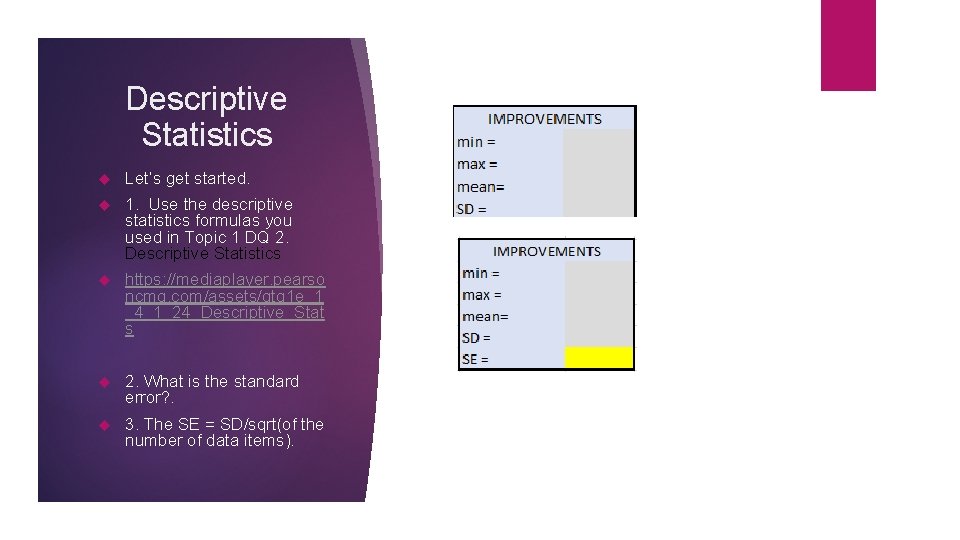
Descriptive Statistics Let’s get started. 1. Use the descriptive statistics formulas you used in Topic 1 DQ 2. Descriptive Statistics https: //mediaplayer. pearso ncmg. com/assets/gtq 1 e_1 _4_1_24_Descriptive_Stat s 2. What is the standard error? . 3. The SE = SD/sqrt(of the number of data items).

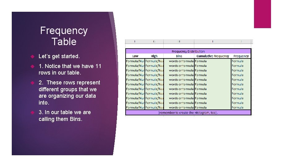
Frequency Table Let’s get started. 1. Notice that we have 11 rows in our table. 2. These rows represent different groups that we are organizing our data into. 3. In our table we are calling them Bins.

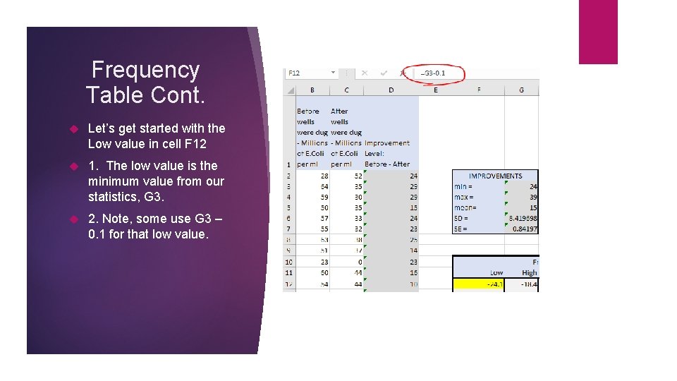
Frequency Table Cont. Let’s get started with the Low value in cell F 12 1. The low value is the minimum value from our statistics, G 3. 2. Note, some use G 3 – 0. 1 for that low value.

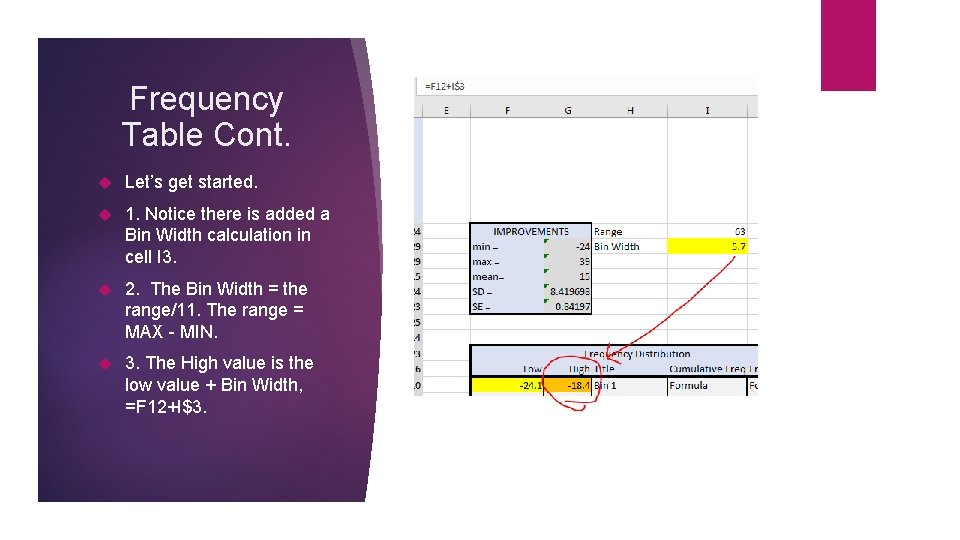
Frequency Table Cont. Let’s get started. 1. Notice there is added a Bin Width calculation in cell I 3. 2. The Bin Width = the range/11. The range = MAX - MIN. 3. The High value is the low value + Bin Width, =F 12+I$3.

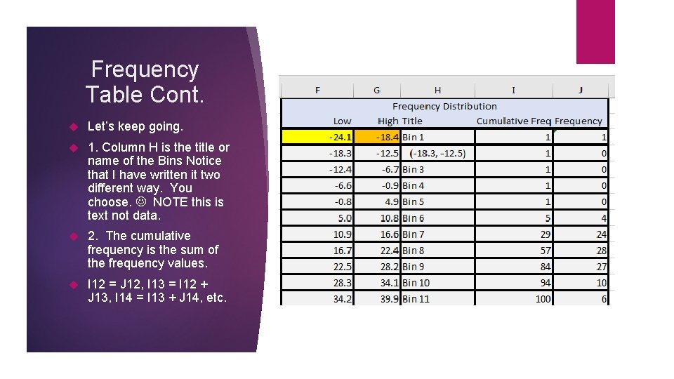
Frequency Table Cont. Let’s keep going. 1. Column H is the title or name of the Bins Notice that I have written it two different way. You choose. NOTE this is text not data. 2. The cumulative frequency is the sum of the frequency values. I 12 = J 12, I 13 = I 12 + J 13, I 14 = I 13 + J 14, etc.

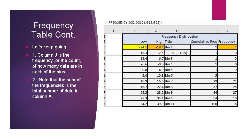
Frequency Table Cont. Let’s keep going. 1. Column J is the frequency , or the count, of how many data are in each of the bins. 2. Note that the sum of the frequencies is the total number of data in column A.

Frequency Table Cont. To construct the frequency column J, do the following steps. 1. Enter the data in Column A. This is already done. 2. Complete column G. 3. In cell J 12, type, but don't press enter, the following formula. This is already done. =Frequency(D$2: D$101, G 12: G 22) 4. Hold the “Shift” key and click your mouse the last cell in column J, J 22. This will highlight all of column J. 5. Press the “F 2” key on your computer (your formula will show) and then press “Ctrl. Shift-Enter” to copy the formula as an array. This will complete column J for you.

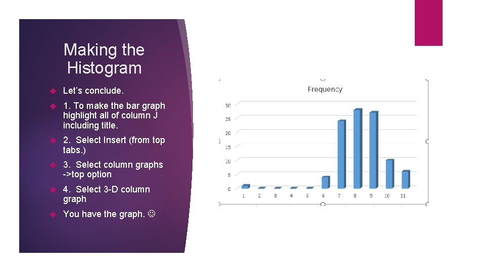
Making the Histogram Let’s conclude. 1. To make the bar graph highlight all of column J including title. 2. Select Insert (from top tabs. ) 3. Select column graphs ->top option 4. Select 3 -D column graph You have the graph.

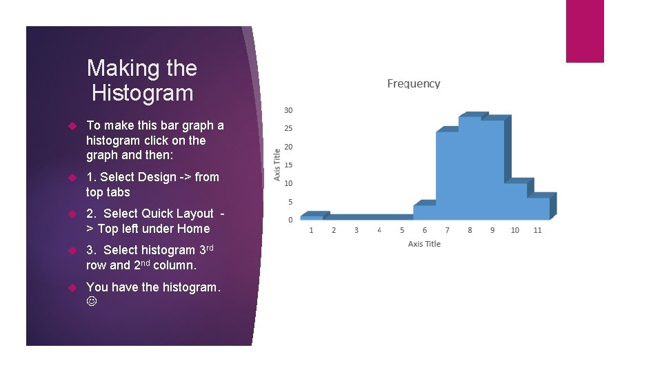
Making the Histogram To make this bar graph a histogram click on the graph and then: 1. Select Design -> from top tabs 2. Select Quick Layout > Top left under Home 3. Select histogram 3 rd row and 2 nd column. You have the histogram.

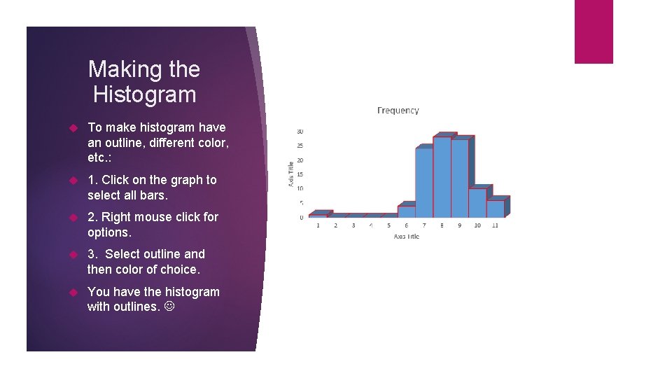
Making the Histogram To make histogram have an outline, different color, etc. : 1. Click on the graph to select all bars. 2. Right mouse click for options. 3. Select outline and then color of choice. You have the histogram with outlines.

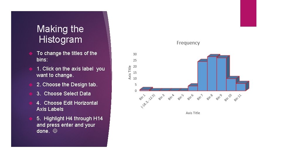
Making the Histogram To change the titles of the bins: 1. Click on the axis label you want to change. 2. Choose the Design tab. 3. Choose Select Data 4. Choose Edit Horizontal Axis Labels 5. Highlight H 4 through H 14 and press enter and your done.