Working Scientifically Lesson 4 Analysing Graphs Learning Objective

Working Scientifically: Lesson 4 Analysing Graphs

Learning Objective • To be able to analyse graphs. Success Criteria • To draw conclusions based on data presented on a graph. • To describe more complex graphical data. • To explain data. • To suggest reasons for findings.

Starter: Tables and Graphs Key Terms Write your answer on t piece of paper. Make sure that you don’t show the answer until you are told to. 1. This is the variable that you measure. 2. This the variable that should be on the x axis. 3. What type of graph should you use when you have a categoric independent variable? 4. Name three different ways to present data. 5. What should be written beneath each axis?

Starter: Tables and Graphs Key Terms Answers 1. dependent variable 2. independent variable 3. bar chart 4. bar chart, line graph, scatter graph, pie chart, table, frequency diagram, histogram 5. It should be labelled including units, where appropriate.

What’s the Difference? Write a definition for the words ‘describe’ and ‘explain’. What is the difference? AQA definitions: Describe – recall facts, events or processes in an accurate way. Explain – make something clear, or state the reasons for something happening.

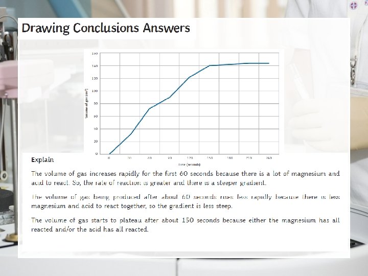
Drawing Conclusions from Graphs Complete the Drawing Conclusion s Activity Sheet Extension What could you do to ensure that the results were: • Repeatable? • Reproducible?
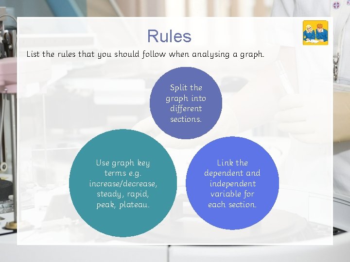
Rules List the rules that you should follow when analysing a graph. Split the graph into different sections. Use graph key terms e. g. increase/decrease, steady, rapid, peak, plateau. Link the dependent and independent variable for each section.
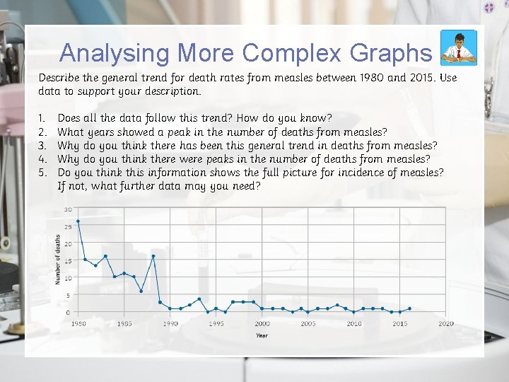
Analysing More Complex Graphs Describe the general trend for death rates from measles between 1980 and 2015. Use data to support your description. 1. 2. 3. 4. 5. Does all the data follow this trend? How do you know? What years showed a peak in the number of deaths from measles? Why do you think there has been this general trend in deaths from measles? Why do you think there were peaks in the number of deaths from measles? Do you think this information shows the full picture for incidence of measles? If not, what further data may you need?
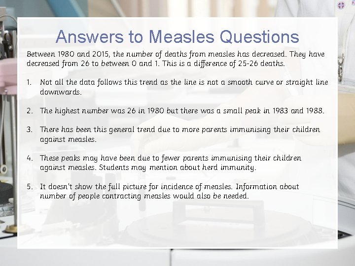
Answers to Measles Questions Between 1980 and 2015, the number of deaths from measles has decreased. They have decreased from 26 to between 0 and 1. This is a difference of 25 -26 deaths. 1. Not all the data follows this trend as the line is not a smooth curve or straight line downwards. 2. The highest number was 26 in 1980 but there was a small peak in 1983 and 1988. 3. There has been this general trend due to more parents immunising their children against measles. 4. These peaks may have been due to fewer parents immunising their children against measles. Students may mention about herd immunity. 5. It doesn’t show the full picture for incidence of measles. Information about number of people contracting measles would also be needed.

Plenary Summarise what you have learnt from the tables and graphs working scientifically lessons. Be prepared to feedback to the class.

- Slides: 12