Windows Programming Using C Presented by Gurpreet Singh
Windows Programming Using C# Presented by: Gurpreet Singh Assistant Professor Department of School of Computing and Engineering Galgotias University
Contents System. Drawing Namespace n System. Windows. Forms Namespace n ¨ Creating forms applications by hand ¨ Creating forms applications using Visual Studio designer 2

Forms Programming n n Forms programming allows you to create standalone Windows GUI applications The API has been modernized for. NET It now supports a modern delegate-based programming model Forms programming uses ¨ System. Drawing n Basic GDI+ functionality ¨ System. Windows. Forms n Higher-level controls 3
System. Drawing This namespace provides many graphic data structures which are used throughout the GUI programming model n It also provides support for low-level drawing operations n These can be used to draw anything, not just what is offered by the pre-built controls n 4
System. Drawing. Point Structure which represents a 2 -D point n Constructor n ¨ Point(int n x, int y) Properties – get/set of X coordinate ¨ Y – get/set of Y coordinate ¨X 5
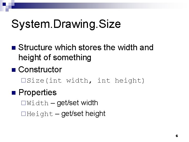
System. Drawing. Size Structure which stores the width and height of something n Constructor n ¨ Size(int n width, int height) Properties – get/set width ¨ Height – get/set height ¨ Width 6
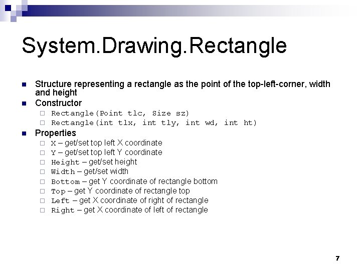
System. Drawing. Rectangle n n Structure representing a rectangle as the point of the top-left-corner, width and height Constructor ¨ ¨ n Rectangle(Point tlc, Size sz) Rectangle(int tlx, int tly, int wd, int ht) Properties ¨ ¨ ¨ ¨ X – get/set top left X coordinate Y – get/set top left Y coordinate Height – get/set height Width – get/set width Bottom – get Y coordinate of rectangle bottom Top – get Y coordinate of rectangle top Left – get X coordinate of right of rectangle Right – get X coordinate of left of rectangle 7
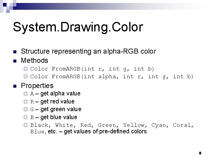
System. Drawing. Color n n Structure representing an alpha-RGB color Methods Color From. ARGB(int r, int g, int b) ¨ Color From. ARGB(int alpha, int r, int g, int b) ¨ n Properties ¨ ¨ ¨ A – get alpha value R – get red value G – get green value B – get blue value Black, White, Red, Green, Yellow, Cyan, Coral, Blue, etc. – get values of pre-defined colors 8
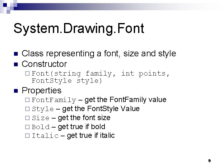
System. Drawing. Font n n Class representing a font, size and style Constructor ¨ Font(string family, int points, Font. Style style) n Properties ¨ Font. Family – get the Font. Family ¨ Style – get the Font. Style Value ¨ Size – get the font size ¨ Bold – get true if bold ¨ Italic – get true if italic value 9
System. Drawing. Font. Style n An enumeration with members ¨ Bold, n Italic, Regular, Strikeout, Underline The values can be ORed together to indicate that more than one style should apply at once 10
System. Windows. Forms n n This namespace contains all of the controls used on the average Windows interface A control is a higher-level object composed of ¨A window in which the control is drawn ¨ Visual parts of the control which are drawn in the window ¨ A set of delegates which are triggered when various events occur 11
Form Class This is the top-level window class n This class contains all other controls n Normally, your top-level form inherits from the Form class n Although the class has numerous methods, most of the time you interact with it via properties and delegates n 12
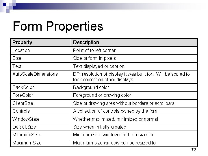
Form Properties Property Description Location Point of to left corner Size of form in pixels Text displayed or caption Auto. Scale. Dimensions DPI resolution of display it was built for. Will be scaled to look correct on other displays. Back. Color Background color Fore. Color Foreground or drawing color Client. Size of drawing area without borders or scrollbars Controls A collection of controls owned by the form Window. State Whether maximized, minimized or normal Default. Size when initially created Minimum. Size Minimum size window can be resized to Maximum. Size Maximum size window can be resized to 13
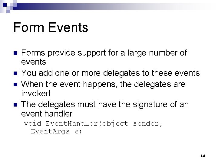
Form Events n n Forms provide support for a large number of events You add one or more delegates to these events When the event happens, the delegates are invoked The delegates must have the signature of an event handler void Event. Handler(object sender, Event. Args e) 14
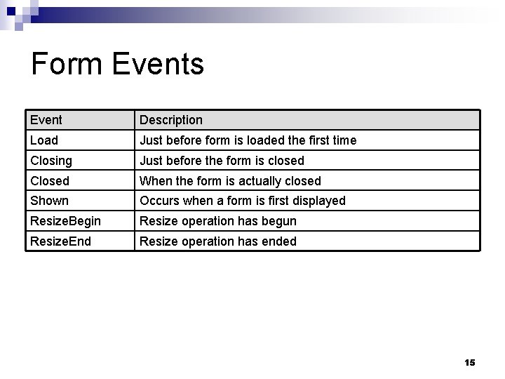
Form Events Event Description Load Just before form is loaded the first time Closing Just before the form is closed Closed When the form is actually closed Shown Occurs when a form is first displayed Resize. Begin Resize operation has begun Resize. End Resize operation has ended 15
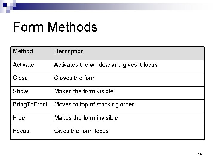
Form Methods Method Description Activates the window and gives it focus Closes the form Show Makes the form visible Bring. To. Front Moves to top of stacking order Hide Makes the form invisible Focus Gives the form focus 16

Creating Windows Applications n n n We will demonstrate how to build a simple GUI interface using a text editor Most of the time, the designer in Visual Studio will be used Doing it by hand ¨ Shows how it works under the hood ¨ Let’s you make modifications by hand ¨ Provides an understanding so you can create your own controls 17
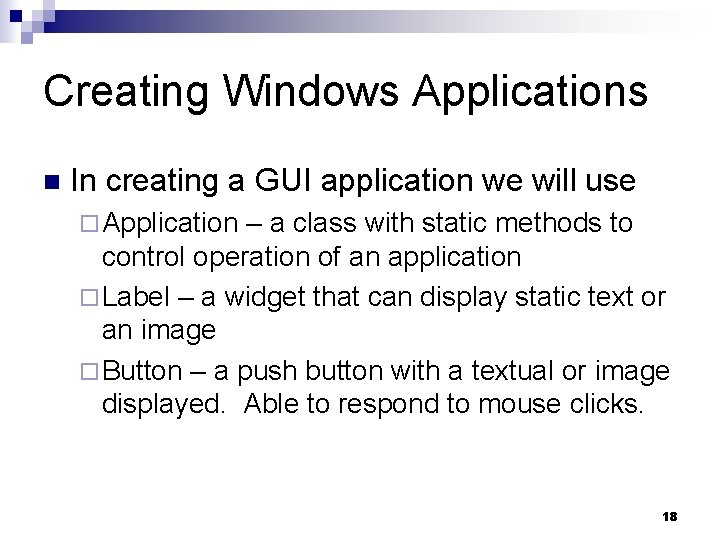
Creating Windows Applications n In creating a GUI application we will use ¨ Application – a class with static methods to control operation of an application ¨ Label – a widget that can display static text or an image ¨ Button – a push button with a textual or image displayed. Able to respond to mouse clicks. 18
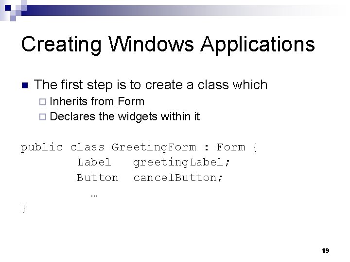
Creating Windows Applications n The first step is to create a class which ¨ Inherits from Form ¨ Declares the widgets within it public class Greeting. Form : Form { Label greeting. Label; Button cancel. Button; … } 19
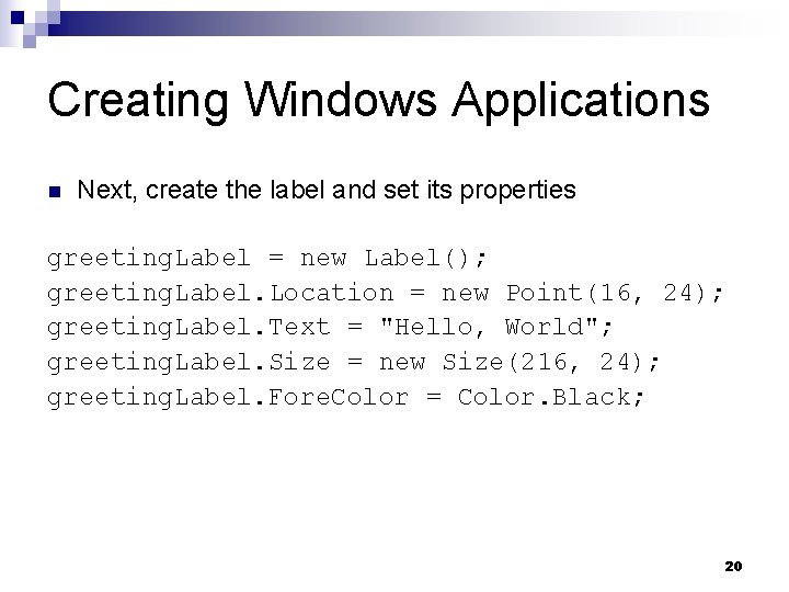
Creating Windows Applications n Next, create the label and set its properties greeting. Label = new Label(); greeting. Label. Location = new Point(16, 24); greeting. Label. Text = "Hello, World"; greeting. Label. Size = new Size(216, 24); greeting. Label. Fore. Color = Color. Black; 20
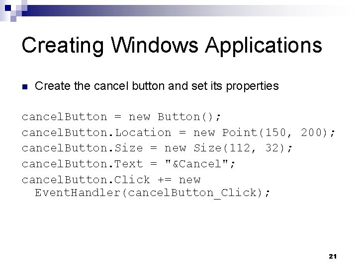
Creating Windows Applications n Create the cancel button and set its properties cancel. Button = new Button(); cancel. Button. Location = new Point(150, 200); cancel. Button. Size = new Size(112, 32); cancel. Button. Text = "&Cancel"; cancel. Button. Click += new Event. Handler(cancel. Button_Click); 21
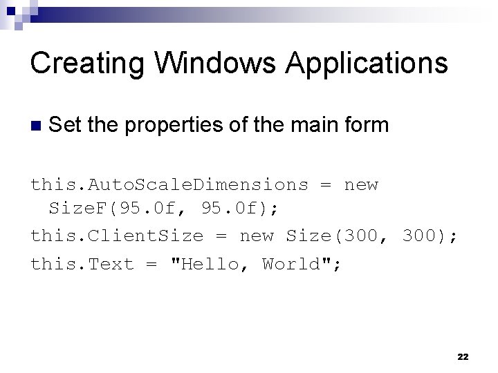
Creating Windows Applications n Set the properties of the main form this. Auto. Scale. Dimensions = new Size. F(95. 0 f, 95. 0 f); this. Client. Size = new Size(300, 300); this. Text = "Hello, World"; 22
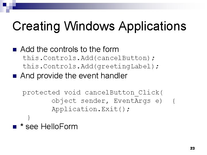
Creating Windows Applications n Add the controls to the form this. Controls. Add(cancel. Button); this. Controls. Add(greeting. Label); n And provide the event handler protected void cancel. Button_Click( object sender, Event. Args e) Application. Exit(); } n { * see Hello. Form 23
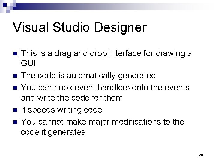
Visual Studio Designer n n n This is a drag and drop interface for drawing a GUI The code is automatically generated You can hook event handlers onto the events and write the code for them It speeds writing code You cannot make major modifications to the code it generates 24
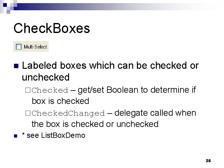
Check. Boxes n Labeled boxes which can be checked or unchecked – get/set Boolean to determine if box is checked ¨ Checked. Changed – delegate called when the box is checked or unchecked ¨ Checked n * see List. Box. Demo 25
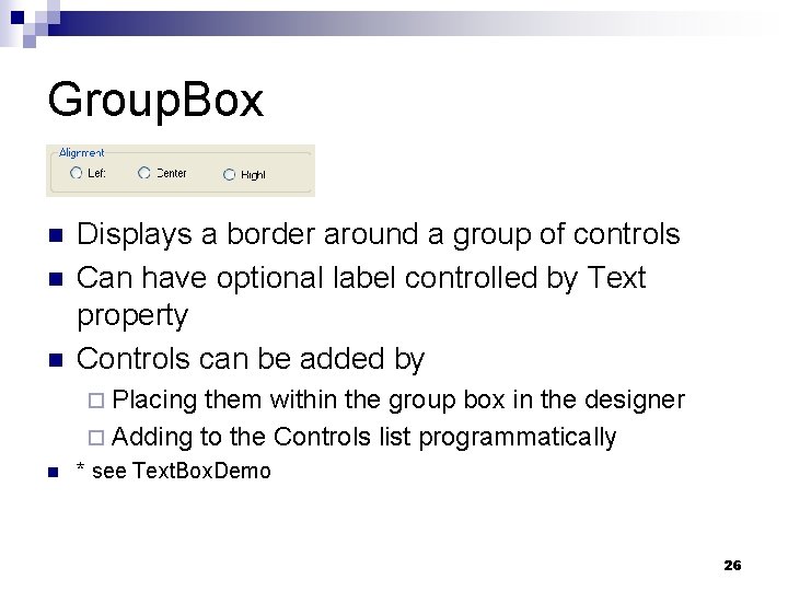
Group. Box n n n Displays a border around a group of controls Can have optional label controlled by Text property Controls can be added by ¨ Placing them within the group box in the designer ¨ Adding to the Controls list programmatically n * see Text. Box. Demo 26
Panels A panel is like a group box but does not have a text label n It contains a group of controls just like group box n ¨ Border. Style – get/set border n Border. Style. Fixed 3 D n Border. Style. Fixed. Single n Border. Style. None style as 27
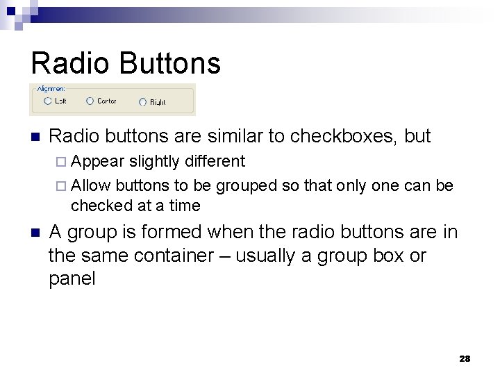
Radio Buttons n Radio buttons are similar to checkboxes, but ¨ Appear slightly different ¨ Allow buttons to be grouped so that only one can be checked at a time n A group is formed when the radio buttons are in the same container – usually a group box or panel 28
Radio Buttons – get/set Boolean indicating if the button is checked ¨ Checked. Changed – delegate invoked when the button is checked or unchecked ¨ Checked ¨ * see Text. Box. Demo 29
Text. Box n This is a single line or multi-line text editor – get/set Boolean to make multiline ¨ Accepts. Return – in a multiline box, if true then pressing Return will create a new line. If false then the button referenced by the Accept. Button property of the form, will be clicked. ¨ Password. Char – if this is set to a char, then the box becomes a password box ¨ Multiline 30

Text. Box – if true, the control is grayed out and will not accept user input ¨ Scroll. Bars – determines which scrollbars will be used: Scroll. Bars. None, Vertical, Horizontal, Both ¨ Text. Align – get/set Horizontal. Alignment. Left, Center, or Right ¨ Text. Changed – event raised when the text is changed ¨ Read. Only 31
File Dialog The file dialog allows you to navigate through directories and load or save files n This is an abstract class and you use n ¨ Open. File. Dialog ¨ Save. File. Dialog n You should create the dialog once and reuse it so that it will remember the last directory the user had navigated to 32
File Dialog n n Initial. Directory – string representing the directory to start in Filter – a string indicating the different types of files to be displayed ¨A set of pairs of display name and pattern separated by vertical bars n n Windows Bitmap|*. bmp|JPEG|*. jpg|GIF|*. gif Filter. Index – the filter to use as an origin 1 index 33
File Dialog n n File. Name – the name of the file selected Show. Dialog – a method to show the dialog and block until cancel or OK is clicked if (open. Dialog. Show. Dialog() == Dialog. Result. OK) { Image img = Image. From. File(open. Dialog. File. Name); picture. Box 1. Image = img; } n * see Image. Viewer 34
Image Class n n An abstract class that can store an image Several concrete classes are used for image types such as BMP, GIF, or JPG fname) – loads any supported image format from a file ¨ From. Stream(stream) – loads an image from a stream ¨ Height – image height ¨ Width – image width ¨ From. File(string n *see Image. Viewer 35
Picture. Box Class n This displays an image – assigned an Image object to display ¨ Size. Mode – determines what to do if the image does not fit into the window ¨ Image Normal n Stretch. Image n Auto. Size n Center. Image n Zoom * see Image. Viewer n n 36
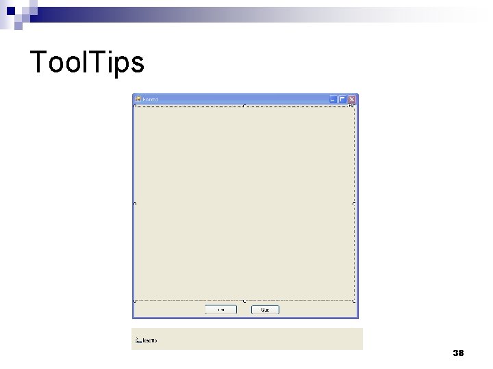
Tool. Tips These are the small pop-up boxes which explain the purpose of a control n To use n ¨ Create a new tooltip in the designer ¨ Drop the tooltip onto the form ¨ The tooltip will appear on a tray below the form n * see Image. Viewer 37
Tool. Tips 38
Tool. Tips After the tooltip appears in the tray, a new tooltip property appears for every component n This can be assigned different text for each component n That text will be displayed when the mouse hovers over that component n 39
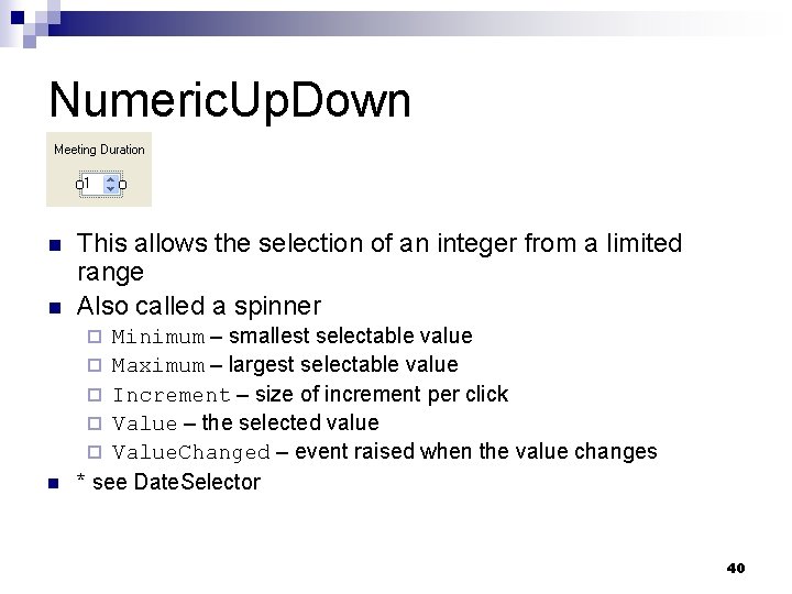
Numeric. Up. Down n This allows the selection of an integer from a limited range Also called a spinner n Minimum – smallest selectable value ¨ Maximum – largest selectable value ¨ Increment – size of increment per click ¨ Value – the selected value ¨ Value. Changed – event raised when the value changes * see Date. Selector n ¨ 40
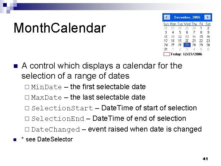
Month. Calendar n A control which displays a calendar for the selection of a range of dates – the first selectable date ¨ Max. Date – the last selectable date ¨ Selection. Start – Date. Time of start of selection ¨ Selection. End – Date. Time of end of selection ¨ Date. Changed – event raised when date is changed ¨ Min. Date n * see Date. Selector 41
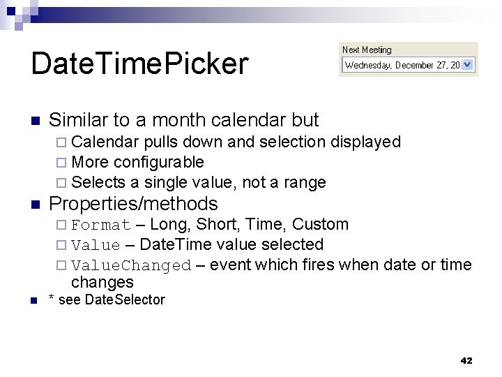
Date. Time. Picker n Similar to a month calendar but ¨ Calendar pulls down and selection displayed ¨ More configurable ¨ Selects a single value, not a range n Properties/methods ¨ Format – Long, Short, Time, Custom ¨ Value – Date. Time value selected ¨ Value. Changed – event which fires when changes n date or time * see Date. Selector 42
System. Date. Time Structure A structure representing a date and time n Constructors n ¨ Date. Time(int d, int m, int y) ¨ Date. Time(int d, int m, int y, int h, int m, int s) n Properties – returns a Date. Time object set to the current local time ¨ Now 43
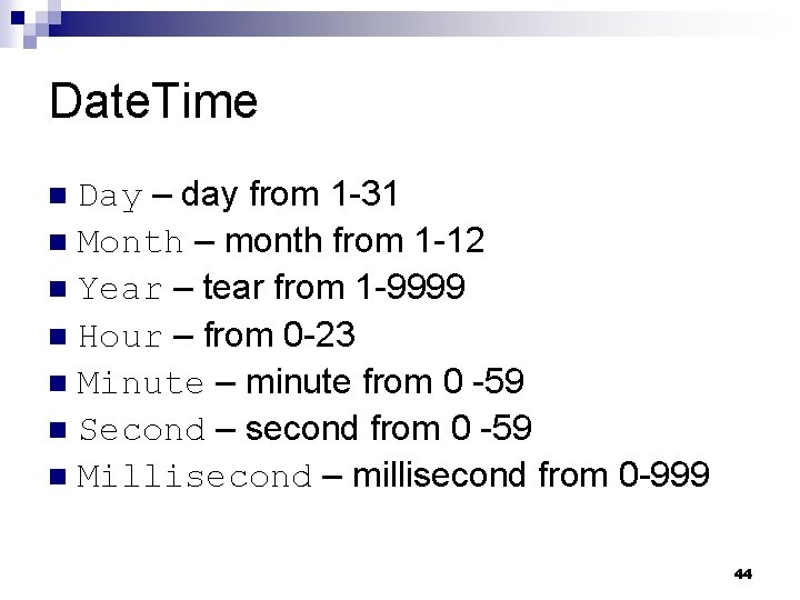
Date. Time Day – day from 1 -31 n Month – month from 1 -12 n Year – tear from 1 -9999 n Hour – from 0 -23 n Minute – minute from 0 -59 n Second – second from 0 -59 n Millisecond – millisecond from 0 -999 n 44
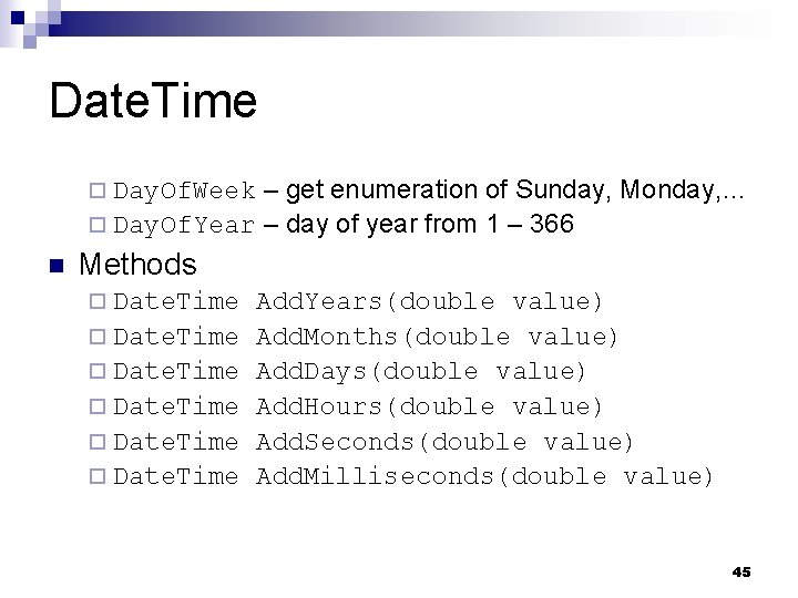
Date. Time – get enumeration of Sunday, Monday, … ¨ Day. Of. Year – day of year from 1 – 366 ¨ Day. Of. Week n Methods ¨ Date. Time Add. Years(double value) Add. Months(double value) Add. Days(double value) Add. Hours(double value) Add. Seconds(double value) Add. Milliseconds(double value) 45
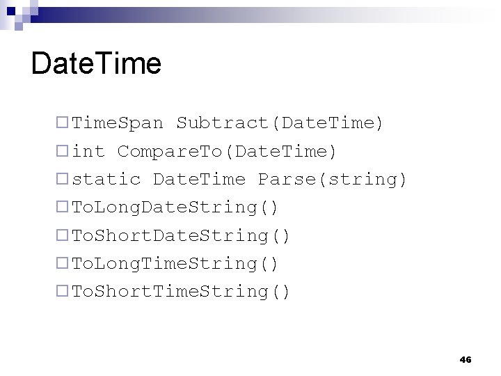
Date. Time ¨ Time. Span Subtract(Date. Time) ¨ int Compare. To(Date. Time) ¨ static Date. Time Parse(string) ¨ To. Long. Date. String() ¨ To. Short. Date. String() ¨ To. Long. Time. String() ¨ To. Short. Time. String() 46
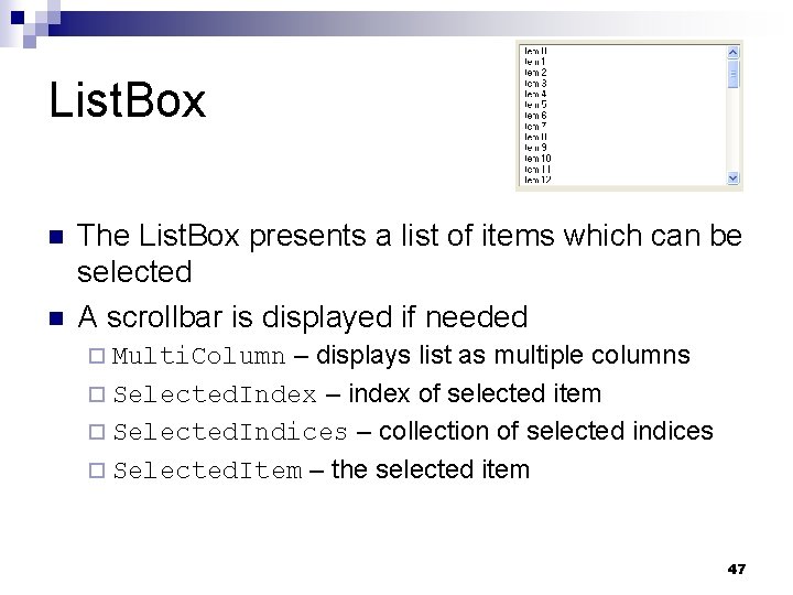
List. Box n n The List. Box presents a list of items which can be selected A scrollbar is displayed if needed – displays list as multiple columns ¨ Selected. Index – index of selected item ¨ Selected. Indices – collection of selected indices ¨ Selected. Item – the selected item ¨ Multi. Column 47
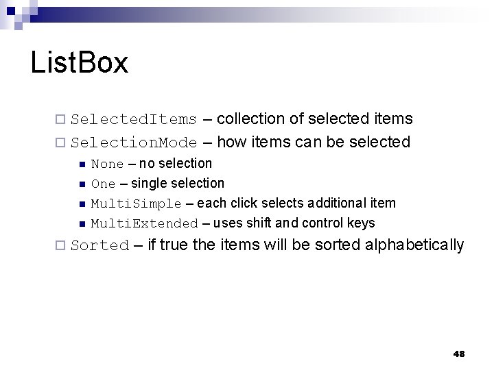
List. Box – collection of selected items ¨ Selection. Mode – how items can be selected ¨ Selected. Items n n None – no selection One – single selection Multi. Simple – each click selects additional item Multi. Extended – uses shift and control keys ¨ Sorted – if true the items will be sorted alphabetically 48
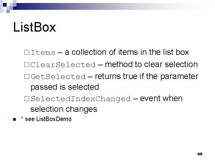
List. Box – a collection of items in the list box ¨ Clear. Selected – method to clear selection ¨ Get. Selected – returns true if the parameter passed is selected ¨ Selected. Index. Changed – event when selection changes ¨ Items n * see List. Box. Demo 49
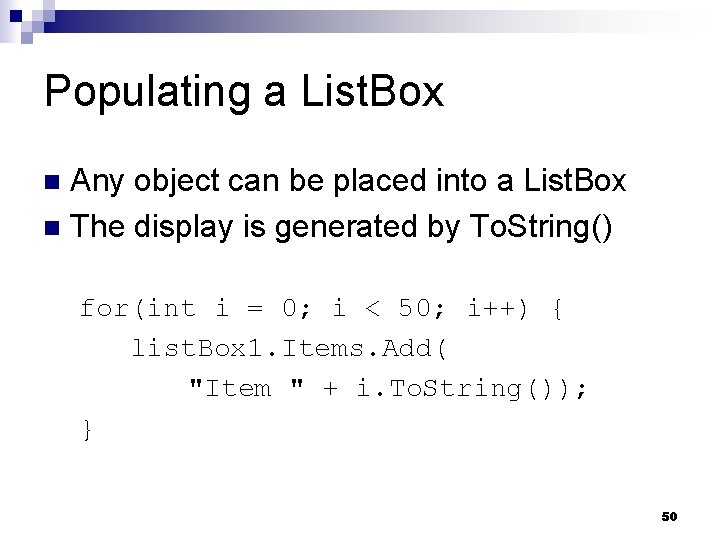
Populating a List. Box Any object can be placed into a List. Box n The display is generated by To. String() n for(int i = 0; i < 50; i++) { list. Box 1. Items. Add( "Item " + i. To. String()); } 50
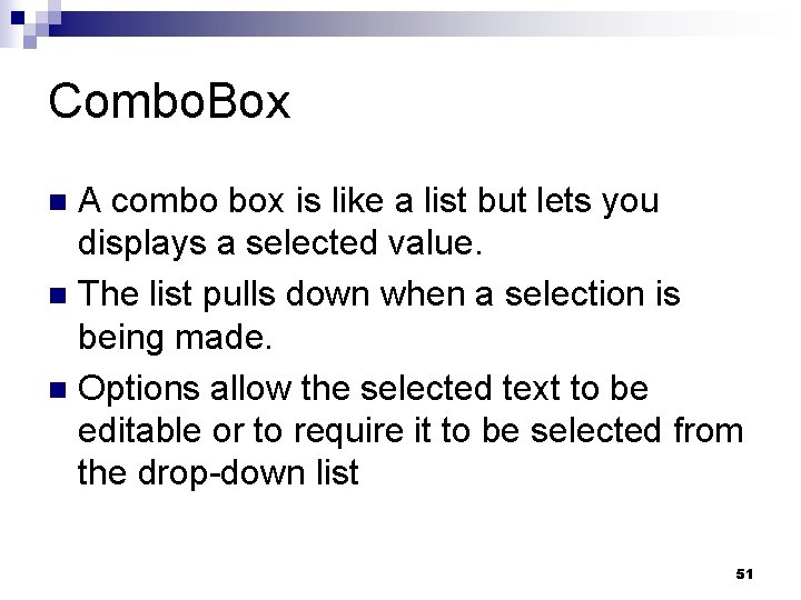
Combo. Box A combo box is like a list but lets you displays a selected value. n The list pulls down when a selection is being made. n Options allow the selected text to be editable or to require it to be selected from the drop-down list n 51
Combo. Box n Drop. Down. Style – – text is editable & list always visible ¨ Drop. Down – default indicating text is editable & user must click to see list ¨ Drop. Down. List – value is not editable & user must click to see list ¨ Simple n Items – the collection of items in the list 52
Combo. Box Max. Drop. Down. Items – max number of items in pulldown before scrollbar used n Selected. Index – index of selection n Selected. Item – selected item n Sorted – whether entries are sorted n Selected. Index. Changed – event raised when selection changes n 53
- Slides: 53