Windows Presentation Foundation Maximilian Knor Developer Evangelist Developer


 • List. Box • Combo. Box")


")


- Slides: 59
Windows Presentation Foundation Maximilian Knor Developer Evangelist Developer and Plattform Group Microsoft Österreich max. knor@microsoft. com http: //blogs. msdn. com/knom/
MSDN Briefings – Organisation Monthly technical briefings Currently released technology Your current needs Invitation / Registration / Feedback http: //blogs. msdn. com/msdnat http: //blogs. msdn. com/talk Well, what I am doing here?
Topics Windows Presentation Foundation Overview 2 D Controls and Layout Styles, Templates & Resources Data Binding Animation Interop and Migration
Why WPF? Another UI Framework? Aren‘t these some classics App flickers on re-size Overlay controls and videos Themeing und styling What‘s the cause? Win 32 has limits Graphics rendered by CPU
The WPF Approach Unify UI, Documents, Media Integrated development New Windows infrastructure Vector based graphics Use display hardware (D 3 D) Built-in UI patterns Designers and tools Bringing designers into the process Declarative programming models
. NET 3. 0 Windows WPF Presentation User Foundation Experience Windows WCF Communication Unified Foundation Messaging Windows WF Workflow Federated Foundation Workflow CS Windows Federated Card Space Identity
WPF Programming Model Separate UI and behavior Do you know ASP. NET Similar but more powerful XAML What, Not How! Creates object hierarchy <Button Width="100 px"> OK <Button. Background> Horizontal. Gradient= "White Lt. Blue" </Button. Background> </Button> Button b 1 = new Button(); b 1. Content = "OK"; b 1. Background = new Solid. Color. Brush(Colors. Light. Blue); b 1. Width = new Length(100); Dim b 1 As New Button b 1. Content = "OK" b 1. Background = New Solid. Color. Brush(Colors. Light. Blue) b 1. Width = New Length(100)
Developer Designer Collaboration Designer Developer
XAML Extensible Applications Markup Language <Button Name="button 1" Background="Red"> Click Me! </Button> Button button 1 = new Button(); button 1. Content = "Click Me!"; button 1. Background = new Solid. Color. Brush( Colors. Red);
Properties as Attributes or Elements <Button Content="Click Me!" Background="Light. Green" /> <Button> <Button. Background> Light. Green </Button. Background> Click Me! </Button>
Attached Properties <Canvas> <Button Canvas. Top="30" Canvas. Left="40"> Click Me! </Button> </Canvas>
Markup Extensions <Button Name="button 1"> <Button. Style> <Static. Resource. Key="key" /> </Button. Style> Click Me! </Button> <Button Name="button 1" Style="{Static. Resource key}" Content="Click Me" />
Topics Windows Presentation Foundation Overview 2 D Controls and Layout Styles, Templates & Resources Data Binding Animation Interop and Migration
Shapes Elements of UI tree Just like controls and other elements Rectangle Ellipse Polyline Polygon Path
Demo 2 D Shapes
Shapes and Code Shapes accessible from code behind Just like any element Change appearance by setting properties Screen is automatically updated <Ellipse Fill="Yellow" Name="my. Ellipse" Stroke. Thickness="7" Stroke="Black" Width="100" Height="100" /> //. . . in code behind my. Ellipse. Width = 200;
Brushes Specifies how shape is filled Used for properties throughout WPF <Rectangle Fill="Red" Width="200" Height="100" />
Linear/Radial. Gradient. Brush Fills across a range of colors Enables interesting visual effects
Image. Brush <Text. Block Font. Size="72" Font. Family="Arial Black"> <Text. Block. Foreground> <Image. Brush Image. Source="c: WindowsBlue Lace 16. bmp" /> </Text. Block. Foreground> Hello, World! </Text. Block>
Composability: Drawing. Brush Fill with vector image Scalable
Composability: Visual. Brush Fill with any UI element Makes certain design tricks easy Reflection of UI Use as 3 D surface texture
Opacity. Mask Apply opacity to any visual using any Brush
Transformations Any element can be transformed Scaling, rotation, moving Optionally affects layout Layout. Transform Render. Transform Included into hit testing
Demo Transformations
Topics Windows Presentation Foundation Overview 2 D Controls and Layout Styles, Templates & Resources Data Binding Animation Interop and Migration
Class Hierarchy
Dependency Property public class My. Dependency. Object : Dependency. Object { public static readonly Dependency. Property Some. State. Property = Dependency. Property. Register("Some. State", typeof(String), typeof(My. Dependency. Object)); public string Some. State { get { return (string)this. Get. Value(Some. State. Property); } set { this. Set. Value(Some. State. Property, value); } } }
Layout Controls Stack. Panel Wrap. Panel Canvas Dock. Panel Grid. . .
WPF Positioning Absolute Positioning X / Y, Width / Height Relative Positioning NO X/Y, Width/Height Margin Alignment <Button Margin="20, 10, 20, 10">Hallo Welt</Button>
WPF Positioning - Alignment Horizontal. Alignment Stretch, Left, Right, Center Vertical. Alignment Stretch, Top, Center, Bottom <Button Horizontal. Alignment="Stretch" Vertical. Alignment="Stretch"> Hallo Welt </Button> <Button Horizontal. Alignment="Left" Vertical. Alignment="Bottom"> Hallo Welt </Button>
Simple Controls Password. Box Scroll. Bar Progress. Bar Slider Text. Box Rich. Text. Box. . .
Content Controls Button Repeat. Button Toggle. Button Check. Box Radio. Button Label Frame List. Box. Item Status. Bar. Item Scoll. Bar. Viewer Tool. Tip User. Control Window Navigation. Window. . .
Demo Controls
Events Routed Event Handling Routing Strategy Tunneling, Bubbling, Direct
Events Create Routed Events public static readonly Routed. Event Tap. Event = Event. Manager. Register. Routed. Event( "Tap", Routing. Strategy. Bubble, typeof(Routed. Event. Handler), typeof(My. Button. Simple)); public event Routed. Event. Handler Tap { add { Add. Handler(Tap. Event, value); } remove { Remove. Handler(Tap. Event, value); } }
Events Event notation Preview. Xxx – Tunnelled Xxx - Bubbled Base Class Routed. Event. Args Attached Events
Demo Routed Event Handling
Headered Content Controls • Content Control with additional header • Expander • Menu. Item • Group. Box • Tab. Item • Usw.
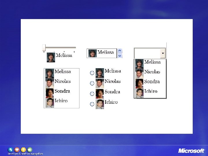
Items Controls • Container for multiple items (list) • List. Box • Combo. Box • Menu • Context. Menu • Status. Bar • Tree. View • Tab. Control • Usw.
Commands Controls define a command <Button Command="Application. Commands. New"> <Image Source="toolbargraphics/New. bmp" /> </Button> Command. Bindings define the handler <Window. Command. Bindings> <Command. Binding Command="Application. Commands. New" Executed="File. New" Can. Execute="Can. File. New" /> </Window. Command. Bindings>
Demo Tab. Control, Listbox, Toolbar, Commands
Topics Windows Presentation Foundation Overview 2 D Controls and Layout Styles, Templates & Resources Data Binding Animation Interop and Migration
Designer Developer
Fee dba c from k Cus tom ers Design Styling & Templates Development Process Final Product Skeleton e p y t o r P & t n e m i r e Exp
Styles are about setting properties…
Setting Properties Styles Trigger Animations Template
Lookless Controls and Templates Control implies behaviour Probably supplies default look Designer free to supply new look
Styling and Resources Style rarely defined inline Tend to be reused for consistency Usually defined as resources
Resource Dictionaries Simple Key, Value collection Framework. Element. Resources <Grid> <Grid. Resources> <Style x: Key="dapper"> <Setter Property="Background" Value="Lime. Green" /> </Style> </Grid. Resources>. . . <Button Style="{Static. Resource dapper}">Click</Button>
Resource Hierarchy <Window> <Window. Resources> . . . </Window. Resources> System Resources Application Resources Window/Page Resources Element Resources <Grid> <Grid. Resources> . . . </Grid. Resources> <List. Box> <List. Box. Resources> . . . </List. Box. Resources> </List. Box> </Grid> </Window>
Application Resources Styles and templates Shared graphics <Application x: Class="Resource. Play. My. App" xmlns="http: //schemas. microsoft. com/winfx/avalon/2005" xmlns: x="http: //schemas. microsoft. com/winfx/xaml/2005"> <Application. Resources> <Style x: Key="dapper"> <Setter Property="Background" Value="Lime. Green" /> </Style> </Application. Resources> </Application>
Page/Window Resources Utility elements Data sources Converters Page-specific templates
Element-Specific Resources Locally-scoped Styles and templates <Window. . . > . . . <Grid> <Grid. Resources> <Style Target. Type="{x: Type Text. Block}"> <Setter Property="Margin" Value="5" /> </Style> </Grid. Resources> . . . </Grid> . . . </Window>
Automatic Styles/Templates Most resources must use x: Key Optional with Styles and Data Templates Can use Target. Type or Data. Type instead Applied to target automatically – no reference required <Window. Resources> <Style Target. Type="{x: Type Text. Block}"> <Setter Property="Margin" Value="5" /> </Style> </Window. Resources>
Demo Styles
System Resources System. Colors – Colors and Brushes System. Fonts System. Parameters (sizes, settings) <Rectangle Height="50" Width="100" Fill="{x: Static System. Colors. Control. Brush}" /> <!-- Better – responds to config changes --> <Rectangle Height="50" Width="100" Fill="{Dynamic. Resource {x: Static System. Colors. Control. Brush. Key}}" />
Resources and Code-Behind Find. Resource Set. Resource. Reference Change resource value with indexer some. Elem. Resources["foo"] = bar; Initializing from code-behind not so good Must set before referencing XAML loaded OK for app resources, less good otherwise