Windows Presentation Foundation Layout with Panels By Kester
Windows Presentation Foundation Layout with Panels By Kester Marrain
Chapter Overview l l l l Canvas Stack. Panel Wrap. Panel Dock. Panel Grid Primitive Panels Handling Content Overflow
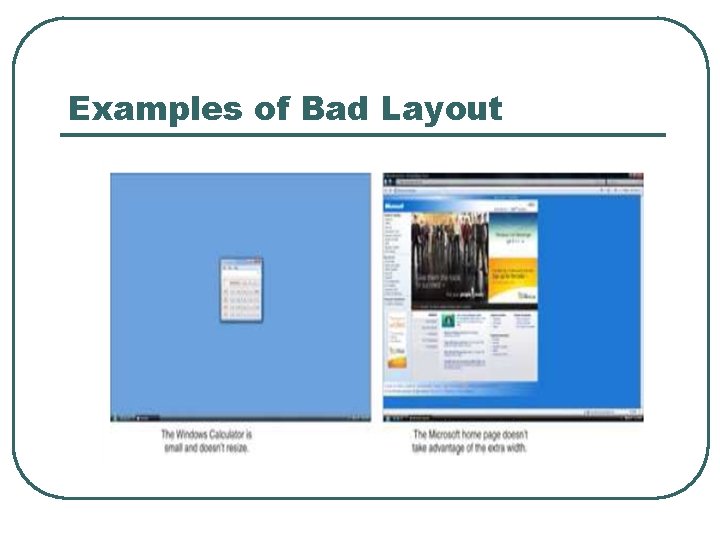
Examples of Bad Layout
CANVAS l l l The canvas is the most basic panel. Canvas only supports the “classic” notion of positioning elements with explicit coordinates (coordinates are device independent pixels). Canvas also enables you to specify coordinates relative to any corner of it.
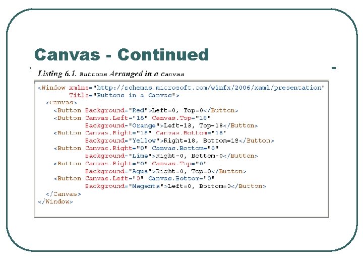
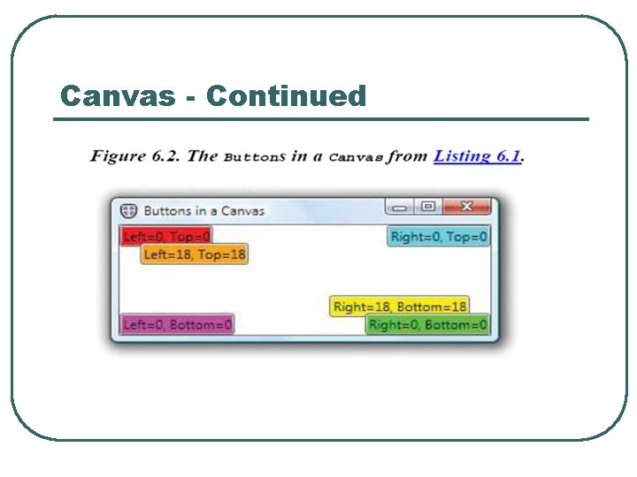
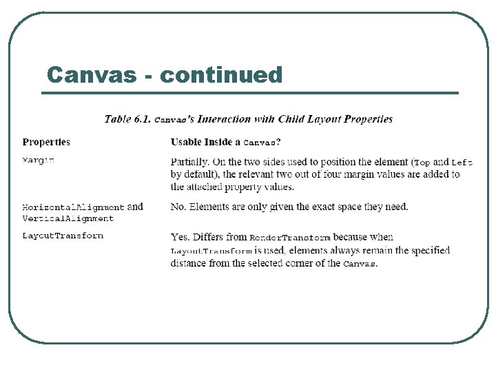
Canvas - continued l l Elements can be positioned by using a canvas’ attached properties: Left, Top, Right, Bottom and ZIndex. In essence, choosing the corner in which to “dock” each element and attached properties serve as margins. Elements cannot use more than two of the canvas’ attached properties.
Canvas - Continued
Canvas - Continued
Canvas - continued
Stack Panel l l Stack panels do not define their own attached properties. There is only one way to customize the behavior of Stack. Panel – setting its orientation property to Horizontal or Vertical (Vertical is the default).

Stack Panel - continued
Stack Panel - continued l When Flow. Direction is set to Right. To. Left, stacking occurs right to left for a stack panel with a horizontal orientation.
Stack Panel - continued
Stack Panel - continued
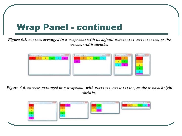
Wrap Panel - continued l l Similar to Stack. Panel but in addition to stacking, it wraps its child elements to additional rows and columns when there is not enough space for a single stack. Like a stack panel the wrap panel has no attached properties for controlling element positions.
Wrap Panel - continued l Defines three properties for controlling its elements behavior: • Orientation – Just like stack panel with default • • of horizontal. Item. Height - A uniform height for all child elements. Item. Width – A uniform width for all child elements.
Wrap Panel - continued l You can force wrap panels to arrange elements in a single row or column by setting its Width for Horizontal and Height for Vertical to Double. Max. Value or Double. Positive. Infinity. In XAML this must be done using the x: Static markup extension.
Wrap Panel - continued
Wrap Panel - continued
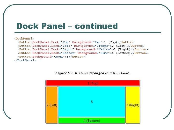
Dock Panel l Dock Panel enables easy docking of elements to an entire side of a panel, stretching it to fill the entire width or height. It also enables a single element to fill the remaining space unused by the docked element. Dock Panel has a Dock attached property, so children can control their docking with one of four properties: Left, Right, Top, Bottom.
Dock Panel – continued
Dock Panel - continued

Dock Panel - continued
Grid l l Grid is the most versatile panel. Enables arrangement of children in a multi-row or multi-column fashion. Has Row, Row. Span, Column and Column. Span attached properties. Grid cells can be left empty and multiple elements can appear in the same Grid cell.
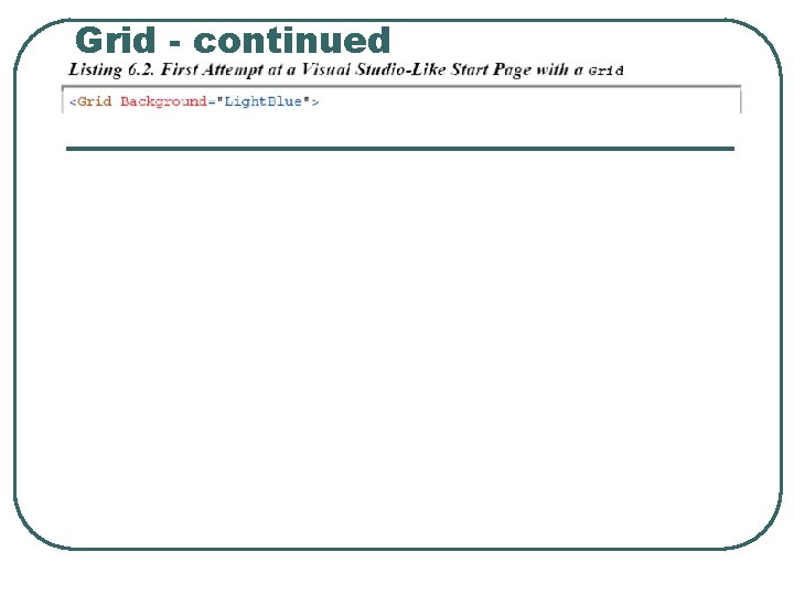
Grid - continued
Grid - continued
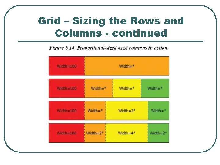
Grid – Sizing the Rows and Columns l l Row. Definition and Column. Definition properties do not default to Auto. They are of type System. Windows. Grid. Length rather than double. Grid supports three different types of Row. Definition and Column. Definition sizing: • • • Absolute Sizing Auto Sizing Proportional Sizing
Grid – Sizing the Rows and Columns - continued
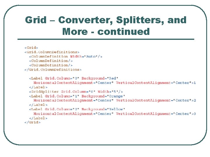
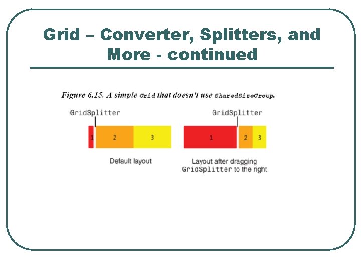
Grid – Converter, Splitters, and More l l System. Windows. Grid. Length. Converter is the type converter that converts strings to Grid. Length structures. Interactive sizing of rows and columns is accomplished using a Grid. Splitter. Any number of Grid. Splitter can be added to a Grid. The Grid. Splitter attached properties are Grid. Row, Grid. Column, Grid. Row. Span, Grid. Column. Span, Resize. Direction, Resize. Behavior and Shared. Size. Group.
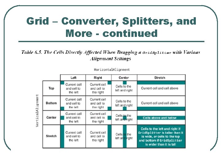
Grid – Converter, Splitters, and More - continued l l l The best way to use Grid. Splitter is to place it in its own autosized row or column. To avoid overlapping the existing content in the adjacent cells. If it is in a cell with other content it should be added last so it has the topmost Z order. The Grid. Splitter must be given an explicit width or height to be seen.
Grid – Converter, Splitters, and More - continued
Grid – Converter, Splitters, and More - continued
Grid – Converter, Splitters, and More - continued
Grid – Converter, Splitters, and More - continued
Comparing Grid to other Panels l l l A single row and single column Grid with Horizontal. Alignment and Vertical. Alignment of all children to values other than stretch Grid functions like a Canvas. A single column Grid with autosized rows looks like a vertical stack panel. Using Row. Span and Column. Span a Grid is emulate a dock panel.
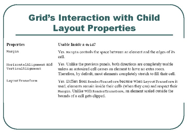
Grid’s Interaction with Child Layout Properties
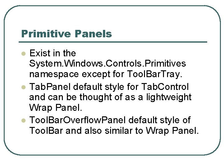
Primitive Panels l l l Exist in the System. Windows. Controls. Primitives namespace except for Tool. Bar. Tray. Tab. Panel default style for Tab. Control and can be thought of as a lightweight Wrap Panel. Tool. Bar. Overflow. Panel default style of Tool. Bar and also similar to Wrap Panel.
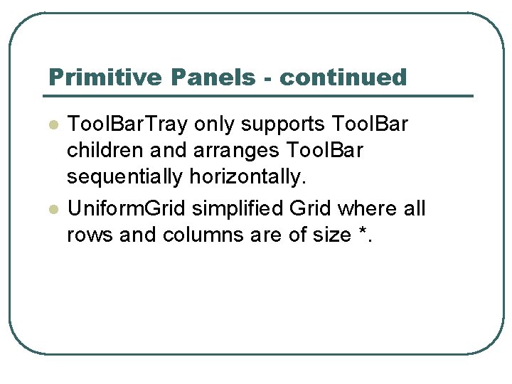
Primitive Panels - continued l l Tool. Bar. Tray only supports Tool. Bar children and arranges Tool. Bar sequentially horizontally. Uniform. Grid simplified Grid where all rows and columns are of size *.
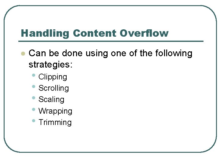
Handling Content Overflow l Can be done using one of the following strategies: • Clipping • Scrolling • Scaling • Wrapping • Trimming
Handling Content Overflow Clipping l l l Clipping (truncating or cropping) is the default way that panels handle content that is to large. All UIElements have a Boolean Clip. To. Bounds property that controls whether a child element can be rendered outside of its bounds. Clipping occurs before Render. Transforms are applied.
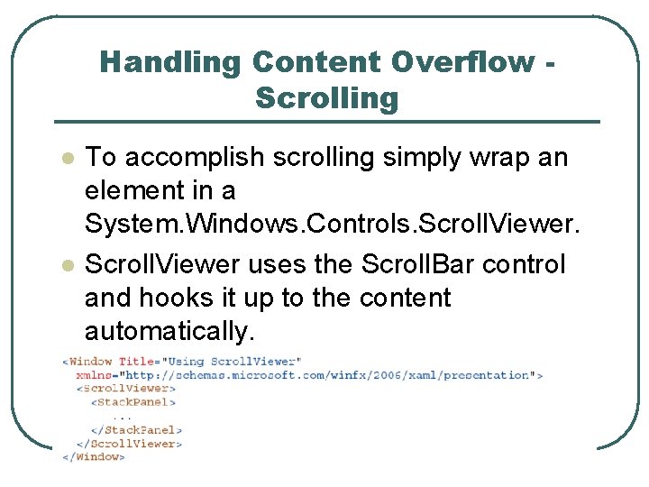
Handling Content Overflow Scrolling l l To accomplish scrolling simply wrap an element in a System. Windows. Controls. Scroll. Viewer uses the Scroll. Bar control and hooks it up to the content automatically.
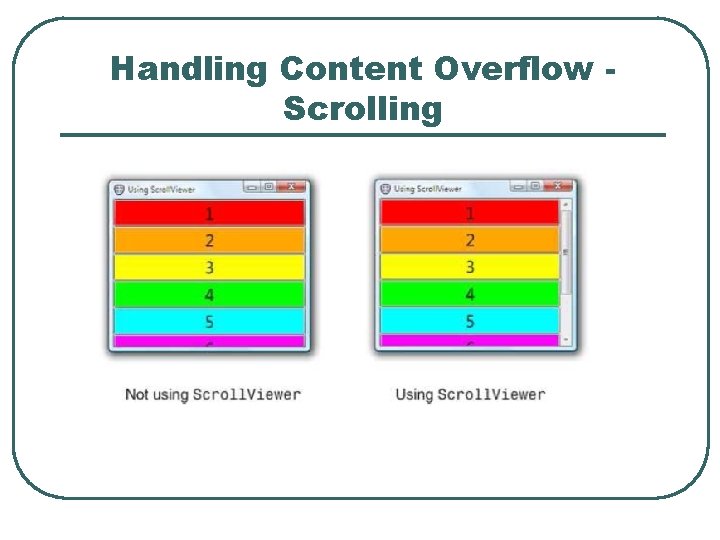
Handling Content Overflow Scrolling
Handling Content Overflow Scrolling l Virtualizing. Stack. Panel acts like a Stack Panel, but it temporarily discards any items off-screen to optimize performance (only when data binding).
Handling Content Overflow Scaling l l The Viewbox control provides an easy mechanism to scale arbitrary content within a given space. Viewbox is a type of Decorator and only has one child element. By default Viewbox stretches in both dimensions to fill space given to it. Viewbox removes all wrapping.
Handling Content Overflow Scaling l The Stretch. Direction property of Viewbox controls whether content should be shrunk, enlarged or both. • • • l Up. Only Down. Only Both Viewbox has a stretch property to control how its single child gets scaled within its bounds. The property is an enumeration consisting of: • • None Fill Uniform (Default) Uniform. To. Fill
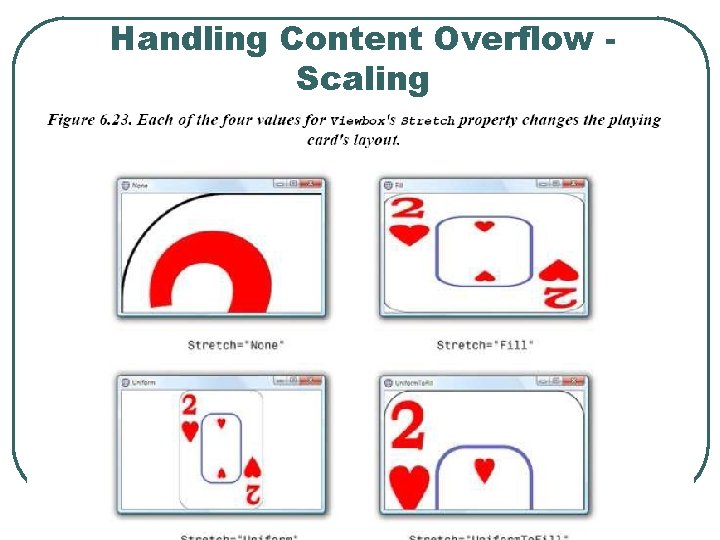
Handling Content Overflow Scaling
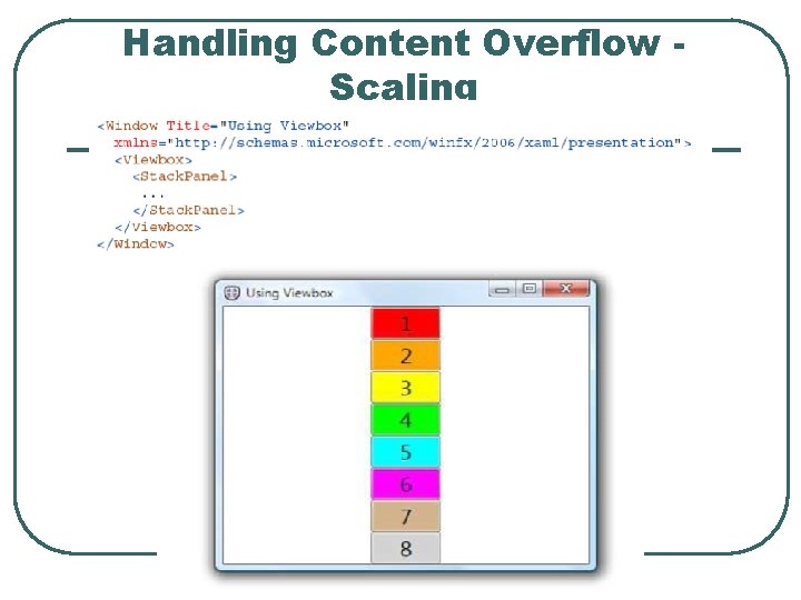
Handling Content Overflow Scaling
Reference l Sams Windows Presentation Foundation Unleashed WPF by Adam Nathan.
- Slides: 47