Windows layout Windows layout During the design process
- Slides: 28

Windows layout

Windows layout • During the design process, the individual elements, or building blocks, of screens will have been identified. • A logical flow of information will also have been determined. • Then organize layout for individual windows and Web pages, clearly and meaningfully. • Proper screen presentation and structure will encourage quick and correct information execution of tasks and functions, and enhanced user

Windows layout • In graphical user interfaces, components to be included on windows include a title, screen controls, headings, other screen content, and possibly instructional messages. • On Web pages, components to be included consist of elements such as the page title, textual content, graphics, headings, screen controls, links, and other necessary components.

Windows layout • Organizing and Laying Out Screens • How a screen is organized and how its information is actually presented to achieving the design goals of fast and accurate.

Windows layout • • • General Guidelines Present the proper amount of information on each screen. Too little is inefficient. Too much is confusing. — Present all information necessary for performing an action or making a decision on one screen, whenever possible. Provide an ordering that: Is logical and sequential. Minimizes pointer and eye movement distances. Position the most important and frequently used controls at the top left. — Maintain a top-to-bottom, left-to-right flow.

Organization Guidelines

Organization Guidelines • Organizational guidelines to be addressed include those relating to • groupings, • borders, • dependent controls, • alignment, and • Balance.

Organization Guidelines Creating Groupings Provide groupings of associated elements. Elements of a radio button or check box control. White space: — Provide adequate separation of groupings Headings: — Provide section headings and subsection headings for multiple control groupings. • — Provide headings that meaningfully and describe the nature of the group of related fields. • •

Organization Guidelines • • • Borders: — Enhance groupings through borders around: • Groups of related controls or fields. — Individual control borders should be visually differentiable from outer borders. • Provide a border consisting of a thin line around single controls. • Provide a border consisting of a slightly thicker line around groups of fields or controls. — Do not place individual field or control borders around: • Single entry fields. • Single list boxes. • Single spin boxes. — Do not place borders around command buttons.

Organization Guidelines • Section Borders • Line borders may be used to surround groupings of related controls. • Section headings should be located at the upper left within the border itself. • Display section headings in capital letters to differentiate them easily from individual control captions. • If both control borders and section borders are included on the same screen, make the section border slightly thicker

Organization Guidelines Aligning Screen Elements Minimize alignment points on a window. — Vertically. — Horizontally. Fewer screen alignment points reduce a screen’s complexity and make it more visually appealing. • Aligning elements will also make eye and pointer movement through the screen much more reduce the distance both must travel. • Alignment is achieved by creating vertical columns of screen fields and controls and also horizontally aligning the tops of screen elements. • • •

Organization Guidelines • Control Navigation • Tab/arrow keys: • — Use the tab key to move between operable window controls, in the logical order of the controls. • • Do not tab to field captions/labels. • • Use arrow keys to move through radio buttons within a single control. • • Within a border or group box, use arrow keys to move between the check boxes since they appear as a logical group. • • Use arrow keys to navigate within list box choices. • Keyboard equivalents: • — Use keyboard equivalents (mnemonics) for direct access to each control, whenever possible. • • Mnemonic designations must be unique within a window.

Organization Guidelines • • • • Window Guidelines ■ Organization: — Organize windows to support user tasks. — Present related information in a single window whenever possible. — Use: • Primary windows to: — Begin an interaction and provide top-level context for dependent windows. — Perform a major interaction. • Secondary windows to: — Extend the interaction. — Obtain or display supplemental information related to the primary window. • Dialog boxes for: — Infrequently used or needed information. — “Nice-to-know” information.

Organization Guidelines • Window Guidelines • ■ Number: • — Minimize the number of windows needed to accomplish an objective. • ■ Size: • — Provide large enough windows to: • • Present all relevant information for the task. • • Not hide important information. • • Not cause crowding or visual confusion. • • Minimize the need for scrolling.

Web Page Guidelines

Web Page Guidelines • • General: Layout Grid: Elements: Size: Organization: Formatting: Other:

Web Page Guidelines • General • Efficient. • A page will be more powerful if more is said with less. • Every element of the design must support the goal of the message being presented. • Exercise extreme care in using decorative elements. • Logical and consistent. • A logical and consistent layout of the site and its pages will enable people to quickly find what they are looking for.

Web Page Guidelines • General • Self-explanatory. • Each page should be clear indication of what Web site it belongs to and where it fits within the structure of the Web site’s information space. • Present the proper information, and arrange it, so users always know where they are. • Scannable. • Allow people to easily scan a page and select relevant and useful information. • Also create short paragraphs and use simple bulleted lists • Avoid the use of too many links and use plenty of white space. • Proper balance. • Always keep a proper balance between textual information, graphics and navigation links. • A page’s elements must balance, interact with, and support each other. • Always make sure text is visible first so people can start reading right away. • Long and detailed textual information can usually presented in secondary pages.

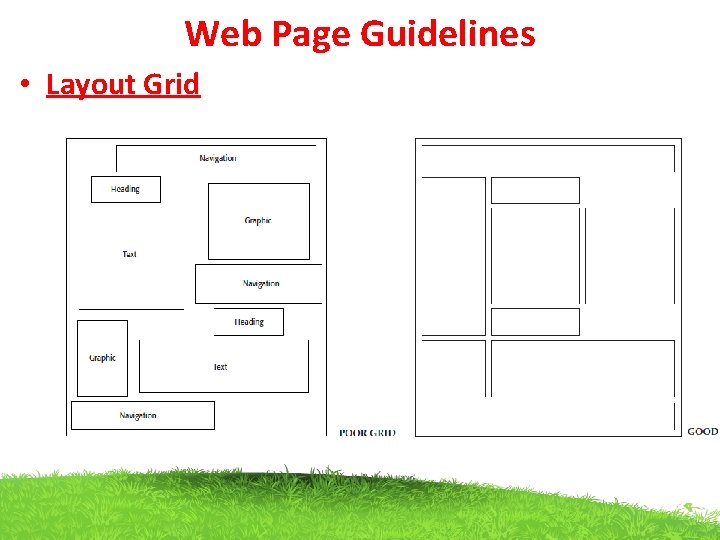
Web Page Guidelines • Layout Grid • To provide both structure and consistency to a Web site, establish a standard layout • These design grids will be composed of rectangular sections into which the page’s navigation components (headings, text, and graphics) will be placed. • To develop the grids: • Gather samples of the contents of site pages. • Include all types of pages: navigation pages, content pages, simple pages. • Follow all layout guidelines (alignment, balance, and so on) • Plug in content (navigational components, text, and graphics) for each page.

Web Page Guidelines • Layout Grid

Web Page Guidelines • Elements • To keep pages simple, restrict the number of functional elements on a page to seven or fewer. • Elements include such things as the title, the navigation bar, the textual link listing to major site areas, textual content, graphics, and the page footer. • The more elements on a page, the greater the confusion

Web Page Guidelines • Size • Page length. • Optimum page length must balance all these factors. • In general, • the best approach seems to be to minimize a page’s length, restricting it to two or three screens of information.

Web Page Guidelines • Organization • Important elements at the top. • Critical or important information should be placed where it will be immediately visible when the page is displayed. • As described earlier, in Web page design this is referred to as “above the fold, ”. • Above the fold is about the top 4 inches of a page and is the area of the page most users are assured of seeing. • Information “below the fold” will usually require scrolling to access and may not always be seen.

Web Page Guidelines • Formatting • White space. • To enhance readability and organization, and make the page more sufficient amount of white space on each page. • According to many experts, white space should consume at least 30 percent of a page. The remaining 70 percent of space, restrict text to no more than another 30 percent. • The remaining 40 percent may be used for graphics. • If the entire 40 percent is not used for graphics, use it for more white space, not additional text. • Textual line length. • For easier reading, restrict textual lines to no more than the length of two alphabets, or 52 characters. • Text and related graphics. • Keep text and any related graphics close to each other. • The viewer will assume a connection between elements located in close.

Web Page Guidelines • Formatting • Horizontal spacing. • Provide sufficient horizontal spacing for the groupings of information • A chunk of text, its heading, and any related graphic should be as a grouping. • Horizontal rules. • Use horizontal rules on pages. • Use horizontal rules only if the objective is break the flow.

Web Page Guidelines • • Other Frames. Use frames with caution. “Develop System Menus and Navigation Schemes, ” frames can be confusing for many users. They may cause problems with scrolling, bookmarking, and printing. They also reduce the content window size. Frames, however, may be useful for global page elements such as navigation links or information. The site name and a link to the home page must always be provided on the content page so the user does not reach a dead-end.

Web Page Guidelines • • • Home Page Limit to one screen. Clearly identify the Web site’s content and purpose. Elements to include: — Site overview or map. — Navigation links to most (if not all) of the site or major sections. — Some useful content. One can easily return to the home page, when one is confused or decides to do something else. The home page also gives people a first impression of a site A negative first impression can lead to rejection, a positive first impression create an urge for further exploration.

Web Page Guidelines