Why do we use charts Charts are a
- Slides: 5

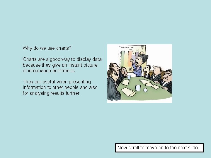
Why do we use charts? Charts are a good way to display data because they give an instant picture of information and trends. They are useful when presenting information to other people and also for analysing results further. Now scroll to move on to the next slide.

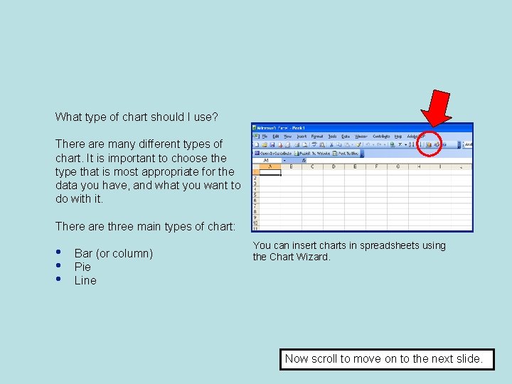
What type of chart should I use? There are many different types of chart. It is important to choose the type that is most appropriate for the data you have, and what you want to do with it. There are three main types of chart: • • • Bar (or column) Pie Line You can insert charts in spreadsheets using the Chart Wizard. Now scroll to move on to the next slide.

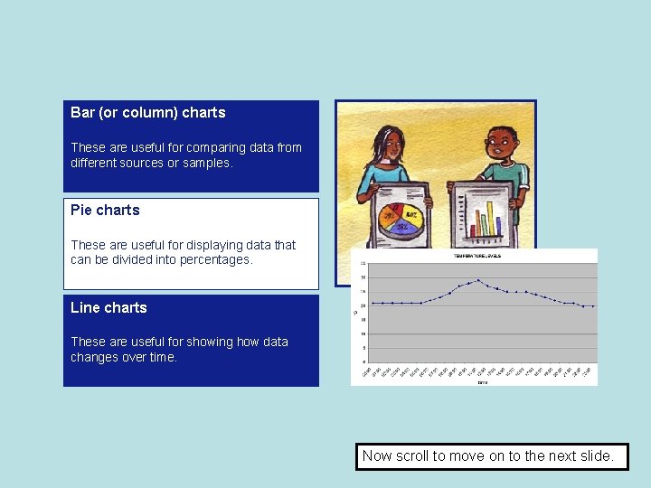
Bar (or column) charts These are useful for comparing data from different sources or samples. Pie charts These are useful for displaying data that can be divided into percentages. Line charts These are useful for showing how data changes over time. Now scroll to move on to the next slide.

Activity: With a partner, decide which type of chart would best display each example of data below. Be prepared to explain your choices. 1. The percentages of students who use different social networking sites. 2. The most popular television programmes watched in 2010 and 2011. 3. The level of noise in the school hall throughout a school day. 4. The number of goals scored, week by week, at matches through one season by football teams from two different schools. 5. The number of times students use their mobile phone for calls, text messages and phone calls, shown as percentages. 6. The temperature in the school kitchen throughout the school day. Now scroll to move on to the next slide.

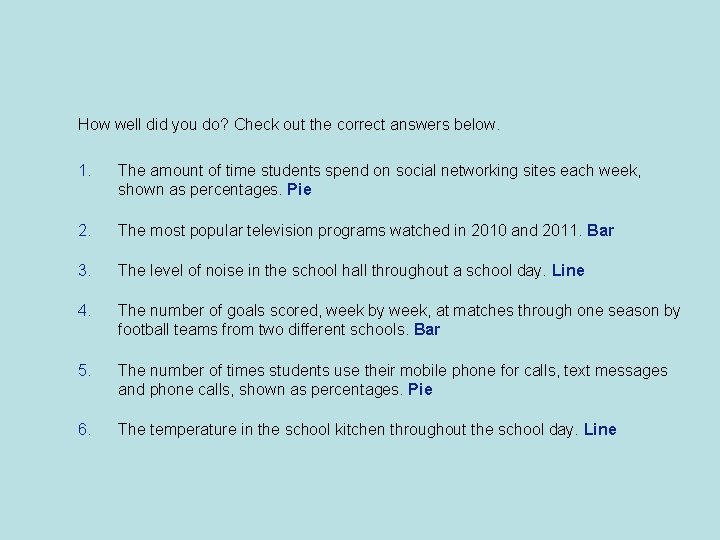
How well did you do? Check out the correct answers below. 1. The amount of time students spend on social networking sites each week, shown as percentages. Pie 2. The most popular television programs watched in 2010 and 2011. Bar 3. The level of noise in the school hall throughout a school day. Line 4. The number of goals scored, week by week, at matches through one season by football teams from two different schools. Bar 5. The number of times students use their mobile phone for calls, text messages and phone calls, shown as percentages. Pie 6. The temperature in the school kitchen throughout the school day. Line