What Makes GOOD design What makes art good


")
 10 pts Creativity ( new")
- Slides: 35
What Makes “GOOD” design
What makes art “good”?
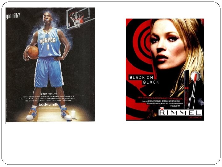
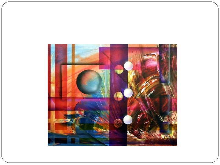
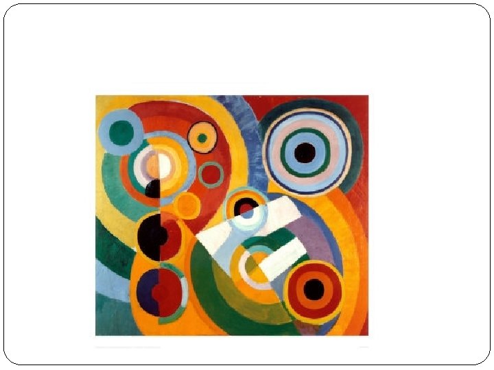
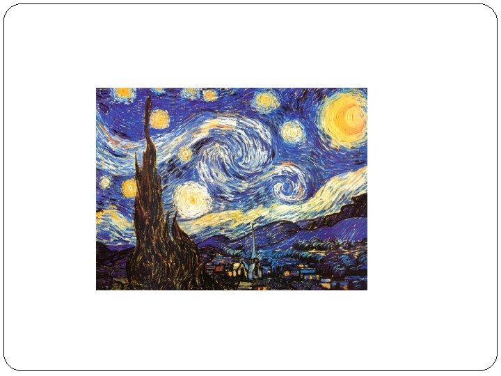
Asymmetrical vs Symmetrical Exciting vs boring
So how do you make a good asymmetrical design?
1. Create EMPHASIS by placing the FOCAL POINTS in one of the GOLDEN SECTIONS. Remember, the focal point in an asymmetrical design CANNOT be placed in the middle.
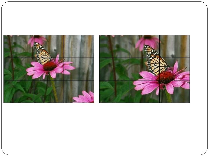
Rule of thirds
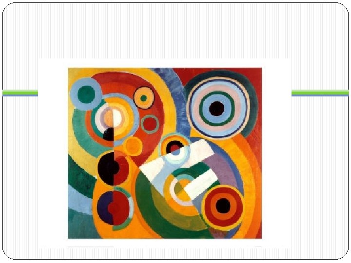
You need to balance your focal point with CONTRAST
One darker item may need to be balanced by several lighter items or vice versa.
� A small visually interesting object can balance a much large less interesting object. �A small pop of CONTRAST balances out the larger area. � Small shape against big shapes � Texture area against smooth area � Geometric against organic …AND VICE VERSA
Several smaller items on one side are balanced by a large item on the other side.
Small areas of vibrant color can be used to balance larger areas of more neutral colors or vice versa.
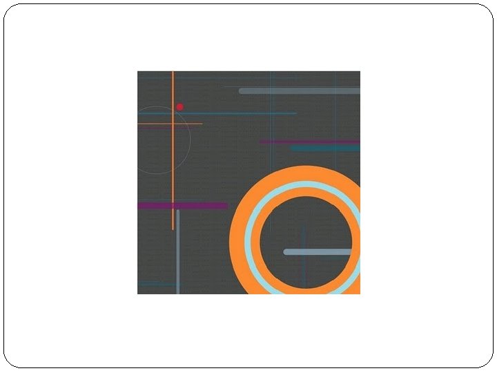
And tie everything in with RYTHYM
NOW IT’S YOUR TURN TO MAKE A “GOOD” DESIGN
Step 1 Create a background.
Create a background with your paper.
Step 2 Break up your NEGATIVE SPACE with objects or shapes or lines. Use RYTHYM and/or CONTRAST
Cut 3 shapes or lines that break up the NEGATIVE SPACE.
STEP 3 ADD CONTRAST. LIGHT/DARK BIG/SMALL TEXTURED/SMOOTH WAVY LINE/STRAIGHT GEOMETRIC/ORGANIC ADD RYTHYM. LINES COLORS SHAPES TEXTURES
CUT AND ADD AT LEAST 5 more shapes, lines, or objects that add contrast and rhythm.
Step 4: Add your FOCAL POINT to one of the golden sections. Using CONTRAST in an artwork LIGHT/DARK BIG/SMALL TEXTURED/SMOOTH WAVY LINE/STRAIGHT GEOMETRIC/ORGANIC Used to create EMPHASIS Used to create eye MOVEMENT
Step 5. Add more rhythm and contrast until your work achieves balance.
Cut lines and/or shapes that add contrast and rhythm to your design and arrange so you have a “unified” artwork.
Pick you favorite design for your first project. We will be doing a non-objective painting the design onto canvas using actual and implied texture and adding the different colors in your design.
Nonobjective art nonrepresentational art- does not represent or depict a person, place or thing in the natural world. The content of the work is about the technique and process of using the elements and principles.
Criteria: Must have: An ASSYMETRICAL DESIGN RYHTHM CONTRAST TEXTURE (ACTUAL AND IMPLIED)
Grading Rubric Pre-Planning(3 creative, solid sketches, models, or ideas) 10 pts Creativity ( new idea, doesn’t look like anyone else’s) 20 pts Criteria (has all the criteria given at beginning of assignment) 20 pts Effort ( makes good use of class time, doesn’t rush, asks questions and for suggestions, isn’t just “good enough”)20 pt. S Craftsmanship (project is neat, clean, and presentable) 20 pts Self- Critique (Complete answers on your self evaluation) 10 pts