What is the most accurate representation of the


 Project the Earth onto a plane that touches the globe at")


- Slides: 34
What is the most accurate representation of the earth? A globe
Why are globes the best representation of the earth? Positive Features These 4 are called “properties” Proportional / Round Correct Size Correct Distance Correct Shape Correct Direction
Ever see a lost driver pull a globe out of the glove compartment? Negative Features Not Convenient Not Detailed Only See ½ at a Time Limited in Purpose What would you use if you want something more convenient, more detailed, with a special purpose, or when you want to see the whole world at the same time?
Any time you take a round object and put it on a flat piece of paper. . . • Positive Features • Negative Features • • • Proportional / Round Correct Size Correct Distance Correct Shape Correct Direction Not Convenient Not Detailed Only See ½ at a Time Limited in Purpose Something is going to be DISTORTED.
How do you get from this… To this… To this?
What is Cartography? mapmaking Imagine a globe made of glass with the shapes of the continents etched on the surface. Now imagine a light at the globe’s center projecting shadows of the land masses in all directions. The cartographer’s job is to draw the shapes of those shadows on a flat piece of paper and transform them into a reasonable portrait of the planet.
Map Projections This first, crucial step in mapmaking is called the “projection. ” They are called projections because originally, the maps were made by “projecting” shadows on to paper. Projections fall into three basic categories: planar, conic, and cylindrical.
Let’s try an experiment. d n • You’ve heard the phrase “seeing is believing. ” Let’s see if it is true with maps. • Examine the map below. Which is larger in size, Greenland or Australia? a l n ? e e p r a G m s e e o h t d n y o h g w i b n e o h T ok s lo Greenland = 836, 109 sq. miles Australia = 2, 941, 299 sq. miles In real life Australia is more than 3 ½ times larger than Greenland.
Cylinder Projection Wrap the globe with a paper cylinder and project the shapes onto the surface of the paper. Trace the lines and shapes onto the paper. Slit the cylinder and flatten it into a map. This projection is most accurate near the Equator and greatly distorted near the Poles. The most famous cylindrical map is the Mercator projection. This projection has been used for over 400 years for navigation (direction), but Is not very good for size and distance. In real life, South America is 9 times larger than Greenland!
The True Size Of: • https: //thetruesize. com/#? borders=1~!MTY 4 Nj. E 1 Mzg. Mj. M 4 ODA 2 MA*Mz. Yw. MDAw. M DA(MA
Lets try an experiment with a map. • Everyone knows that Alaska is farther north than any other state. • Using the map shown, write down the name of the state that is the second farthest north (after Alaska) ØWhich state did you choose? ØWashington? ØMaine? ØHow do you measure how far north something is?
• The correct answer is Minnesota! • Did you measure from how far UP the state is or how far NORTH? • Measure how far Washington and Maine are from 50 degrees North. If you missed the state, it might have something to do with the map PROJECTION!
Conic Projection Cap the globe with a cone to achieve a conic projection. Cut open the cone, and the basis of a map emerges. The map will be least distorted along the line where the cone touches the sphere. Conic projections are handy for portraying the United States, which fits nicely within the resulting smile-shaped map. In real life, are latitude lines straight or curved? So is the border between the US and Canada straight or curved?
Let’s try another experiment • Look at the following map: What looks like the shortest distance between California and Japan? • Is it a straight line? The shortest distance Is actually the red line! Why does it look longer? It depends on the map PROJECTION!
Planar Projection (Azimuthal) Project the Earth onto a plane that touches the globe at a single point, and you get a planar projection. Because this projection, also known as an azimuthal projection, is most accurate at its center, it is often used for maps focusing on one of the Poles. What does the shortest distance between California and Japan look like on this map?
Other Projections https: //www. youtube. com/watch? v=v. V X-Pr. BRt. TY https: //www. jasondavies. com/maps/tr ansition/
Map Objectives Picking the right projection is crucial for achieving the map’s objective. Mapmakers usually tailor their creations to focus on area (or size), shape, distance, and direction
AREA or Size To compare geographical data on a level playing field, pick a projection that maintains the correct proportions among the sizes of Earth’s landmasses. Such a map, often called an equal-area projection. The price of getting the sizes right, however, is distortion in the shapes of the continents.
SHAPE Preserving the shape of a landmass—an important concern for those wanting to see what Earth “really” looks like—gets harder as the area covered gets larger. A world map can only preserve the continents’ shapes by distorting their sizes. Maps that stress shape are called conformal.
DISTANCE Geometry students the world over learn that the shortest distance between two points is a line. Not on most maps. If distance is the focus of your map, choose a projection centered on a key point. Lines radiating from the middle will be equidistant. Shapes and sizes will be distorted, however, especially at the outer edges.
DIRECTION Many navigational charts rely on projections focused on direction. Such maps, usually centered on one place, allow mariners to plot a journey they can actually sail without constant course corrections. That ability matters far more at sea than shapes and sizes, which can get distorted.
What are you looking for? The National Geographic Society has changed it preferred projections for its world reference maps. In 1922 the Society adopted the Van der Grinten projection, which encloses the world in a circle. Their cartographers switched in 1988 to the Robinson projection, on which the high latitudes are less distorted in size (but more so in shape). A decade later, the Society began using the Winkel Tripel projection, which provides a better balance between size and shape.
Exaggeration • Take a look at the map. • If you saw a satellite image of the same place at the same scale, how big would the roads look? • We have to exaggerate the size of the roads with colors and symbols or we couldn’t see them. (They’re not that wide on the surface of the earth!)
Generalization • Take a look at the map. • The light green is a deciduous forest and the orange is tall prairie grass. • Imagine you were standing on the line where the two zones meet. Would you expect to see a line where the trees end and the grass starts? Maps are designed to generalize what certain places are like rather that what the earth is exactly like.
Scale • Another important aspect of a map is scale. • Cartographers generally use 3 ways of showing scale on maps: – Fraction/Ratio – Bar/graphic – Written statement 1: 63360 or 1/63360 One inch equals one mile
Large v. Small Scale • Maps are said to be “large” or “small” scale based on the ratio or fraction compared to the earth. • Which is a larger fraction? 1/10000 or 1/10000 • While 1/10000 is a larger fraction, it shows a smaller area of the earth, but in larger detail. • One way to remember this is that a large scale map shows individual features larger (closer up) than small scale maps.
Which map shows the largest scale? A B C D
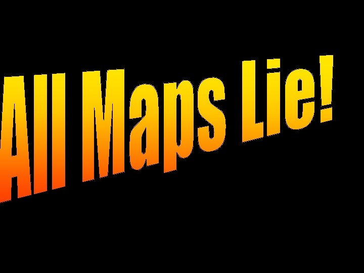
How would you explain the following statement… All Maps Lie. The Key Words are: DISTORTION Exaggeration Generalization
The TRUTH about All Maps Lie: 1. All maps are flat, the earth is not 2. All maps distort at least one of the following items: Size Shape Distance Direction 3. Straight lines on the earth may appear curved lines on some maps 4. North is not always “up” 5. Shortest distance between two points may not appear to be straight on some map. 6. Many maps exaggerate features 7. Maps tend to generalize information
Explain the cartoon below:
Remember: Anytime you take a round object and put it on a flat piece of paper something will be DISTORTED!
Notes: A globe is the most accurate representation of the earth Globes Positive Features Negative Features Proportional / Round Correct Size Correct Distance Correct Shape Correct Direction Not Convenient Not Detailed Only See ½ at a Time Limited in Purpose Cartography means mapmaking
More Notes: All maps lie because: 1. All maps is flat, the earth is not 2. All maps distort at least one of the following items: Size Distance Shape Direction 3. Straight lines may become curved lines 4. North is not always up 5. Shortest distance between two points may not appear to be straight on the map 6. Many maps exaggerate features 7. Maps tend to generalize information