What is Design A Plan for arranging elements


- Slides: 34

What is Design? A Plan for arranging elements in such a way as to best accomplish a particular purpose.

Noun or Verb? • Design is both a noun and a verb. • It describes the thing created as well as the process of creating it.

Design Uses: • • A design is created with the elements Line Shape Color Value Texture Space Form These work together…

Design uses: • • • With the Principles: Unity Variety Emphasis Balance Pattern Rhythm-movement Contrast Proportion

Observation • Identify three elements and explain how they are used. • 1. • 2. • 3. Identify three principles and explain how they are used. 1. 2. 3.

How do the elements and principles work together? Element. Principle. The element and principle work together…

• Although design can be divided into elements and principles for the sake of discussion, it is only when these elements and principles work together to form a whole that a design is considered sucessful.

• Elements of design can be compared to the elements of writing. Words and punctuation and the principles of design can be compared to the rules of grammar. • WE WOULD NOT RANDOMLY THROW WORDS AND PUNCTUATION ON A PAGE AND EXPECT THEM TO COMMUNICATE.

Portrait Definition Description of a format which is taller than it is wide.

Land-scape Definition Description of a format which is wider than it is tall.

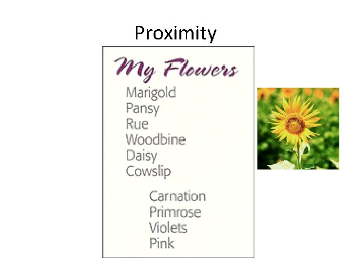
Proximity Definition • closeness; the state of being near

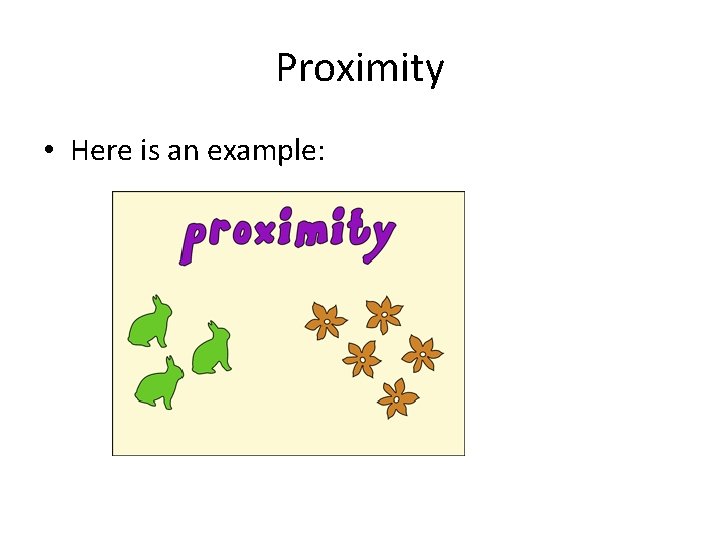
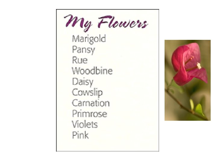
Proximity • Here is an example:


In the list above, what do you assume about all those flowers? Probably that they have something in common, right?

Proximity

*In the list above, what do you assume about all those flowers? Probably that they have something in common, right? *In the list above, what do you assume? It appears that the last four flowers are somehow different from the others. *You understand this instantly. And you understand it without even being conscious of it. You know the last four flowers are somehow different because they are physically separated from the rest of the list. That's the concept of proximity-on a page (as in life), physical closeness implies a relationship.

That's the concept of proximity-on a page (as in life), physical closeness implies a relationship.

Alignment Definition an arrangement or position of things in a straight line or in parallel lines

Robin's Principle of Alignment states, "Nothing should be placed on the page arbitrarily. Every item should have a visual connection with something else on the page. " The principle of alignment forces you to be conscious-no longer can you just throw things on the page and see where they stick. When items are aligned on the page, the result is a stronger cohesive unit. Even when aligned elements are physically separated from each other, there is an invisible line that connects them, both in your eye and in your mind. Although you might have separated certain elements to indicate their relationships (using the principle of proximity), the principle of alignment is what tells the reader that even though these items are not close, they belong to the same piece. The following pages illustrate this idea.

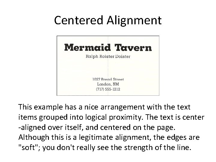
In the example that you saw in the proximity section, text can also be aligned-it's aligned down the center. A centered alignment often appears a bit weak.

Centered Alignment This example has a nice arrangement with the text items grouped into logical proximity. The text is center -aligned over itself, and centered on the page. Although this is a legitimate alignment, the edges are "soft"; you don't really see the strength of the line.

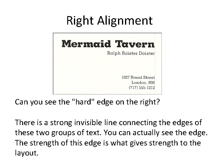
If text is aligned, instead, on the left or the right, the invisible line that connects the text is much stronger because it has a hard vertical edge to follow. This gives left- and rightaligned text a cleaner and more dramatic look. Lets see.

Right Alignment Can you see the "hard" edge on the right? There is a strong invisible line connecting the edges of these two groups of text. You can actually see the edge. The strength of this edge is what gives strength to the layout.

Design , like writing, involves problem solving , planning and organizing. In verbal communication, we choose which words to use and how to put them together to best communicate our thoughts and ideas. In visual communication we choose which elements to use and how to put them together to best communicate our thoughts and ideas.

Business Cards 1. Is there one main focal point? If yes explain. If not, and how could you create one? 2. Does the font work ? Why or Why not? Explain. 3. How many different alignments? Hard or soft lines, Centered, left or Right. Identify. 4. Are the logical elements grouped together into close proximity? Where does your eye travel? List 1 st, 2 nd, 3 rd. 5. Does the Graphics work for or against the layout? Why or Why not?

Business Cards should be 2 -3. 5 inches Business cards should present a professional image people will remember.

Must Haves 1. Use your logo as the basis. Make it the largest element on the card. 2. Keep it simple 3. Include Name, Title, company name , Address, Phone and fax number, email and websites. 4. Typeface should be readable 5. Stick to one or two colors Typeface- set of one or more fonts that share the same design features.

Keep it Clean

Keep it Readable

Make it Memorable

Creativity • 1. Think about nontraditional shapes that grab attention. Does the card have to be Square? • 2. Think about Colored or Textured paper. • 3. Thermograph- process that creates a raised edge or lettering, shinny print can add interest.

Vocabulary • Font- a particular size, weight and style of a typeface. • Typeface- set of one or more fonts that share the same design features. • Typography - The Art and Technology of • Arranging type in order to make language visual.

Redesign • Pick a card that has a logo that does not work or does not have a logo. • Pick a card that has a center alignment. • Pick a card that does not illustrate close proximity.

Redesign Logo • • • Make the logo the main focal point. Use a hard or soft left or right alignment. Group elements in close proximity. Explain the eye travel. Explain the typography.