What is a scatter graph Scatter graphs are
- Slides: 9

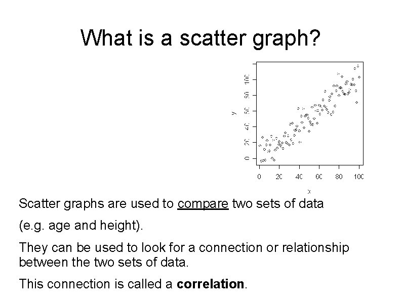
What is a scatter graph? Scatter graphs are used to compare two sets of data (e. g. age and height). They can be used to look for a connection or relationship between the two sets of data. This connection is called a correlation.

A scatter graph is a graph using paired data that can be used to find out whethere is a relationship between two variables. paired data is two separate pieces of data referring to the same thing e. g. the age and value of a car the height and shoe size of a person the marks that a person gained in two separate tests. A variable is a piece of information that can change. e. g. test results - these can be any value, but will be a specific value for a particular person's test.

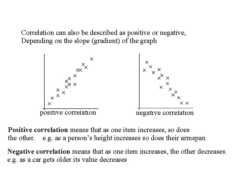
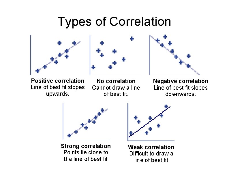
Correlation can also be described as positive or negative, Depending on the slope (gradient) of the graph positive correlation negative correlation Positive correlation means that as one item increases, so does the other. e. g. as a person’s height increases so does their armspan Negative correlation means that as one item increases, the other decreases. e. g. as a car gets older its value decreases

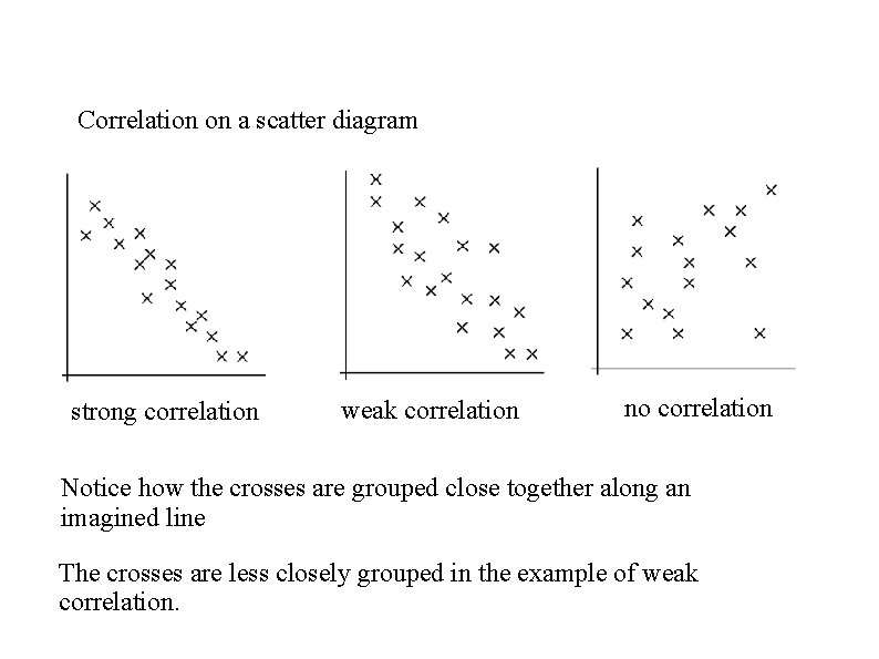
Correlation on a scatter diagram strong correlation weak correlation no correlation Notice how the crosses are grouped close together along an imagined line The crosses are less closely grouped in the example of weak correlation.

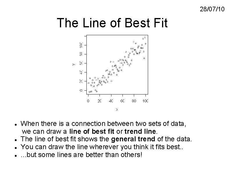
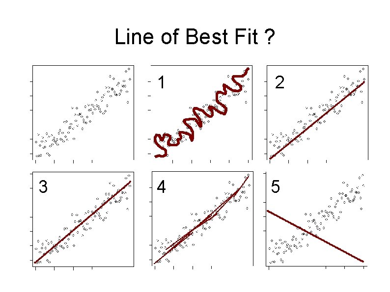
28/07/10 The Line of Best Fit When there is a connection between two sets of data, we can draw a line of best fit or trend line. The line of best fit shows the general trend of the data. You can draw the line wherever you think it fits best. . . but some lines are better than others!

Line of Best Fit ? 3 1 2 4 5

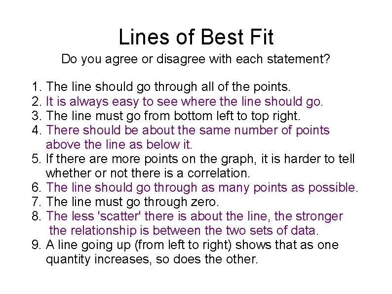
Lines of Best Fit Do you agree or disagree with each statement? 1. The line should go through all of the points. 2. It is always easy to see where the line should go. 3. The line must go from bottom left to top right. 4. There should be about the same number of points above the line as below it. 5. If there are more points on the graph, it is harder to tell whether or not there is a correlation. 6. The line should go through as many points as possible. 7. The line must go through zero. 8. The less 'scatter' there is about the line, the stronger the relationship is between the two sets of data. 9. A line going up (from left to right) shows that as one quantity increases, so does the other.

Types of Correlation Positive correlation Line of best fit slopes upwards. No correlation Cannot draw a line of best fit. Strong correlation Points lie close to the line of best fit Negative correlation Line of best fit slopes downwards. Weak correlation Difficult to draw a line of best fit

Interpreting Scatter Diagrams • The relationship between two variables is called a Correlation • A line of best-fit is a line which helps us to identify the type of correlation (positive, negative, no correlation) & make predictions • The line of best fit is drawn so that the points are evenly distributed on either side of the line • The closer the dots to the line, the stronger the correlation Remember: 1. The line of best fit is a STRAIGHT LINE 2. It DOES NOT have to pass through the origin 3. It DOES NOT have to go through each point