What do these cartoons show and how do


- Slides: 34
What do these cartoons show and how do they make you feel?
Lesson Objective/Amcanion y wers WALT - WE ARE LEARNING TO…… Date: __________ THEME 6: Development and Resource Issues LO: What are global patterns of development?
What is development?
Demographic Development – Life expectancy
Demographic Development – Able to travel
Demographic Development – Wealth
Social Development – Quality of life
Social Development – Equal Opportunities
Cultural Development – Education
Cultural Development – Culture
Political Development – Freedom of Speech
Political Development – Democratic Government
What is development? A combination of all these things?
Task 1: Write a definition for what development means? Improvement Change Advancement Progress Growth
What is development? An increase in standards of living and quality of life for an increasing proportion of the population. Task 2: Match the correct key word with the definition. Economic development Involves forming a stable government and allowing greater freedom of speech. Social development Occurs when there is rising life expectancy and greater access to education, healthcare, clean water and housing for all people, particularly women and minority groups. Political development The result of increased employment and rising incomes.
Task 3: Describe what each image is showing and state whether it is more or less developed. 1 2 4 5 3
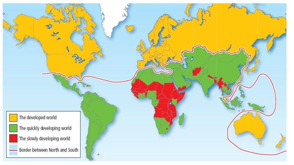
1. WHICH CONTINENTS ARE GREEN? 2. WHICH CONTINENT HAS THE MOST RED? 2. WHAT DOES THIS MAP SHOW?
The Brandt line In 1980, William Brandt, a German politician, drew a line on the map that separated the richer countries from the poorer ones. This map was developed to illustrate the gap between rich and poor countries. This famous map draws attention to the gap between the richer North and the poorer South and is still in use today. But is it still relevant and accurate? Task 4: Add the Brandt line to your map.
The Brandt line • There is still a strong gap that exists between the wealthiest and poorest countries of the world today. • The line showed that most wealthy countries were in the northern hemisphere, so these became known as the ‘global north’. The line loops around Australia and New Zealand in the southern hemisphere so that they could be included in the ‘north’. • Poorer countries became known as the ‘global south’ because many were in the southern hemisphere. • The line dividing these groups became known as the ‘North–South divide’.
Task 5: Use your map to answer the questions. 1. Choose one HIC and one LIC and label your map. 2. Describe the distribution of HICs and LICs. 2. Identify any countries that do not fit the Brandt ‘development gap’ from 1980. What does this tell you about how patterns of inequality have changed since 1980?
There are different forms of inequality seen all over the world.
Inequality between elderly people Inequality within transport
Inequality in where we live… Mukesh Ambani, the fifth richest man in the world, is building a 550 -foottall, skyscraper as his family’s private home in Mumbai, India.
Even in the same city… House for sale $150 m… House wanted…
There is inequality in being able to provide for your own family…
Inequality in what people drink…
Inequality in how people are educated…
Economic Development: The wealth of a country is usually measured by how much its economy earns each year. This is measured in a variety of ways, but the most common are: • Gross domestic product (GDP), which is the total value of the economy each year. • Gross national income (GNI) person, which is a little like the average wage. • Poverty line – the % of the population who earn less than a certain amount per day; the World Bank set this figure at US$1. 90 in 2015.
Task 1. Explain what is meant by GNI. ……………………………………………………………………………… 2. Look at the information in the table below which shows the ‘Top 10’ wealthiest countries in 2012. Country Wealth in $ USA China India Japan Russia Germany Brazil UK France Italy $15. 2 trillion $11. 4 trillion $4. 5 trillion $4. 4 trillion $3. 1 trillion $2. 4 trillion $2. 3 trillion $2. 2 trillion $1. 8 trillion 3. How many of the ‘Top 10’ most wealthy countries are located in Europe ? …………………………………………………………………. 4. How many of the countries are located in the ‘South’, below the Brandt Line ? …………………………………………………………………. . 5. Suggest how the ‘Top 10’ may have been different 10 years ago. Give a reason for the difference ? …. ……………………………………………………………………
Look at it another way Here’s the world drawn by population…. . .
… and here’s the world drawn by GDP
Population How do the two maps contrast and compare? GDP
Limitations of evidence of development: Economic indicators can be very ____ in measuring a countries level of development. However, there also ____ to only using _____indicators when looking at how developed a country is. These include: • They measure only ____ and do not include social factors. • They do not recognise _____ within a country. • They do not consider the cost of ______ within a country and hence the amount of ______ that can be bought with a given amount of ____. wealth useful economic living limitations money goods inequality