WHAT DESIGNERS NEED TO KNOW ABOUT ACCESSIBILITY A
WHAT DESIGNERS NEED TO KNOW ABOUT ACCESSIBILITY (A 11 Y) Jon Gunderson, Ph. D. Disability Resources and Education Services University Of Illinois – Urbana/Champaign 2018 Convey. UX Conference, Seattle, WA
DESIGNERS ARE CRITICAL FOR A 11 Y Remediation (Dominate) • Build the product add accessibility at the end or as users identify issues. Automated testing (Very Popular) • Automated tools during the development process use to identify accessibility issues to fix. • Some services advertise they don’t need to do anything theirservice will make your product accessible. Design (Rare) • Understanding the needs and interaction of people with disabilities (PWD) using assistive technologies or OS accessibility features.
FIRST STEPS IN A 11 Y DESIGN • Accessibility basics • Role • Name • Description • ARIA Landmarks and HTML Headings • Keyboard interaction model • Keyboard focus styling

ROLE, NAME AND DESCRIPTION Role • Type of user interface element Name • Label for the user interface element (e. g. purpose or action) Description • Additional information about a user interface element (e. g. instructions or context for name)
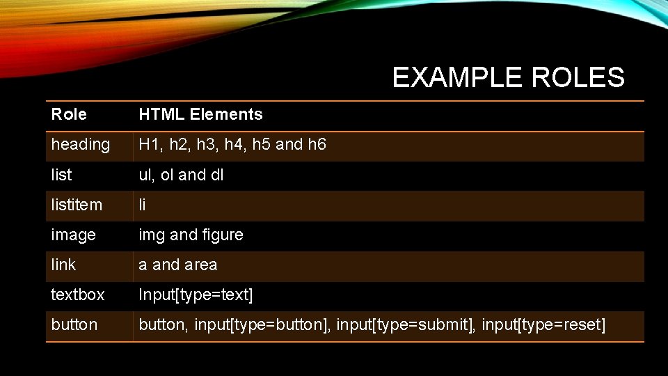
EXAMPLE ROLES Role HTML Elements heading H 1, h 2, h 3, h 4, h 5 and h 6 list ul, ol and dl listitem li image img and figure link a and area textbox Input[type=text] button, input[type=button], input[type=submit], input[type=reset]
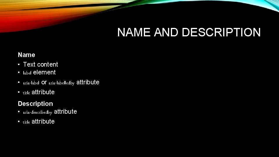
NAME AND DESCRIPTION Name • Text content • label element • aria-label or aria-labelledby attribute • title attribute Description • aria-describedby attribute • title attribute
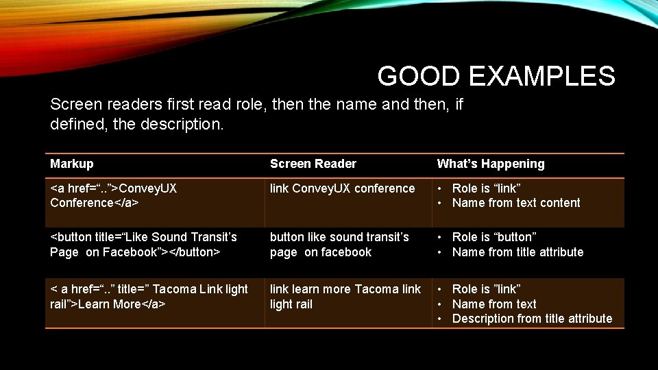
GOOD EXAMPLES Screen readers first read role, then the name and then, if defined, the description. Markup Screen Reader What’s Happening <a href=“. . ”>Convey. UX Conference</a> link Convey. UX conference • Role is “link” • Name from text content <button title=“Like Sound Transit’s Page on Facebook”></button> button like sound transit’s page on facebook • Role is “button” • Name from title attribute < a href=“. . ” title=” Tacoma Link light rail”>Learn More</a> link learn more Tacoma link light rail • Role is ”link” • Name from text • Description from title attribute
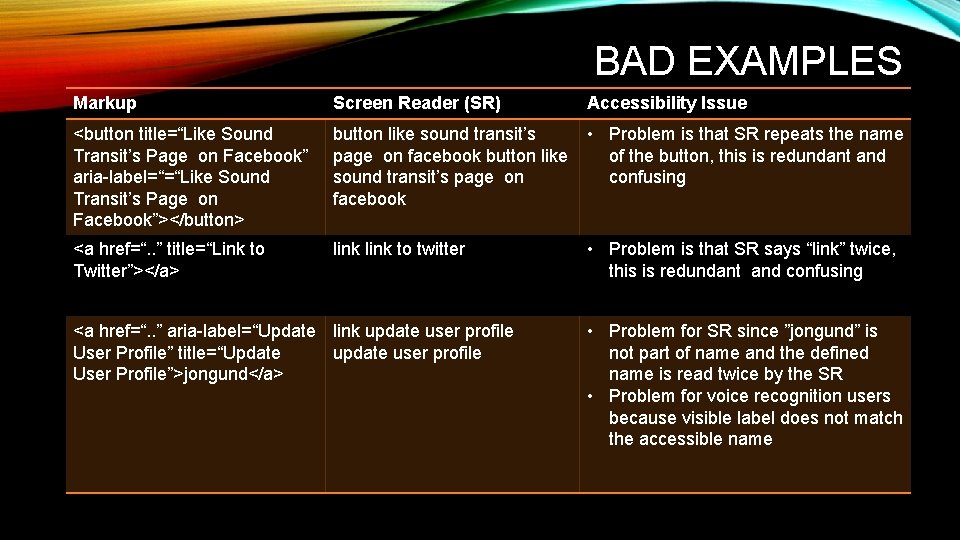
BAD EXAMPLES Markup Screen Reader (SR) <button title=“Like Sound Transit’s Page on Facebook” aria-label=“=“Like Sound Transit’s Page on Facebook”></button> button like sound transit’s • Problem is that SR repeats the name page on facebook button like of the button, this is redundant and sound transit’s page on confusing facebook <a href=“. . ” title=“Link to Twitter”></a> link to twitter <a href=“. . ” aria-label=“Update link update user profile User Profile” title=“Update user profile User Profile”>jongund</a> Accessibility Issue • Problem is that SR says “link” twice, this is redundant and confusing • Problem for SR since ”jongund” is not part of name and the defined name is read twice by the SR • Problem for voice recognition users because visible label does not match the accessible name
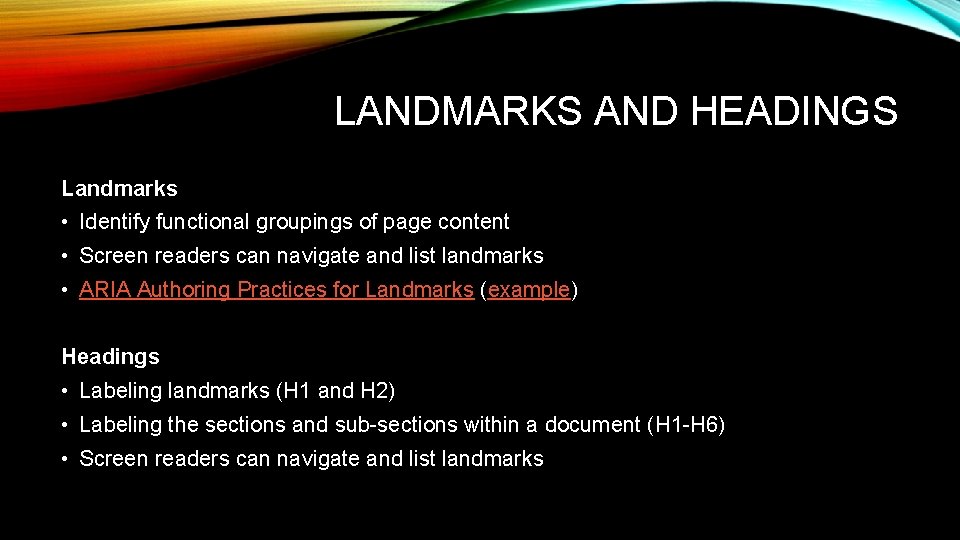
LANDMARKS AND HEADINGS Landmarks • Identify functional groupings of page content • Screen readers can navigate and list landmarks • ARIA Authoring Practices for Landmarks (example) Headings • Labeling landmarks (H 1 and H 2) • Labeling the sections and sub-sections within a document (H 1 -H 6) • Screen readers can navigate and list landmarks
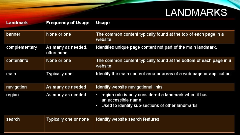
LANDMARKS Landmark Frequency of Usage banner None or one The common content typically found at the top of each page in a website. complementary As many as needed, often none Identifies unique page content not part of the main landmark. contentinfo None or one The common content typically found at the bottom of each page in a website. main Typically one Identify the main content area or areas of a web page or application navigation As many as needed Identify website navigational links region As many as needed • region role is only considered a landmark when it has an accessible name. • Used to identify sub-sections of other landmarks search Typically one or none Identify website search features
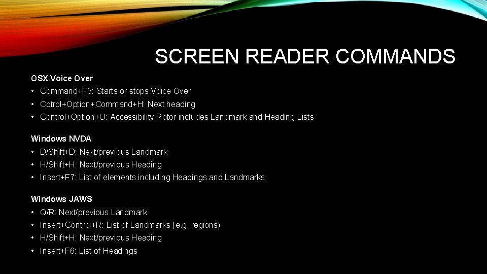
SCREEN READER COMMANDS OSX Voice Over • Command+F 5: Starts or stops Voice Over • Cotrol+Option+Command+H: Next heading • Control+Option+U: Accessibility Rotor includes Landmark and Heading Lists Windows NVDA • D/Shift+D: Next/previous Landmark • H/Shift+H: Next/previous Heading • Insert+F 7: List of elements including Headings and Landmarks Windows JAWS • Q/R: Next/previous Landmark • Insert+Control+R: List of Landmarks (e. g. regions) • H/Shift+H: Next/previous Heading • Insert+F 6: List of Headings
LANDMARK AND HEADING EXAMPLES Accessibility Bookmarklets for visualizing Landmarks and Headings
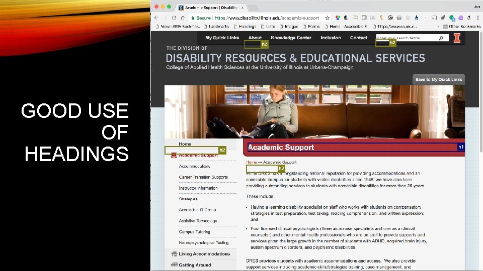
GOOD USE OF HEADINGS
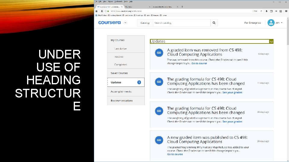
UNDER USE OF HEADING STRUCTUR E
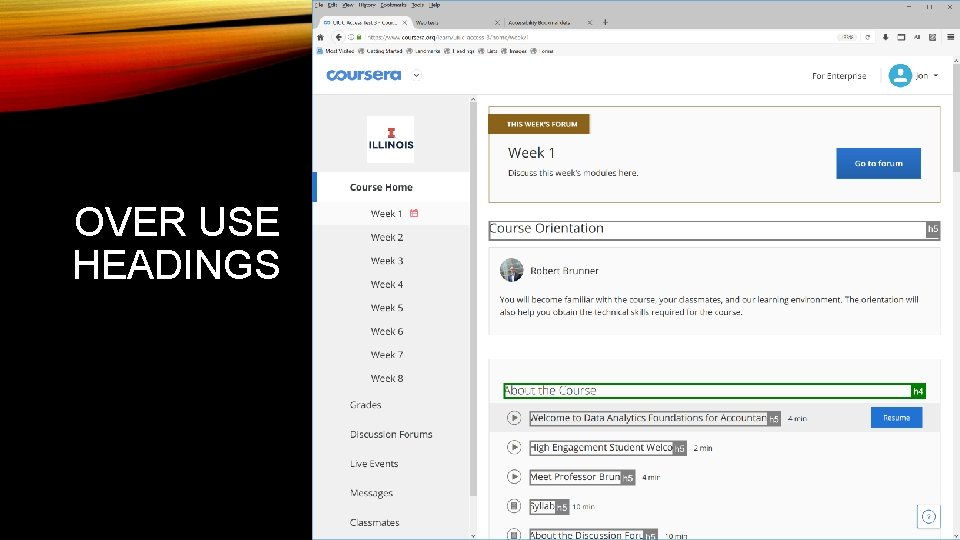
OVER USE HEADINGS
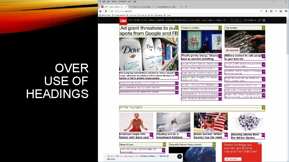
OVER USE OF HEADINGS
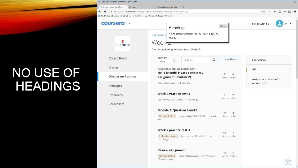
NO USE OF HEADINGS
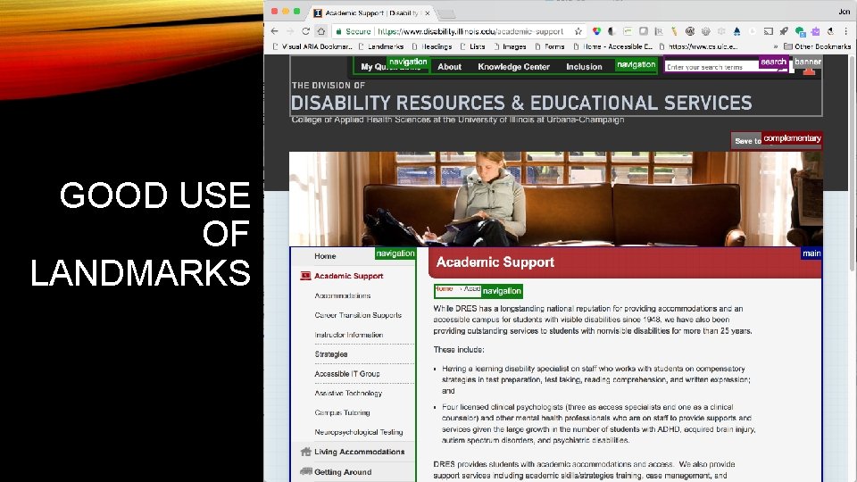
GOOD USE OF LANDMARKS
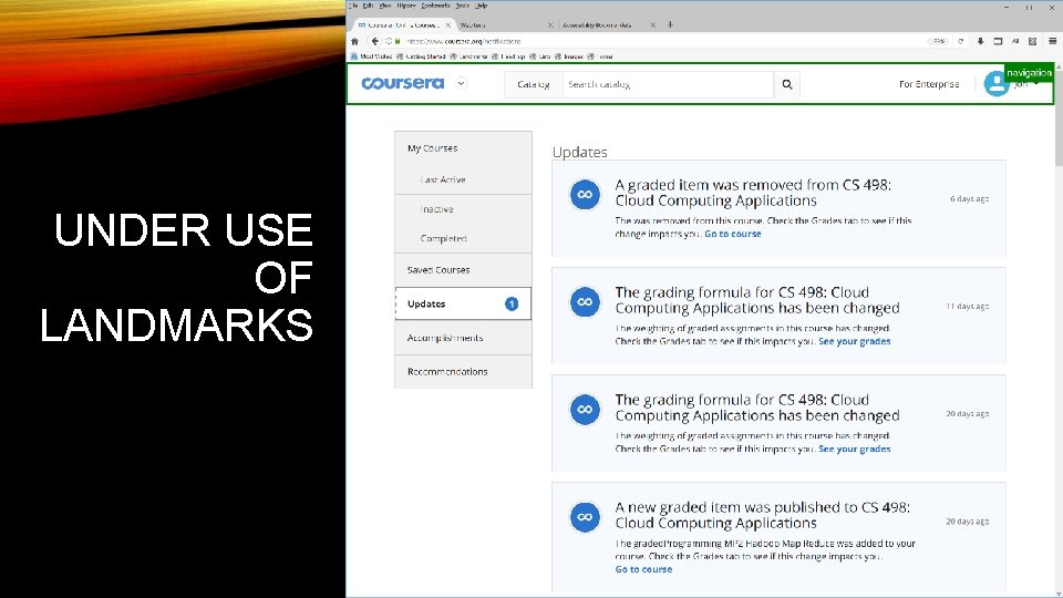
UNDER USE OF LANDMARKS
KEYBOARD INTERACTION MODEL • All functionalities must be accessible through keyboard alone • Interactive elements must have keyboard support • Basic tab navigation is often inefficient or incomplete • ARIA widget roles describe advanced keyboard interaction • ARIA Authoring Practices provide design patterns for roles and keyboard interaction
MENU ROLE EXAMPLE • ARIA Roles describe keyboard interaction, not user interface design features • Tab key moves focus to the selected menu item • When menu has focus, tab key moves focus out of the menu (e. g not to menu items) • Cursor keys to move between items in a menu • • Left and up key previous item Right and down to next item Home to move to first item End to move to last item • ARIA Menu Button Design Pattern and Examples
KEYBOARD FOCUS STYLING • The first accessibility feature I check a web page • Many people interpret WCAG requirements to only “not interfere” with default focus styling of browsers • Reset stylesheets often override and disable default focus styling of browsers • Designers must start actively style keyboard focus as part of the design to make it salient to all users
KEYBOARD FOCUS EXAMPLE • Focus should always be visible (e. g. no off-screen focusable elements) • Focus should include a border for links and form controls • Focus styling must meet color contrast requirements of WCAG • Focus should be easy to see as you navigation with the TAB key • Links in the main content should be underlined (e. g. important for people with low vision) • Inaccessible test page • Accessible test page
ACCESSIBILITY CAN AS YOUR FRIEND • 3. 2. 3 Consistent Navigation: Navigational mechanisms that are repeated on multiple Web pages within a set of Web pages occur in the same relative order each time they are repeated, unless a change is initiated by the user. (Level AA) • 3. 2. 4 Consistent Identification: Components that have the same functionality within a set of Web pages are identified consistently. (Level AA)
W 3 C RESOURCES • Web Content Accessibility Guidelines 2. 0 • Accessible Rich Internet Application (ARIA) 1. 1 • ARIA Authoring Practices • Using ARIA • HTML 5 Specification
SCREEN READER RESOURCES OSX Voice (Safari and Chrome) • Penn State: Voice Over for OS X • Apple Voice Over Commands Windows NVDA (Open Source) • Penn State: NVDA Keyboard Commands • Webaim: NVDA Keyboard Commands • NVDA: Web Browse Keyboard Commands Windows Jaws • Penn State: JAWS commands for web • Web. AIM: JAWS commands for web • Freedom Scientific: JAWS commands for web
OPEN SOURCE TOOLS The following tools support rules for accessible design requirements outlined in this presentation. • Functional Accessibility Evaluator • AInspector Sidebar for Firefox (ESR 52 Version) • Accessibility Bookmarklets
ADDITIONAL TRAINING AND RESOURCES Training from Illinois • Information Accessibility Design and Policy Certificate • Accessibility Badges Other Resources • W 3 C Web Accessibility Initiative • Web. AIM • Knowability

QUESTIONS AND DISCUSSION? Contact Jon Gunderson at jongund@illinois. edu
- Slides: 29