What comes to mind when you see the

- Slides: 20


What comes to mind when you see the logo? What is our identity?

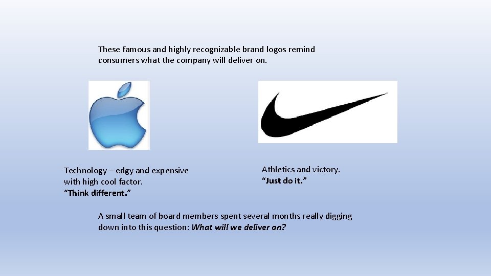
These famous and highly recognizable brand logos remind consumers what the company will deliver on. Technology – edgy and expensive with high cool factor. “Think different. ” Athletics and victory. “Just do it. ” A small team of board members spent several months really digging down into this question: What will we deliver on?

Values of our brand Core Value: Advocacy Action Values: Professional Development, Communication, Connectivity Experience Values: Engagement, Unity, Support From these values we constructed our core message…

Core Message CHSA advocates for its members at the federal, state and local county level ensuring that members can speak with a unified voice about the challenges facing California’s most vulnerable families, and the Head Start community that serves them. From our core message we created our tagline …

Tagline Connecting * Engaging * Advocating for our highest needs children This tagline is what we used to design a logo. Which brings us back to …


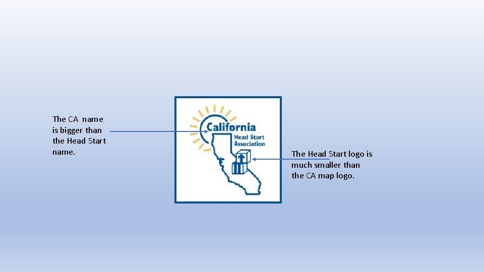
The CA name is bigger than the Head Start name. The Head Start logo is much smaller than the CA map logo.

As the logo is reduced size for letter head or business cards …

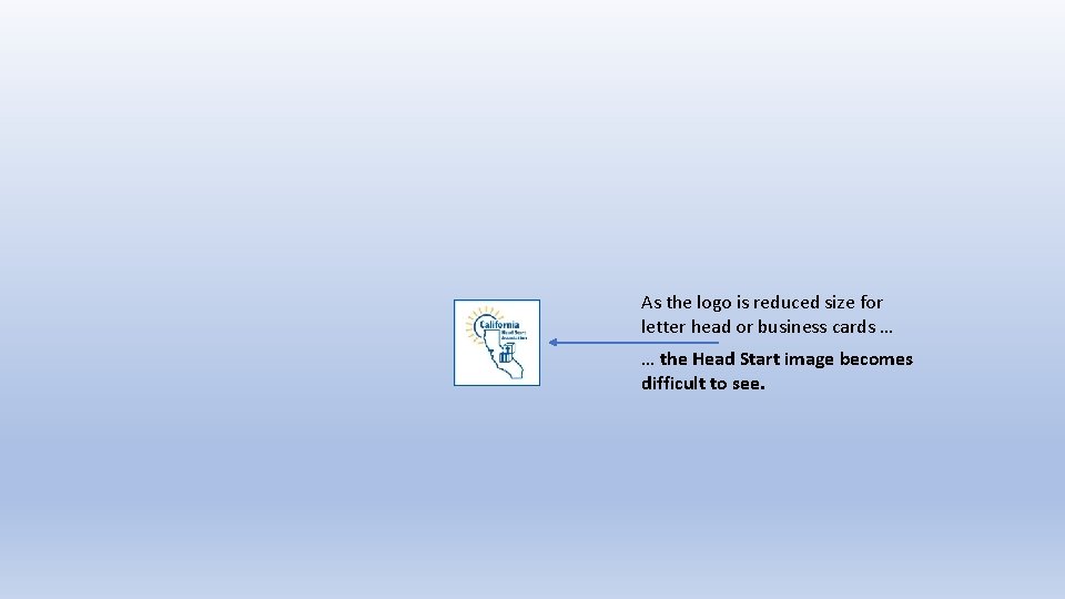
As the logo is reduced size for letter head or business cards … … the Head Start image becomes difficult to see.

Let’s look at the Head Start logo more closely …


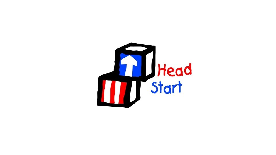
If we remove the words…

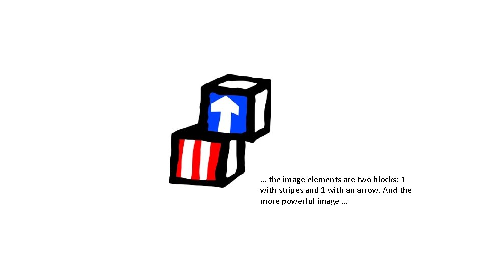
… the image elements are two blocks: 1 with stripes and 1 with an arrow. And the more powerful image …

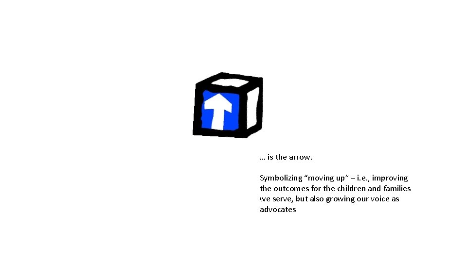
… is the arrow. Symbolizing “moving up” – i. e. , improving the outcomes for the children and families we serve, but also growing our voice as advocates

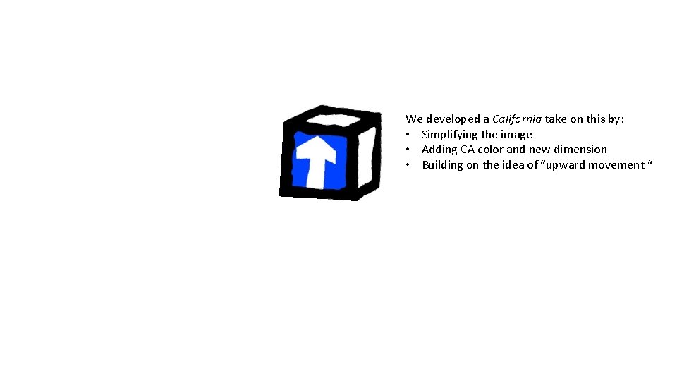
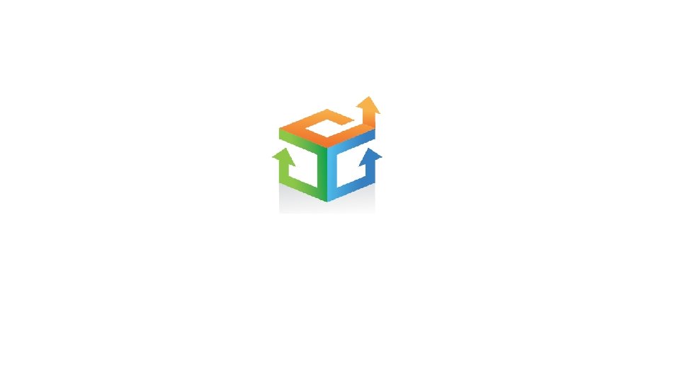
We developed a California take on this by: • Simplifying the image • Adding CA color and new dimension • Building on the idea of “upward movement “


Our new name tells the world we are the Head Start community in California – in that order. Our new tagline captures our commitments as a professional community – and for whom. Our new logo is reminiscent of the traditional Head Start symbol (“blocks and arrow”) but conceived in a modern, forward-thinking design. We are – all of us - moving up. We are getting stronger as a professional community, lifting up the families we serve, and leading Head Start advocacy in California and nationally.

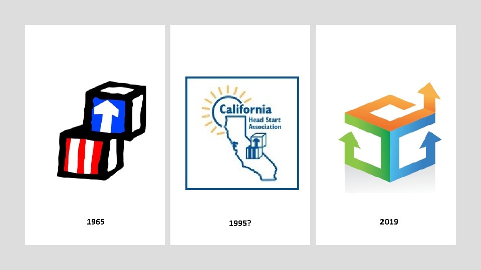
1965 1995? 2019