What can we learn from maps MAPS Do


 Map • a map type that uses a dot symbol to")


- Slides: 35
What can we learn from maps?
MAPS • Do Now: Spend 3 minutes drawing a map of something – It can be your route to school, your class schedule, the places you have lived, or anything else. Include features that you believe will help the viewer best understand what the purpose of your map is.
What is a Map? • Based on what you have done, how would you define “map. ” • Definition – diagram of an area that shows physical and/or human features.
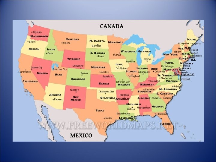
General Reference Map
Thematic Map • emphasizes a specific subject area or theme connected to a specific geographical area.
Physical Map
Political Map
Resource Map
Climate Map
Choropleth Map • a thematic map in which areas are shaded or patterned in proportion to the measurement of the statistical variable being displayed on the map
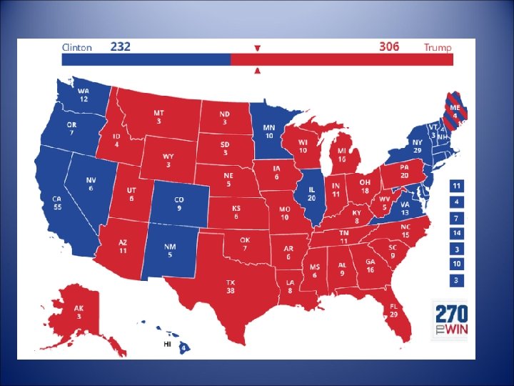
Electoral Outcomes in 2016 Presidential Election by County
The US Population by Light Intensity
Family income of $421, 926 or higher is top 1% nationally
Dot Distribution Map
Dot Distribution (Density) Map • a map type that uses a dot symbol to show the presence of a feature or a phenomenon • Helps understand Density
One dot = 500 goats
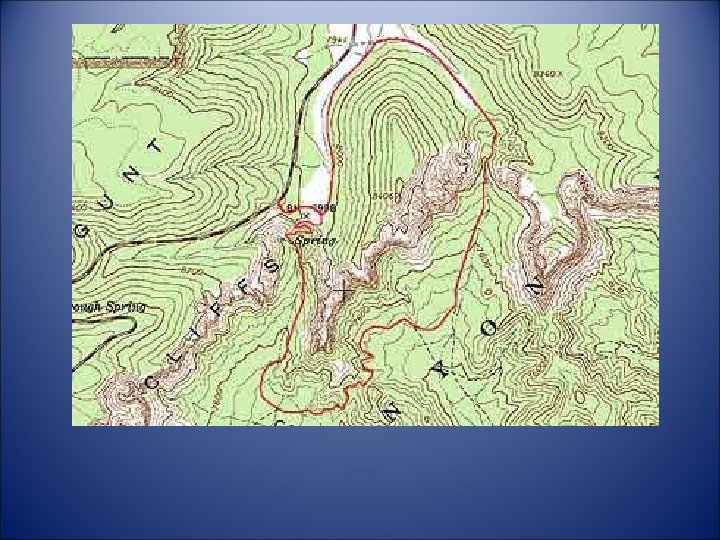
ISOLINE MAPS The isoline representation is the most used method to visualize variations in quantitative phenomena over a particular area. Commonly used to show temperature, precipitation, or ground elevations.
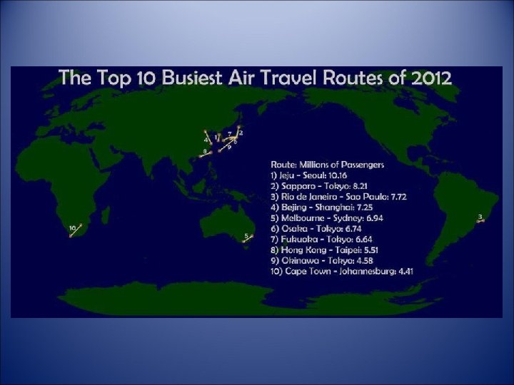
Located Charts
Located Chart • Bar graph, pie graph or other visual representation of data appears on map to make comparisons between places.
Highest Paid Public Employee
Countries with a Mc. Donalds
Cartogram
Where England has invaded
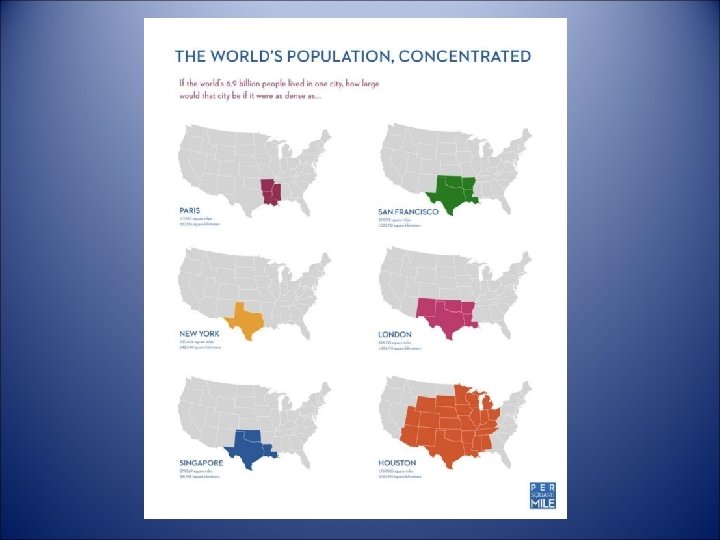
The US if Population Were Evenly Distributed
Most Popular Sport Played
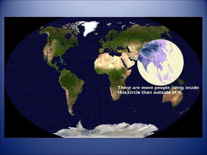
Continents With Even Population Distribution
Driving on the right side or left side